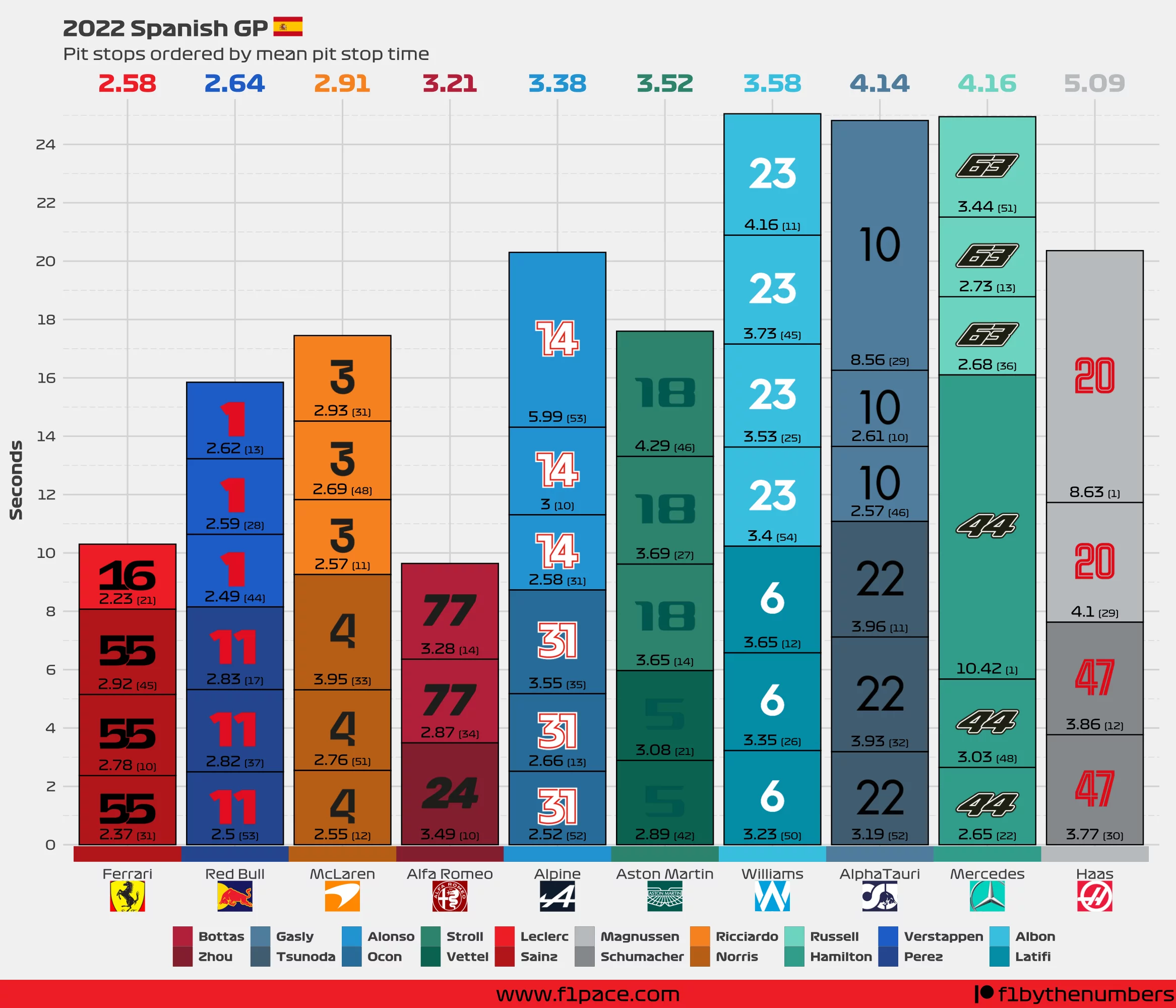
Formula 1 pit crew mechanic is one of the most demanding jobs in motorsports. Working under extreme pressure with little room for error, these mechanics are at times the difference between a good and a bad result for a given driver. Because of this, I will continue this series of posts showing their performance week after week and recognizing their efforts.
For now, I came up with the simple idea of adding a plot to visualize the pit stops that happened during the race. The chart itself is self-explanatory, but just in case, let’s see what information it has:
- The x-axis has each team that participated during the race.
- The y-axis has the total number of seconds.
- The bars are divided and stacked based on each pit stop for each team.
- The big numbers at the top show the average pit stop time for each team.
- The small numbers within each section of a bar represent the time for that particular stop.
- The number inside the parenthesis shows the lap when that pit stop was made.
- The driver number within each section of a bar is just for looks ;)

Final remarks
I hope you are enjoying the content. I have been quite busy adding extra content to the site but I definitely plan to add additional content related to the pit crew. Let me know in the comments below if you’re interested in that. As usual, if you like the content, please share it on social media. If you want to support me you can click on the “buy me a coffee” button below to give me a donation.
