I’m here with another new addition to the blog—which is quite surprising, even for myself. I’m not sure what’s going on, to be honest.
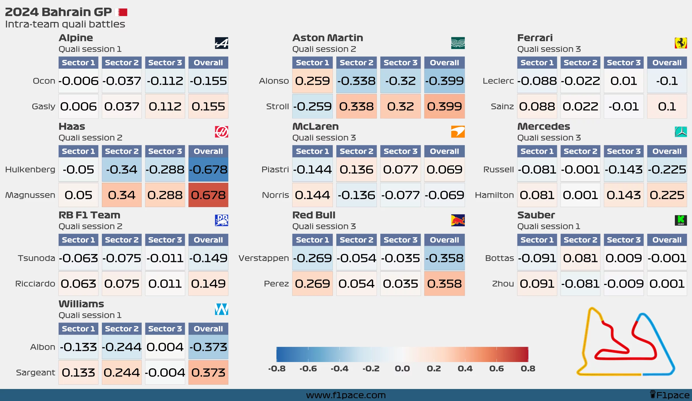
The charts show the deltas for each driver for each sector and the entirety of the lap for the qualifying session of the previous race. Since sometimes a driver advances to the next quali session while his teammate doesn’t, I filtered the data to contain the maximum quali session in which both drivers from the same team participated.
The colour acts as a heatmap, with stronger colours showing a larger difference than fainter ones. In this case, the drivers who were faster will have a blue background, while drivers with slower times will have a red background.
I hope you like it.

