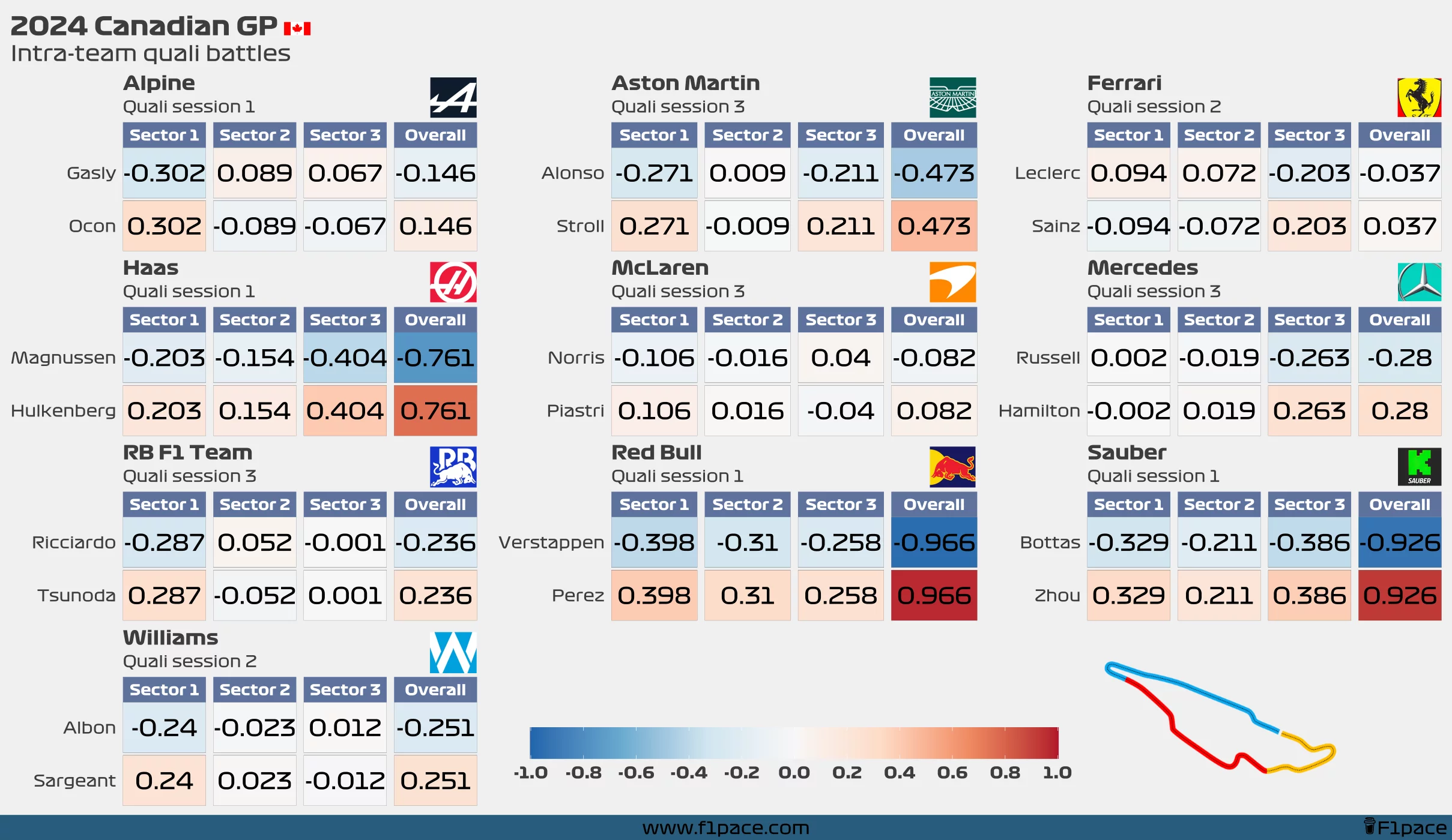
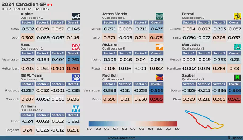
The charts show the deltas for each driver for each sector and the entirety of the lap for the qualifying session of the previous race. Since sometimes a driver advances to the next quali session while his teammate doesn’t, I filtered the data to contain the maximum quali session in which both drivers from the same team participated.
The colour acts as a heatmap, with stronger colours showing a larger difference than fainter ones. In this case, the drivers who were faster will have a blue background, while drivers with slower times will have a red background.
I hope you like it.

