Is this site worth at least $1 to you?
I really need your support to keep going. I love this project and I want to keep it going, but if I can’t find the support to make this site sustainable I may have to shut down operations in the near future.
Use the Get in touch link to send your email and the name or handle you’d like shown. Thanks for the support.
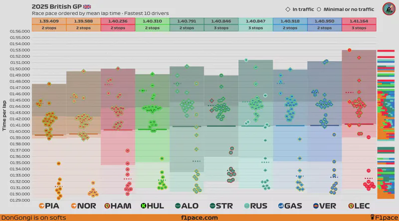
Race pace
The main idea of these charts is to show the representative average race pace of each driver. Since plotting the raw data will not show accurate information, I did a bit of data pre-processing. Click on the “expand methodology” button if you want to know more about how the data was analyzed.
Click to expand methodology
This was a very difficult race to analyze. With so many virtual and safety cars, race control went wild sending track status information.
Experimental feature: Added traffic data
Drivers are flagged as “in traffic” if they spend more than 33% of the lap (~1/3) within 2 seconds of any driver ahead (including backmarkers).
Still in testing so inaccuracies are possible.
Remember Drivers with more pit stops tend to have faster average times than drivers with fewer pit stops.
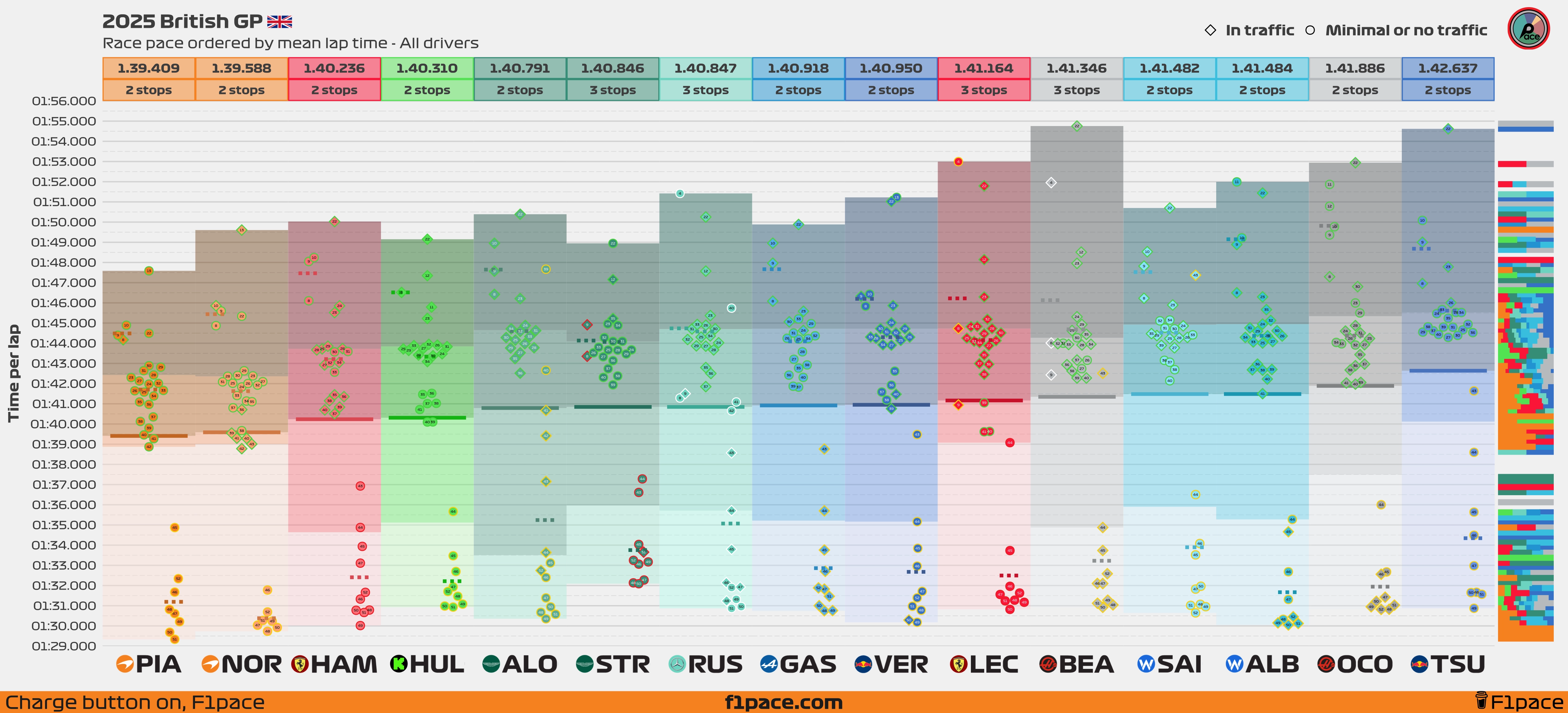
The next plot is interactive. Click on the toolbar on the top, left side of the plot to zoom in and scroll. Hover with the mouse over the data points to get additional information.
This chart is better visualized on a computer. To get additional information on a point while using a mobile device, click and hold the desired data point to get the proper tooltip displayed.
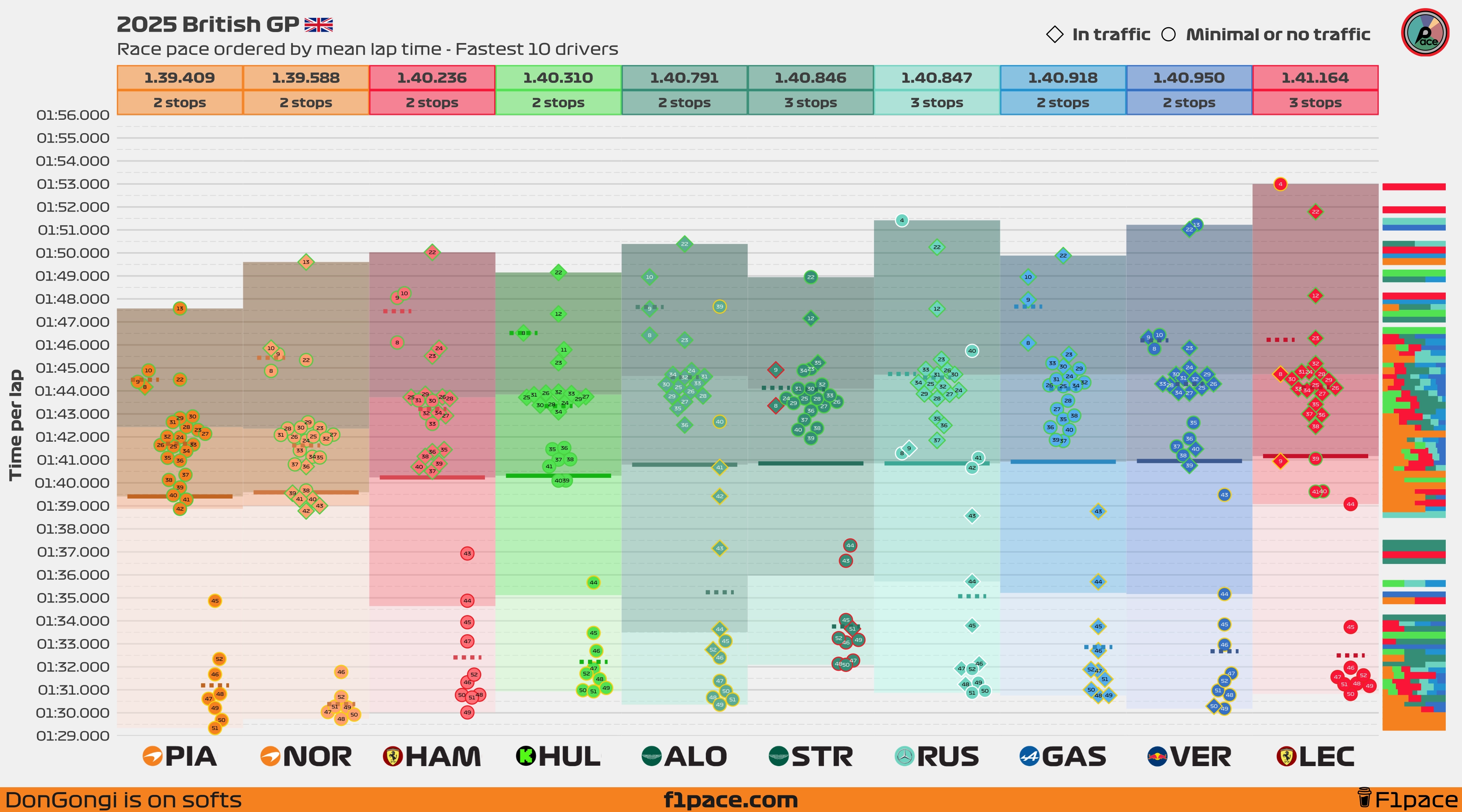
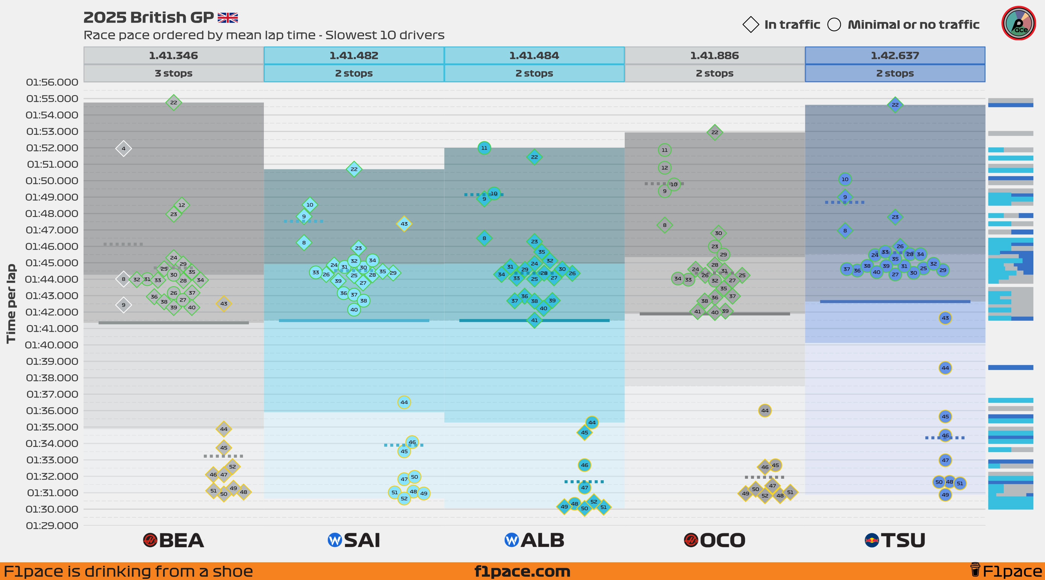
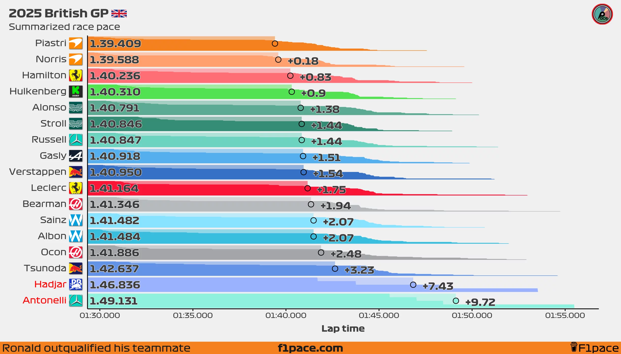
Summarized race pace
This chart shows the same information as the previous chart, but in a summarized way. I’m not a huge fan of the traditional plain bar charts, so I created this chart which shows the same information and a little bit more.
The chart looks pretty funky, but you can read it like this:
- The number on the right side shows the average lap time for each driver.
- This number corresponds to the big dot that is showed in each of the bars.
- Each bar is divided by all the laps done by each driver. This is another way of showing the distribution instead of just the average (like a typical bar chart would do).
- Longer “mini-bars” show laps in which a particular driver had a slower lap time. Shorter “mini-bars” represent laps in which a driver had a faster lap time.
- If a driver’s name is red-colored, that means that the driver completed less than 70% of the race distance.
Race laps… all of them
I’ve removed this chart because it takes quite a bit of time to generate and I don’t think anybody was looking at it. If you liked this chart and want me to bring it back, hit me up using the Get in touch link.
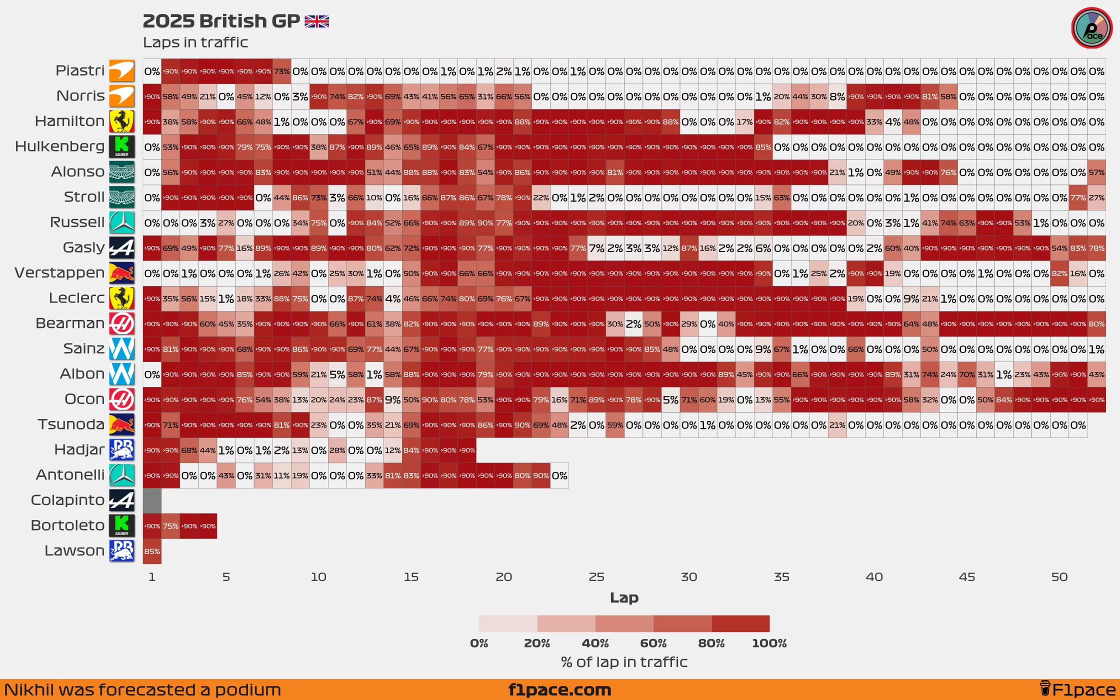
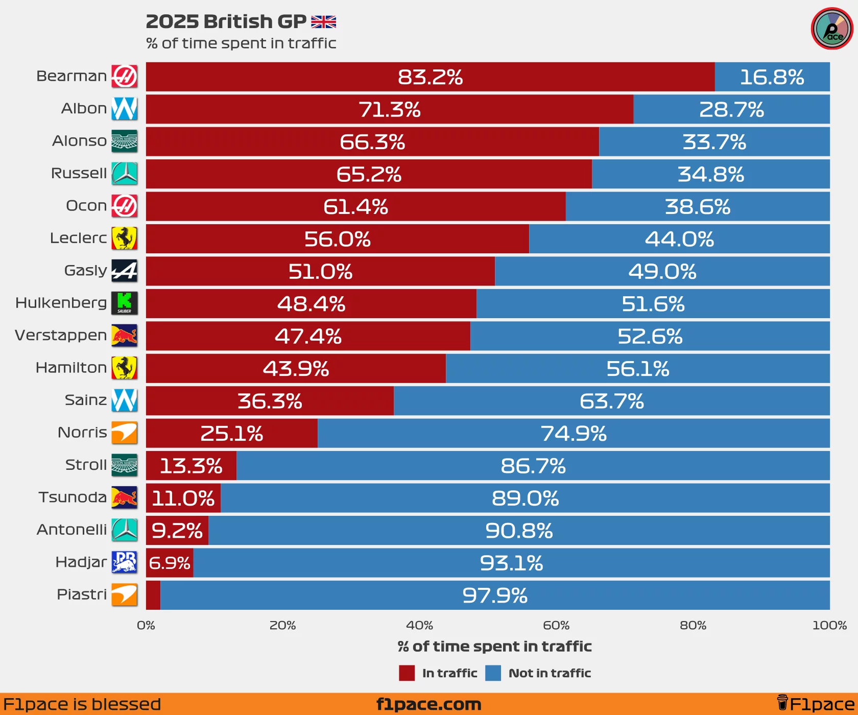
Laps in traffic
These are two new additions to the site. The first chart, taps in traffic, shows the percentage of each lap that a driver spent in traffic. The second chart, % of time spent in traffic, shows a summary of the total time a driver spent in traffic during a race. Both of these charts include backmarkers, which is how it should be done since backmarkers can have a big impact on the final results of a race.
It’s important to note that the % of Time Spent in Traffic chart doesn’t include laps completed under safety car (SC) or virtual safety car (VSC) conditions.
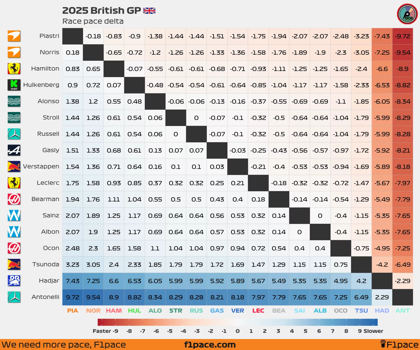
Race pace delta
Similar to what I did with my latest quali post, I am now adding a new chart which shows the race pace deltas between all the drivers.
You can read the chart like this:
- Choose a driver from the left side of the plot (y-axis)
- Choose a second driver from the bottom of the plot (x-axis)
- See where they intersect. The number that you see is the delta for their mean/average race pace.
- If you see negative numbers then that means that the driver on the left side was faster than the driver he’s being compared to.
- If you see positive numbers then that means that the driver on the left side was slower than the driver he’s being compared to.
The chart includes drivers that retired during the race.