Pit stops are one of the most important elements in modern F1, and the pit stop crews deserve a lot of respect for the job they do week in and week out. Still, one of the most difficult aspects of judging a pit crew is the fact that pit stop times are highly variable, and a single pit stop can make the best team look like the worst. So, I’ve decided to create a robust model to address this issue and answer the question: Which team has the best pit stop crew in Formula 1?
Would you be interested in a follow up to this article? Maybe exploring trends for some teams (how xPT/xPCT/xPDT changes over a season), or focusing on specific teams and their different philosophies (what teams focus on to improve, perhaps by improving top speed or by reducing mistakes)? Let me know in the comments or by using the Get in touch form.
The raw pit stop data
What exactly happened during the season, considering the luck and variability of the data?
First of all, let’s take a look at the raw pit stop data. It shows exactly how the stops happened during the season—no adjustments for conditions, just all the stops compiled and summarized. As you keep reading, you’ll see that this approach comes with some subtle but noticeable downsides.
Raw performance per team
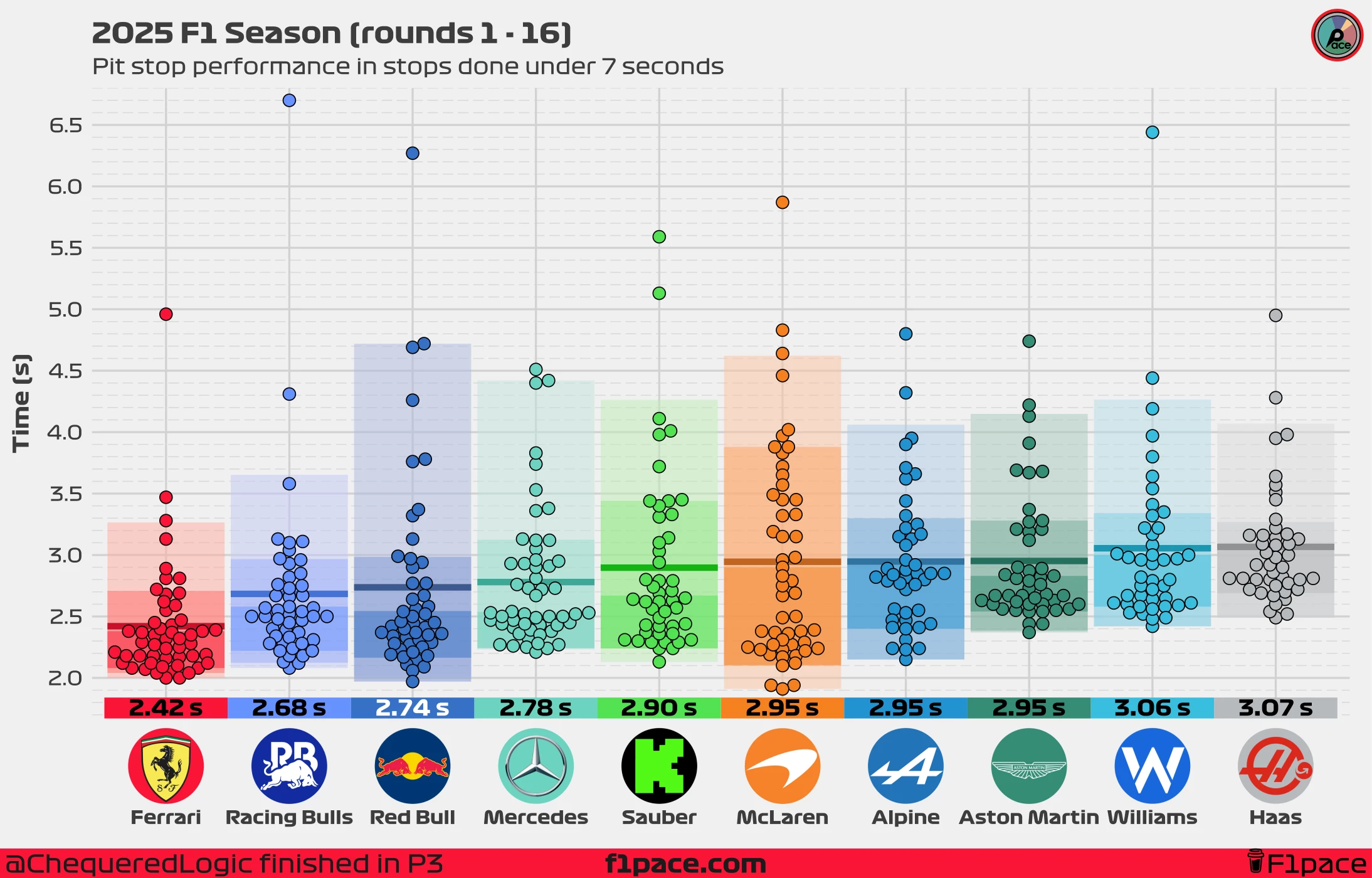
Looking at the data, grouped and summarized by team, the Ferrari pit crew comes out on top. Ferrari and their mechanics continue to do a fantastic job, performing at the top of their ability during the first 16 races of the 2025 season. Their average of 2.42 seconds per stop is now an incredible 0.26 seconds faster than Racing Bulls’. Considering that each pit stop takes, on average, less than three seconds, this is a significant gap.
Speaking of Racing Bulls, it’s quite interesting to see them ahead of their big brother, Red Bull. Their data is intriguing: on average, they are beating Red Bull by just 0.06 seconds per stop, down from 0.15 seconds per stop at round 14, but it appears that their maximum, raw pace isn’t quite on Red Bull’s level. However, they have made fewer major mistakes than the Red Bull crew, which helps lower their average substantially. Even including their slow 6.7 stop at the Zandvoort GP, their crew can be considered as more consistent than Red Bulls'.
Looking down the rankings, Mercedes are competing directly with Red Bull, with Mercedes behind the Austrian team by just 0.04 seconds per stop. Sauber trail Mercedes, with an average stoptime of 2.9 seconds per stop. Behind them we have McLaren, who have increased their top speed and have posted the fastest stop of the season, but have also made several costly mistakes.
The bottom five teams in this ranking are separated by around 1 tenth of a second, with Alpine and Aston Martin matching McLaren with an average pit stop time of 2.95 seconds per stop. At the bottom, we have Williams and Aston Martin, separated by just 1 hundreth of a second with respective average times of 3.06 and 3.07 seconds per stop. Is is all bad for the slower teams? We’ll take a look at their detailed performance in the following sections of this article.
Raw performance per driver
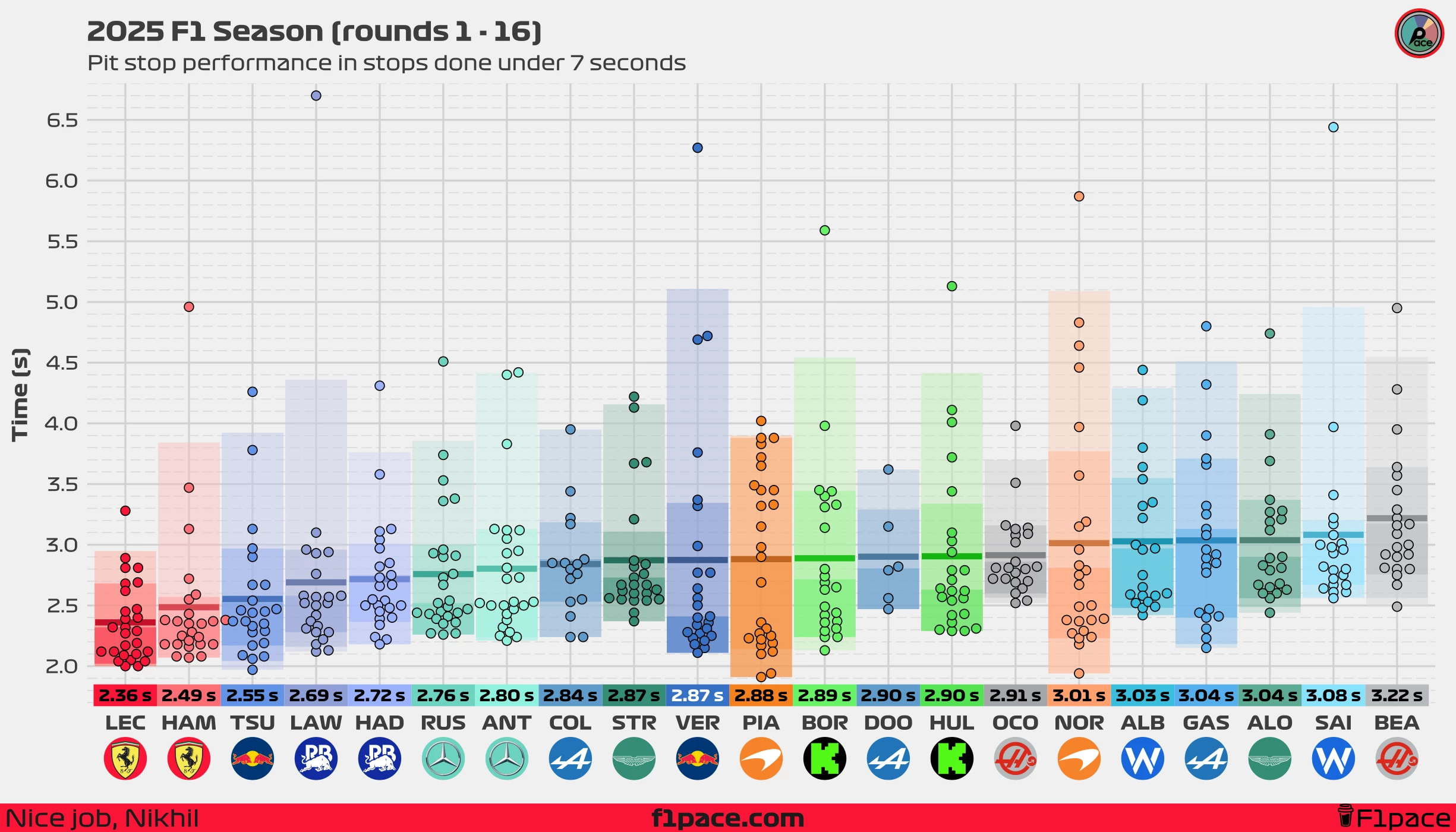
I think it’s fair to say that, normally, you would expect both drivers from the same team to have similar pit stop times. Each team has a single pit crew that works on both cars when they stop for new tires. Still, reality is messier, and it’s rare to see two teammates with exactly the same average pit stop times.
Most teammates are, in fact, very close to each other. Hamilton and Leclerc are separated by just 0.13 seconds; Russell and Antonelli by 0.04 seconds; Bortoleto and Hulkenberg by 0.01 seconds, and Lawson and Hadjar by just 0.03 seconds. You get the idea. Nonetheless, there are a couple of very interesting results.
First, the Red Bull pairing. While Tsunoda’s data is slightly contaminated by his two races with Racing Bulls, the delta to Verstappen is quite stark. Tsunoda has an average pit stop time of 2.55 seconds compared to Verstappen’s 2.87 seconds, a delta of 0.32 seconds. This is quite a big difference considering that both drivers are assisted by the same pit crew.
Second, the results at Haas: While neither Ocon nor Bearman boast strong pit stops—their fastest stop of the season so far is 2.49 seconds—it’s clear that Ocon has a faster average time, currently by a whopping 0.31 seconds, which is massive in the world of F1 pit stops.
Our new metric: xPT
How fast a pit crew should be, based on their talent and equipment?
This is where things get interesting. We’ve already looked at the raw pit stops, which show us exactly what happened during the season—including all the messiness and chaos that are part of pit stops. However, we can try to separate the true skill level of the pit crews from this chaos and understand the expected, real performance of each crew. To do this, I created my own performance metric, which I’ve titled expected Pit Time, or xPT.
xPT is the output of a statistical model that aims to identify the patterns within pit stops. The xPT metric is our model’s best estimate of how fast a pit crew should be, based on their talent and equipment. It’s calculated by analyzing hundreds of pit stops and statistically adjusting for all the “noise” and context. By removing the factors that obscure our data, xPT gives us a single, fair number to compare the real, repeatable skill of each team’s pit crew. A team with a low xPT is fundamentally fast, regardless of whether they got lucky or unlucky on a particular Sunday.
xPT (expected Pit Time): Our model’s best estimate of how fast a pit crew should be, based on their talent and equipment.
The xPT model is adaptable and gets updated as more data is gathered week after week. The more data the model has, the more accurate it becomes. Its predictions and inferences get stronger as the season progresses.
Using xPT as a metric, we can see which teams are performing better than expected, which are performing at their average, and which are truly struggling. One of the main advantages of xPT is it’s interpretability since it’s expressed in the original units of our data—seconds. With it, we can create a true power ranking of the pit crews, revealing who is consistently the best—not just who happened to get it right once. Let’s take a look at our first results.
How to read the charts
- The overall ranking: The teams are ranked from 1 (fastest) to 10 (slowest) based on their xPT, or Expected Pit Time.
- The number in the colored box next to each team’s logo: This number represents the model’s single best estimate for their “true” pit stop skill, measured in seconds. This number is the estimated “normal” pit stop time that you would expect fomr each time, based on the model’s beliefs.
- The x-axis: The horizontal axis shows the xPT in seconds. Just like a lap time, a lower number is better. Teams further to the left are faster.
- The slabs The slabs, or “domes”, provide a range of plausible values for each team’s skill. The peak of the hill is the single most likely value (the number in the box). As you move down the slopes of the hill, those values are less likely but still plausible. Narrower slabs shows that the model has high confidence in the results, while wider slabs show higher uncertainty about the actuall skill level of each pit crew.
- The black dot and horizontal bars: The dot and bars below each slab represent the represents the median value and the the “most likely” ranges for our expected value. The dot is the same as the number displayed on the left side of the plot.
- The dashed, vertical line: This line represents the midfield average (the median xPT of all teams). It provides a quick reference to see which teams are in the top half of the grid (to the left of the line) and which are in the bottom half (to the right).
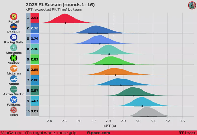
xPT by team
Looking at the “xPT by team” chart, we can see what the model “believes” to be the actual expected average pit stop time for each pit crew. Based on 2025 season data, our model indicates that Ferrari’s real, repeatable performance should result in an average time of 2.51 seconds per pit stop. This number was estimated to be 2.53 seconds at the latest pit stop analysis that I made on round 14. Red Bull have reclaimed the second spot, now sitting 0.02 second ahead of their sister team, Racing Bulls. Behind them, Mercedes, Sauber, Mclaren, and Alpine are quite competitive with one another, and are separated by an xPT of only 0.08 seconds per stop.
While our main chart shows the full range of plausible skill levels for each team, we can also use the model to answer a more direct question: what is the probability that one team is truly faster than another? By leveraging statistical analysis, we estimate that there is a 99.2% probability that Ferrari’s true underlying pit stop skill (xPT) is better than Red Bull’s, the second fastest team based on our model’s estimates. This means that, after removing noise from the data, it’s almost certain that Ferrari currently has the best pit crew in the business.
xPT by driver
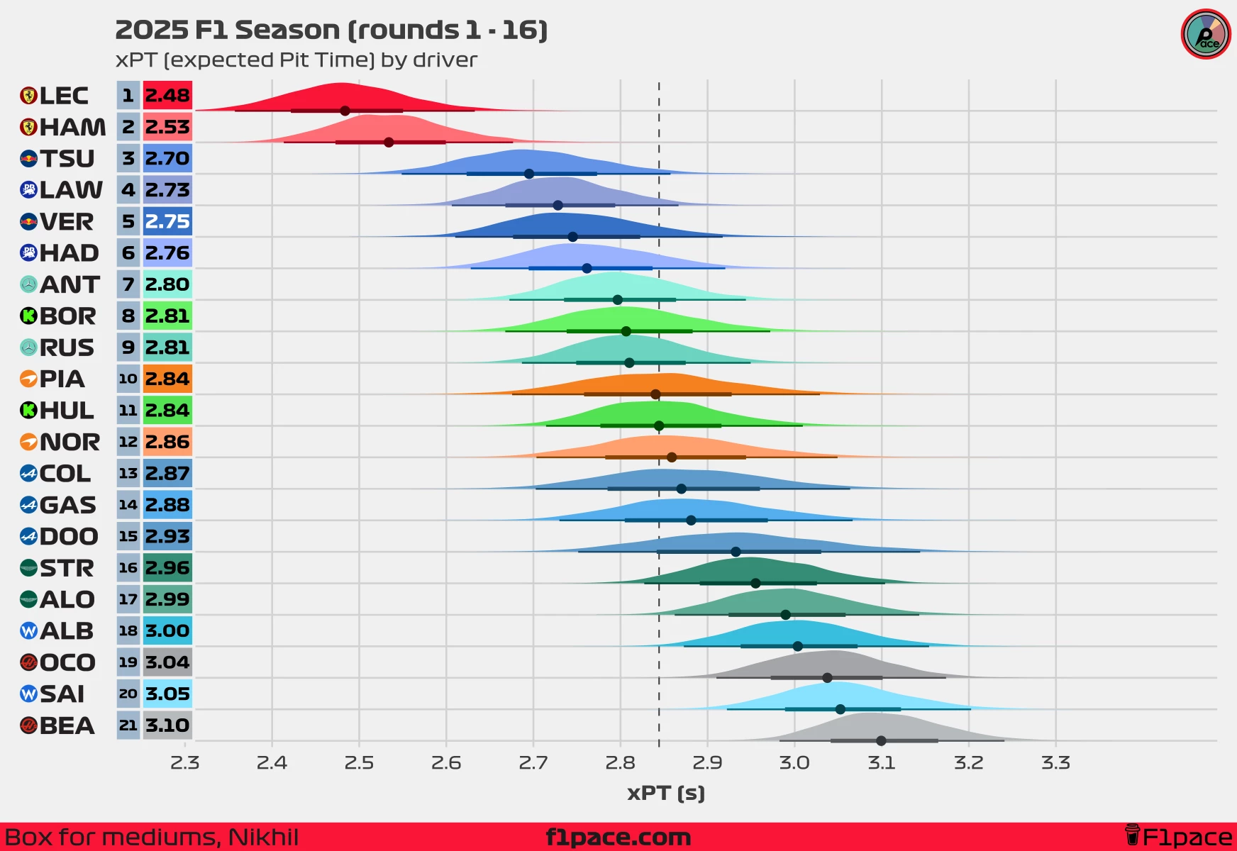
This chart shows xPT, but now stratified by driver. Why is there a difference between two drivers from the same team? I can’t really say for sure. Our model is good at detecting these differences, but from a statistical point of view, finding the “why” would require data that I don’t have access to. Still, we can observe some very interesting trends.
At Ferrari, for example, our model puts Leclerc at an xPT of 2.48 seconds, down from 2.51 seconds at round 14, compared to Hamilton’s 2.53 seconds, also down from 2.55 seconds at round 14. While this is a minor difference—too small to say for certain whether it’s real or just an artifact of our model—it’s interesting to see that there may be slight but noticeable differences between drivers, although calling a 0.05-second difference in a stop significant would be a stretch.
In general, you’ll notice that most drivers have a very similar xPT to that of their respective team, which is what we would expect. The same pit crew works on both cars, so a team’s pit crew has a much greater impact than individual drivers.
Norris vs Piastri: The McLaren drivers are separated by just 0.02 seconds in terms of xPT. This means that considering the entire season, our model expects that both drivers should have pit stops that are very close to each other.
Reality vs expectations
How fast has a pit crew been compared to the model’s expectations?
Our model is designed to smooth the data, separating a team’s underlying skill from the influence of luck and random variability. This is why you’ll notice that some teams have a faster or slower raw average than what the model predicts. By comparing these two numbers—the raw average and the model’s prediction—we can get a robust estimate of which teams are truly over- or underperforming relative to their expected potential.
Delta to xPT (expected Pit Time): A measure of a team’s performance against expectations, showing how much their simple raw average deviated from the model’s more robust prediction of their true ability.
Delta to xPT by team
How to read the charts
- The number in the colored box next to each team’s logo: This number represents the estimated delta between the raw pit stop times and the estimated pit stop times (xPT), measured in seconds. Negative numbers represent higher performance than expected from each pit crew, while positive numbers show pit crews that are underperforming.
- The x-axis: The horizontal axis shows the delta to xPT in seconds. Just like a lap time, a lower number is better. Teams further to the left are are over performing the expectations of the model by a higher margin, while teams further to the right are under performing the expectations of the model.
- The slabs The slabs, or “domes”, provide a range of plausible values for the delta to the xPT. The peak of the hill is the single most likely value (the number in the box). As you move down the slopes of the hill, those values are less likely but still plausible. Narrower slabs shows that the model has high confidence in the results, while wider slabs show higher uncertainty.
- The black dot and horizontal bars: The dot and bars below each slab represent the represents the median value and the the “most likely” ranges for our delta to the xPT. The dot is the same as the number displayed on the left side of the plot.
- The dashed, vertical line: This line represents the 0 threshold. Teams or drivers on the left side of this line are beating the expectations, while teams on the right of it are performing at a lower level than expected.
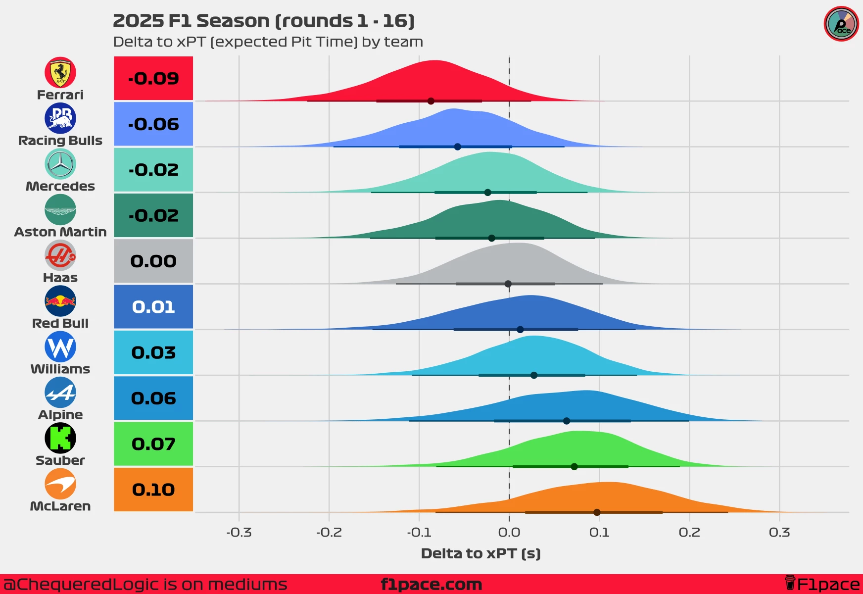
You may have noticed that McLaren has an xPT (expected Pit Time) of 2.85 seconds. This is lower than their raw average pit stop time of 2.95 seconds per stop. Why is this? Based on their raw pit times, our model believes that McLaren’s crew has the potential to perform an average pit stop in 2.85 seconds per stop. If you look at the raw data, McLaren has performed several fast stops—faster than those of many other teams. However, they also have many stops that are much slower than you would expect given their underlying quality. At the moment, our model suggests that McLaren is underperforming by 0.1 seconds per stop.
On the other extreme, we have Ferrari. While our model expects Ferrari to average 2.51 seconds per pit stop, in reality, their average is 2.42 seconds. The delta to xPT shows that Ferrari is not just meeting expectations but far exceeding them, outperforming their xPT by an average of 0.09 seconds. Not only are they the fastest crew based on our model, but they also have the “it” factor, which puts them on another level compared to the remainder of the crews.
Currently, Racing Bulls are overperforming by an average of 0.06 seconds per stop, slightly less than Ferrari, while Alpine and Sauber are underperforming by 0.06 and 0.07 seconds respectively.
Regarding the rest of the teams, you can see that their values hover the 0 second mark, which means that they are performing according to the model’s expectations. Some teams are significantly faster, as we’ve seen with Ferrari, while some are significantly slower, including Alpine, Sauber, and Mclaren, who seem to be struggling compared to what the model believes they can do.
Delta to xPT by driver
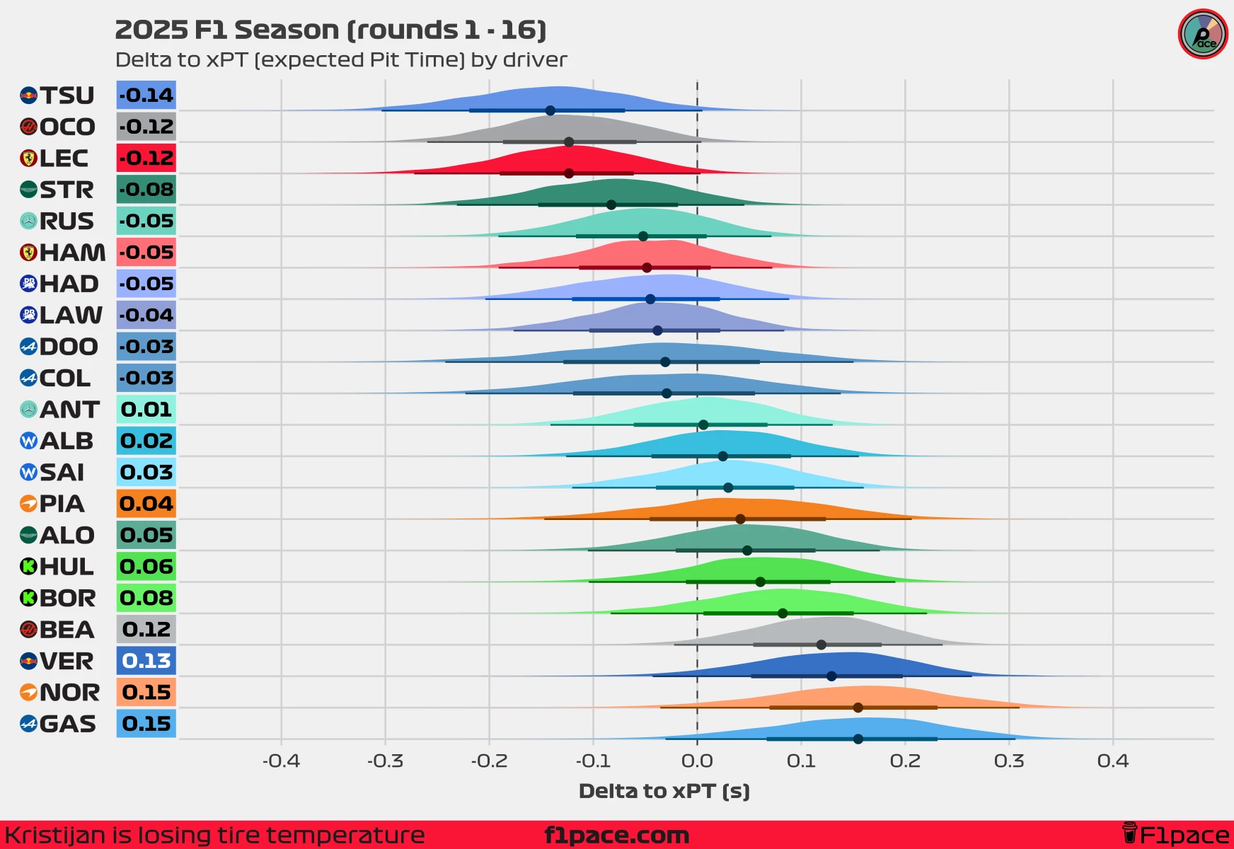
Just as with the previous section, this chart shows how much a driver is over or under performing based on the expectations (xPT) of the model. Some results are expected, such asLeclerc overperforming the expectations of the model. While the model already ranks the Ferrari as the best pit crew in F1, the delta to xPT shows that they are performing even better than expected. Is it down to luck? Motivation? Just a hot streak? Our model can’t answer that, so it’s up to you. If you have any additional information you can send me up, knowing that everything that you tell me is confidential, including your identity.
The most interesting result is found at Red Bull. While Tsunoda leads in this metric, exceeding the model’s expectations by 0.14 seconds, his teammate, Max Verstappen is underperforming by 0.13 seconds per stop compared to the model’s expectations. Looking at the raw data shows that Verstappen has had many more slow stops than Tsunoda, causing this big discrepancy between both teammates. Currently, our model estimates with 77.2% certainty that Tsunoda’s stops have been faster compared to Verstappen’s.
A world with no delays
What is the team’s baseline pit stop speed after removing the time lost to fumbles and delays?
One of the key benefits of this model is its ability to break down a pit stop into two main components. It allows us to statistically separate a team’s core performance—their baseline speed with all delays removed—from the delays themselves.
To measure this core performance, I created xPCT (expected Pit Core Time). It’s crucial to understand that “delays” aren’t just major errors. This metric also filters out the time from tiny hesitations and minor fumbles, giving us a true picture of a team’s fundamental speed.
In short, xPCT reveals a team’s raw potential. A team with a low xPCT has the underlying talent for elite pit stops, while a higher xPCT suggests a lower ceiling on their best possible times.
xPCT (expected Pit Core Time): A team’s baseline speed, calculated by removing the average time lost to fumbles, hesitations, and other common delays.
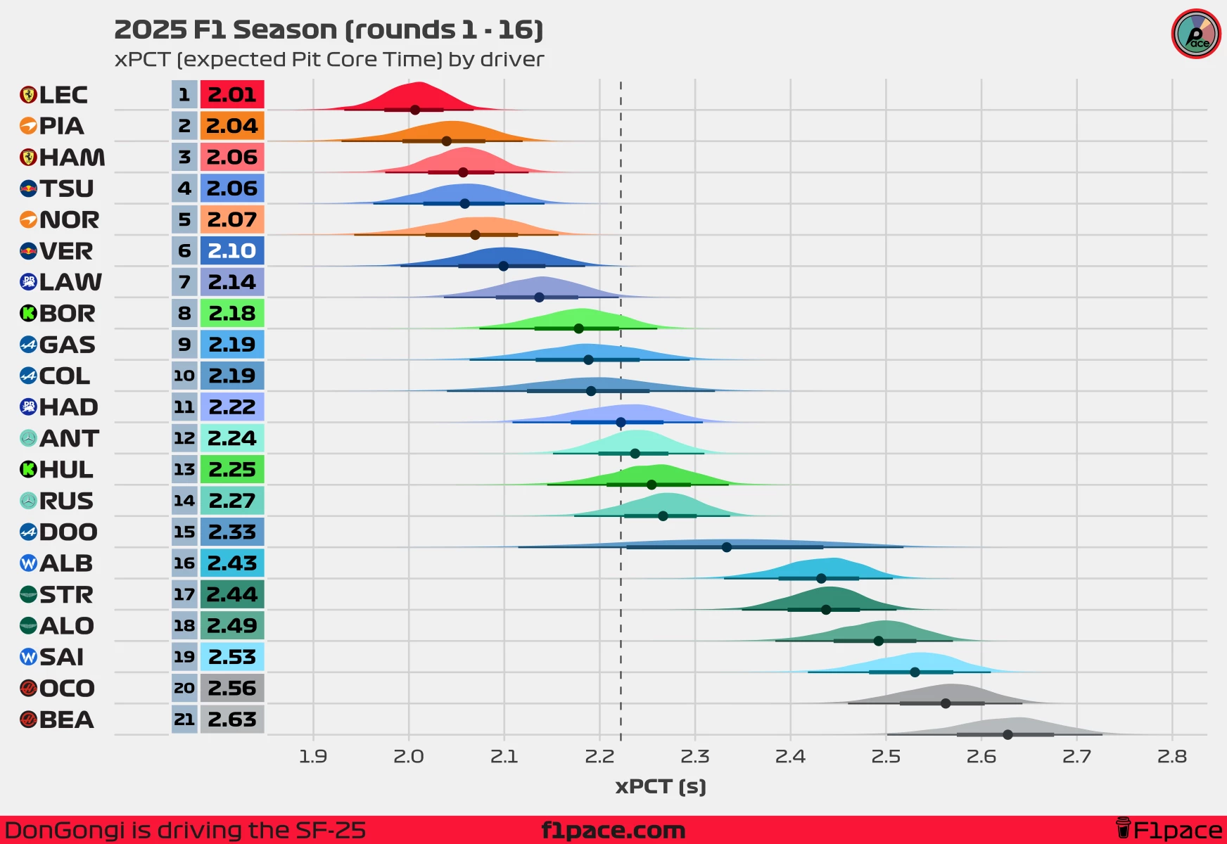
xPCT by team
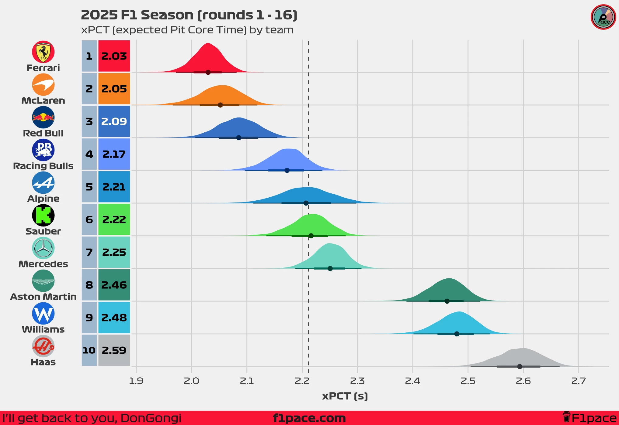
Looking at our newest xPCT metric, we have the usual winner, Ferrari. Our model believes that Ferrari have the top xPCT, meaning that if we could remove all of the delays that affect pit stops, they could perform an average pit stop of 2.03 seconds.
In second place we have McLaren. We’ve already talked about the duality of them. Based on their xPCT of 2.05 seconds, our model believes that their baseline is incredibly fast, and that they have the potential to perform pit stops with an average time of 2.05 seconds. This is just a mere 0.02 seconds slower than Ferrari, the gold standard in this 2025 season. Our model believes taht McLaren have shown that on the fast end of stops, they are elite.
Red Bull aren’t too far behind the top 2 in this category. They’ve dominated the world of pit stops for years, so it’s not unexpected to see them close to the top of this metric. With an xPCT of 2.09 seconds, they trail Ferrari by just 0.06 second per stop, and McLaren by 0.04 seconds per stop.
xPCT by driver
On a driver-by-driver stratification, we do not expect to see big differences between teammates. While drivers have an input, and the results won’t be exactly the same for them, a team and their crew have much more influence over pit stop times than drivers. Some notable exceptions are seen at Racing Bulls, with Lawson having an xPCT of 2.14 compared to Hadjar’s 2.22, at Williams, with Albon having an xPCT of 2.43 vs Sainz’s 2.53, at Haas with Ocon xPCT’s of 2.56 vs Bearman’s 2.63, and at Sauber with Bortoleto leading Hulkenberg with an xPCT of 2.18 vs 2.25 for Nico.
Just as with the teams, you see the Ferrari, McLaren, and Red Bull drivers dominating in this metric, while teams such as Aston Martin, Williams, and Haas, find themselves in the bottom of the leaderboard.
This metric measures “skill” based on the input of a driver. Perhaps some drivers are faster at reacting to the green light, which would mean that at the top end, you would expect fast stops from them compared to their teammate.
The cost of delays
What is a team’s average delay time per pit stop?
A team’s core speed (xPCT) is only half the story. A crew might have elite potential, but if their delays are consistently costly, their overall pit times will suffer.
This brings us to our second key metric: xPDT (expected Pit Delay Time). This new metric measures the average time penalty a team incurs from any delay, whether it’s a major error or a minor hesitation.
xPDT (expected Pit Delay Time): The average amount of time added to a team’s core speed, representing the typical time penalty for any delay during the pit stop process.
Ultimately, the goal for any team is to master both: a low xPCT (high core speed) and a low xPDT (minimal, low-cost delays). The combination of both is what creates consistently world-class pit stops.
xPDT by team
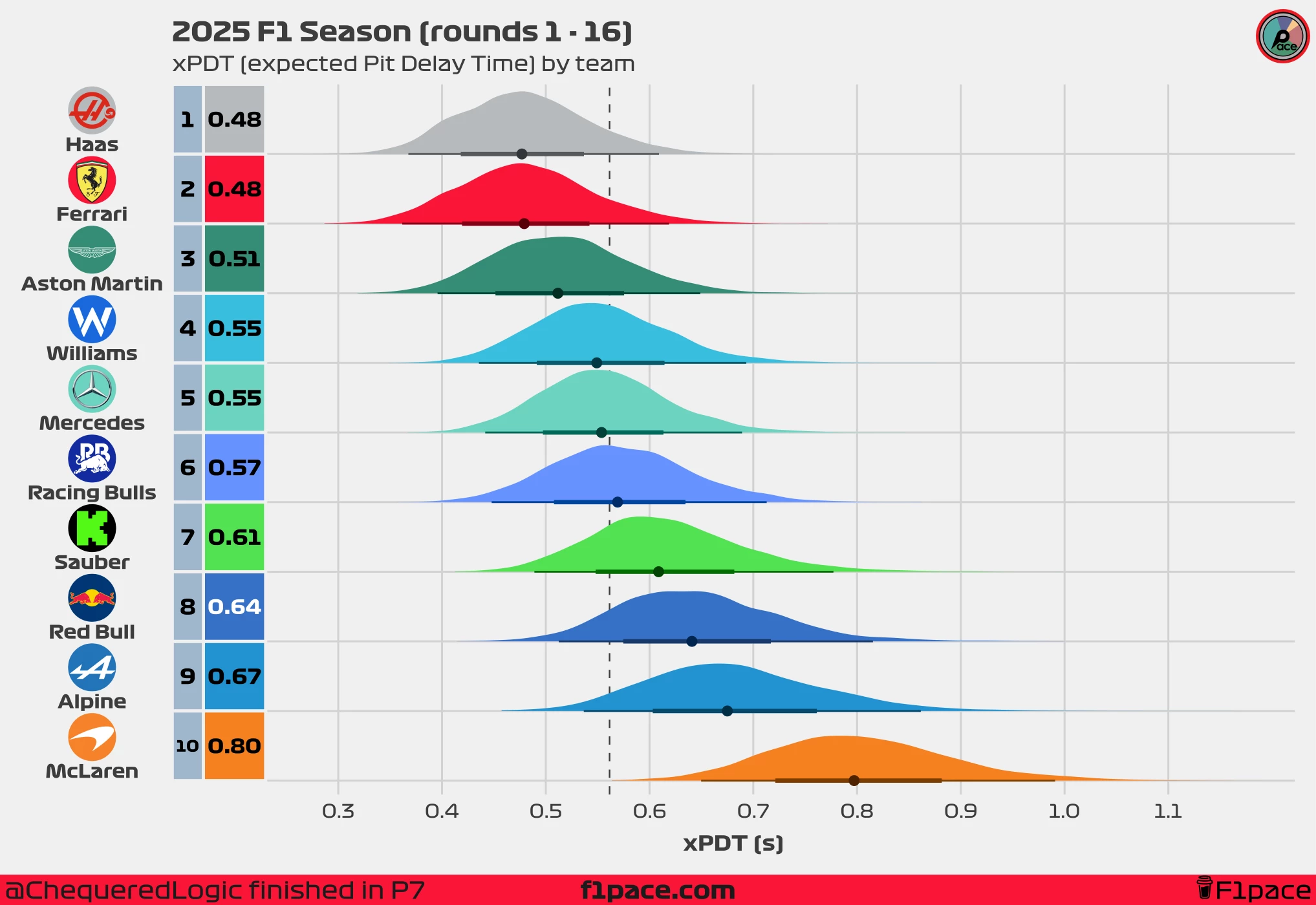
I find this metric extremely interesting. At the top we have Haas, Ferrari, which is expected since they’re fast and consistent, but we have a suprise inclusion in Haas. While Haas are dead last in both raw average pit stops, as well as in xPT and xPCT, they are at the top in our xPDT metric. What are our xPCT and xPDT metrics telling us about Haas? They show us that while Haas have been slower than all of the other pit crews, their delays are usually not very costly. They do not have top potential, and overall are struggling, but on the consistency side, they are very strong.
At the other extreme, we have McLaren. They are pretty much a mixed bag of characteristics. You have seen their two extremes in recent races. On one hand, thy are close to the top in xPCT, almost on par with Ferrari, meaning that they have top potential. On the other, they are the worst team in our xPDT metric. This essentially means that while the crew has the ability to perform consistently fast times, they are also very prone to having very costly delays, more than every other team in Formula 1. The result is a team that ranks closer to the middle of the pack in xPT. A simple way to describe them would be “Bags of talent, potential for maximum speed, but with costly mistakes”.
xPDT by driver
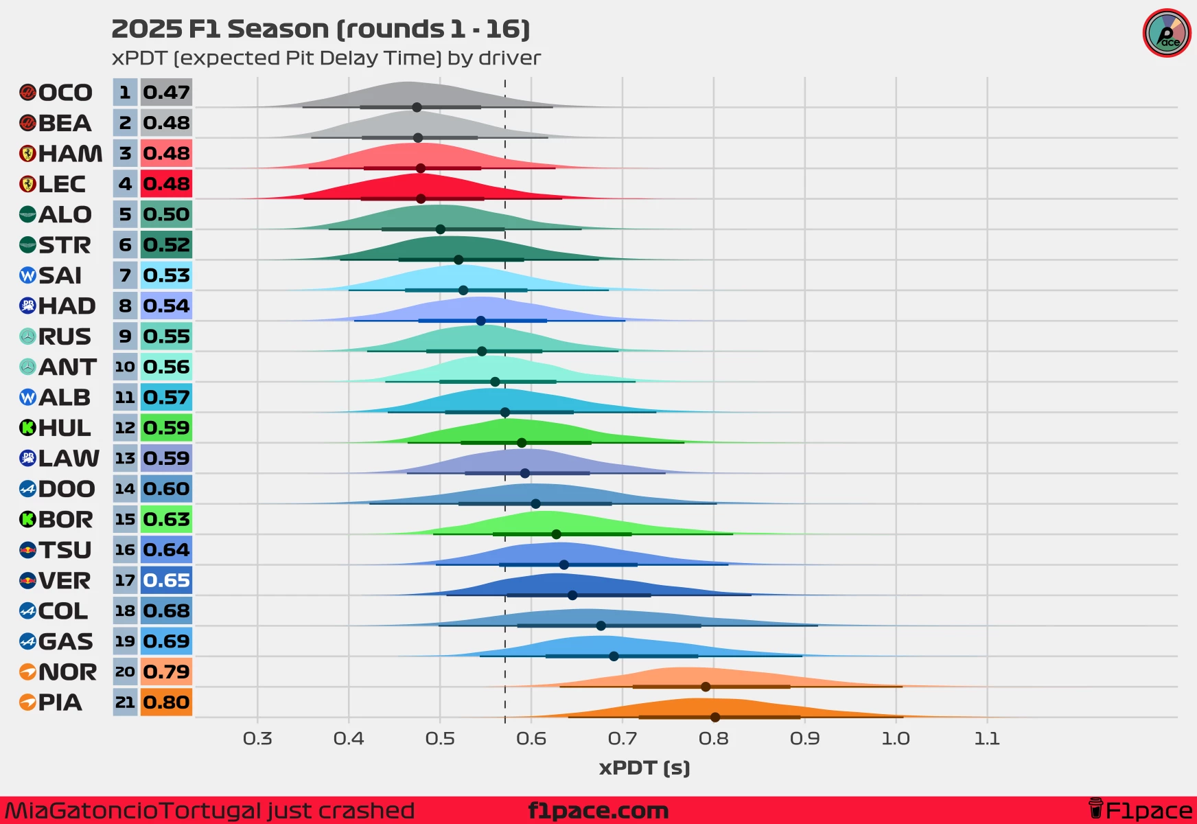
Just as with our xPCT metric, the xPDT should follow the same pattern of having both teammates close to each other. At the top you will find the drivers that have had the less costly delays, including both Haas, Fererari and Aston Martin drivers. These drivers are not expected to lose a lot of time on an average pit stop. At the bottom, you will see drivers that have been affected by costly delays, with both McLaren drivers finding themselves in the bottom two spots, meaning that generally the errors would be more costly for them.
The search for the fastest stop
How fast a pit crew should be, based on their talent and equipment?
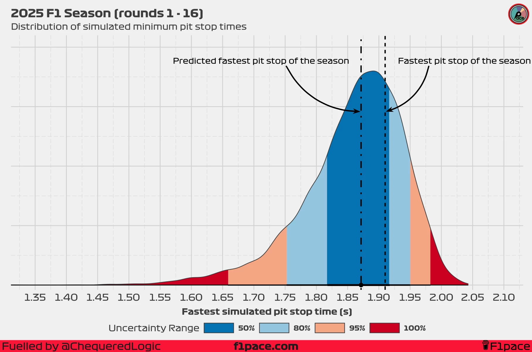
One of the most exciting aspects of pit stops is discovering the limit of performance. Formula 1 pit crews are already extremely fast, but they’re always searching for that extra tenth in every stop. Using our model, we can calculate a prediction interval to answer the question: “How fast can a pit stop be?”—based on the current season’s data.
On our previous pit stop analysis, done after the 14th race of the season, our model predicted a 50% chance of seeing a pit stop under the 1.9 second Mark. As of the 16th race of the season, the fastest stop has been of 1.91 seconds, just slightly over the “expected” fastest pit stop time of the season.
Currently, our model believes there’s a 72.3% chance of seeing a faster stop than our current fastest of 1.91 seconds.
For reference, last year saw only two stops completed at or under the 1.91 s mark, with the fastest two clocking in at 1.9 seconds, done by McLaren and Red Bull. So, what about this year? Can the teams break the 1.9-second barrier?
Our model estimates that the most likely fastest stop this season would be 1.87 seconds, down from our previous estimate of 1.9 seconds. A 1.87 seconds stop would rank as the fastest in the previous 2024 season.
You may be wondering about the best pit stop ever—the 1.8-second record set by McLaren in 2023. Can we expect to see that record broken this year? Our model didn’t have a lot of confidence, and estimated the chance as only 8.38% as of the 14th race of the season. However, we have recently seen some incredibly fast times posted by the McLaren pit crew, which means that the beliefs of the model have been updated. Now, as the 16th race of the season, our model puts the probability of witnessing a record-breaking pit stop at an increased 20.4%. This is basically a 1 in 5 chance of seeing a world-record pit stop this year. We may see something special in the upcoming weeks.
| Scenario | Probability |
|---|---|
| Pit stop < 1.91 s (fastest in 2025) | 72.3% |
| Pit stop < 1.87 s (model’s best estimate) | 50% |
| Pit stop < 1.8 s (fastest ever) | 20.4% |
Conclusions
To sum it up, this deep dive into pit stop performance using both raw data and the xPT model has offered a much clearer picture of where each team really stands in 2025. Ferrari continues to set the standard, leading in both raw pace and underlying consistency, while teams like McLaren show there’s a lot of untapped potential still on the table.
Our xPCT and xPDT metrics show that McLaren have incredible potential to perform fast stops, but they have struggled with delays, as shown by their high xPDT. On the other hand, teams like Ferrari have been consistently fast, showing they’re the best in all of our metrics.
The data also uncovers some fascinating differences between teammates and highlights just how much small details matter when chasing every last tenth. The model believed that breaking the all-time pit stop record was unlikely this year, but its predictions have been increasing due to the fast stops done by McLaren. There is an increasingly higher chance of seeing a team breaking the 1.8 second pit stop record, claiming the throne as the fastest pit crew in the world. As the season goes on, it will be exciting to see which crews can truly push the limits and rewrite what’s possible in the pit lane.
Disclaimer
For the rounds 1 - 12 pit stop analysis I was using the 95% of stops. As of the 14th race of the season, I’ve decided to include all stops done under 7 seconds. This should provide a more robust estimate for the calculated metrics, while allowing me to exclude atypical stops caused by wing adjustments or penalties. Including all stops under 7 seconds means that we’re now using the top 96% of stops in instead of the previous 95%. A minor change, but one that could have major implications on our final results.
My plea
This is the most advanced article I’ve written for this blog. Doing inference with statistical models isn’t easy—it takes a lot of time to develop a useful and reliable model capable of producing meaningful insights. Creating this model and writing this article took me around two weeks of hard work. If you’ve enjoyed reading it, please consider becoming a supporter to help me continue writing in-depth articles like this one. Your support truly makes a difference and helps keep the blog going. Thank you!