Is this site worth at least $1 to you?
I really need your support to keep going. I love this project and I want to keep it going, but if I can’t find the support to make this site sustainable I may have to shut down operations in the near future.
I’m still giving away 5 free one-month memberships. If you want your name or handle featured in my F1 charts, this is your chance. These charts go out to thousands of fans around the world every race weekend.
Use the Get in touch link to send your email and the name or handle you’d like shown. I’ll randomly pick 5 people. Thanks for the support.
Qualifying teammate battles seem to be of great interest to the current F1 community. While I’m a firm believer that Sundays matter far more than Saturdays, I can’t deny the growing importance of qualifying—especially with how tough overtaking has become with the latest generation of F1 cars. Track position is king, and starting ahead often means staying ahead. So while race day is where the points are handed out, Saturdays are playing a bigger role than ever in shaping the final results.
Analysis
Click to expand methodology
Methodology!
As with race pace, we can’t directly compare qualifying pace between races. Different tracks, lengths, and deltas make it tricky. To handle this, I standardized the data using a metric called symmetric percent difference. Without getting too technical, it’s a more robust way of calculating percent differences — hence why I chose it.
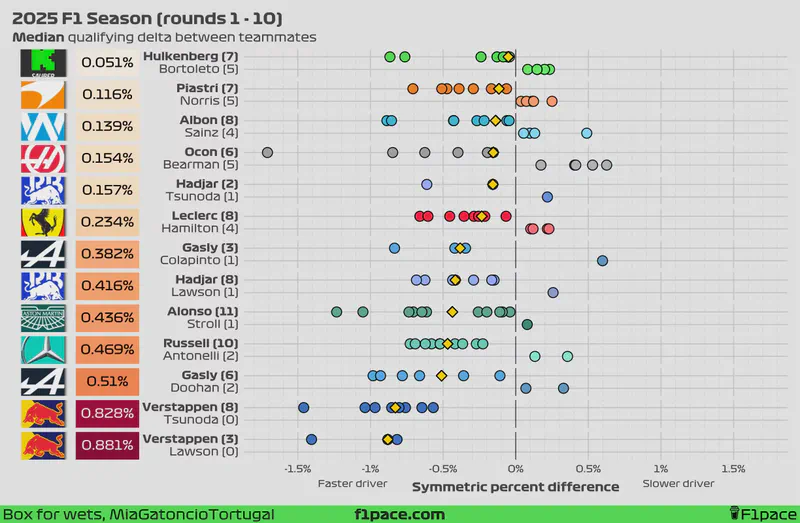
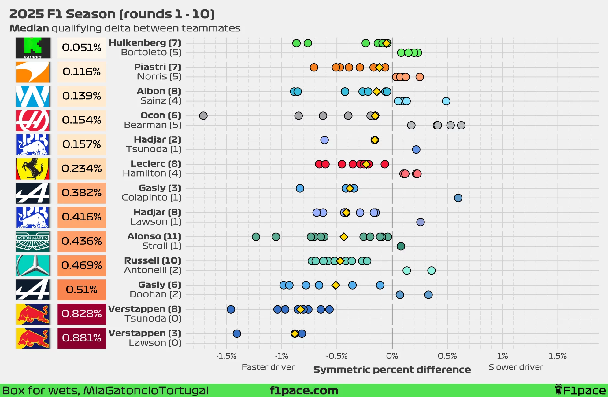
I calculated the symmetric percent difference for all qualifying sessions between teammates, keeping only the maximum session where both drivers participated. For example, if George Russell made it to Q3 but his teammate only reached Q2, I used the Q2 data for the comparison. If a driver couldn’t set a lap time in Q1 while their teammate did, I removed that session entirely. While this isn’t ideal, using equally comparable data points is crucial for a fair performance comparison. Negative symmetric percent difference values mean that a driver was faster than his teammate, while positive values mean that the driver was slower than his teammate. A difference of 0% means that both drivers were just as fast.
I calculated the values for each race for each team and plotted them as individual data points in the chart. I then calculated the median of these values for the season (so far) and displayed it the left side of the plot, next to the team logo. Smaller overall values represent that both teammates were more evenly matched during quali, while larger overall values show a greater gap between teammates.
Additionally, on the left-hand side of the chart next to the driver’s name, I also added the number of times a particular driver has been faster than his teammate in quali.
Finally, I added a gold-coloured diamond to show the median gap between teammates. This number will be equal to the overall value displayed on the left side of the plot, next to the team logo.
Issues!
One of the main issues when gathering data from multiple races is that the deltas will change depending on the length of each track. A delta of 0.1 seconds in a short track (say, 1:05 per lap) will be greater than a delta of 0.1 seconds in a long track such as Spa (~ 1:45).
One way we can standardize the data is by converting the deltas to percentages, but there is one big issue with this. The traditional way of calculating a percent difference is with the following formula:
$$ Percent\ difference = 100\times\frac{value1-value2}{value2} $$
The main problem is that this value is not symmetrical. This means that if I reverse the order of value 1 and value 2, the final percent difference will be different.
$$ Percent\ difference = 100\times\frac{80-90}{90}=-11.11\% $$ $$ Percent\ difference = 100\times\frac{90-80}{80}=12.5\% $$
You can see that the percentages are not reversible, even though in both cases we’ve changed the original value by 10 units.
One way we can solve this problem is by using the symmetric percent difference, which is calculated by using the following formula:
$$ Symmetric\ percent\ difference = 100\times\frac{value1-value2}{(value1+value2)/2} $$ This formula is reversible, meaning that regardless of the order of the values, we will get the same result. Because of this, I decided to use the symmetric percent difference formula as the basis for the analysis.
Quali delta between teammates
We’re already one quarter into the season. With 7 races, and 2 sprints, we now have more representative results. Just as a reminder, this season, we have the anomaly of Lawson switching places with Tsunoda after just three races, which makes our usual analysis a little trickier. Additionally, Alpine have decided to replace Doohan with Colapinto after just 6 races. Normally, I’d just use the median as the key metric of interest since it’s more robust to outliers. However, in this case, the median might skew the average delta between Lawson and Verstappen.
To counter that, I’ve decided to include both the median and the mean qualifying deltas in this article. This approach might change in future posts, but for now, I think it gives us a more complete picture.
The results can change dramatically by switching between the mean and median as the key metric of interest. These numbers will eventually stabilize and converge as the season goes on.
Symmetric percent difference
Looking at the median symmetric percent difference, the biggest gap between teammates remains at Red Bull Racing. Tsunoda finished in 11th place in the Canadian GP qualifying session, trailing Max Verstappen by close to half a second (0.464 seconds). Verstappen is beating Yuki Tsunoda by 0.828%, which is still slightly smaller than the median delta left by Lawson at 0.881%.
If we consider the mean symmetric percent difference instead, the largest gap shifts to Verstappen vs. Lawson, with Max ahead by an average of 1.034%. Yuki continues to reduce this number in recent weeks, but not at a significant rate. The delta to Max currently stands at 0.887%.
At the other end of the spectrum, the smallest delta has now fully shifted from McLaren to Sauber. Hulkenberg leads Bortoleto by just 0.051% based on the median, or 0.115% based on the mean.
Meanwhile, Franco Colapinto managed to beat his teammate, Pierre Gasly. Due to the small sample size, he has managed to reduced the delta from 0.419% to 0.382% based on the median, and from 0.533% to 0.25% based on the mean.
I don’t know if anyone is even reading this, so if you are, please send me a message. If nobody is reading this then why am I wasting my time writing it?
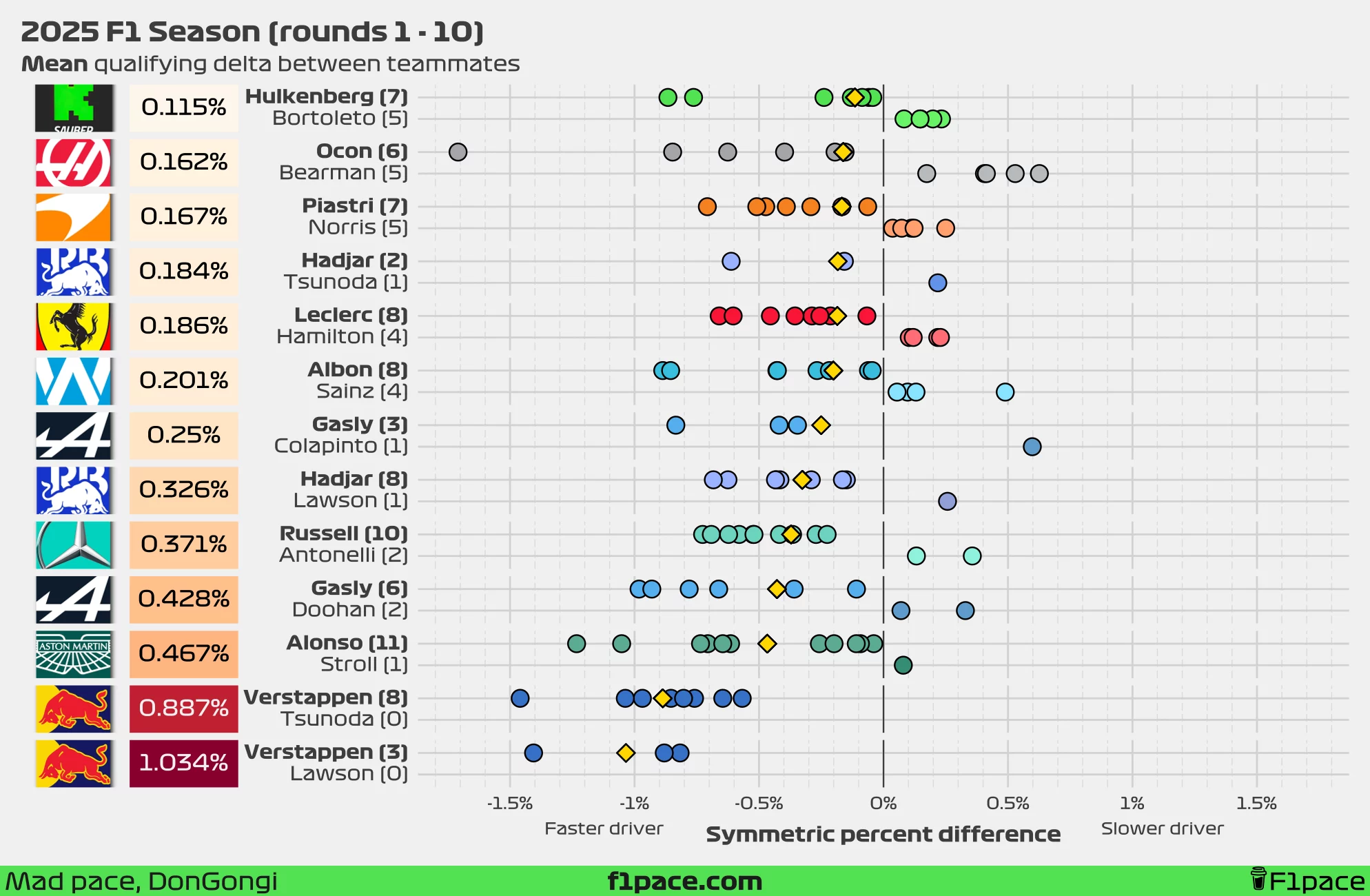
Delta in seconds
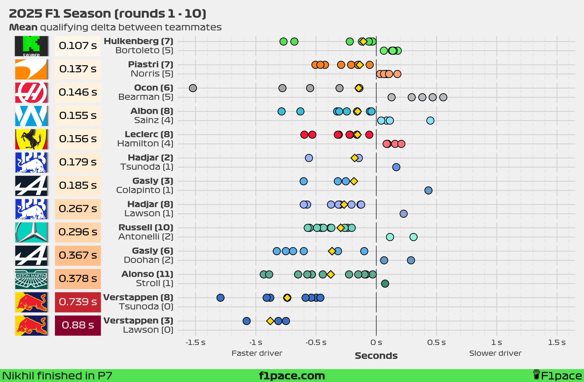
As a new addition, I’ve included an analysis using seconds instead of the symmetric percent difference. I’m still firmly in the “symmetric percent difference is more representative” camp, but the difference between the two metrics is smaller than most people think—and time in seconds is a lot easier to interpret for most people.
The results are very similar to the percent-based version, with just a few minor changes. Looking at the median delta, the smallest gap is found at Sauber—just 0.041 seconds in Hulkenberg’s favour—while the smallest mean gap has now shifted to Sauber as well, with Hulkenberg ahead of Bortoleto by an average of 0.107 seconds.
The biggest gap remains at Red Bull. Currently, Max Verstappen is ahead of Yuki Tsunoda by a median of 0.663 seconds—down from 0.739 seconds—and a mean of 0.739 seconds (down from the previous gap of 0.778 s). This gap has reduced in recent weeks, but at this rate, it is becoming increasingly unlikely that he’ll meet the three-tenths target set by Helmut Marko.
Qualifying stage appearances
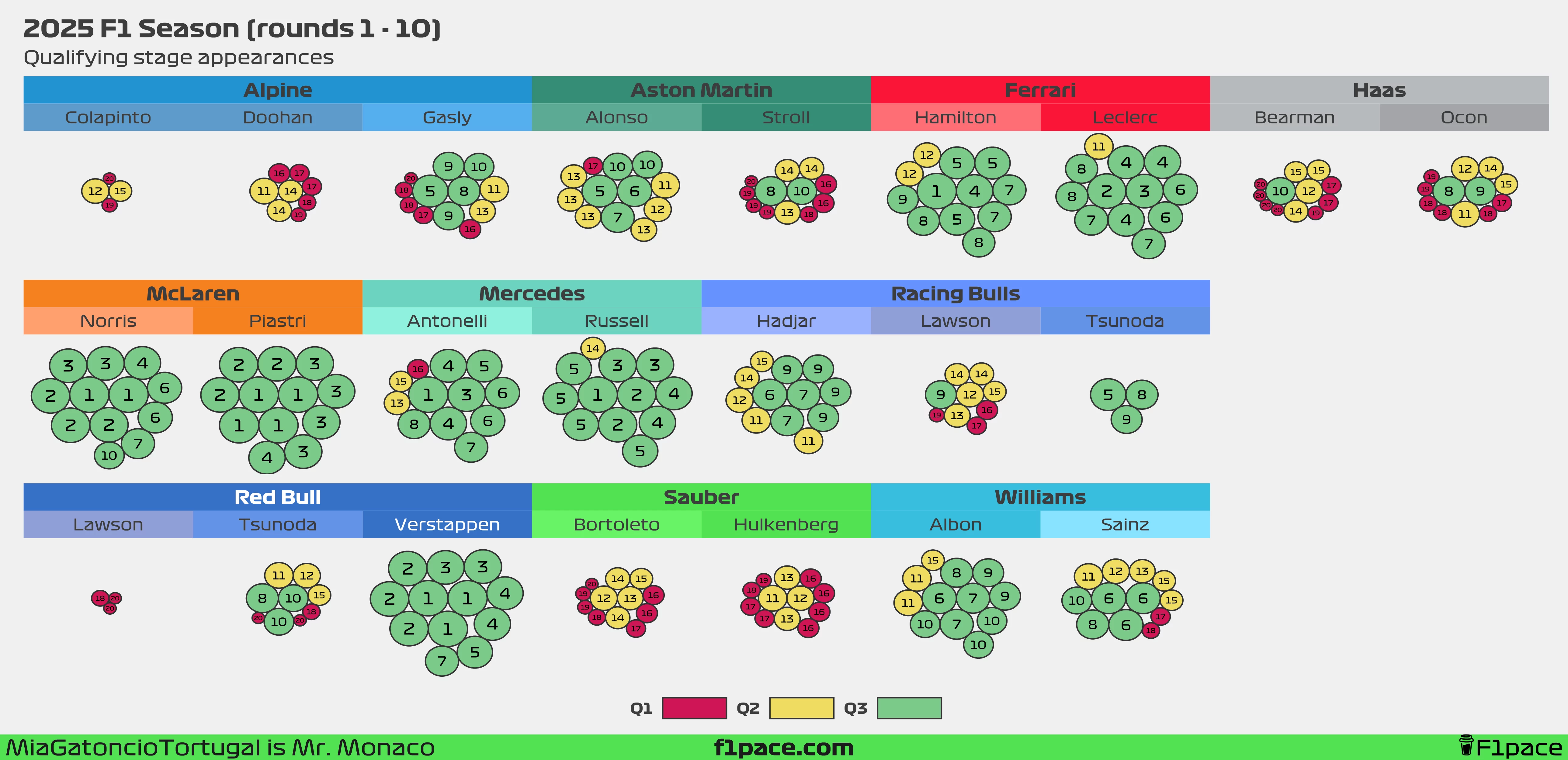
This chart was exported in very high resolution. If the text appears a bit too small, feel free to zoom in to see each individual bubble more clearly.
Click to expand explanation
I’ve often seen tables showing how many times drivers reached Q1, Q2, and Q3, but I’ve never been fully satisfied with them. Tables tend to have too much text while still missing key insights. To address this, I created a bubble chart.
Each bubble represents a driver’s qualifying or sprint qualifying appearance throughout the 2025 F1 season. The bubble’s size reflects the driver’s final qualifying position, with larger bubbles indicating better results. The actual position is displayed as a big number inside the bubble, and the colors indicate the qualifying session reached.
As of the 10th race of the 2025 season, most of the pairings have been fairly evenly matched, with just a few exceptions. The first is at Aston Martin, where Alonso has reached Q3 five times, while his teammate, Lance Stroll, has only managed it twice. The second is, you guessed it, Red Bull Racing. So far, Max Verstappen has reached Q3 in all 12 possible sessions, while Lawson has been eliminated in Q1 three times. Meanwhile, Tsunoda’s rate of Q3 appearances continues to drop — he’s only made it to the final session in three of his nine outings with the team, putting his rate at 33.3%.