Use the Get in touch link if you’re interested in supporting this project.
Qualifying teammate battles seem to be of great interest to the current F1 community. While I’m a firm believer that Sundays matter far more than Saturdays, I can’t deny the growing importance of qualifying—especially with how tough overtaking has become with the latest generation of F1 cars. Track position is king, and starting ahead often means staying ahead. So while race day is where the points are handed out, Saturdays are playing a bigger role than ever in shaping the final results.
No, ChatGPT didn’t write this article. Yes, there are some of us out there who use the em dash.
Analysis
Click to expand methodology
Methodology!
As with race pace, we can’t directly compare qualifying pace between races. Different tracks, lengths, and deltas make it tricky. To handle this, I standardized the data using a metric called symmetric percent difference. Without getting too technical, it’s a more robust way of calculating percent differences — hence why I chose it.
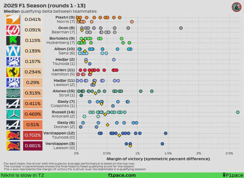
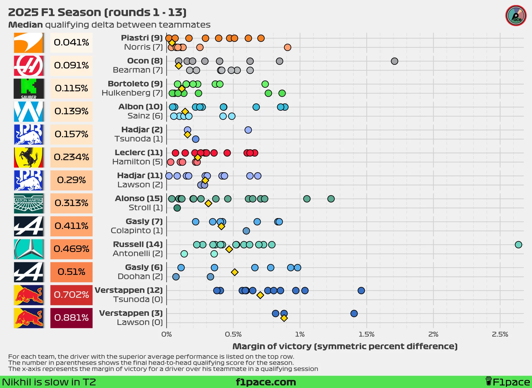
I calculated the symmetric percent difference for all qualifying sessions between teammates, keeping only the maximum session where both drivers participated. For example, if George Russell made it to Q3 but his teammate only reached Q2, I used the Q2 data for the comparison. If a driver couldn’t set a lap time in Q1 while their teammate did, I removed that session entirely. While this isn’t ideal, using equally comparable data points is crucial for a fair performance comparison. Negative symmetric percent difference values mean that a driver was faster than his teammate, while positive values mean that the driver was slower than his teammate. A difference of 0% means that both drivers were just as fast.
I calculated the values for each race for each team and plotted them as individual data points in the chart. I then calculated the median of these values for the season (so far) and displayed it the left side of the plot, next to the team logo. Smaller overall values represent that both teammates were more evenly matched during quali, while larger overall values show a greater gap between teammates.
Additionally, on the left-hand side of the chart next to the driver’s name, I also added the number of times a particular driver has been faster than his teammate in quali.
Finally, I added a gold-coloured diamond to show the median gap between teammates. This number will be equal to the overall value displayed on the left side of the plot, next to the team logo.
Issues!
One of the main issues when gathering data from multiple races is that the deltas will change depending on the length of each track. A delta of 0.1 seconds in a short track (say, 1:05 per lap) will be greater than a delta of 0.1 seconds in a long track such as Spa (~ 1:45).
One way we can standardize the data is by converting the deltas to percentages, but there is one big issue with this. The traditional way of calculating a percent difference is with the following formula:
$$ Percent\ difference = 100\times\frac{value1-value2}{value2} $$
The main problem is that this value is not symmetrical. This means that if I reverse the order of value 1 and value 2, the final percent difference will be different.
$$ Percent\ difference = 100\times\frac{80-90}{90}=-11.11\% $$ $$ Percent\ difference = 100\times\frac{90-80}{80}=12.5\% $$
You can see that the percentages are not reversible, even though in both cases we’ve changed the original value by 10 units.
One way we can solve this problem is by using the symmetric percent difference, which is calculated by using the following formula:
$$ Symmetric\ percent\ difference = 100\times\frac{value1-value2}{(value1+value2)/2} $$ This formula is reversible, meaning that regardless of the order of the values, we will get the same result. Because of this, I decided to use the symmetric percent difference formula as the basis for the analysis.
Quali delta between teammates
We’re already more than halfway through the season. With 13 races—and now 3 sprints after the Belgian GP—we have more representative results. Just as a reminder, this season features the anomaly of Lawson switching places with Tsunoda after just three races, which makes our usual analysis a bit trickier. Additionally, Alpine decided to replace Doohan with Colapinto after just six races. Normally, I’d use the median as the key metric of interest since it’s more robust to outliers. However, in this case, the median might skew the average delta between Lawson and Verstappen.
To counter that, I’ve decided to include both the median and the mean qualifying deltas in this article. This approach might change in future posts, but for now, I think it gives us a more complete picture.
It is important to note that after 16 sessions, the results have now stabilized, which means that at this point in time the mean is the most representative metric for most pairings.
I’ve changed the overall structure of the charts. The x-axis now shows the absolute margin of victory of a driver over his teammate. The main reason for this change was to optimize space. After the Belgian GP, the massive delta of Russell over Antonelli stretched the x-axis too far, making it difficult to see every data point.
Symmetric percent difference
Looking at the median symmetric percent difference, the biggest gap between teammates remains at Red Bull Racing. Tsunoda had a slightly better session at the Belgian GP, managing to qualify for Q3—his first appearance in the top qualifying session since the Miami GP. In the latest Belgian GP, he trailed Verstappen by 0.589% in the sprint qualifying session (SQ) and by 0.376% in the main qualifying session (Q). His performance in qualifying is his best yet at Red Bull, just edging out his previous result at the Austrian GP (0.403%). Currently, Verstappen is beating Yuki Tsunoda by 0.702%, which is less than the median delta Lawson left at 0.881%, but still stands as the highest gap on the grid by a wide margin.
If we look at the mean symmetric percent difference instead, the largest active gap is still at Red Bull, with Max ahead of Tsunoda by an average of 0.755%. Yuki has managed to reduce the average gap from 0.809% to 0.755% after the latest Grand Prix, but this remains the largest delta on the grid by a significant margin.
At the other end of the spectrum, the smallest delta depends on our metric of interest. Looking at the median symmetric percent difference, the closest battle is at McLaren, with Oscar Piastri leading Lando Norris by just 0.041%. If we focus instead on the mean symmetric percent difference, the smallest gap is at Sauber, where Bortoleto still leads Hulkenberg in qualifying—now by a tiny 0.017%.
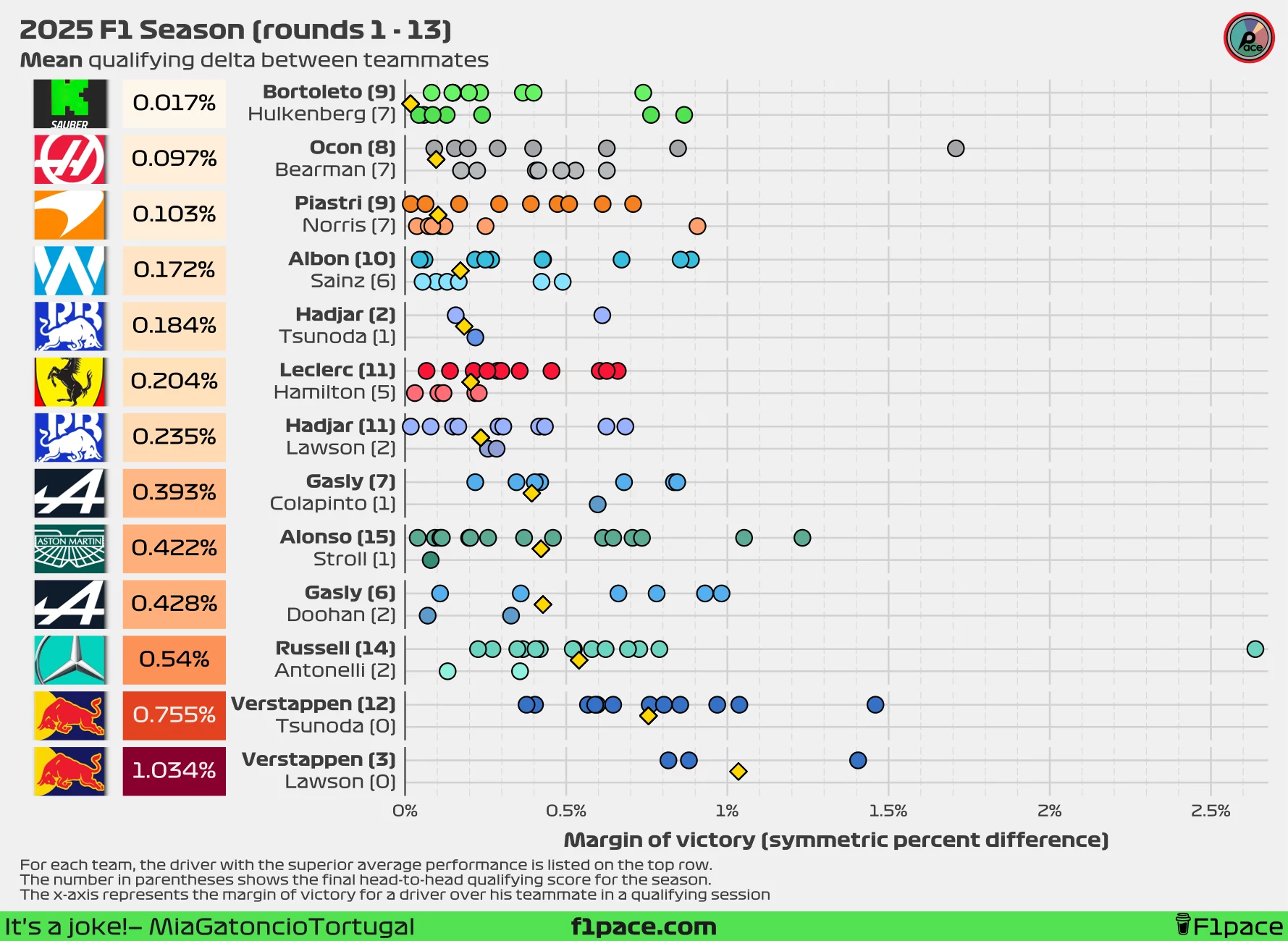
Delta in seconds
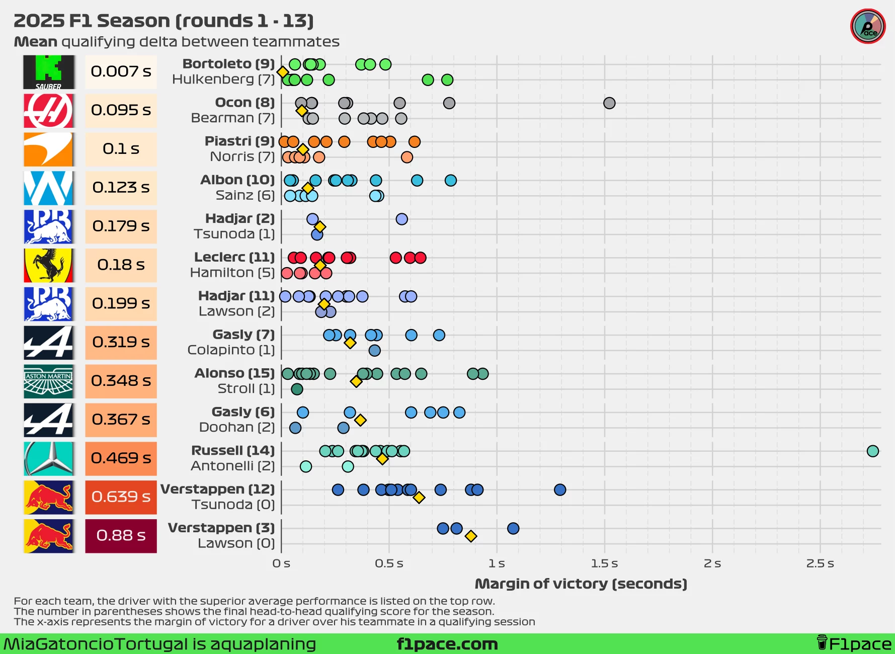
I will continue to include the analysis using seconds instead of the symmetric percent difference. I’m still firmly in the “symmetric percent difference is more representative” camp, but the difference between the two metrics is smaller than most people think—and time in seconds is a lot easier to interpret for most people.
Just as with the symmetric percent difference, the smallest gap depends on our metric of interest. Looking at the median delta, the gap is just 0.035 seconds in favor of Piastri over Norris. The mean qualifying delta tells a different story, with the smallest mean at Sauber: Gabriel leads Nico by just 0.007 seconds, or a minuscule 7 milliseconds over the entire season. Quite incredible.
I think the biggest gap will remain at Red Bull for the rest of the season. I just don’t see how Tsunoda can close the gap enough to approach any other pairing. As I mentioned, the delta between Max and Yuki has decreased, but that’s mostly due to the extreme gaps earlier in the season—Bahrain (0.879s), Saudi Arabia (0.91s), and Miami (0.739s). Yuki had a stronger showing at the Belgian GP qualifying session, but he was still 0.38 seconds slower than his teammate. These performances are not enough to make the battle much closer. At the moment, Max Verstappen is ahead of Yuki Tsunoda by a median of 0.563 seconds and a mean of 0.639 seconds.
Qualifying stage appearances
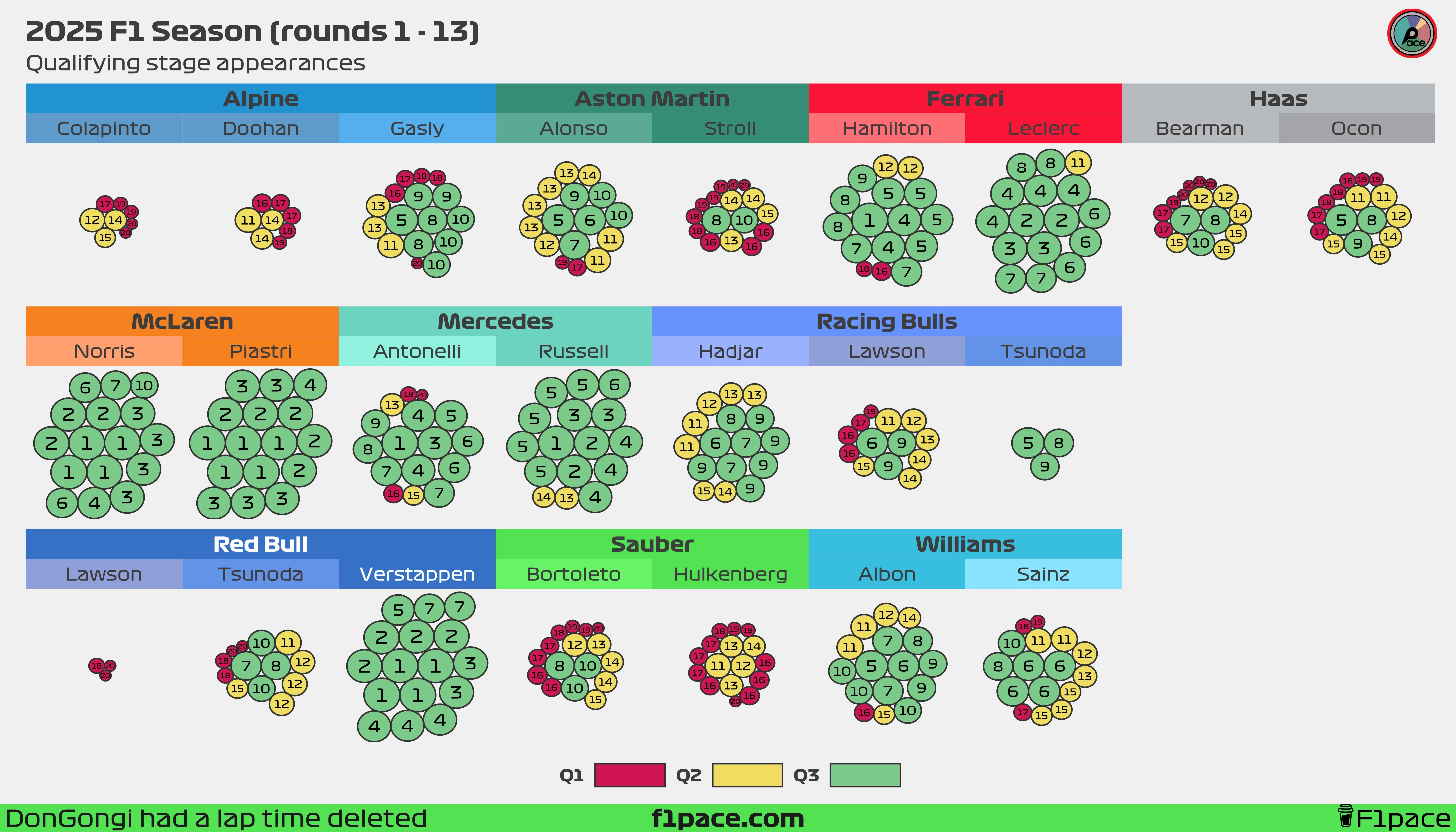
If the text appears a bit too small, feel free to zoom in to see each individual bubble more clearly.
Click to expand explanation
I’ve often seen tables showing how many times drivers reached Q1, Q2, and Q3, but I’ve never been fully satisfied with them. Tables tend to have too much text while still missing key insights. To address this, I created a bubble chart.
Each bubble represents a driver’s qualifying or sprint qualifying appearance throughout the 2025 F1 season. The bubble’s size reflects the driver’s final qualifying position, with larger bubbles indicating better results. The actual position is displayed as a big number inside the bubble, and the colors indicate the qualifying session reached.
As of the 13th race of the 2025 season, most teammate pairings have been fairly evenly matched, with just a few notable exceptions. The first is Aston Martin, where Alonso has reached Q3 six times, while his teammate, Lance Stroll, has managed it only twice. The second is Alpine, where Gasly continues to do a stellar job in a struggling car. After the Belgian GP, Pierre has now qualified for Q3 on eight occasions, while Doohan and Colapinto combined have yet to make a single Q3 appearance. The third exception is, unsurprisingly, Red Bull Racing. So far, Max Verstappen has reached Q3 in all 16 possible sessions and is one of just three drivers with a 100% Q3 appearance rate, along with Lando Norris and Oscar Piastri. Meanwhile, Lawson was eliminated in Q1 three times while racing for Red Bull. In Tsunoda’s case, his Q3 record has improved slightly: the Japanese driver now has four Q3 appearances out of 13 outings for the team, putting his rate at 30.7%.