Use the Get in touch link if you’re interested in supporting this project.
Qualifying teammate battles seem to be of great interest to the current F1 community. While I’m a firm believer that Sundays matter far more than Saturdays, I can’t deny the growing importance of qualifying—especially with how tough overtaking has become with the latest generation of F1 cars. Track position is king, and starting ahead often means staying ahead. So while race day is where the points are handed out, Saturdays are playing a bigger role than ever in shaping the final results.
I’ve added a new section called xQD (Expected Quali Delta). In this section, I present the results of my latest statistical model that aims to improve our understanding of the quali delta between teammates. Check it out.
Analysis
Click to expand methodology
Methodology!
As with race pace, we can’t directly compare qualifying pace between races. Different tracks, lengths, and deltas make it tricky. To handle this, I standardized the data using a metric called symmetric percent difference. Without getting too technical, it’s a more robust way of calculating percent differences — hence why I chose it.
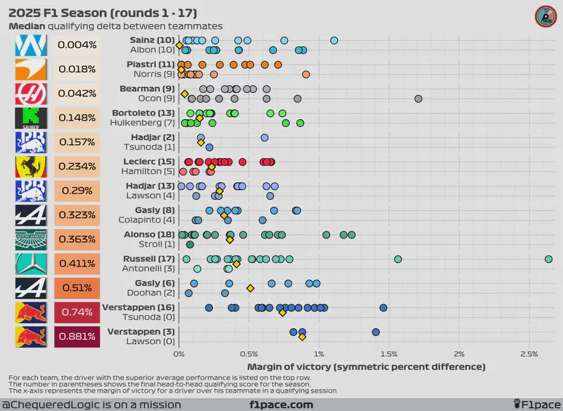
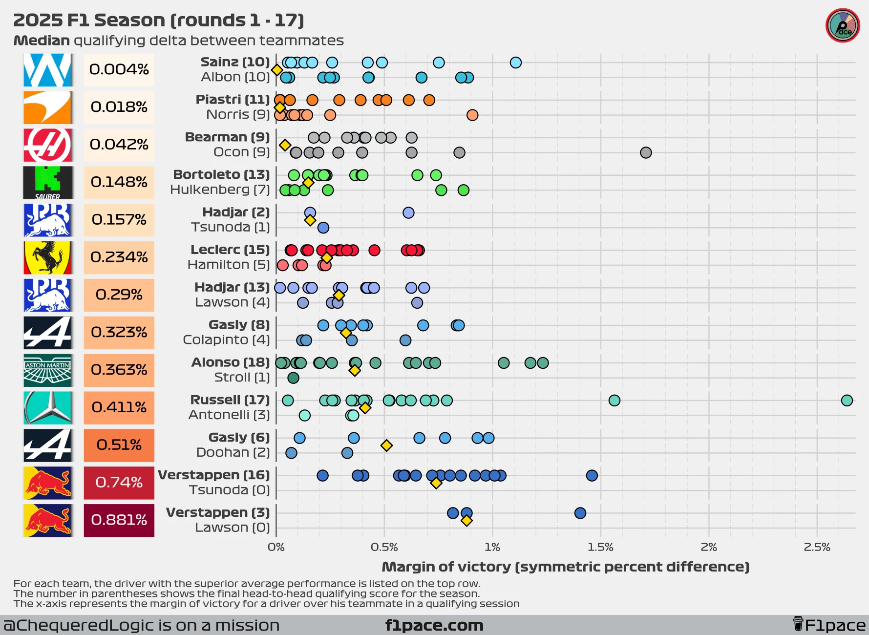
I calculated the symmetric percent difference for all qualifying sessions between teammates, keeping only the maximum session where both drivers participated. For example, if George Russell made it to Q3 but his teammate only reached Q2, I used the Q2 data for the comparison. If a driver couldn’t set a lap time in Q1 while their teammate did, I removed that session entirely. While this isn’t ideal, using equally comparable data points is crucial for a fair performance comparison. Negative symmetric percent difference values mean that a driver was faster than his teammate, while positive values mean that the driver was slower than his teammate. A difference of 0% means that both drivers were just as fast.
I calculated the values for each race for each team and plotted them as individual data points in the chart. I then calculated the median of these values for the season (so far) and displayed it the left side of the plot, next to the team logo. Smaller overall values represent that both teammates were more evenly matched during quali, while larger overall values show a greater gap between teammates.
Additionally, on the left-hand side of the chart next to the driver’s name, I also added the number of times a particular driver has been faster than his teammate in quali.
Finally, I added a gold-coloured diamond to show the median gap between teammates. This number will be equal to the overall value displayed on the left side of the plot, next to the team logo.
Issues!
One of the main issues when gathering data from multiple races is that the deltas will change depending on the length of each track. A delta of 0.1 seconds in a short track (say, 1:05 per lap) will be greater than a delta of 0.1 seconds in a long track such as Spa (~ 1:45).
One way we can standardize the data is by converting the deltas to percentages, but there is one big issue with this. The traditional way of calculating a percent difference is with the following formula:
$$ Percent\ difference = 100\times\frac{value1-value2}{value2} $$
The main problem is that this value is not symmetrical. This means that if I reverse the order of value 1 and value 2, the final percent difference will be different.
$$ Percent\ difference = 100\times\frac{80-90}{90}=-11.11\% $$ $$ Percent\ difference = 100\times\frac{90-80}{80}=12.5\% $$
You can see that the percentages are not reversible, even though in both cases we’ve changed the original value by 10 units.
One way we can solve this problem is by using the symmetric percent difference, which is calculated by using the following formula:
$$ Symmetric\ percent\ difference = 100\times\frac{value1-value2}{(value1+value2)/2} $$ This formula is reversible, meaning that regardless of the order of the values, we will get the same result. Because of this, I decided to use the symmetric percent difference formula as the basis for the analysis.
Quali delta between teammates
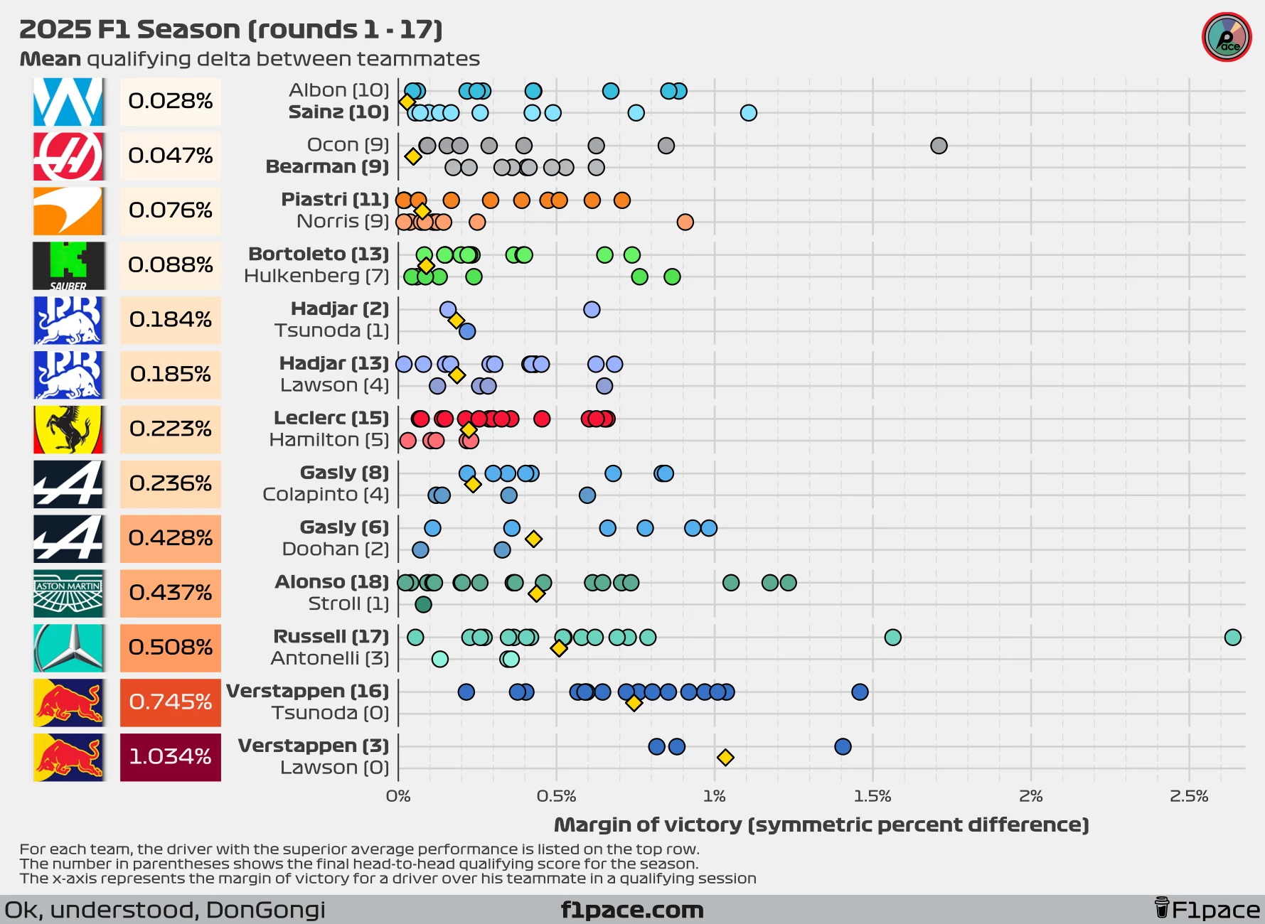
We’re already more than halfway through the season. With 17 races—and now 3 sprints after the Dutch GP—we have more representative results. Just as a reminder, this season features the anomaly of Lawson switching places with Tsunoda after just three races, which makes our usual analysis a bit trickier. Additionally, Alpine decided to replace Doohan with Colapinto after just six races. Normally, I’d use the median as the key metric of interest since it’s more robust to outliers. However, in this case, the median might skew the average delta between Lawson and Verstappen.
To counter that, I’ve decided to include both the median and the mean qualifying deltas in this article. This approach might change in future posts, but for now, I think it gives us a more complete picture.
It is important to note that after 17 races, the results have now stabilized, which means that at this point in time the mean is the most representative metric for most pairings.
I’ve changed the overall structure of the charts. The x-axis now shows the absolute margin of victory of a driver over his teammate. The main reason for this change was to optimize space. After the Belgian GP, the massive delta of Russell over Antonelli stretched the x-axis too far, making it difficult to see every data point.
Symmetric percent difference
Looking at the median symmetric percent difference, the biggest gap between teammates remains at Red Bull Racing. Tsunoda qualified in 6th place at the Azerbaijan GP, making it to Q3, but fell behind Verstappen by a symmetric percent of 1%. Currently, Verstappen is beating Yuki Tsunoda by 0.74%, which is less than the median delta Lawson left at 0.881%, but still stands as the highest gap on the grid by a wide margin.
If we look at the mean symmetric percent difference instead, the largest active gap is still at Red Bull, with Max ahead of Tsunoda by an average of 0.745%, the largest delta on the grid by a significant margin.
At the other end of the spectrum, the smallest delta is seen at Williams. Looking at the median symmetric percent difference, Carlos Sainz is winning the battle against Alex Albon by just 0.004%. If we focus instead on the mean symmetric percent difference, Albon is winning the battle by just 0.028%. As of today, the battle at Williams and Haas is even in terms of round victories for each driver.
Delta in seconds
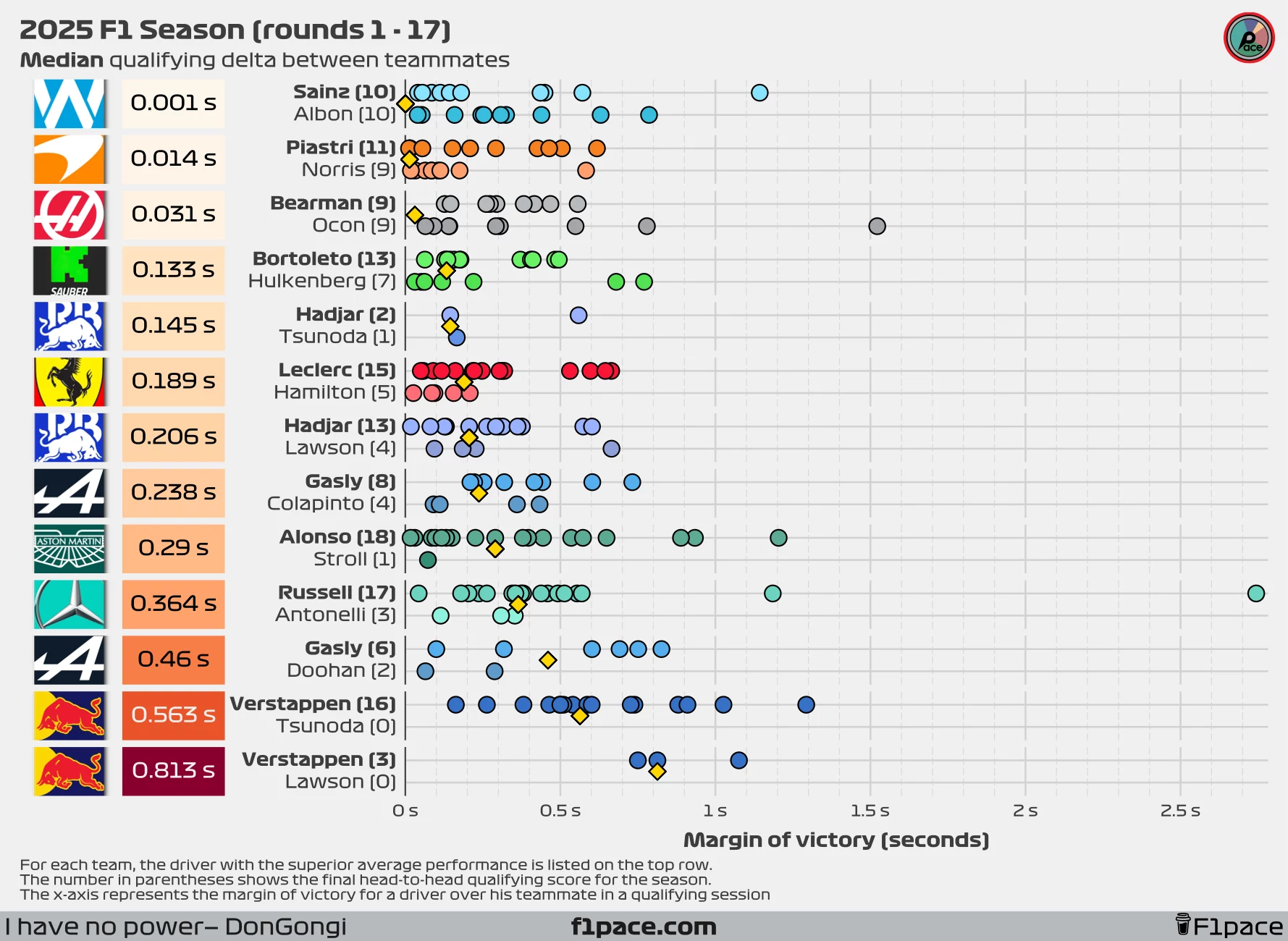
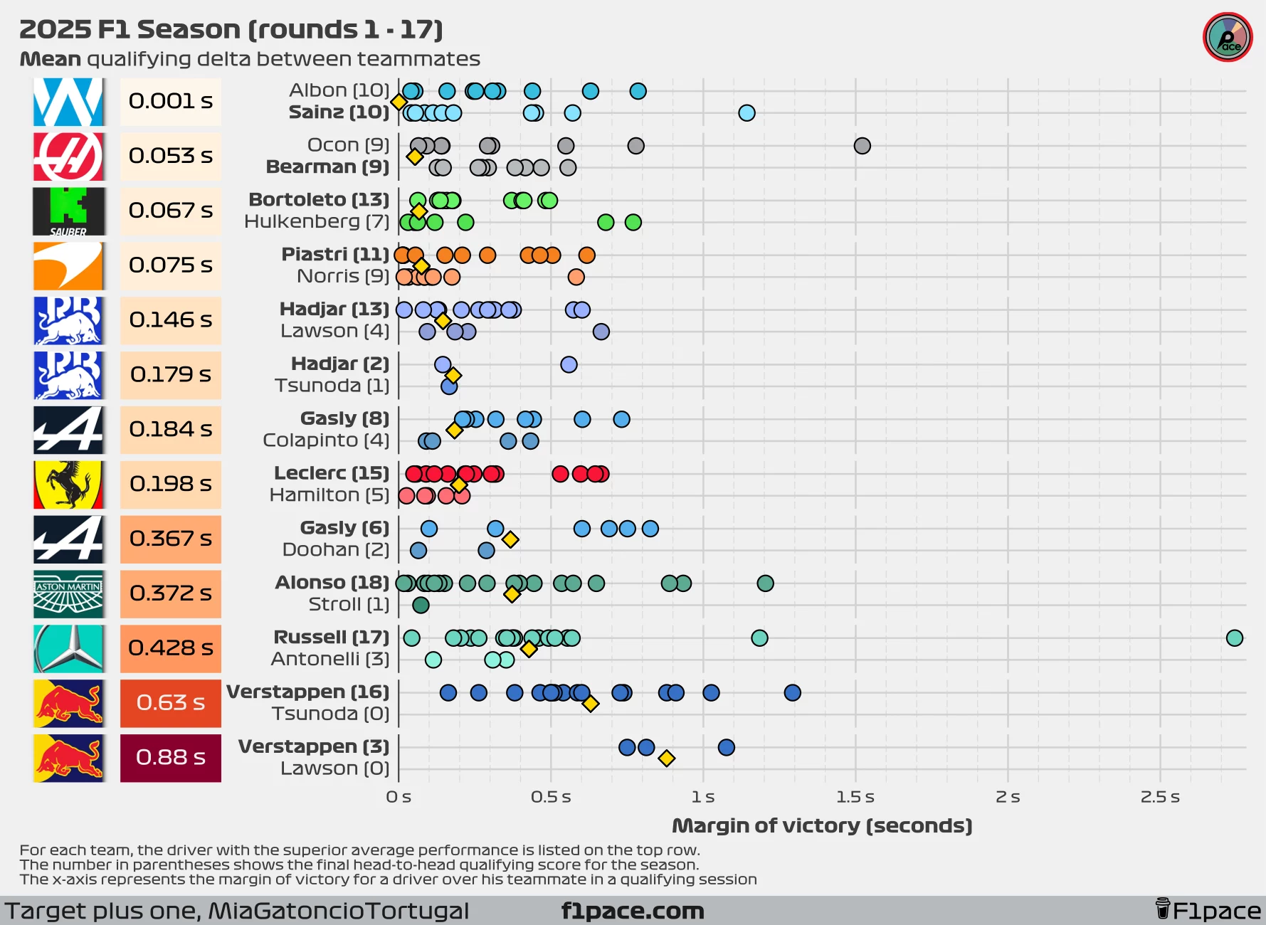
I will continue to include the analysis using seconds instead of the symmetric percent difference. I’m still firmly in the “symmetric percent difference is more representative” camp, but the difference between the two metrics is smaller than most people think—and time in seconds is a lot easier to interpret for most people.
Looking at seconds as the metric of interest, we see some incredible results. Currently both the median and mean delta at Williams show a gap of only 0.001 seconds. Using the median, we have Sainz ahead by just 1 thousand of a second, while using the mean we have Albon ahead by just 1 thousand of a second.
The largest gap will most likely remain at Red Bull for the remainder of the season. At the Azerbaijan GP, he fell behind Verstappen by 1.02 seconds, increasing his delta to Max to a median of 0.563 seconds and a mean of 0.63 seconds.
Qualifying stage appearances
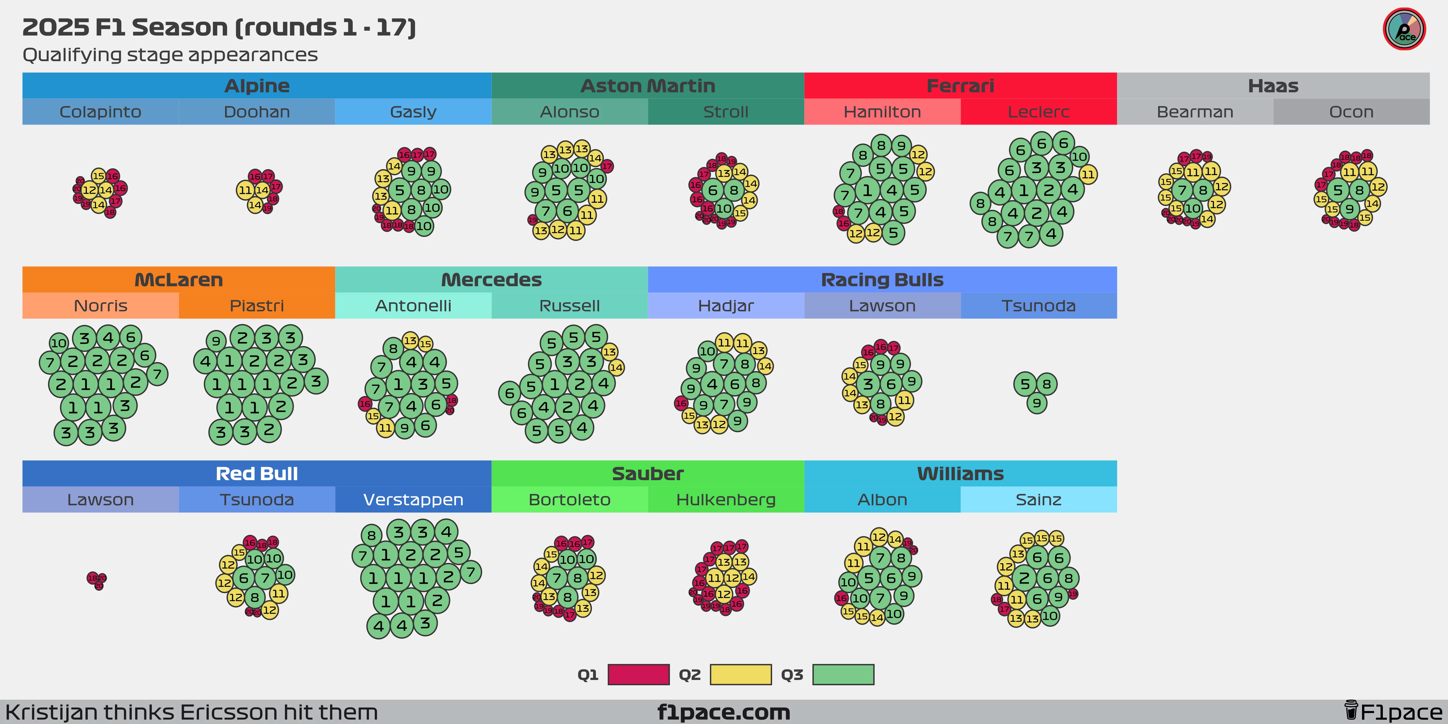
If the text appears a bit too small, feel free to zoom in to see each individual bubble more clearly.
Click to expand explanation
I’ve often seen tables showing how many times drivers reached Q1, Q2, and Q3, but I’ve never been fully satisfied with them. Tables tend to have too much text while still missing key insights. To address this, I created a bubble chart.
Each bubble represents a driver’s qualifying or sprint qualifying appearance throughout the 2025 F1 season. The bubble’s size reflects the driver’s final qualifying position, with larger bubbles indicating better results. The actual position is displayed as a big number inside the bubble, and the colors indicate the qualifying session reached.
As of the 17th race of the 2025 season, the differences between teammates have fully stabilized. Most pairings are quite even, with a few exceptions. The first is Aston Martin, where Alonso has reached Q3 on 9 occasions, while his teammate, Lance Stroll, has managed it only three times. The second is Alpine, where Gasly continues to do a stellar job in a struggling car. After the Azerbaijan GP, Pierre has qualified for Q3 on eight occasions, while Doohan and Colapinto combined have yet to make a single Q3 appearance. The third exception is, unsurprisingly, Red Bull Racing. So far, Max Verstappen has reached Q3 in all 20 possible sessions and is one of just three drivers with a 100% Q3 appearance rate, along with Lando Norris and Oscar Piastri. Meanwhile, Lawson was eliminated in Q1 three times while racing for Red Bull. In Tsunoda’s case, his Q3 record improved but is still not favourable: the Japanese driver now has six Q3 appearances out of 17 outings for the team, putting his Q3 rate at 35.2%.
xQD (Expected Quali Delta)
How much quicker one teammate should be in qualifying, based on underlying pace rather than luck.
We’ve already looked at the mean and median averages, which show an interesting summary of the deltas between teammates in qualifying during the season. We can, however, take it one step further. For this, I created a new metric, which I’ve called Expected Quali Delta, or xQD.
xQD is a value created by a statistical model that uses the raw data and tries to separate the signal from the noise. In our case, the signal represents a driver’s typical edge over a teammate after accounting for track and season effects, while the noise shows the residual session-to-session variability, including but not limited to effects such as gusts of wind, track evolution, and driver errors, among others. With our latest metric, we can not only quantify what the expected delta between teammates would be, but also generate uncertainty intervals around it.
xQD (expected Quali Delta): The model’s best estimate of the qualifying gap between teammates after filtering out session noise.
How to read the chart
- The number in the colored box next to each team’s logo: This number represents the model’s single best estimate of the qualifying gap between teammates after filtering out session noise.
- The x-axis: The horizontal axis shows the xQD in seconds. Higher times represent bigger deltas, in favour of the winning driver.
- The slabs The slabs, or “domes”, provide a range of plausible values for each team’s skill. The peak of the hill is the single most likely value (the number in the box). As you move down the slopes of the hill, those values are less likely but still plausible. Narrower slabs shows that the model has high confidence in the results, while wider slabs show higher uncertainty about the actual delta in each team.
- The black dot and horizontal bars: The dot and bars below each slab represent the represents the median value and the the “most likely” ranges for our expected value. The dot is the same as the number displayed on the left side of the plot.
- The dashed, vertical line: This line represents is the zero threshold. It provides a quick reference to see which in how many simulations the result changed from driver A winning to driver B. If the slabs cross the zero threshold, then it means that on some simulations the current winning driver would be losing the quali battle against his teammate.
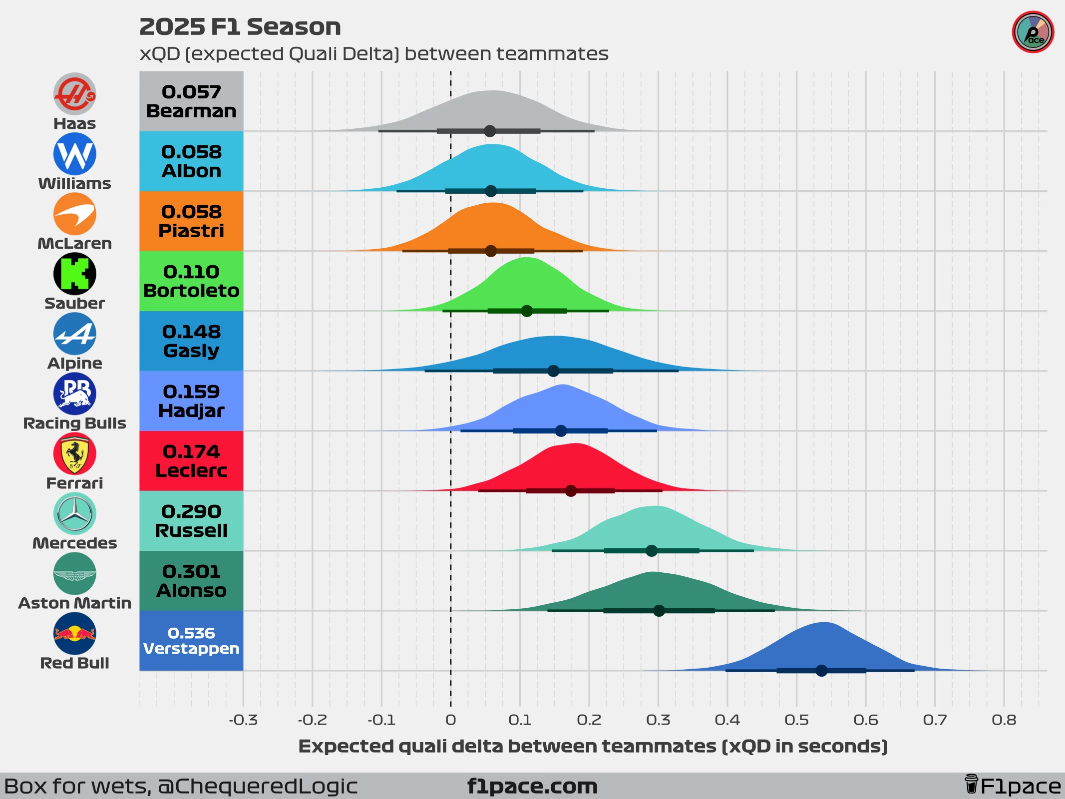
Looking at our xQD chart, we can see that the values produced by our model align with the mean and median qualifying deltas between teammates. For most drivers, xQD will align more closely with the median delta than the mean; however, it is calculated as an “expected mean delta” rather than a median one.
Based on our model, the closest deltas are found at Haas, Williams, and McLaren, which is something we knew from the previously shown summary statistics. However, we can also see that for these three teams, many of the expected predictions cross the zero line. This means that over thousands of simulations, in many of them, our model found the losing driver to be faster than his teammate over a season. For example, at Haas, our model expected Bearman to win the overall qualifying battle by an average of 0.057 seconds over Ocon, but in 24% of the simulations, Ocon actually beat Bearman. Something similar is seen at Williams and McLaren, with around 20% of the simulations showing Sainz beating Albon and Norris beating Piastri.
Understanding our xQD metric
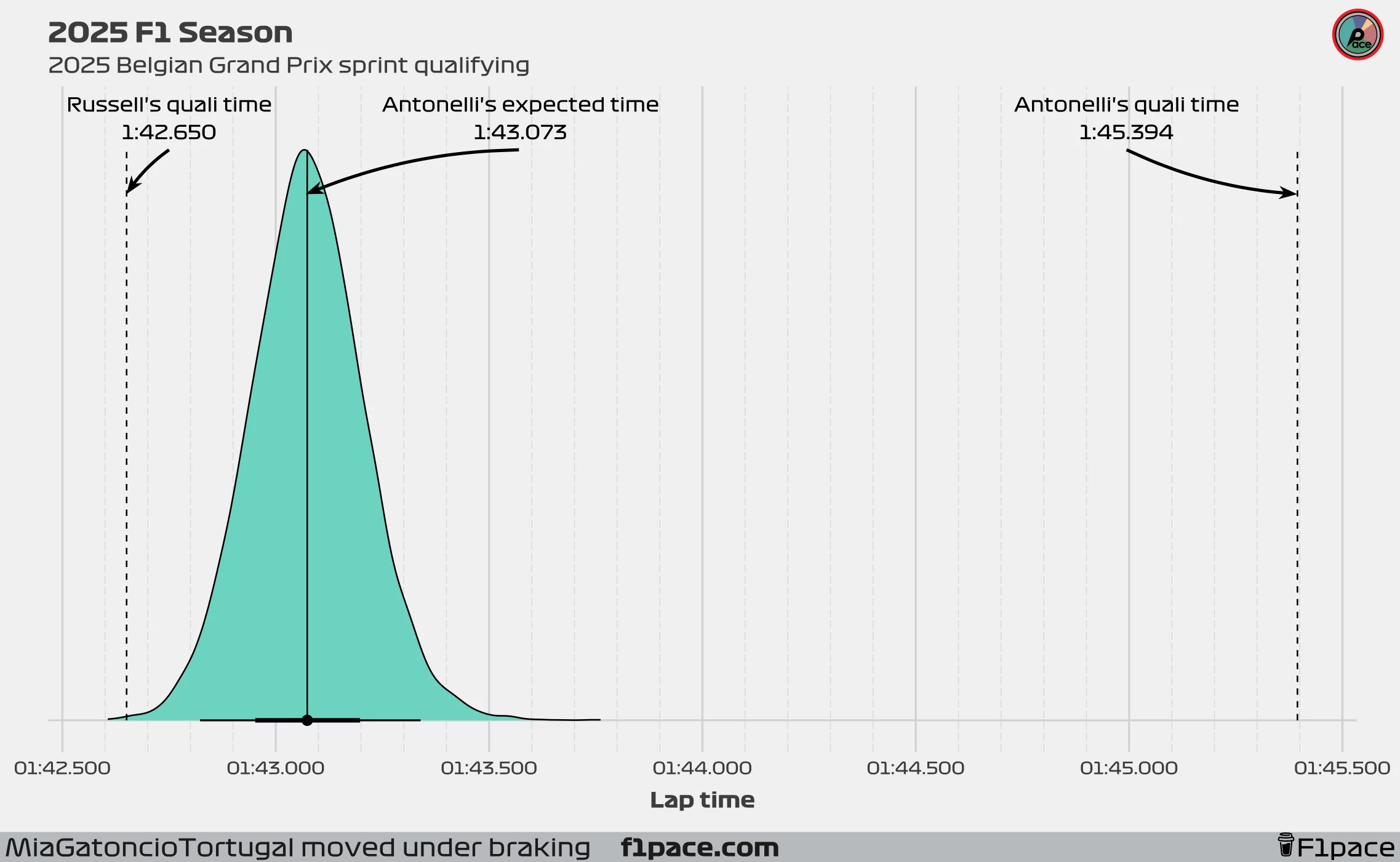
Since our model learns from the data but then creates expectations, it self-corrects sessions in which a driver over or underperformed. Take, for example, Kimi Antonelli at the Belgian Grand Prix sprint qualifying. In this session, Kimi had a qualifying time of 1:45.394, almost three seconds slower than his teammate’s time (1:42.650). The model automatically understands, based on previous data but also considering the disastrous qualifying session that he had, that he is definitely not as slow as he was in that session, but also that he is most likely not as fast as George Russell. With this information, the model creates thousands of simulations which represent plausible values of times that Antonelli could have had in this qualifying session.
In this case, our model expected Antonelli to have a qualifying time of 1:43.070, which would have put him 0.42 seconds behind George Russell. At the same time, 66% of the simulations had Antonelli achieving a time between 1:42.952 and 1:43.192. These values are all very plausible based on the observed data. Perhaps Antonelli would have been slightly faster than 1:43.070, or a bit slower, but generally speaking, a delta of three to five tenths to Russell would not have been completely unexpected. A delta of 2.7 seconds? Not only is it not expected, but it is something that can be considered a complete anomaly.
The limitations
As with any model, ours has limitations. In our case, the two main ones are the lack of data and the scope of it. Our model uses only data from the current season. It doesn’t know anything about Hamilton winning the World Championship seven times, or anything about Bearman being a rookie. The model uses the data from this season, which means that its scope is quite limited. At the same time, we’re only using the data in which both drivers from the same team participated in the same session. This leaves us with limited data, which creates wider uncertainty intervals. Having said that, as long as the model is properly calibrated, it can still provide valuable insights into driver performance relative to their teammates.
Conclusions
As a final conclusion, we can see that using the raw data and the xQD model provides a clear picture of the performance of each driver against his teammate. We have three teams that have a delta very close to zero, with Bearman, Albon, and Piastri leading against their teammates by almost nothing. In another universe, these three drivers could have been losing the qualifying battle against their teammates, even with their current level of talent and performance. At this level, the delta of performance between teammates could be almost nothing, and in many cases, it is nothing.
We’re in the final quarter of the season, so it’ll be very interesting to see what the final delta between teammates becomes when the season is done. Will Leclerc maintain what is a healthy delta against his teammate? Will Albon be the surprise of the season by beating Sainz in qualifying? We’ll find out in the next couple of months.