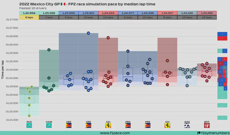
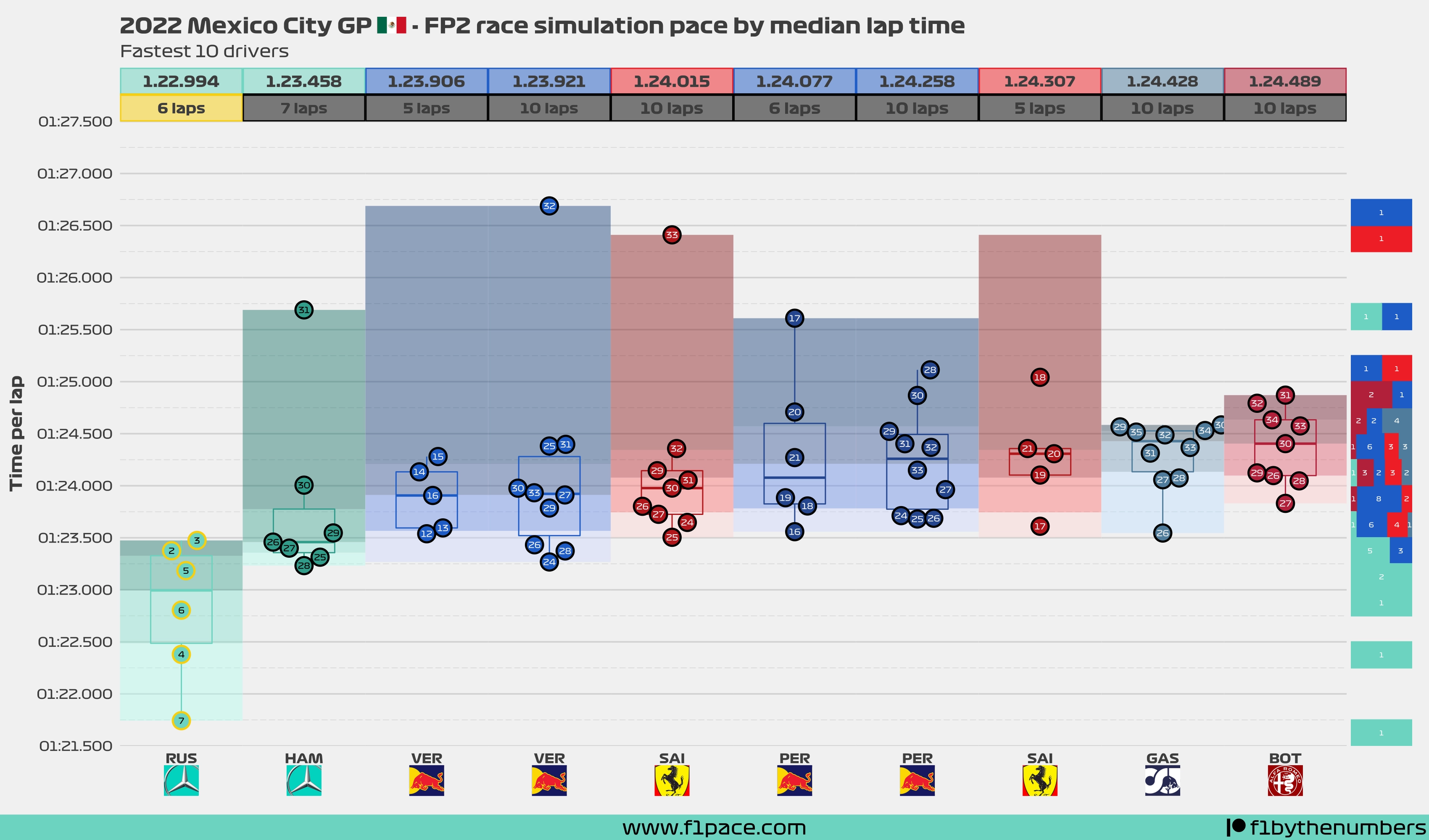
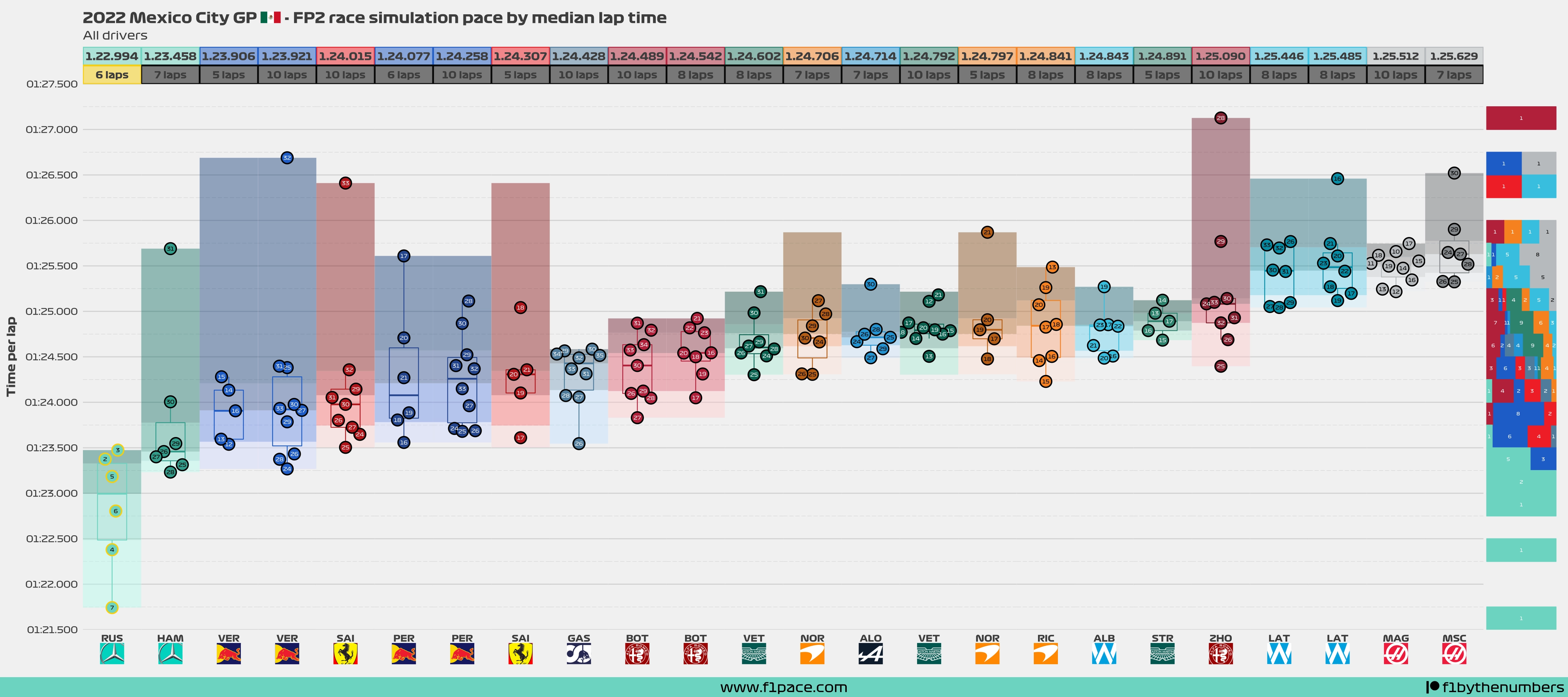
- The numbers inside the dots represent the lap in which that particular time was done. Drivers who did their laps later in the session will tend to have faster times. Keep that in mind when comparing the lap times done by different drivers.
- The box represents a traditional box plot, with the line in the middle representing the median time done by each driver. The top and bottom lines respectively represent the 75% percentile and the 25% percentile.
- The arrows represent the median time done by each driver. With this addition, you can visually compare the median time among the drivers.
- The histogram on the right side of the plot is binning the lap times in intervals of 0.25 seconds. This histogram is on a 100% scale, meaning that each bin is independent of the others.
- If you do not see a driver in the plot, it is because he did not do a race simulation stint during the practice session.
- You may see fewer laps than the number displayed above the driver’s name. This is because some laps were slower than the maximum time represented in this chart.
- For this particular plot, a race pace simulation stint was considered as long a driver had a stint of 5 or more laps.
- Also for this particular plot, I decided to show laps with a maximum time of 1:27.500. Some drivers had laps above that threshold but I am not displaying them here.
FP2 best sector times
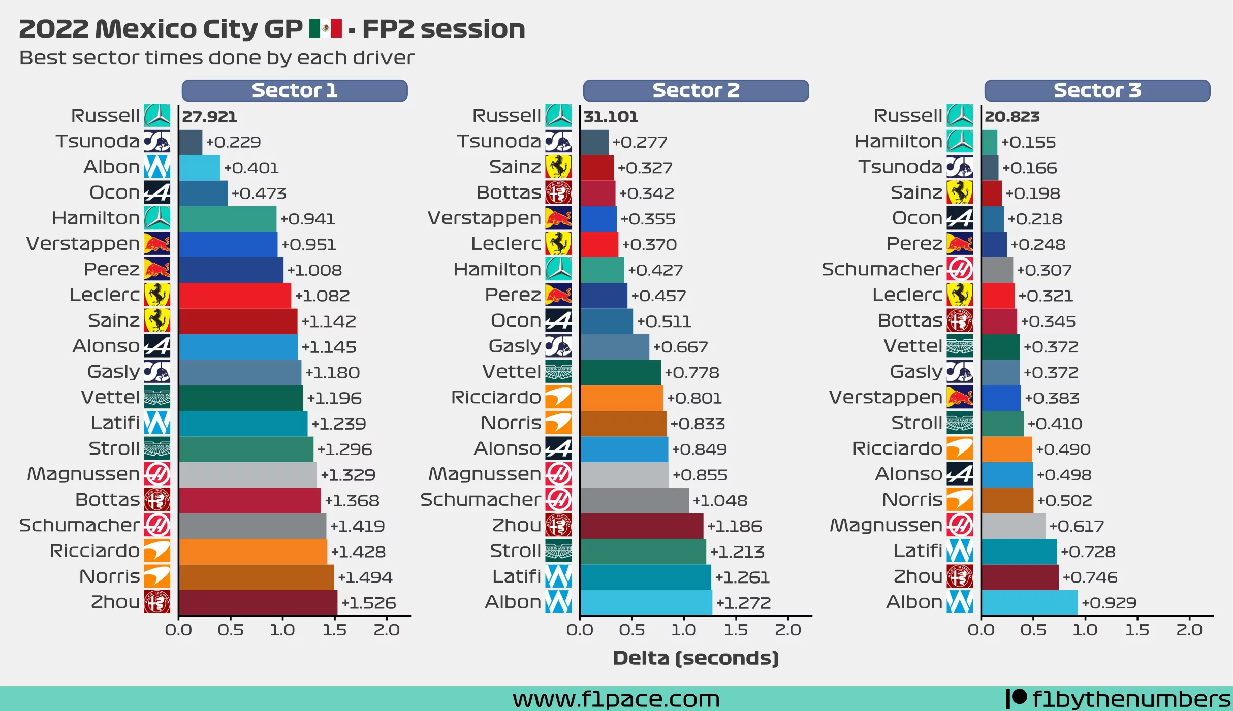
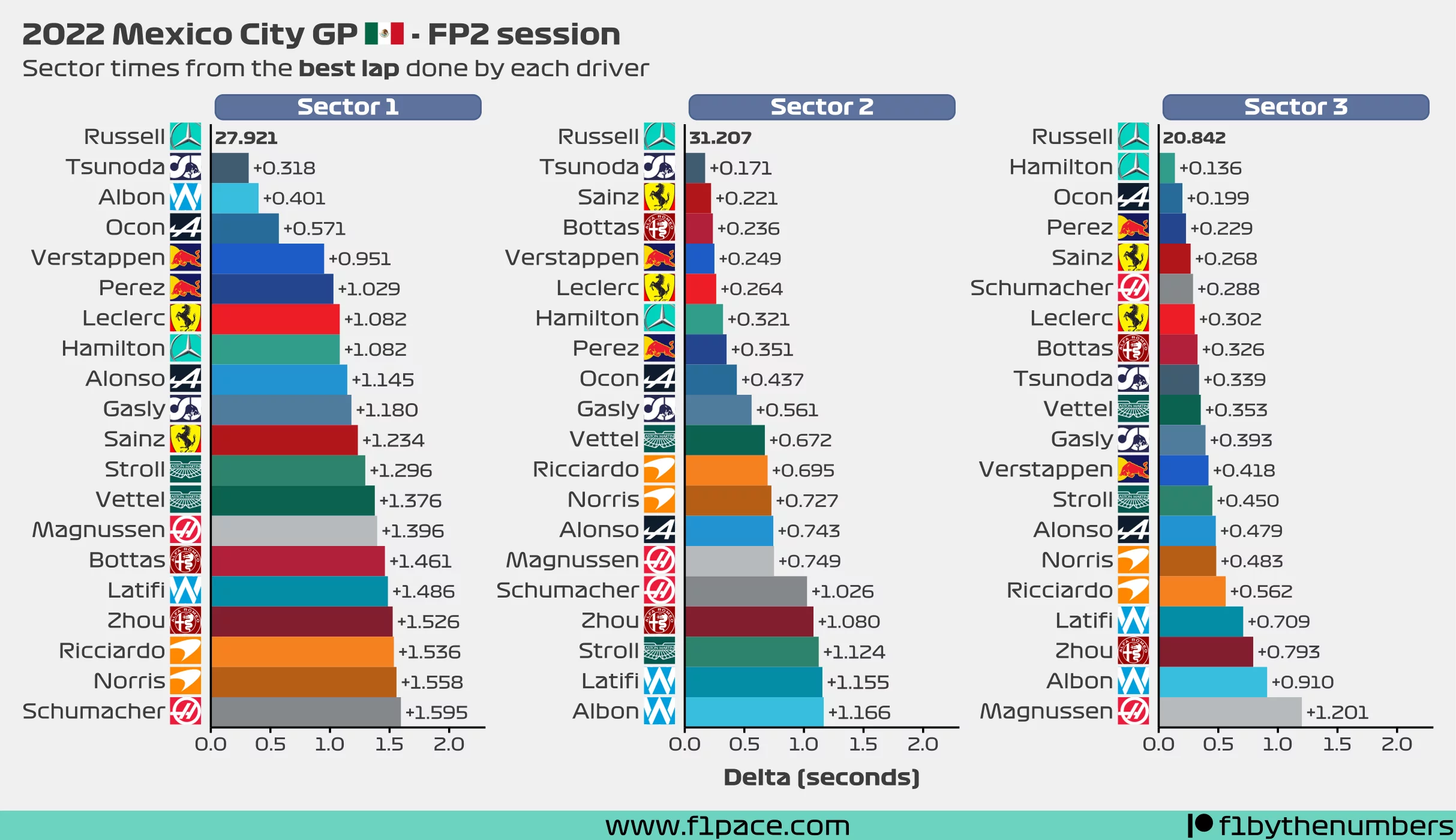
I’ve decided to add some additional information about the FP2 section to this article. The two charts that I’m showing have very similar information about the best sector times of the session. The difference between them is as follows:
- The first chart (Best sector times for each driver) shows the best sector times done by each driver, regardless of the lap those sector times were done. It could’ve been on a random lap and not necessarily on their best flying lap.
- The second chart (Sector times from the best lap done by each driver) shows the sector times of each driver for their fastest lap of the session.
Usually, you will see that the best sector times were done during their best lap of the session. Having said that, this won’t always be the case. For example, if a driver had 2 great sector times during a flying lap and then made a mistake on the final sector then chances are his best third sector time was done on an entirely different lap.
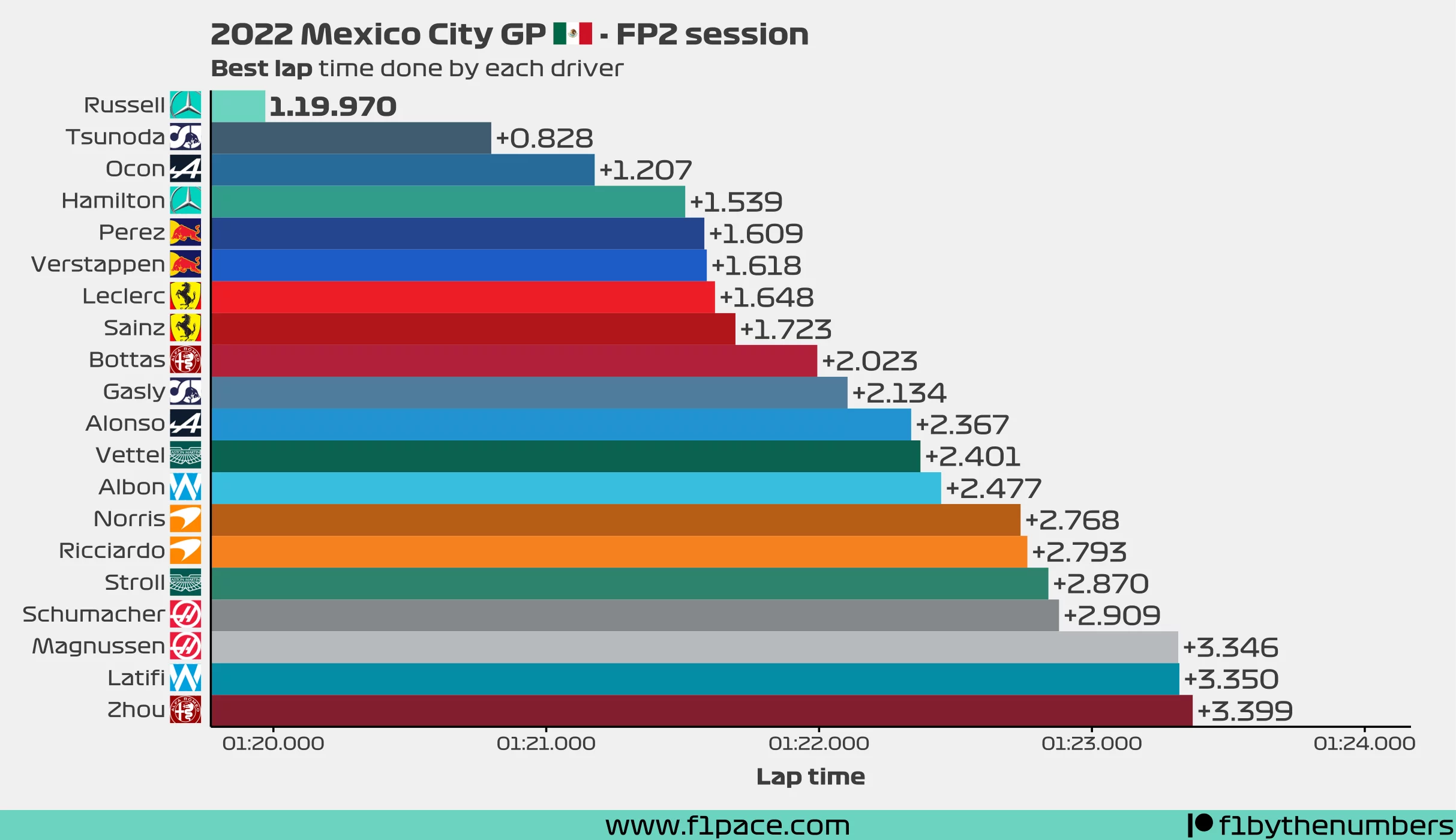
FP2 best lap times
As an extra addition to the blog, I’m adding a simple chart that shows the best lap time done by each driver. The sum of the “Sector times from the best lap done by each driver” chart should add up to the total time seen in this chart.
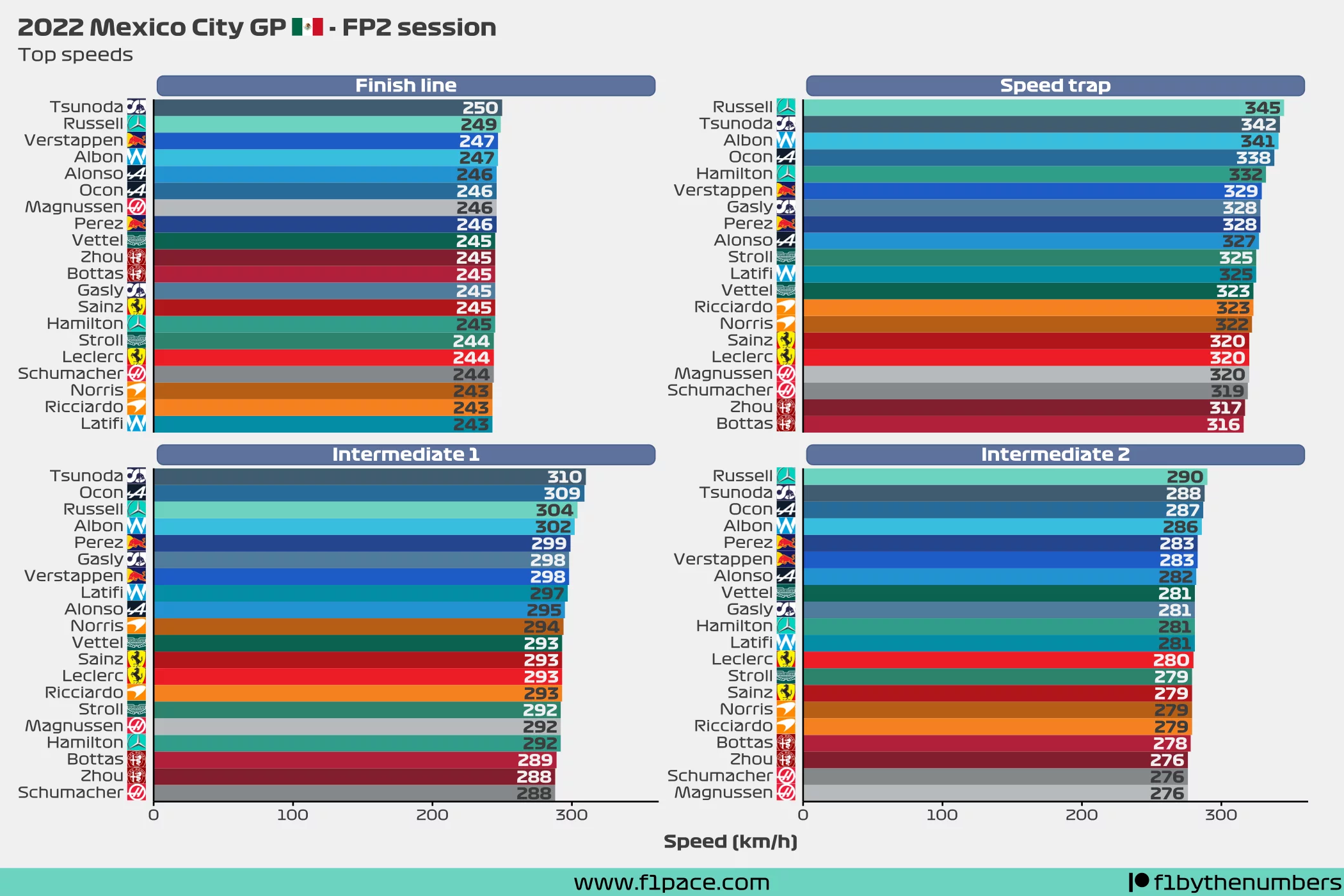
FP2 top speeds
I think a lot of people like to see what were the top speeds of the session so I’m adding a chart for those too.