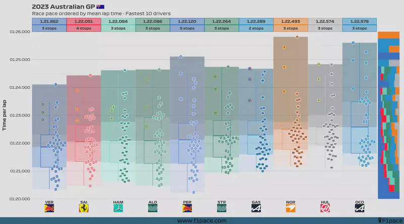
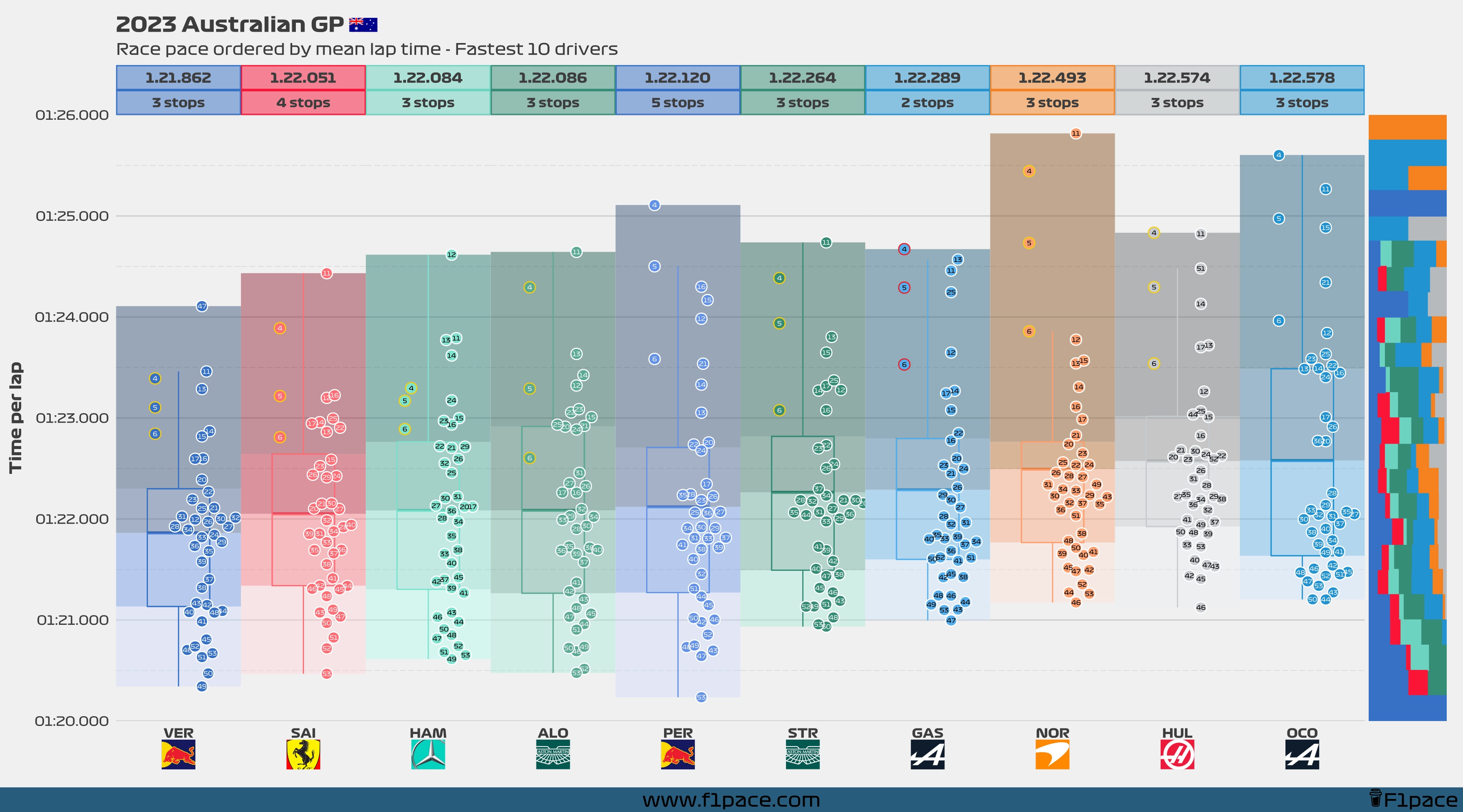
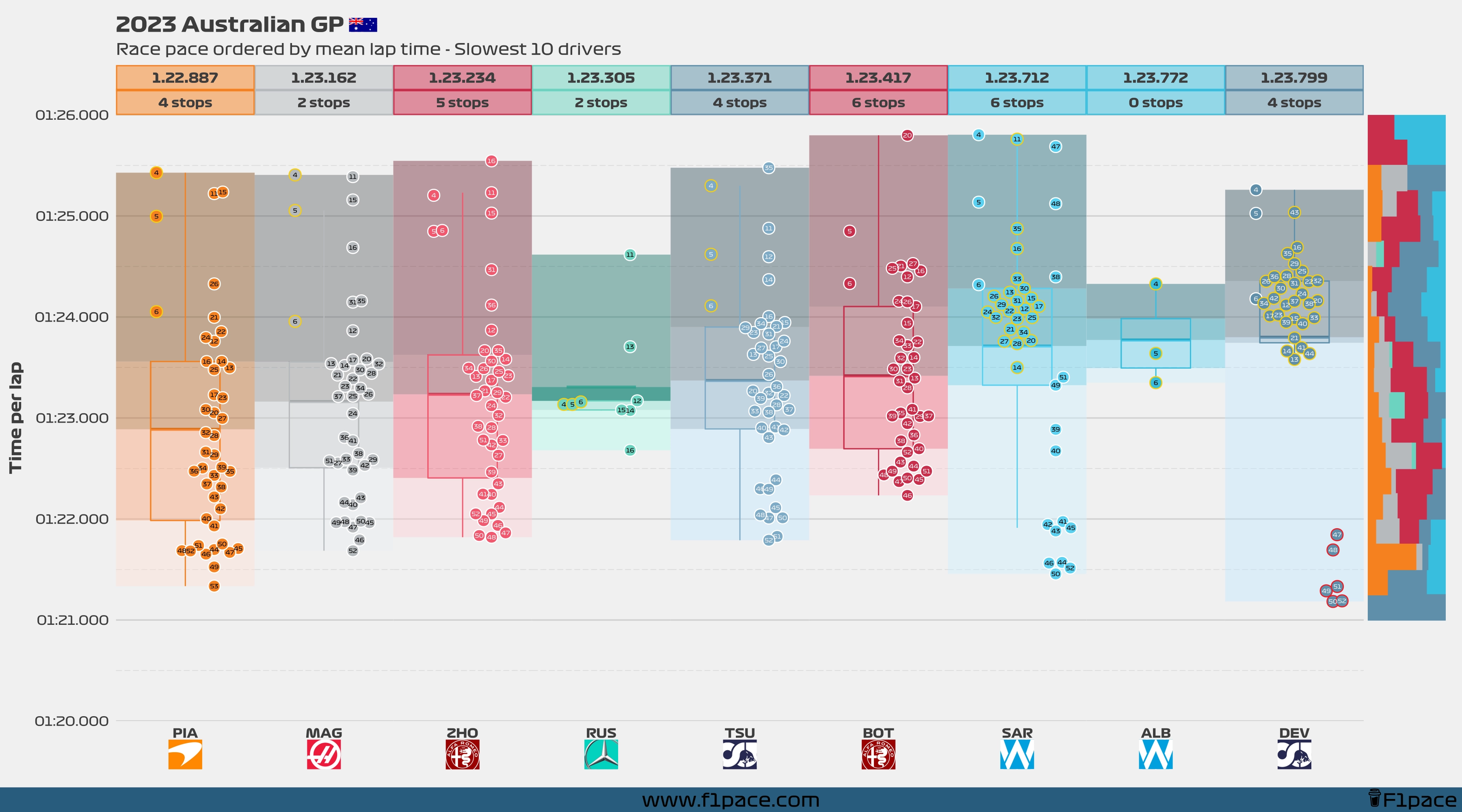
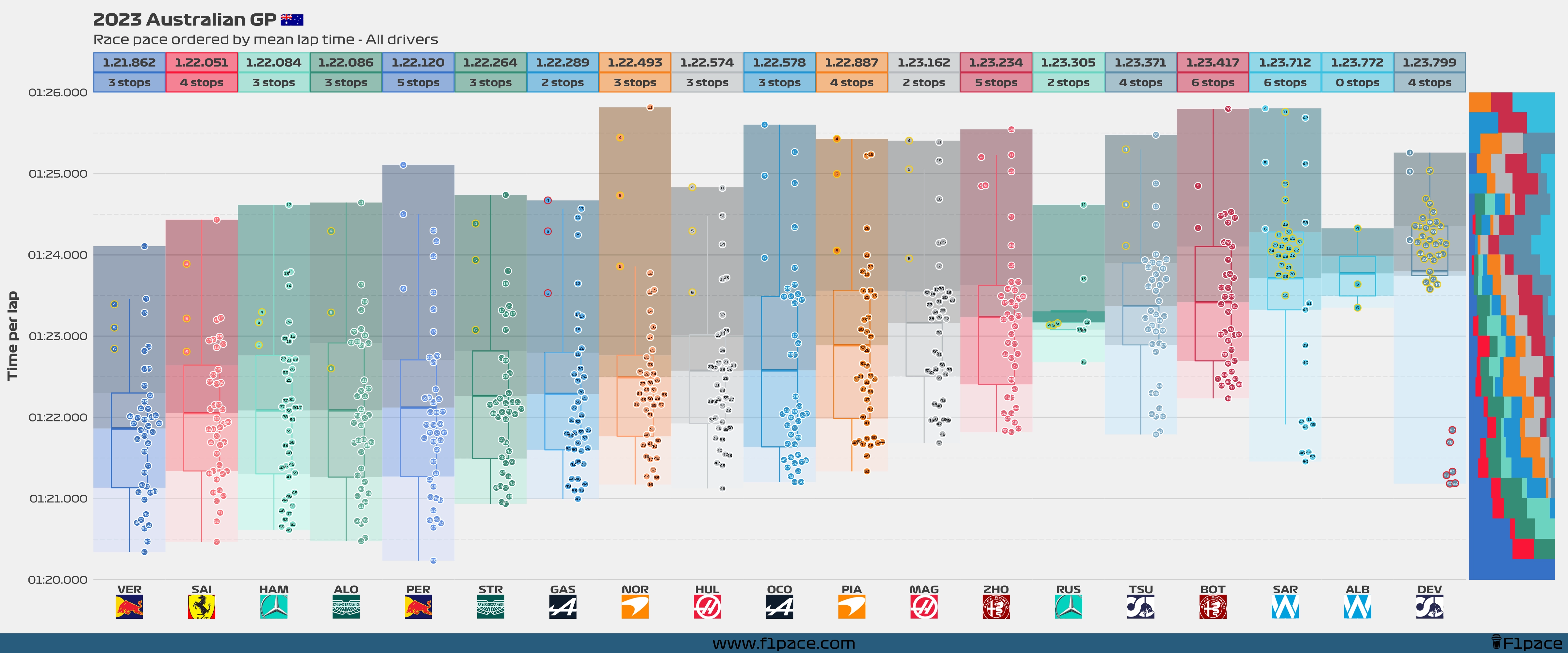
Race pace
The main idea of these charts is to show the representative average race pace of each driver. Since plotting the raw data will not show accurate information, I did a bit of data pre-processing.
- I removed the laps that were not raced under green or yellow flag conditions. This means that laps raced under Virtual Safety Car (VSC) or full Safety Car (SC) conditions were removed from the analysis.
- The first lap is not consistent with the rest of the laps so it was removed from the analysis. Finally, laps in which a driver entered or left the pits are not “full laps”, so they were removed from the analysis as well.
- If laps were done with the intermediate or wet tires, then they were considered for this analysis.
- The box represents a modified box plot, with the line in the middle representing the mean (average) time done by each driver. The top and bottom lines respectively represent the 75% percentile and the 25% percentile.
- The colors behind the box represent quantiles. There are 4 colours for each driver, with each colour representing a specific quantile. Quantiles with lighter colours include the fastest laps, while quantiles with darker colours include the slowest laps.
- The jitter in the x-axis is mainly used to separate stints for each driver.
- For example, if a driver stopped only once for new tires, then he had 2 stints during the race. Laps of the first stint will be aligned slightly more to the left side, while laps of the second stint will be aligned slightly more to the right.
- Within each stint, the x-axis doesn’t represent anything. The points are jittered just to separate them and allow you to have a better view of each lap.
- The scales are NOT necessarily the same for the fastest 10 and slowest 10 charts. I do this just to allow the package to separate the dots better and allow you to see each individual lap. For a fully representative chart of the data take a look at the 3rd chart (All drivers plot).
- Finally, the column on the right side shows the percentage of laps done by each team in a 0.250 seconds bin. If you see for example a lot of red toward the bottom of the column, then it means that most of those laps in that time range were done by Ferrari.
- Scenario: A Ferrari driver had the fastest lap of the race. It was a 1:20.300. That lap falls within the 1:20.250 to 1:20.500 bin. In that case, you would expect to see a fully red row on the column.
- If another driver from another team—let’s say Red Bull—had done for example a lap with a time of 1:20.350, then then you would expect the row in that column to look half red and half blue.
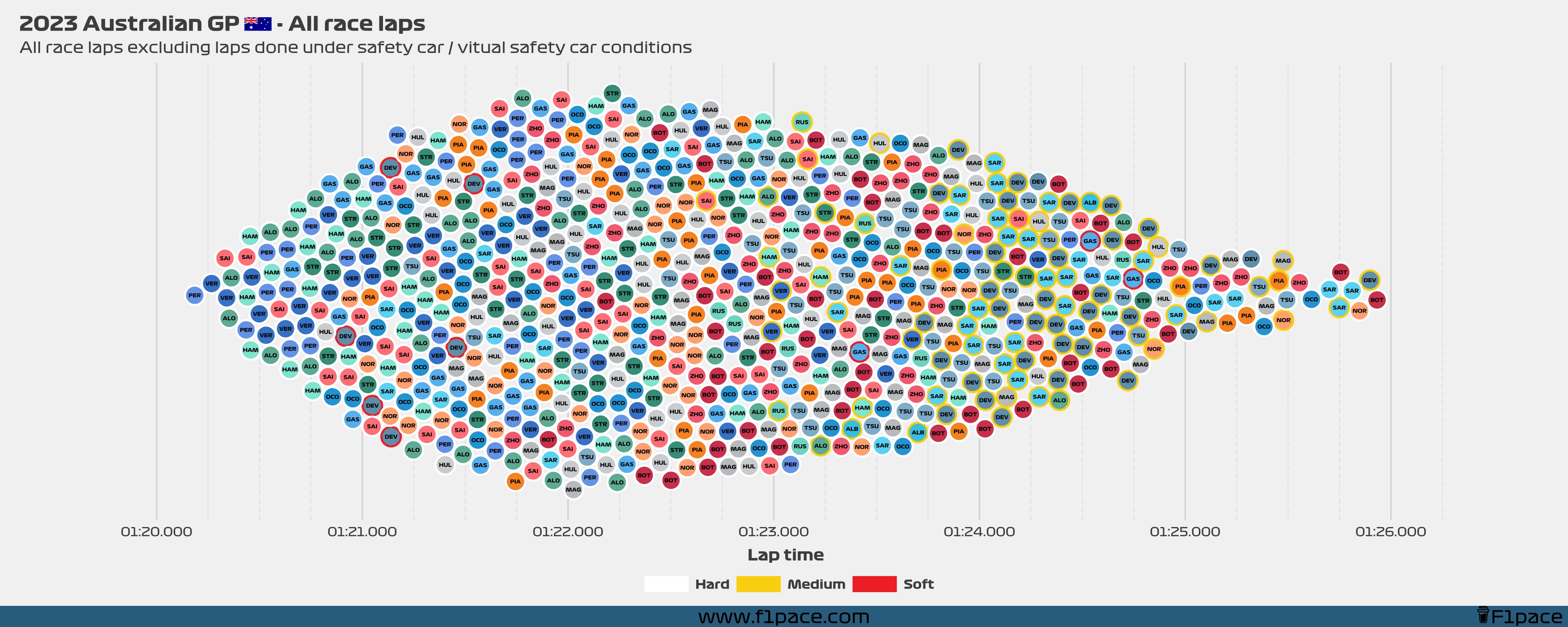
Race laps… all of them
This is a fun little chart that I started using for FP2. It shows all the laps from the race—as long as they were under green flag/yellow flag conditions—but in a single chart. I think of this as a lap cloud—if that’s even a thing. In any case, I like the way it looks. Make sure to zoom in to see the laps with more detail.
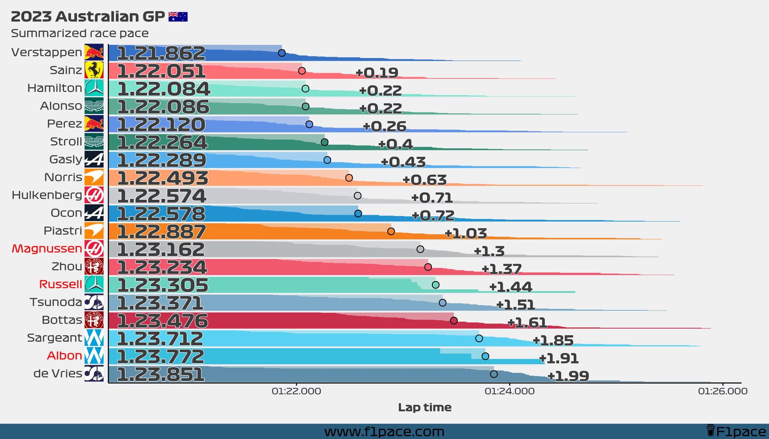
Summarized race pace
This chart shows the same information as the previous chart, but in a summarized way. I’m not a huge fan of the traditional plain bar charts, so I created this chart which shows the same information and a little bit more.
The chart looks pretty funky, but you can read it like this:
- The number on the right side shows the average lap time for each driver.
- This number corresponds to the big dot that is showed in each of the bars.
- Each bar is divided by all the laps done by each driver. This is another way of showing the distribution instead of just the average (like a typical bar chart would do).
- Longer “mini-bars” show laps in which a particular driver had a slower lap time. Shorter “mini-bars” represent laps in which a driver had a faster lap time.
- If a driver’s name is red-colored, that means that the driver completed less than 70% of the race distance.
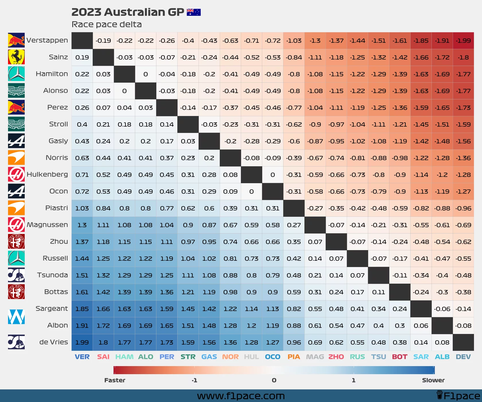
Race pace delta
Similar to what I did with my latest quali post, I am now adding a new chart which shows the race pace deltas between all the drivers.
You can read the chart like this:
- Choose a driver from the left side of the plot (y-axis)
- Choose a second driver from the bottom of the plot (x-axis)
- See where they intersect. The number that you see is the delta for their mean/average race pace.
- If you see negative numbers then that means that the driver on the left side was faster than the driver he’s being compared to.
- If you see positive numbers then that means that the driver on the left side was slower than the driver he’s being compared to.