I came up with the idea of doing these types of charts a while ago. If you follow football (soccer?), you most likely have already seen charts like this for football players. The charts look quite nice in my opinion and depending on the data displayed, they may show interesting information for you, the reader.
I’ve added an explanation at the end of the page in case you have questions about what each category means or how to interpret the chart. If you don’t want to get into the technical aspect, then the chart can be interpreted as follows:
- A full circle means the driver was the best in all categories.
- An empty circle means the driver was the worst in all categories.
- In-between means that they were better or worse depending on the category.
Hopefully you will enjoy them because I will be uploading these charts after every race from now on ;)
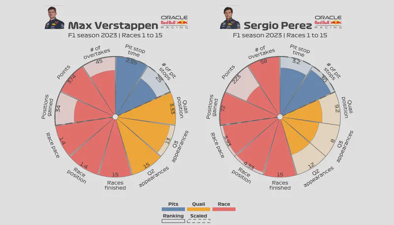
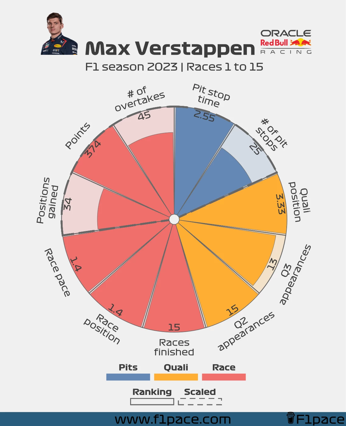
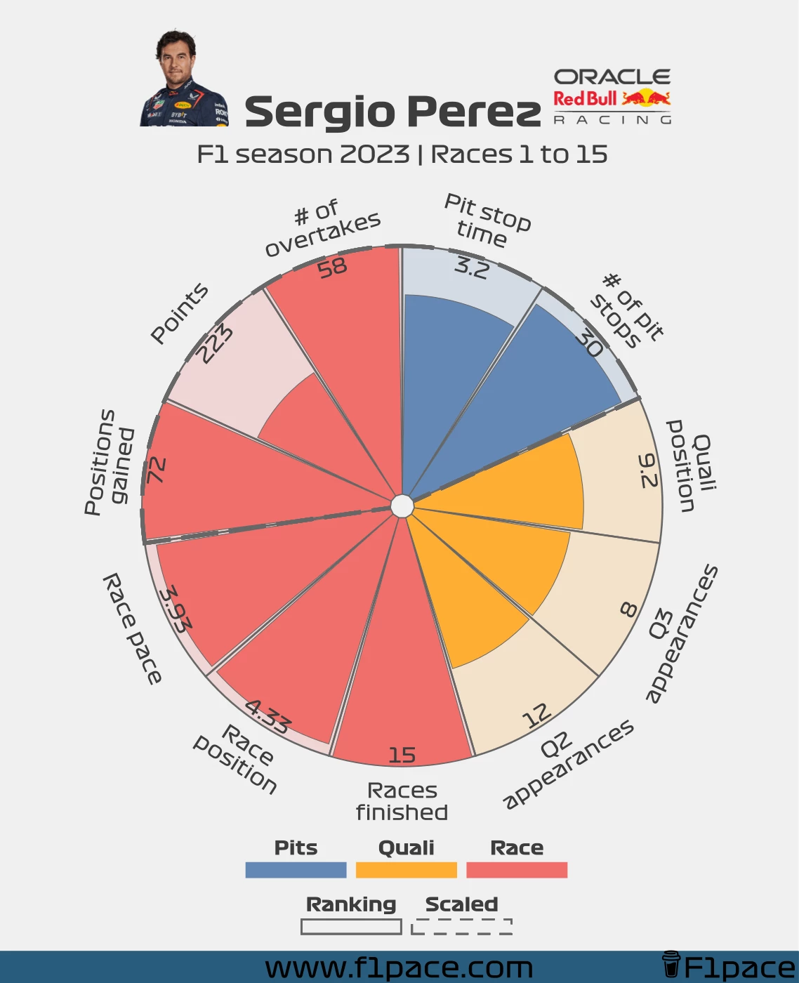
Red Bull
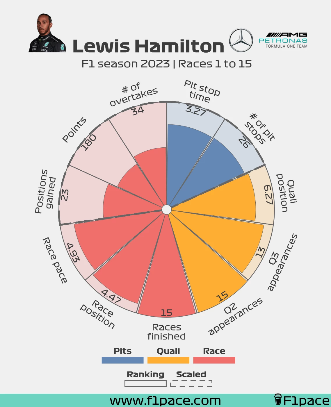
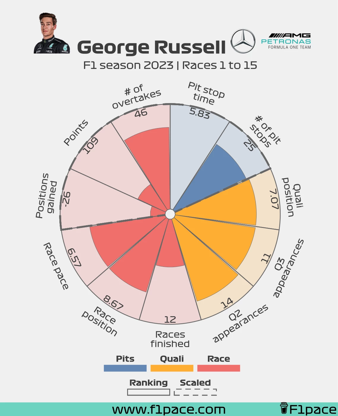
Mercedes
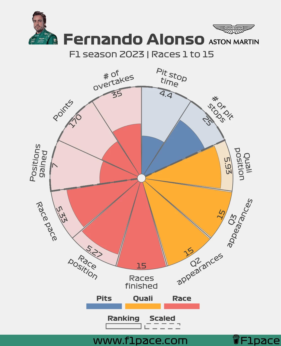
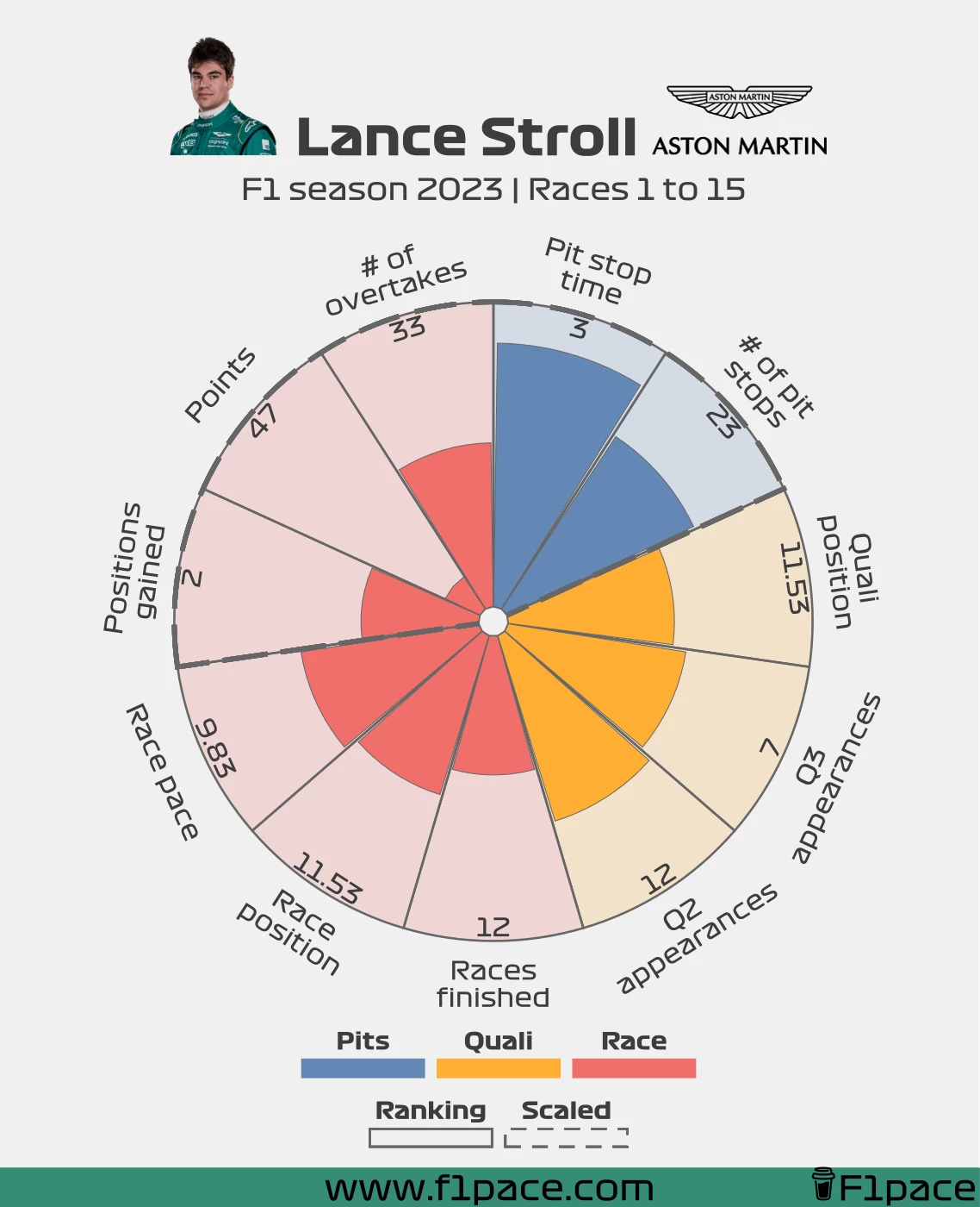
Aston Martin
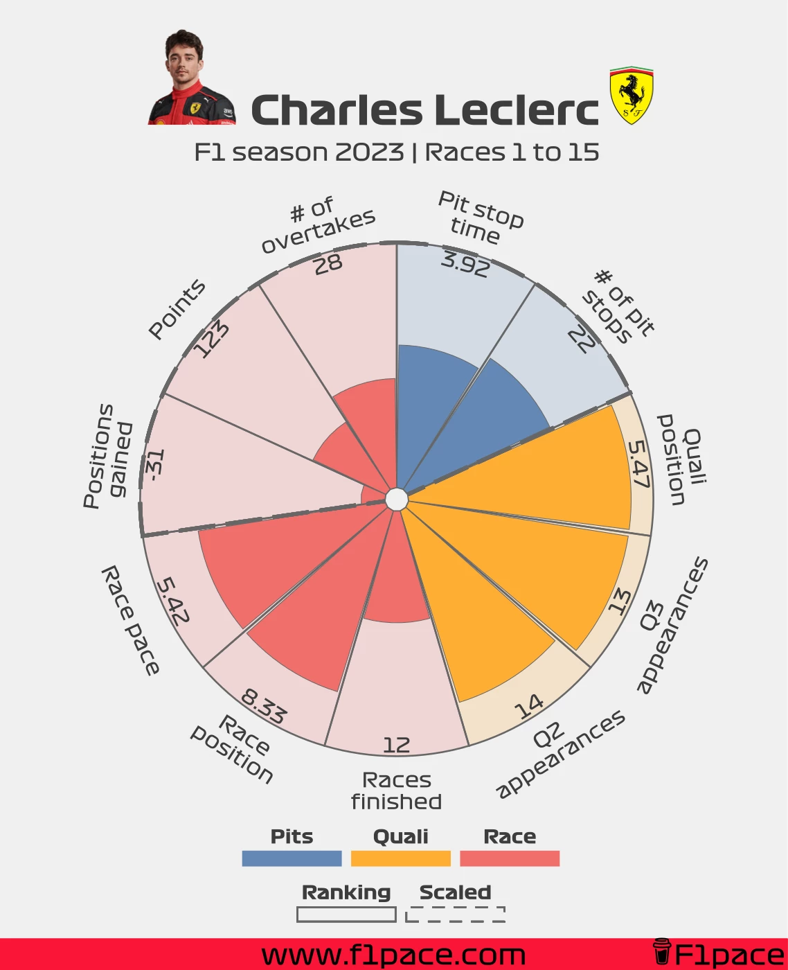
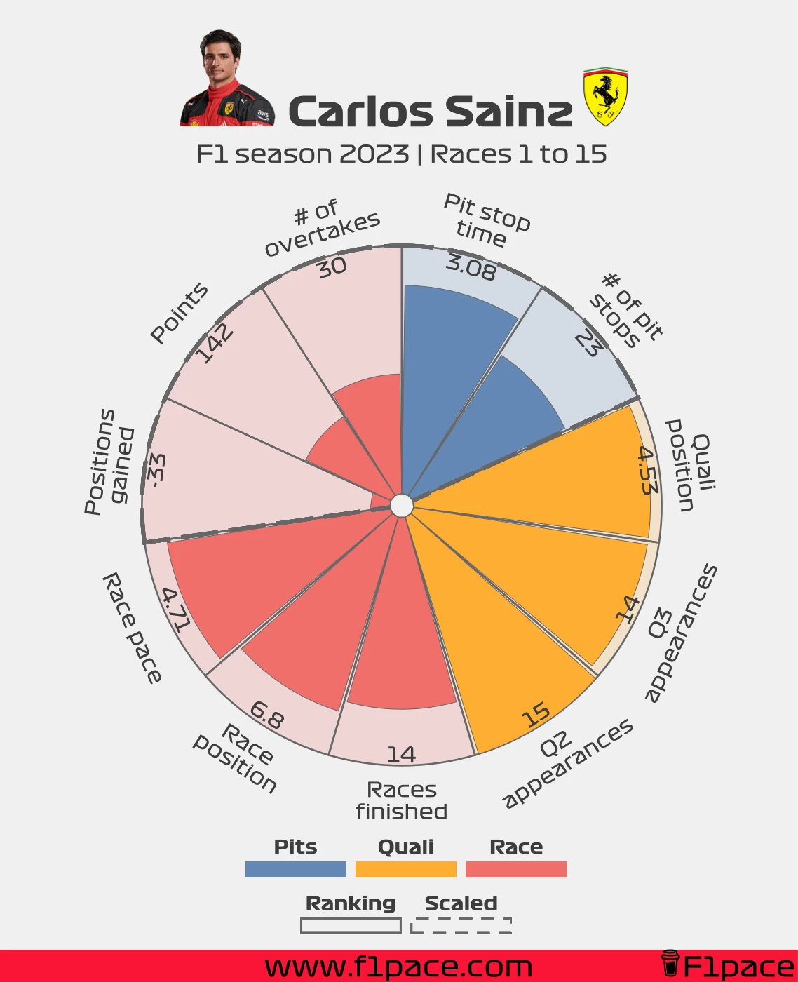
Ferrari
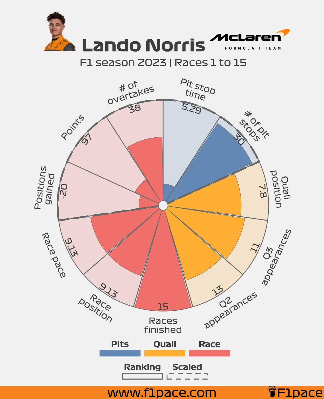
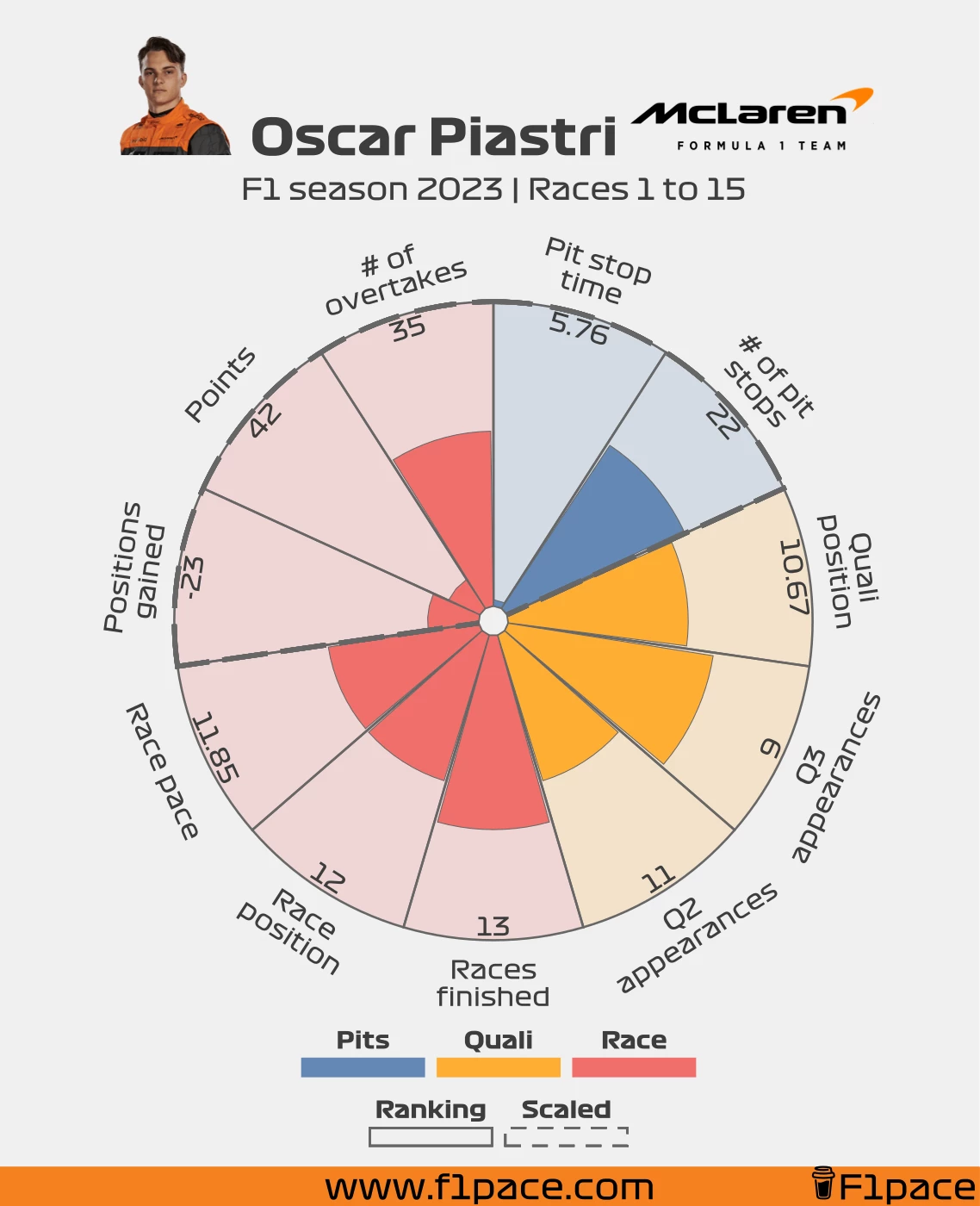
McLaren
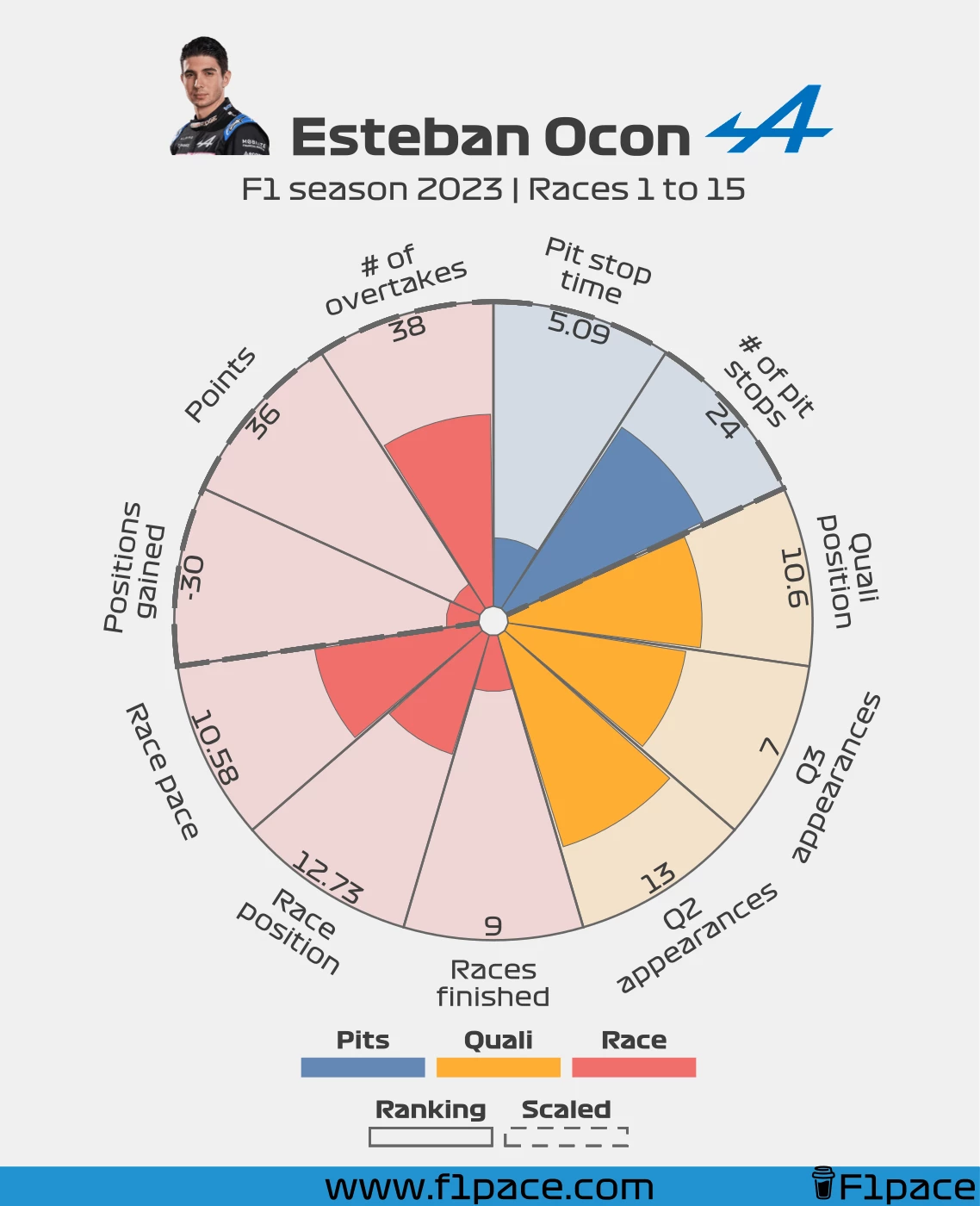
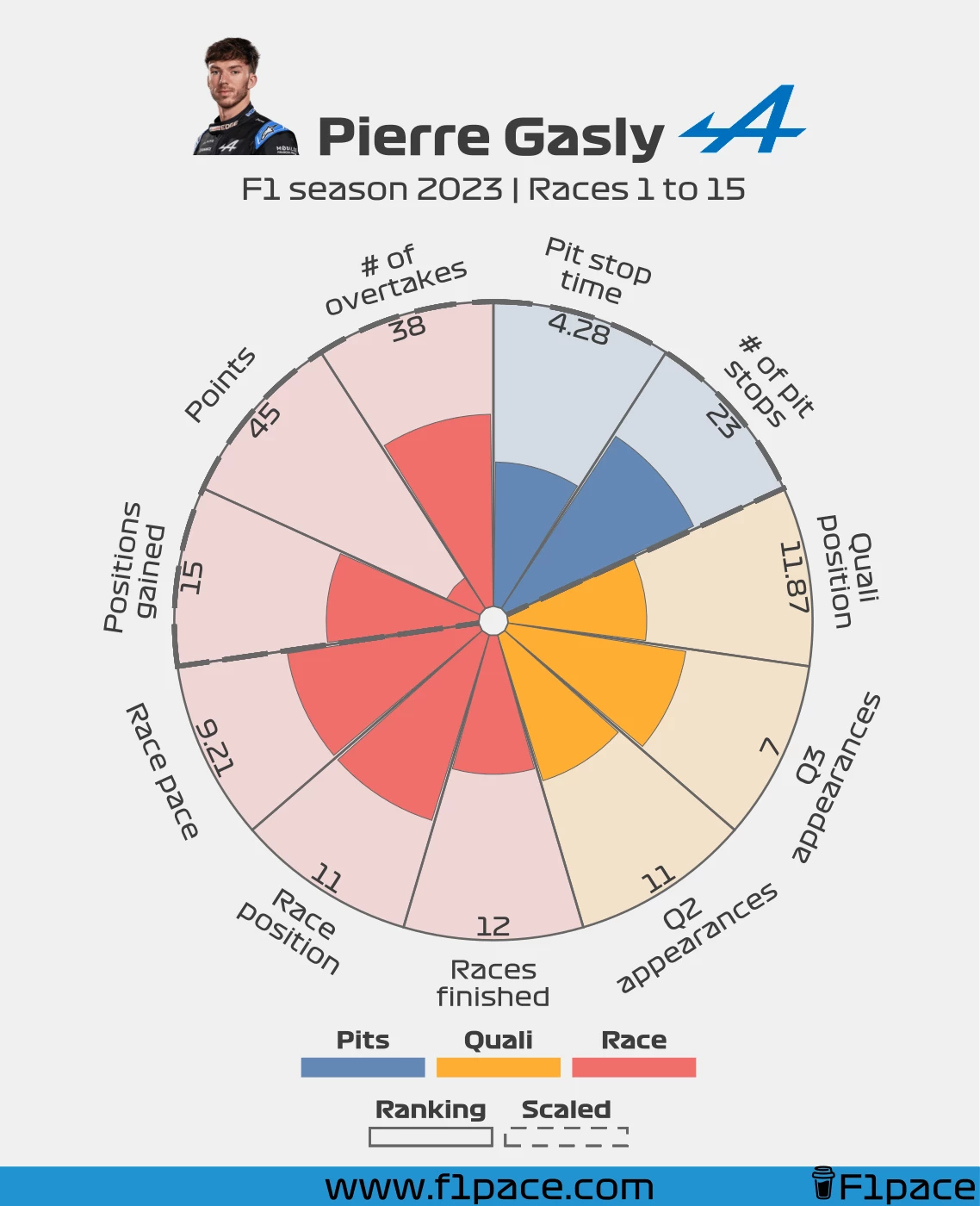
Alpine
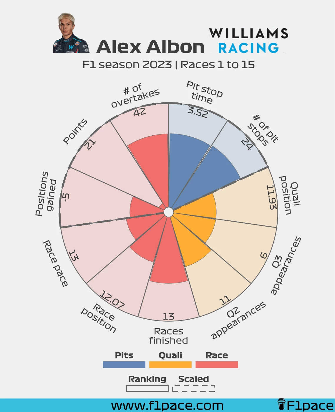
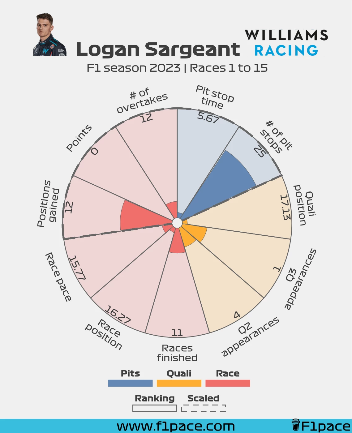
Williams
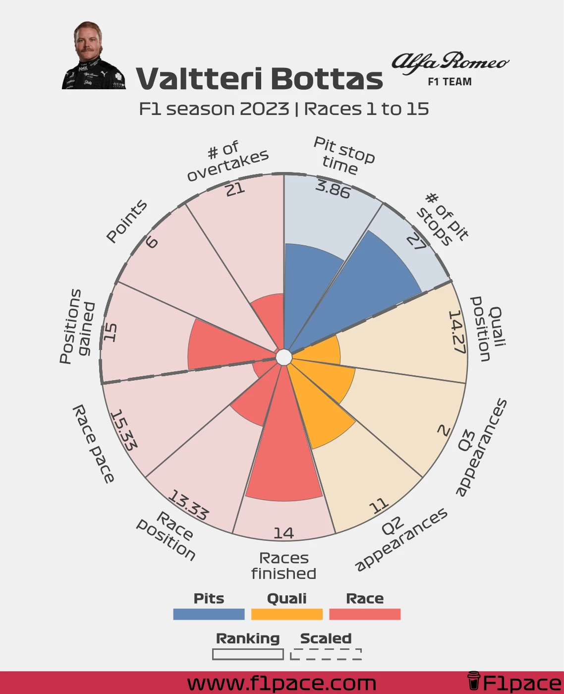
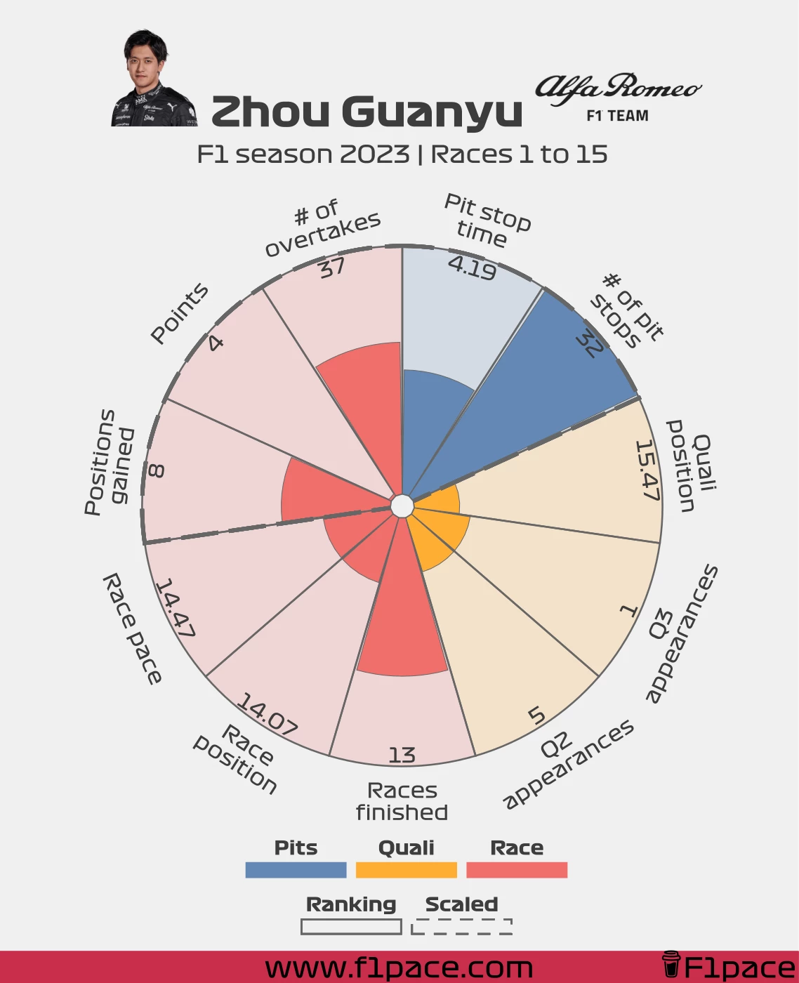
Alfa Romeo
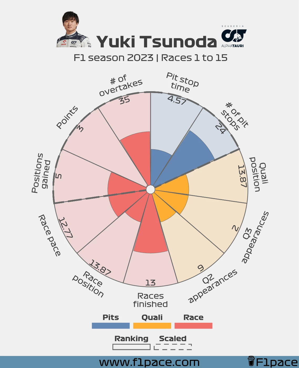
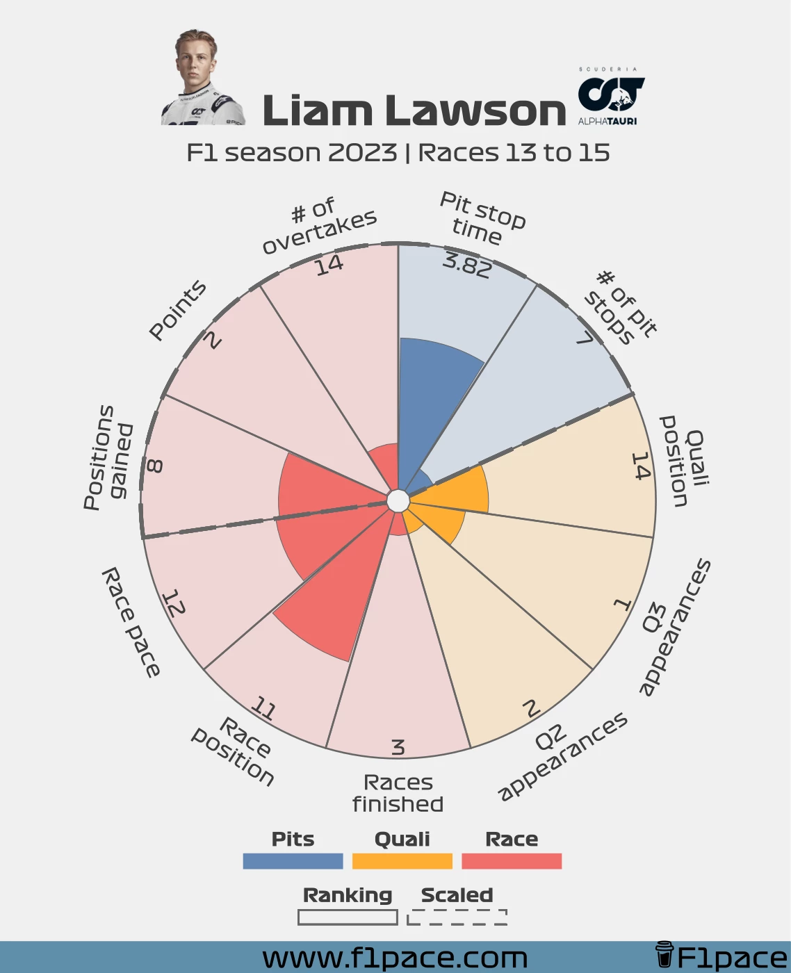
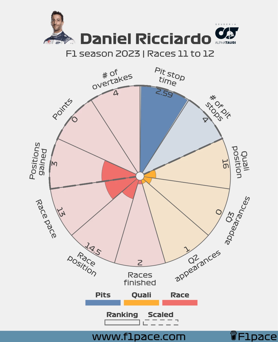
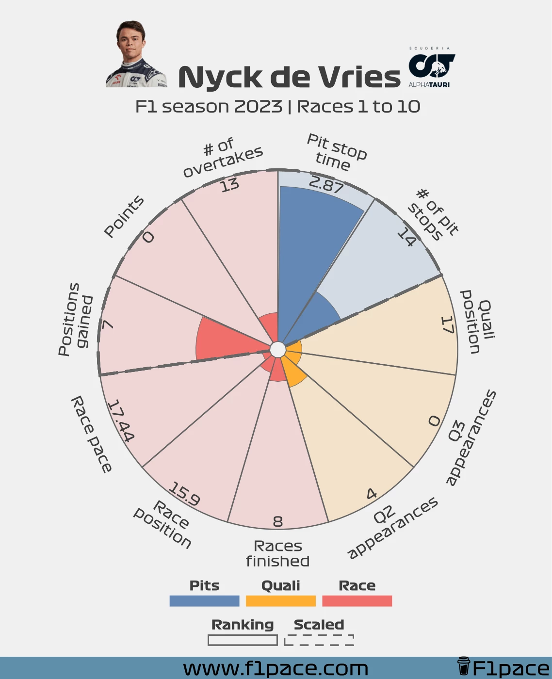
AlphaTauri
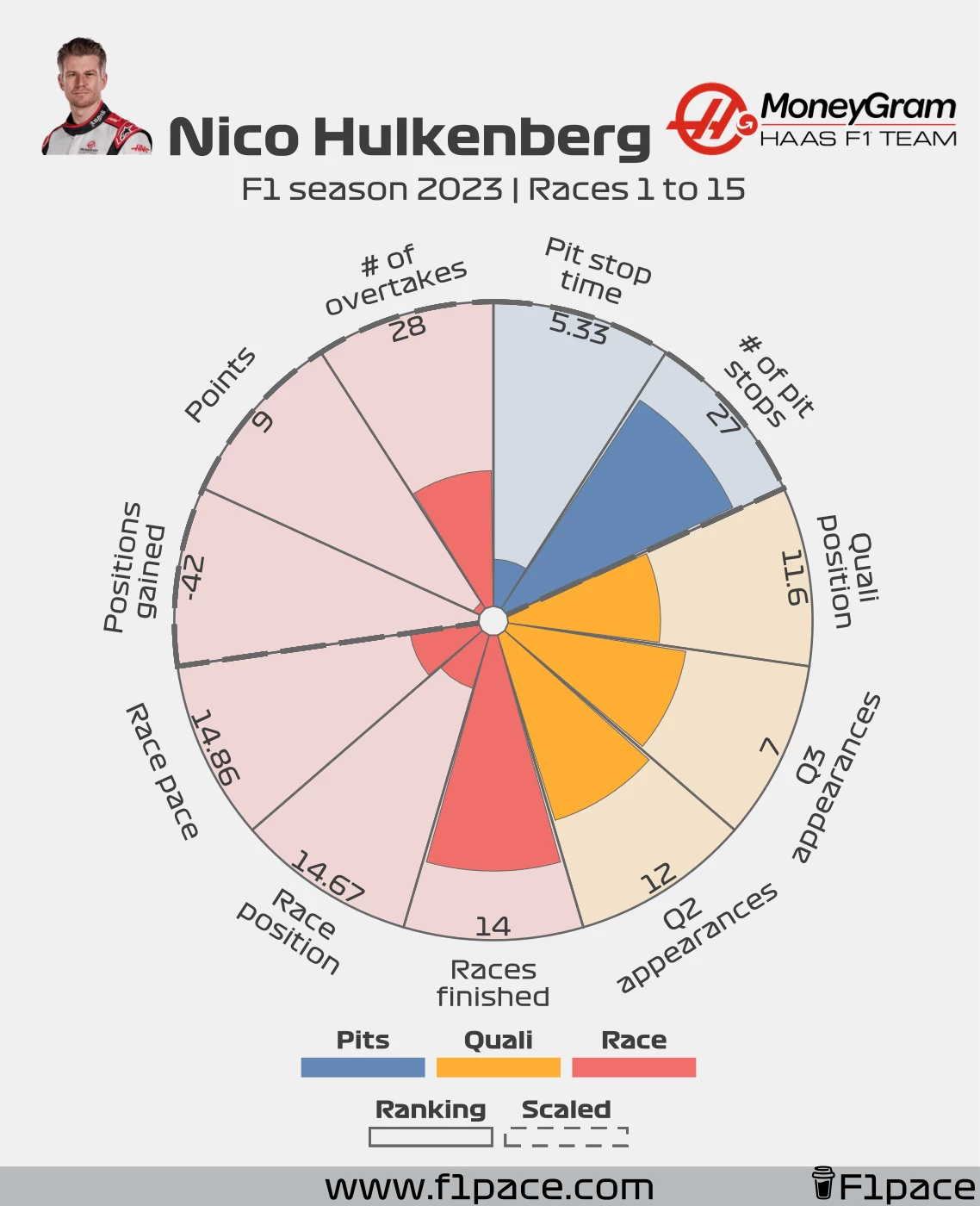
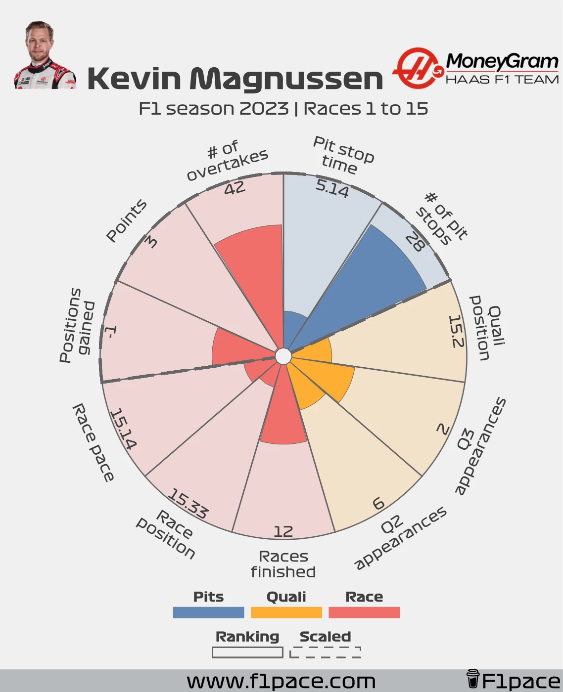
Haas
Categories
- Pit stop time: It represents the average pit stop time for each driver. Lower pit stop times will be represented with a fuller bar.
- Number of pit stops: It represents just that. In this case, more pit stops result in a higher bar. This one isn’t better or worse since it’s highly dependent on race strategy. I just chose to put it like this but more or less is not important.
- Quali position: Average quali position of each driver.
- Q3 appearances: Total number of Q3 appearances.
- Q2 appearances: Total number of Q2 appearances.
- Races finished: Number of races finished.
- Race position: Average race position of each driver.
- Race pace: Average ranking of the race pace for each driver.
- If a driver was the fastest in all races, his ranking would be #1.
- If a driver was the slowest in all races, his ranking would be #21 (due to the driver swap in AlphaTauri).
- Positions gained: Total number of positions gained for each driver. A position gained is just the starting position minus the finishing position.
- A driver who started 1st and finished 2nd would have a total of -1.
- A driver who started 3rd and finished 1st would have a total of 2.
- Points: Total number of points for the current season.
- Number of overtakes: Total number of overtakes for each driver. It only includes overtakes and doesn’t consider if they were overtaken.
Additional explanation
- The bars that have the “ranking” denomination—meaning the ones with a thin, solid line—are represented based on the cumulative distribution function, which works by representing the proportion of all values less than or equal to the current rank. So for example, the driver with the most races completed will have a rank of 100%, meaning he’s the best in that category. In this case, the bar will look 100% full. If more than one driver had the same rank, they will also have a 100% ranking in this bar and will be for the #1 position.
- If there are no ties, then 100% is divided by 21—and in this case, the result is 4.7619—and each driver is assigned a number from 0 to 100% in intervals of 4.7619%.
- Rank #1 = bar height of 100%.
- Rank #2 = bar height of 100% - 4.7619% = 95.2% (rounding!).
- Rank #3 = bar height of 100% - (4.7619% * 2) = 90.5% (rounding!).
- …
- Rank #20 = bar height of 100% - (4.7619% * 20) = 4.7619% .
- If there are no ties, then 100% is divided by 21—and in this case, the result is 4.7619—and each driver is assigned a number from 0 to 100% in intervals of 4.7619%.
- The bars that have the “scaled” denomination—meaning the ones with a thick, discontinuous line—have been scaled from 0 to 100%.
- For example, check the points bar. If a driver has 200 points and he’s leading the championship, those 200 points equal a bar height of 100%.
- A driver with 100 points would then have a bar height of 50%.
- A driver with 50 points would have a bar height of 25%.
- The same for all the other drivers.
- For example, check the points bar. If a driver has 200 points and he’s leading the championship, those 200 points equal a bar height of 100%.
Caveats
AlphaTauri changed driver mid-season, so not all drivers will have the same amount of races. For Tsunoda, all the categories are valid as long as he finishes the entirety of the season. In the case of the drivers with fewer races, most categories can’t be compared with the rest of the grid. The following categories, however, are still representative for all three drivers:
- Race position.
- Race pace.
- Quali position.
- Pit stop time.
Final remarks
I hope you are enjoying the content. This is something that I wanted to post a long time ago but never had the time/energy to do it. I’m happy that it’s finally here though. As usual, if you like the content, please share it on social media. If you want to support me you can click on the “buy me a coffee” button below to give me a donation that will go directly to cover the costs of keeping this website running.