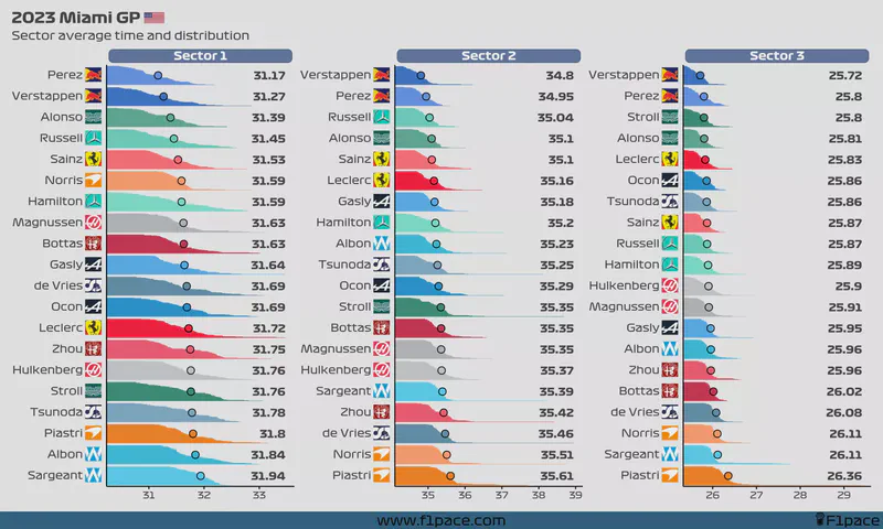
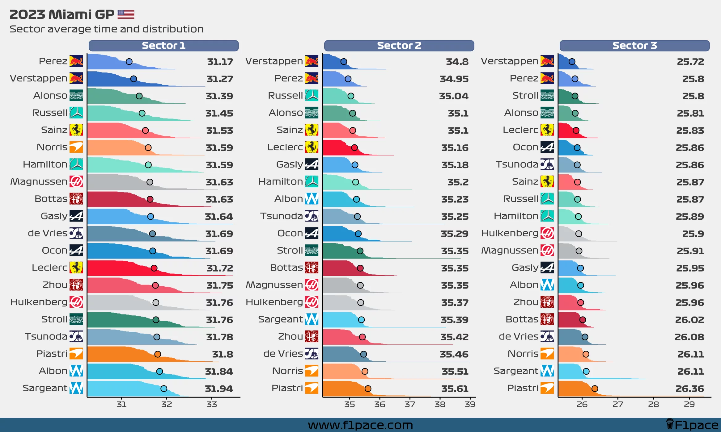
I’ve decided to bring back this chart. I’m motivated at the moment so I might as well take advantage of this extra energy. Enjoy.
Sector times
The chart looks pretty funky, but you can read it like this:
- The number on the right side shows the average sector time for each driver.
- This number corresponds to the big dot that is showed in each of the bars.
- Each bar is divided by all the laps done by each driver. This is another way of showing the distribution instead of just the average (like a typical bar chart would do).
- Longer “mini-bars” show laps in which a particular driver had a slower sector time. Shorter “mini-bars” represent laps in which a driver had a faster sector time.
- If a driver’s name is red-colored, that means that the driver completed less than 70% of the race distance.
Note
The axis is different for each sector time. This is only done to better show each sector time. Think of this chart as 3 separate charts instead of a single one with 3 divisions.