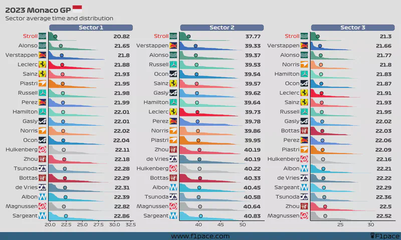
I’ve decided to bring back this chart. I’m motivated at the moment so I might as well take advantage of this extra energy. Enjoy.
Sector times
The chart looks pretty funky, but you can read it like this:
- The number on the right side shows the average sector time for each driver.
- This number corresponds to the big dot that is showed in each of the bars.
- Note that the chart removes the outliers, but the text on the right side calculates the mean sector time including the outliers. In some rare situations the dot and the number won’t match, and in that case the best representation of each sector time is the text and not the dot.
- Each bar is divided by all the laps done by each driver. This is another way of showing the distribution instead of just the average (like a typical bar chart would do).
- Longer “mini-bars” show laps in which a particular driver had a slower sector time. Shorter “mini-bars” represent laps in which a driver had a faster sector time.
- If a driver’s name is red-colored, that means that the driver completed less than 70% of the race distance.
STROLL!!!!
Lance Stroll damaged the car before the rain arrived, so he didn’t do laps when the track was wet and slow. He was not the fastest in any sector, unless you decide that he was, in which case I won’t argue with you (but you’re wrong).
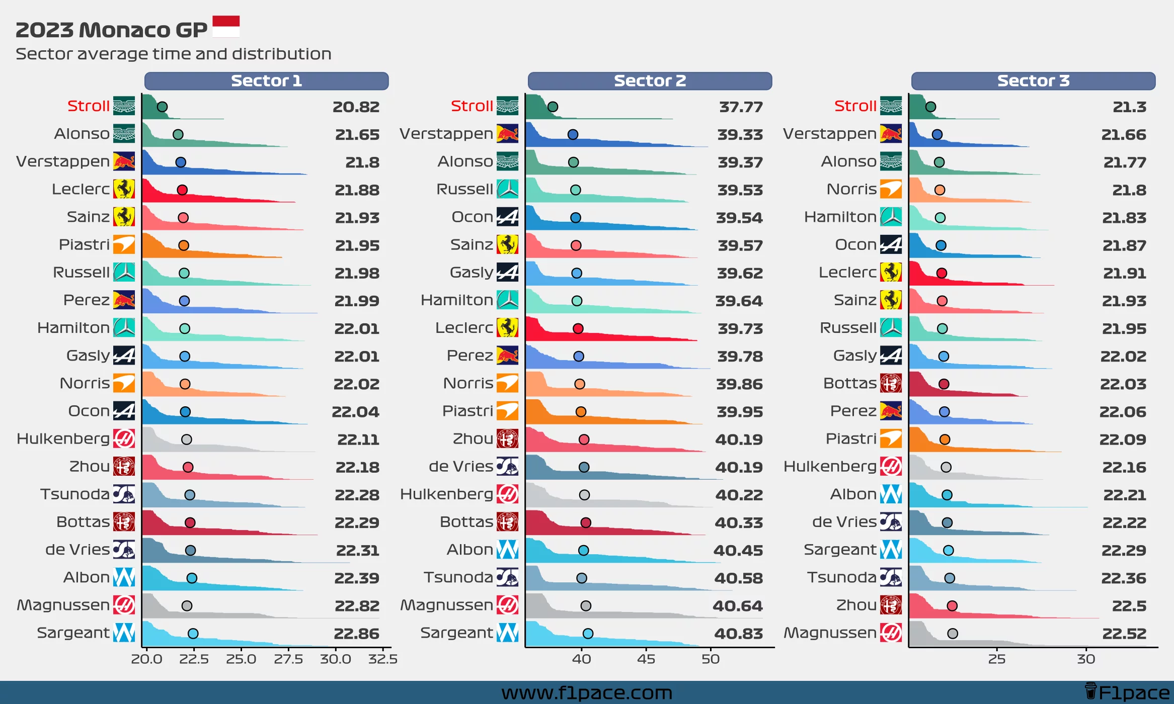
Note
The axis is different for each sector time. This is only done to better show each sector time. Think of this chart as 3 separate charts instead of a single one with 3 divisions.