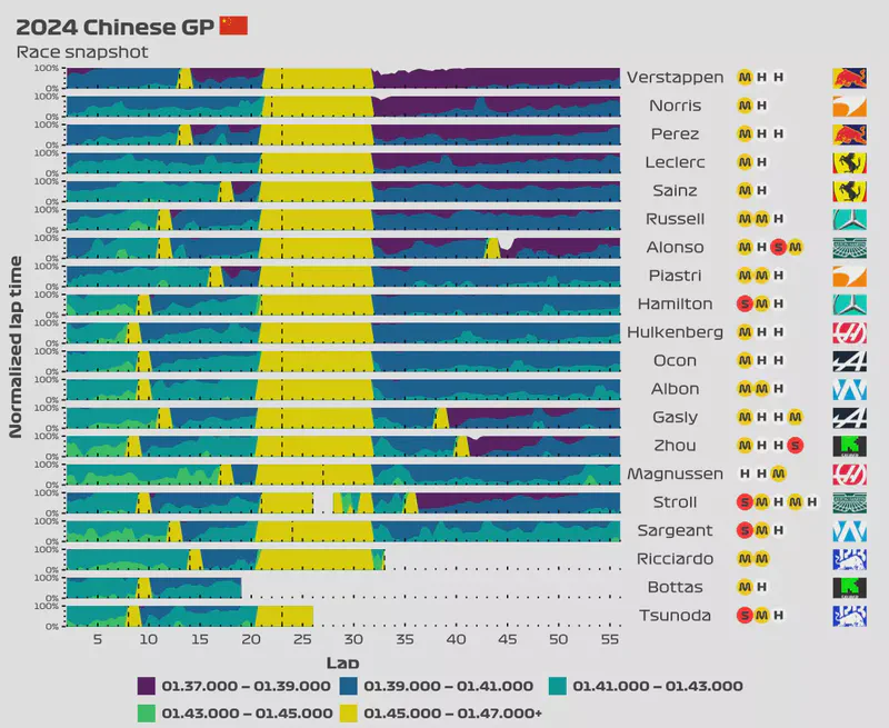
I have a new addition to the blog. I have always wanted to see a chart that shows a quick overview of a race, but this is pretty hard to do since each race has 20 drivers and dozens of laps. Due to the sheer magnitude of data, the plot tends to become messy and unreadable. However, I think I just came up with the right visualization chart that will allow me to show you a quick snapshot of a race.
Race snapshot
Horizon chart explanation
The horizon chart is a great way of displaying a quick overview of an event that contains a large amount of data. It’s hard to explain how a horizon plot is created, but the following image does a great job at showing how the computer creates a horizon plot.
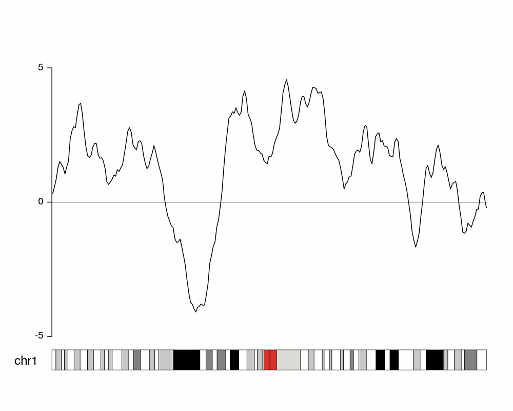
A horizon chart is created by slicing the data into equal intervals, associating each interval with a colour, and then overlapping these segments into a single interval.
A horizon chart can be read the following way:
- Select a driver
- Choose the lap(s) that you are interested in and see which colour is displayed in the foreground of that lap(s).
- The colour will determine the lap time interval, usually in 2-second intervals, but it depends on the plot.
- If more than one colour is displayed, then remember that the colour that determines the interval is only the one in the foreground.
- See what’s the height of the area based on the y-axis. The height can go from 0% to 100%.
- Determine the approximate lap time from the combination of both the colour (lap time range) and area height (0 to 100%).
- Example: If the foreground is dark purple and that corresponds to a lap time of 1:40.000 to 1:42.000, then we know right away that the lap had a time within that interval. If the area reaches the 50% mark, then we know that the lap time was 1:41.000 (50% of the higher-end of the range of 1:42.000)
- If the area reached a height of 25% instead of 50%, then the lap time would’ve been 1:40.500.
- If the area reached a height of 75% instead of 50%, then the lap time would’ve been 1:41.500.
- This can be applied to any area. You won’t get millisecond precision when looking at the plot, but you this chart is not intended to give you that anyway.
- The vertical, dashed-lines show pit stops.
The way you read a horizon chart is a bit unintuitive at first, but once you learn how to read it you’ll realize how much valuable information it can provide in a compact factor.
Note that this horizon chart has been modified to show the most valuable information, which is the regular lap times. Because of this, the lap times over a certain threshold will be displayed with the same colour regardless of the lap time. We lose a bit of detail here, but I find it worth it since this way we gain more granularity on the data that we’re interested in.