I came up with this analysis in my dreams. It was on the snowy afternoon of March 18. Just kidding, I didn’t come up with this idea in my dreams, or at least I don’t think so. Regardless, I think this analysis is pretty exciting. I decided to measure the curvature of each sector for each of the tracks of the 2024 F1 season and then plot each curvature against the quali sector times of each driver. My idea was to see if there were any patterns, for example seeing if certain drivers or teams were stronger or weaker in “flatter” sectors and vice versa, stronger or weaker in “curvier” sectors. Let’s see how that worked out.
Explanation
Sector curvatures
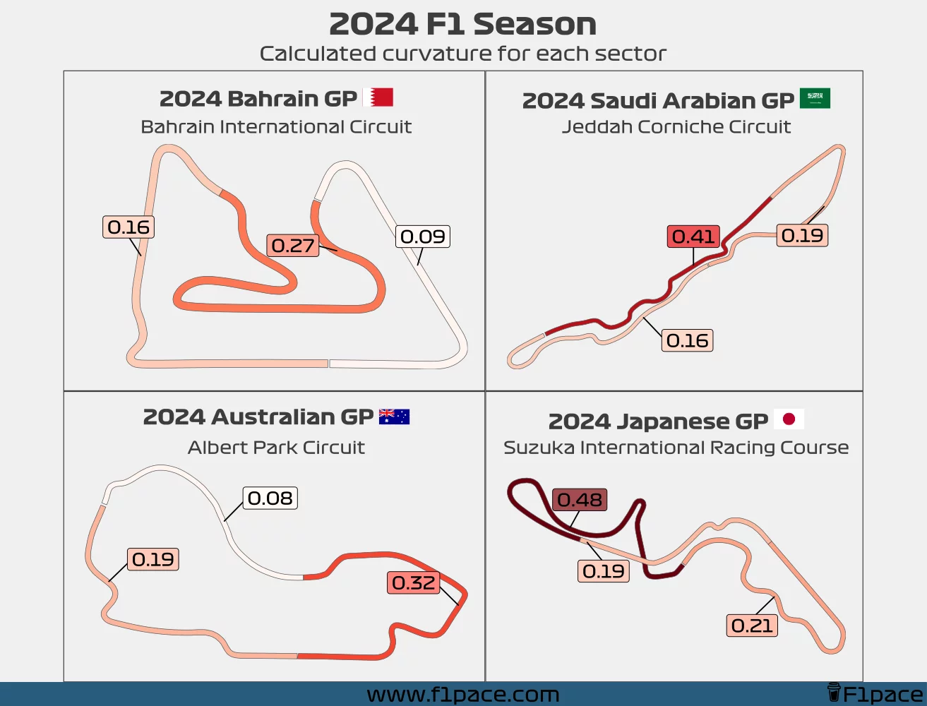
I won’t get into many details on how the track curvature was calculated, but it was done using mathematics so no, I didn’t just come up with these numbers. The curvature number goes from 0 (not curvy at all) to infinite (infinitelly curvy), although in reality most sectors will have a value of less than 1. All that matters in this case is that higher numbers mean that the sector has a higher curvature. The numbers was calculated additively, meaning that if a sector had a section with high curvature and then a section that’s straight, the number will still be high.
Surface plots
The second part of the analysis was related to the quali sector times. We can’t compare sector times with each other since each sector has a different length and characteristics, so I decided to do the following:
- Selected the best lap of each driver of each quali session done so far in the 2024 F1 season.
- This means that if a driver got through Q3, he had 3 laps that could be analyzed for that particular race. Three laps and three sectors per lap = 9 total sectors to analyze.
- Using this best lap, for each quali session and each driver, I extracted the three sector times.
- I calculated the average sector time based on all the collected sector times and then determined the symmetric percent difference by using the formula
$$ Symmetric\ percent\ difference = 100\times\frac{sector\ time - average\ sector\ time}{sector\ time + average\ sector\ time} $$
- Lower values mean that the sector time was faster than average, while higher values mean that the sector time was slower than average.
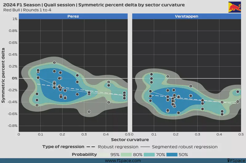
- I then plotted the dots on a chart with the x-axis representing the calculated curvature values for each sector, and the y-axis showing the calculated symmetric percent difference.
- To make the chart easier to interpret—and cooler to look at—I added a surface geometry, which shows the regions of the calculated distribution.
- The regions are called high-density regions and represent the probability of a data point being inside the calculated region.
- For example, if we calculate the 50% density region then we would expect to see 50% of the data points inside of this region.
- The main idea behind this plot is to show if, based on the calculated percent deltas, a driver is performing better in curvier or straighter sectors.
- Additionally, I added two regression lines to each plot. The robust regression is like any other linear regression line, but more robust to outliers. The segmented robust regression works the same way as the robust regression but has additional flexibility and it can be split into segments to better represent the trends of the data.
- If the line has a positive slope—meaning that it is higher on the right side of the plot than on the left one—it means that the driver has shown better performance in curvier sectors compared to straighter sectors.
- If the line has a negative slope—higher on the left side of the plot than on the right one—then that driver was generally stronger in straighter sectors in comparison to curvier sectors.
- Finally I added the round number for some of the points that could be considered outliers. In this case, 1 refers to the Bahrain GP, 2 to the Saudi Arabian GP, etc.
To make the analysis more manageable to you, the reader, I decided to split the teams into the top 5 and bottom 5 teams. The top 5 teams are organized in order of strength (based on my opinion), while the bottom 5 are organized alphabetically.
Analysis
Top 5 teams
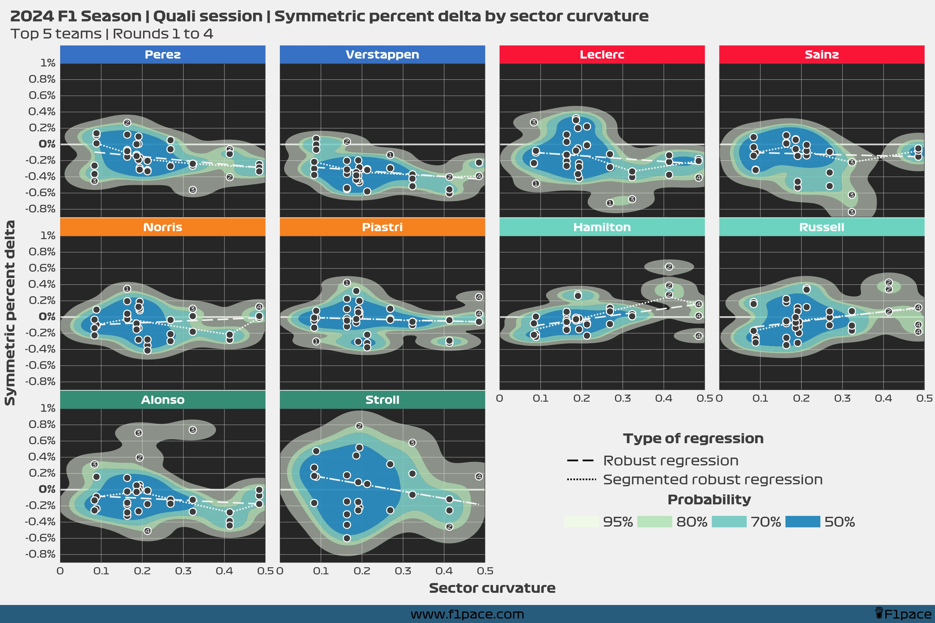
We can see some insightful trends for the top teams as of round 4 of the 2024 F1 Championship. Clearly, Max Verstappen seems to be strong regardless of the sector characteristics. He has only posted three sector times that are slower than the average from a total of 36 analyzed sectors. Both Max and Sergio seem to be stronger in curvier sectors than in straighter sectors. Still, they both are consistently strong regardless of the curviness of each particular sector.
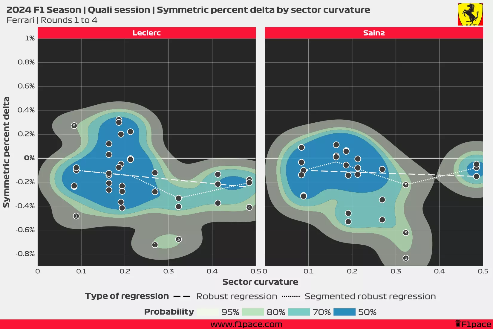
Ferrari as a team has a similar trend, with both Leclerc and Sainz being faster in curvier than in straighter sectors. They, however, have been consistently slower than the Red Bull drivers, with Leclerc having struggled more to put the lap together during quali.
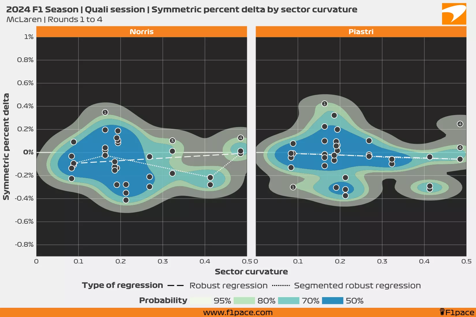
McLaren shows a different story, with Norris being quite consistent regardless of the sector type, but looking a tad stronger in sectors that are neither straight nor curvy. Meanwhile, Oscar Piastri’s regression shows a flat line, which means that on average Piastri has been just as strong in straight and curvy sectors.
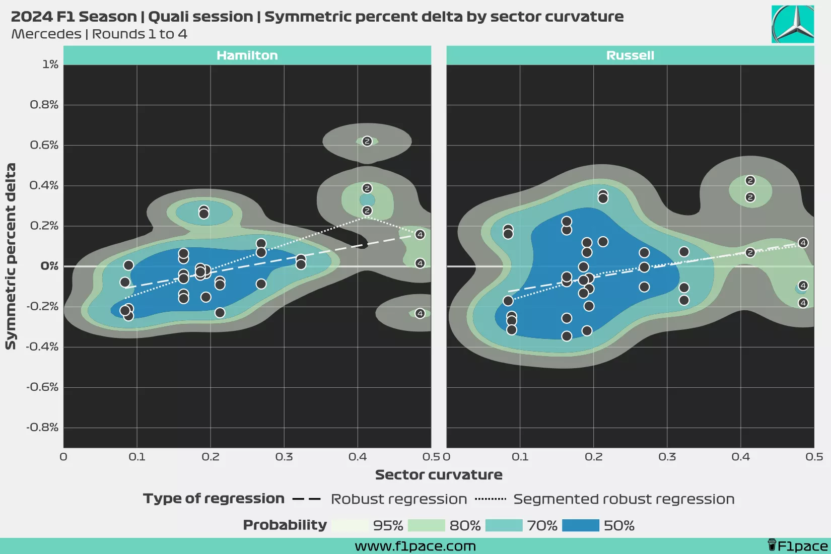
The trend found at Mercedes is very interesting. Both Lewis and George appear to be stronger in straighter sectors, with the trendline showing that the curvier the sector, the slower they are relative to the average sector time. However, the data is still quite limited. Knowing that both drivers struggled in the first sector of the Jeddah Circuit, it may be a bit early to draw definitive conclusions.
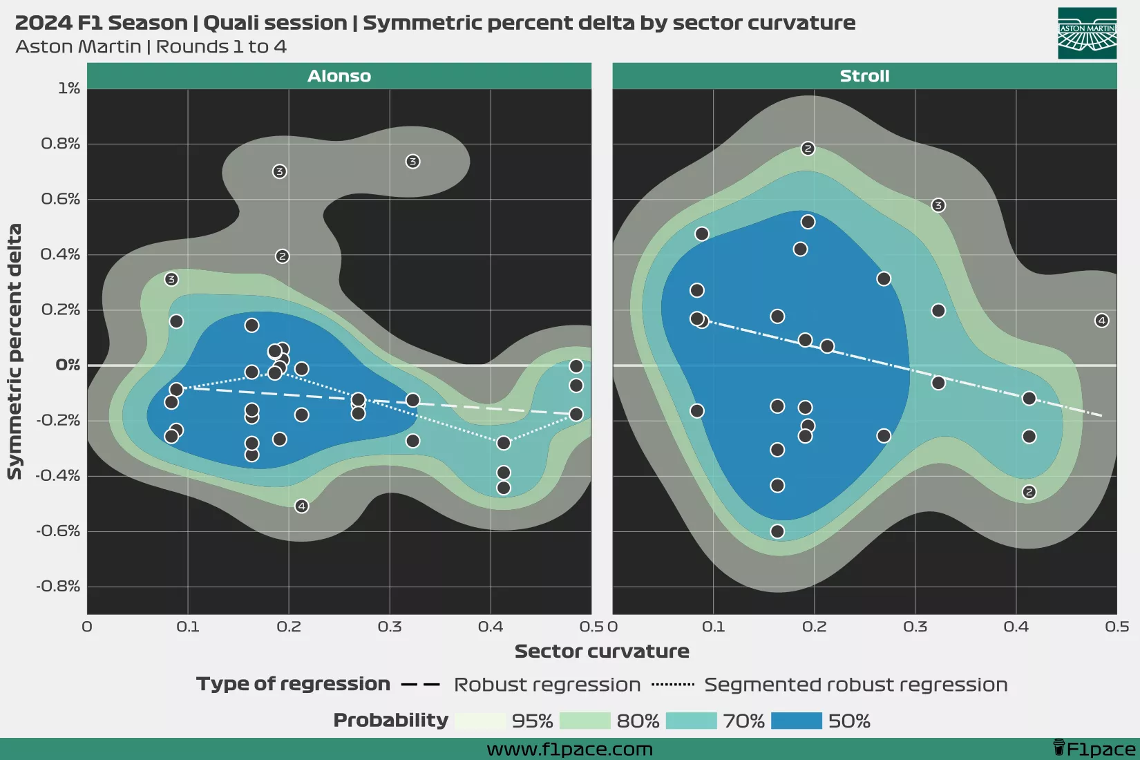
At Aston Martin, we see two completely different stories. Fernando Alonso has been generally strong regardless of the sector, although he comparatively struggled more at the Albert Park Circuit than at the other tracks. Lance Stroll is the only outlier among the 10 drivers analyzed in this chart. Lance has been slower than all of the other drivers, and the calculated distribution shows a wide spread of the data points, which means that while he has had some strong sector times, he also has had some very poor sector times.
Bottom 5 teams
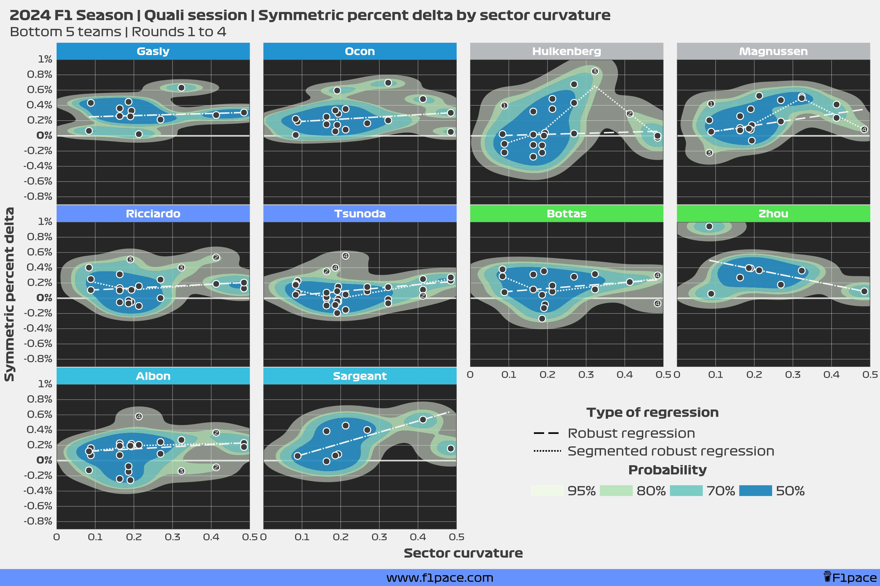
Weaker teams seem to be stronger in straighter sectors than in curvier sectors. You can see this just by looking at the regression lines, which generally show an upward trend. This may be due to them not having as good of an aero package compared to stronger teams, so they instead compensate by having a faster straight-line speed.
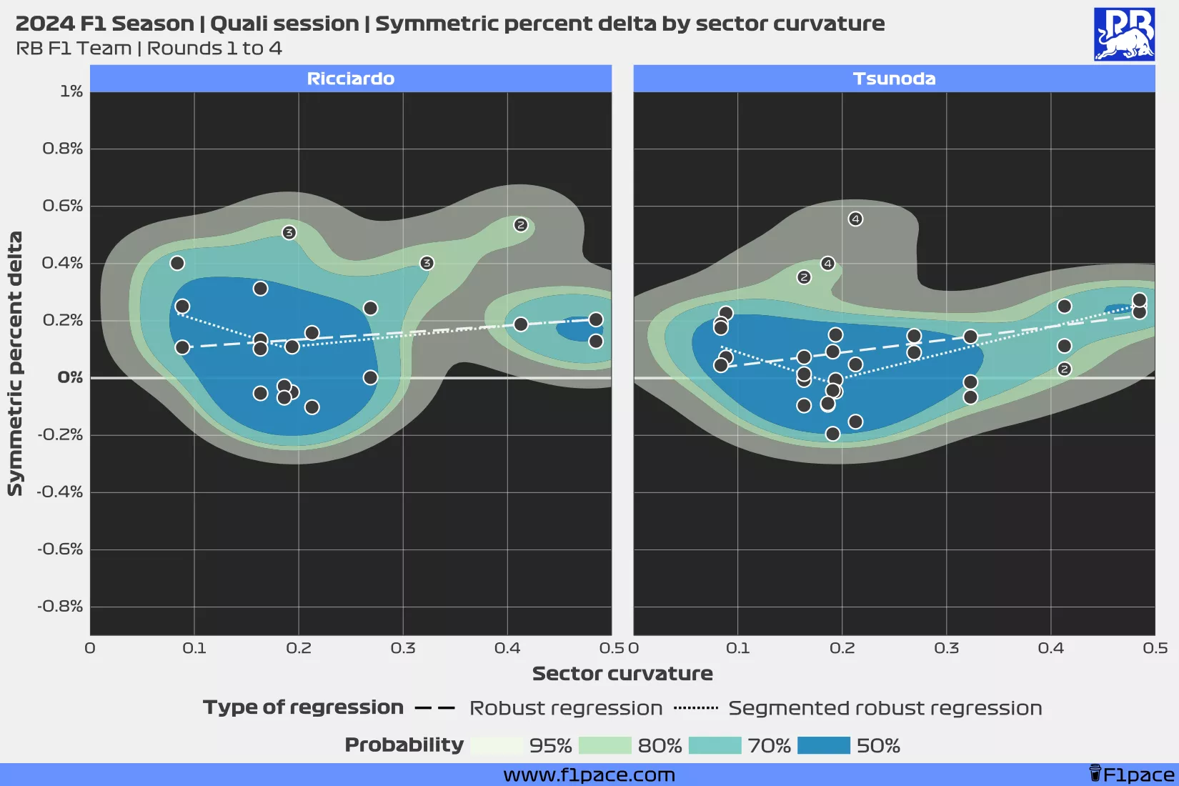
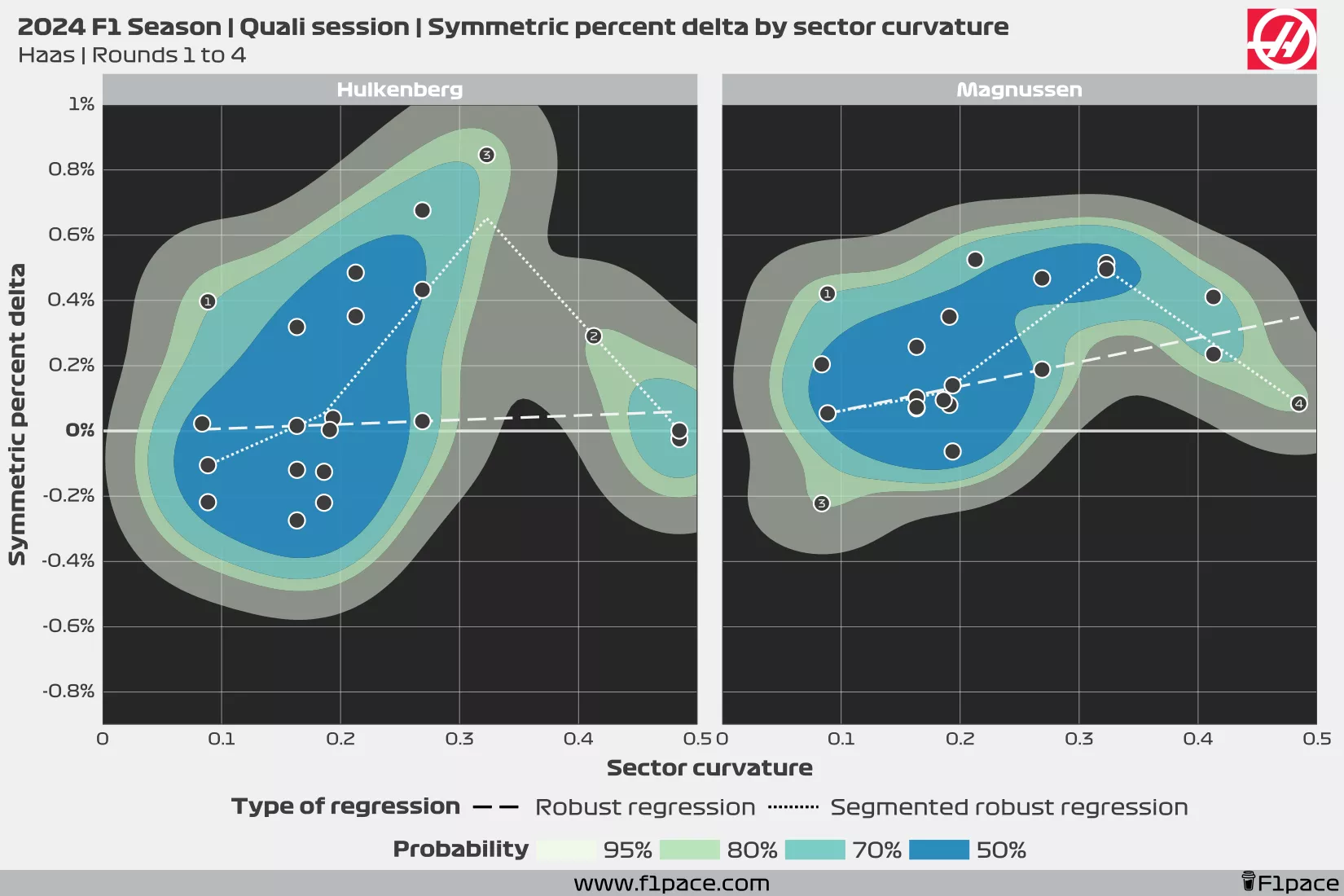
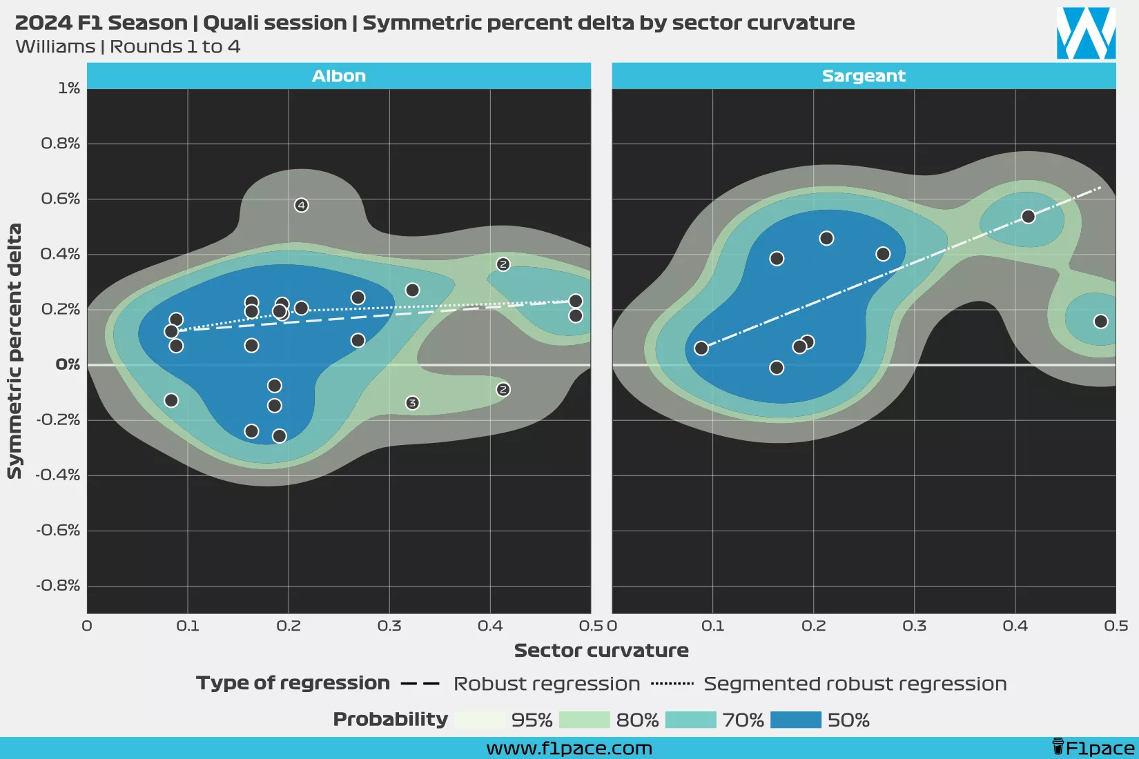
So far, Albon, Hulkenberg and Tsunoda look like the stronger 3 qualifiers from the bottom 5 teams. Both Albon and Tsunoda have been quite consistent regardless of the sector characteristics. Hulkenberg, on the other hand, has a wider performance spread, which means that at times he has been slower than the average. This is perhaps a bit exaggerated since he qualified to quali 3 on the first race of the season and his sector times were compared to the times of the stronger drivers of the grid.
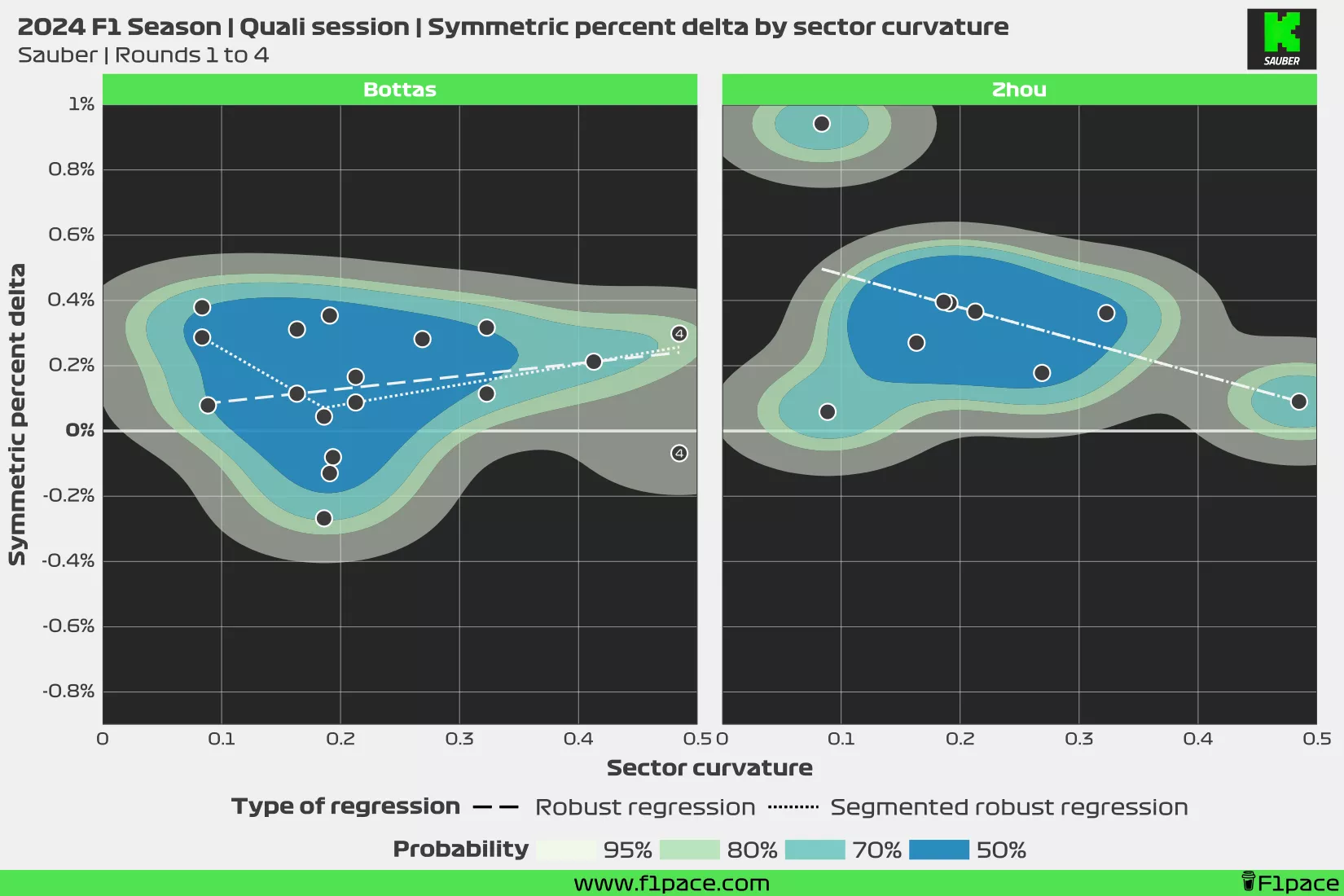
Both Sargeant and Zhou have struggled badly regardless of the sector. Sargeant has only been slightly faster than average in a single sector so far, while Zhou has been slower than average in every sector of all of the quali sessions he has participated in.
Detailed performance
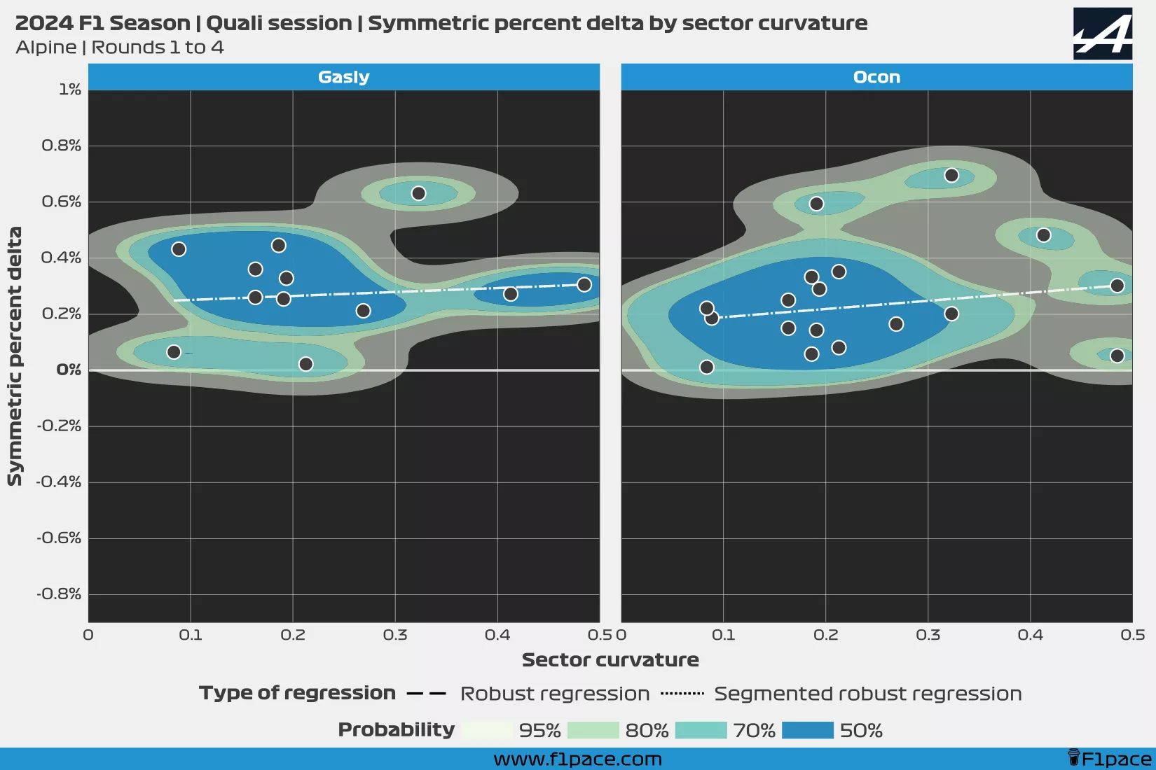
If you’re interested in seeing each chart in more detail, just take a look at the following charts. They show the same information that has been shown in the previous two charts, but since these charts are bigger and less crowded, it shouldbe easier for you to analyze the data.

Final remarks & support me
I hope you have enjoyed this analysis. This one is perhaps more complex than the ones that I usually make, but I think it will provide very interesting information as the season goes on and we keep getting more data.
As usual, please share this post if you find it interesting. If you want to support me you can click on the “buy me a coffee” button to donate a bit of money to my cause. I’m the sole creator and maintainer of this project, so if you could support me in any way I would really appreciate it.