I recently saw a post on one of the most famous social media talking about tire degradation. This post seems to have gained traction, so I decided to take a look at it. I thought the post had interesting data, but at the same time, there were a couple of signs that made me doubt its validity. After thinking about it for a couple of days, I decided to do the same analysis with my methodology.
This is one of those analyses that takes more time than usual, so if you enjoy it, please consider making a donation to keep this project going. If your current financial situation doesn’t allow for it—trust me, I know about that—then please consider sharing this post with people that you think would be interested in it. Your support, no matter in which way, helps to keep this site alive.
Disclaimer
I’m not here to bash anyone. I’m 100% for people getting into data analysis and I always will be. Having said that, I’m a firm believer that data and its analysis should be fully transparent. Unfortunately, most analyses out there are not transparent at all, and it becomes quite hard to judge if the actual analysis is valid or not. Please, if you do data analyses for Formula 1 or any other subject, post your methodology, and let people know how you did it.
If you agree or disagree with this approach of using information from another analyst, please let me know in the comments below.
Original post
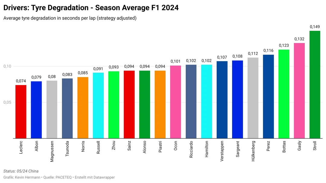
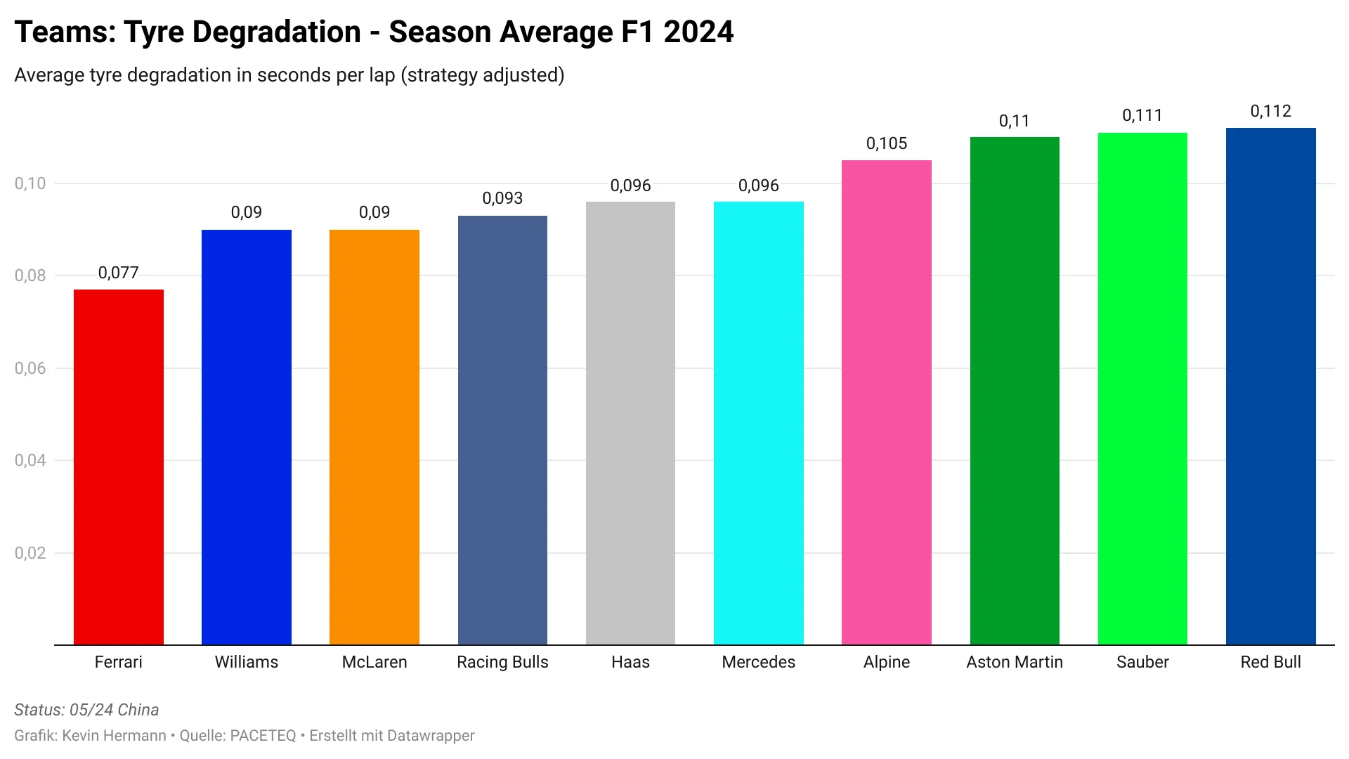
These are the two charts provided in the original post. The author is credited on the bottom-left side of each chart. I’m listing below some of the main concerns that I had with these charts.
- Many drivers have the exact same average degradation (0.094 three times for example)
- Same thing happens with teams (0.09 twice, 0.096 twice)
- The chart says nothing about tire usage, which will massively influence the results. If a driver uses the softs for more laps than the hards, then he may have additional tire degradation. That doesn’t mean he or the car is worse at keeping the tires alive, just that he used tires that are more fragile more often.
- The title says that the data was “strategy adjusted” without providing more information about what means.
- There is just no further detail. No information about how the chart was created, which data was used, how were the averages calculated, etc.
My analysis
Tire usage
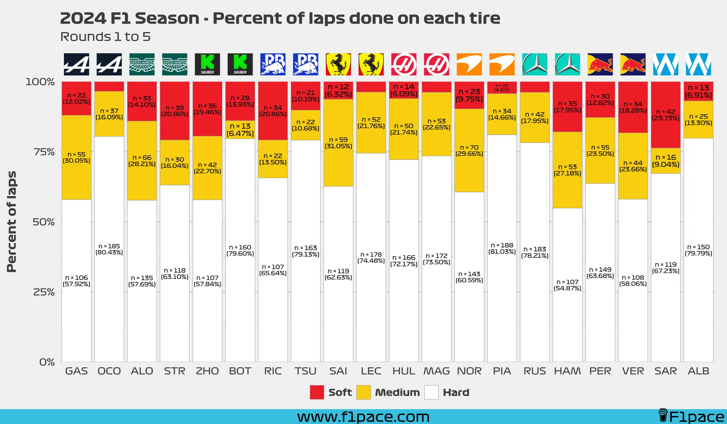
As I mentioned, one of my concerns was how tire usage would influence the results. I first decided to plot the distribution of tire usage for each driver. As you can see, most drivers rely mostly on the hard compound for the majority of their stints. Having said that, there are some significant differences among a few of the drivers. Take, for example, Esteban Ocon. He has driven the hard compound for over 80% of his laps, while Hamilton has only done it for around 55% of his.
It is crucial to consider the mentioned tire distribution when making a final conclusion
Tire degradation calculation
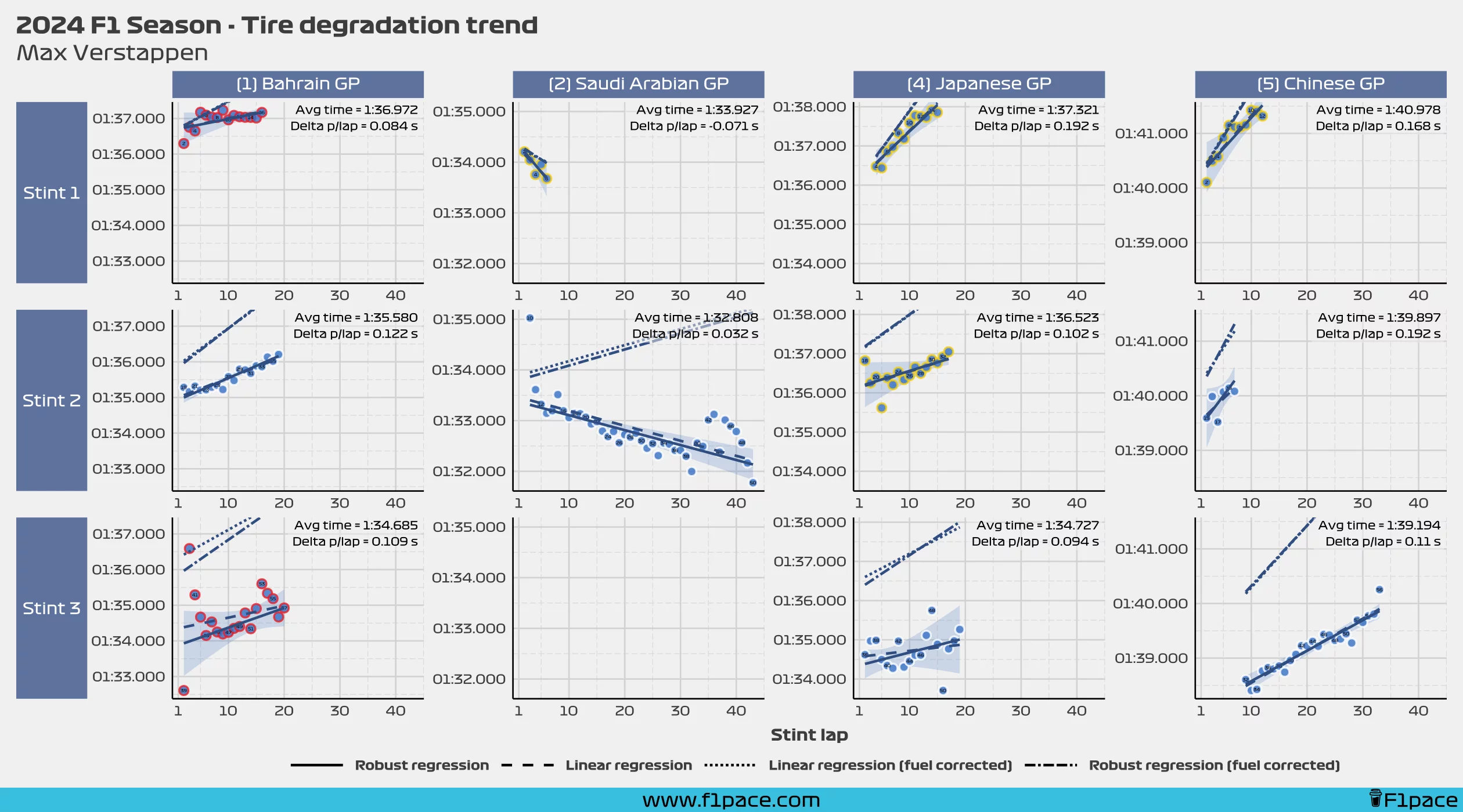
You may be wondering how I calculated tire degradation. Without getting into mathematical models, I will say that I used a robust linear model which fits the data properly without getting overly complex. The idea behind using a robust model instead of a simple linear model was to deal properly with outliers, which is one of the biggest weaknesses that the traditional linear model has. This model is displayed as robust regression (fuel-corrected) in the chart.
I usually model the data without creating fuel-corrected dependent variables mostly because I believe that the fuel correction is too basic and doesn’t really represent real life. Having said that, it’s clear to me that the original post contains fuel-corrected data. Because of this, I used a fuel correction of 0.03 seconds per kg of fuel and I assumed an initial fuel load of 100 kg. Data was corrected to assume that a car always keeps 100 kg of fuel throughout the race.
Weighted average degradation per tire
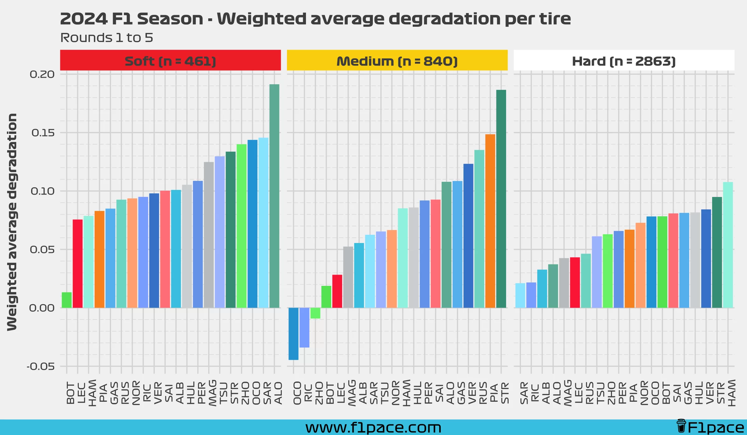
The original post said that the analysis corrected for strategy. I built a few models to try to do this, but the results were extremely underwhelming. In my opinion, there is not enough data to create a model flexible enough to deal with stint length properly. Because of this, I went with a simpler approach, which is to use a weighted average. The weighted average gives more weight to stints with more laps and less weight to stints with fewer laps. This means that a stint with 20 laps will be worth more for the average than a stint of only 5 laps. This will allow us to get results which properly value degradation based on the length of each stint.
As you can see, the data is quite varied depending on the tire that we select. Still, it is clear to me that the hard compound is the one that will most likely determine how much or how little tire degradation each driver and team had.
Weighted average degradation per driver
Ok, so to try to compare apples to apples I needed to get the average for each driver regardless of the tire used. This usually won’t be the right approach, but I have to do it to be able to compare both charts properly. Just as before, I did a weighted average, which gives more weight to longer stints.
Remember how I said that the tire usage distribution would affect the results? Well, I believe that the weighted average may solve that problem for us. While it is true that softer compounds will have more degradation, it is fair to say that the stints done on those tires will be shorter as well. Because of this, even though these stints will tend to show more degradation, they will also have less weight on the final calculation. Are these results 100% statistically unbiased? No, I don’t think they are, but they should be good enough for our analysis.
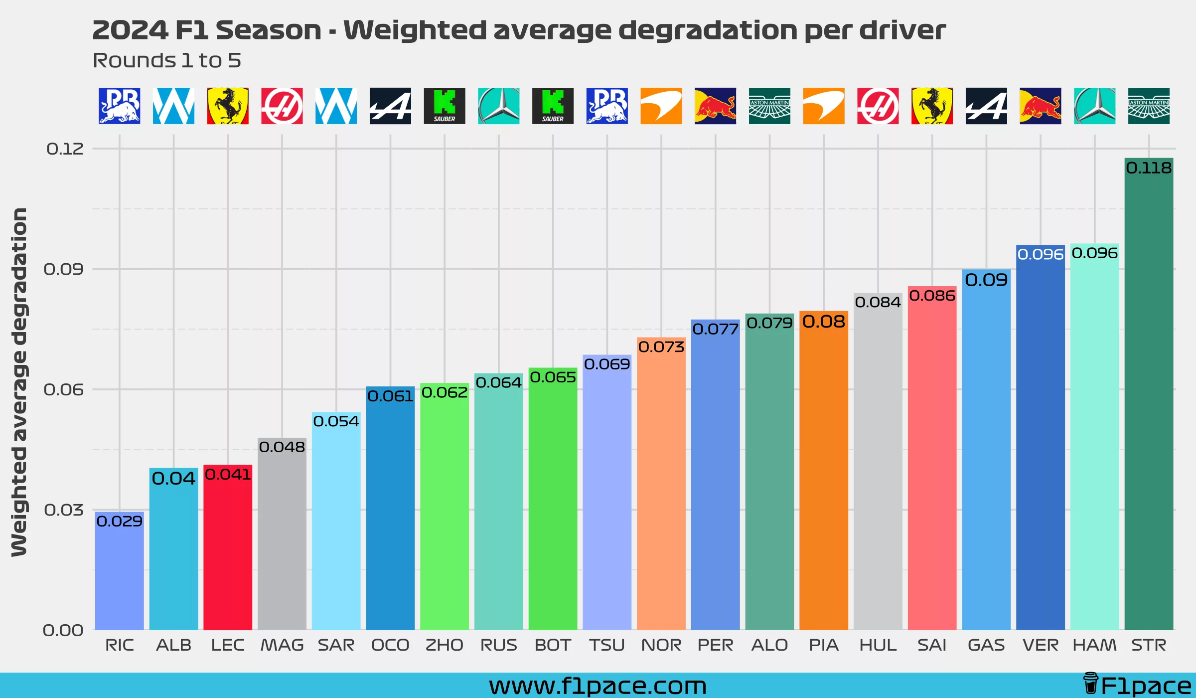
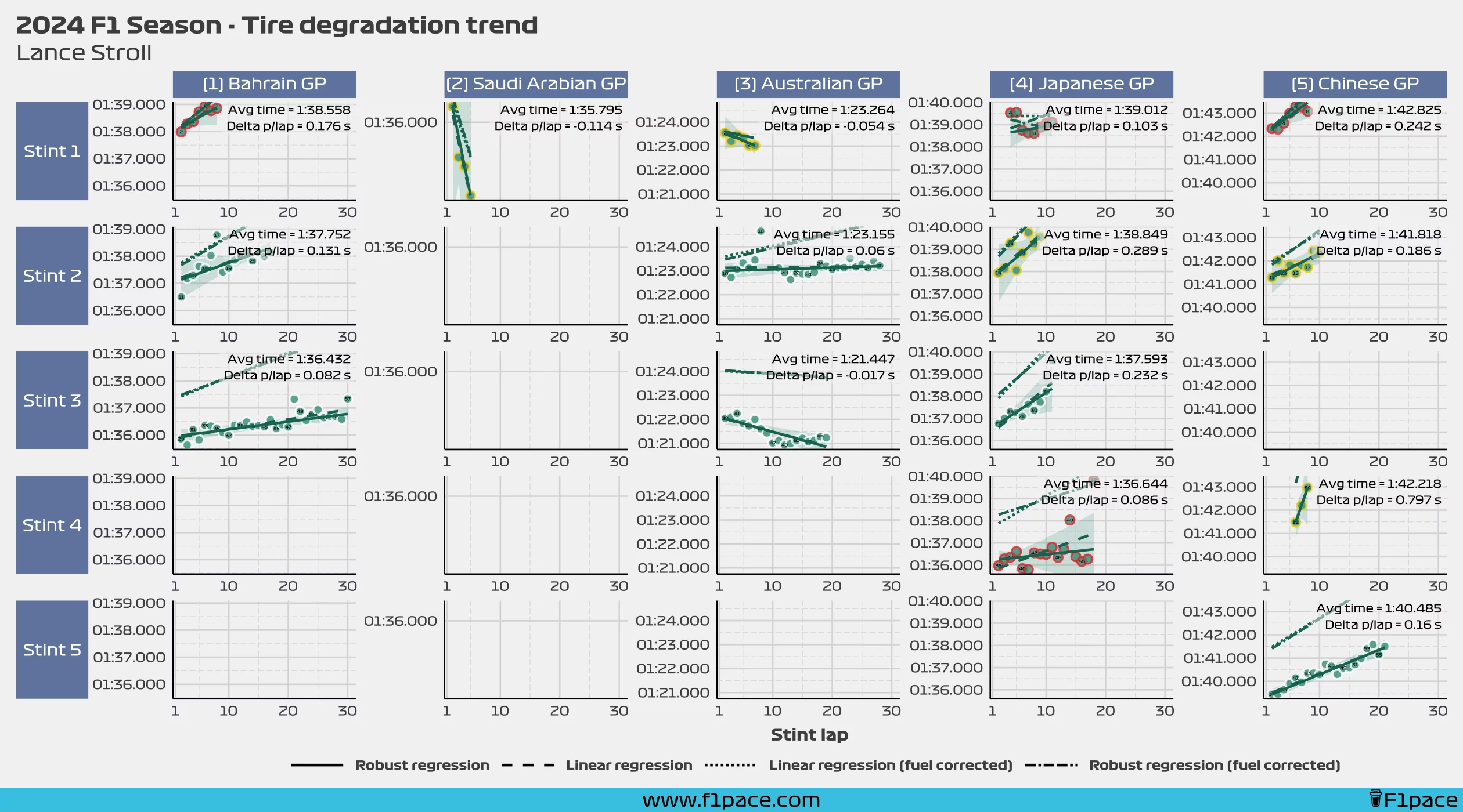
You can see the final result with Daniel Ricciardo leading the charts, albeit with one less race than many of the other drivers. On the other side of the spectrum, Lance Stroll is the driver with the worst tire degradation among all of the current F1 drivers.
It is important to consider that we’ve only had 5 races so far so retirements currently play a big role in the results. I think, however, that the results should stabilize after a few more races.
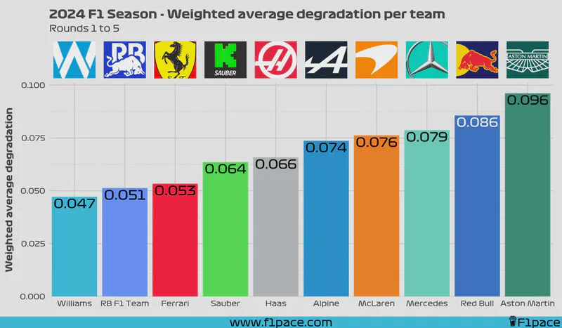
Weighted average degradation per team
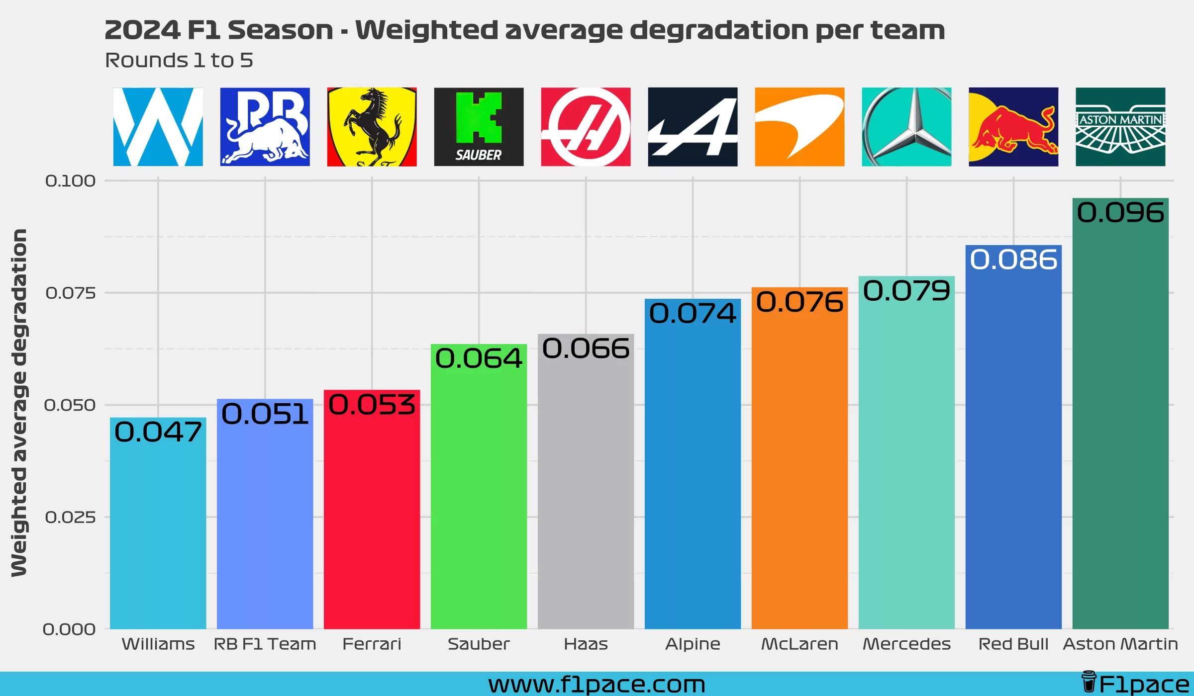
Just as before, we can calculate the data using weighted averages, but aggregating the results for each team. Based on my results, the best team so far at keeping the tires alive is Williams, closely followed by RB F1 Team and Ferrari. The worst teams in this aspect are Aston Martin and Red Bull. Yes, Red Bull hasn’t shown that they’re great at conserving the tires, but they are so fast that they have no need to do it. I think it’s a fair assumption to say that Red Bull can keep the tires alive if needed, but they haven’t been in that situation yet.
Comparison
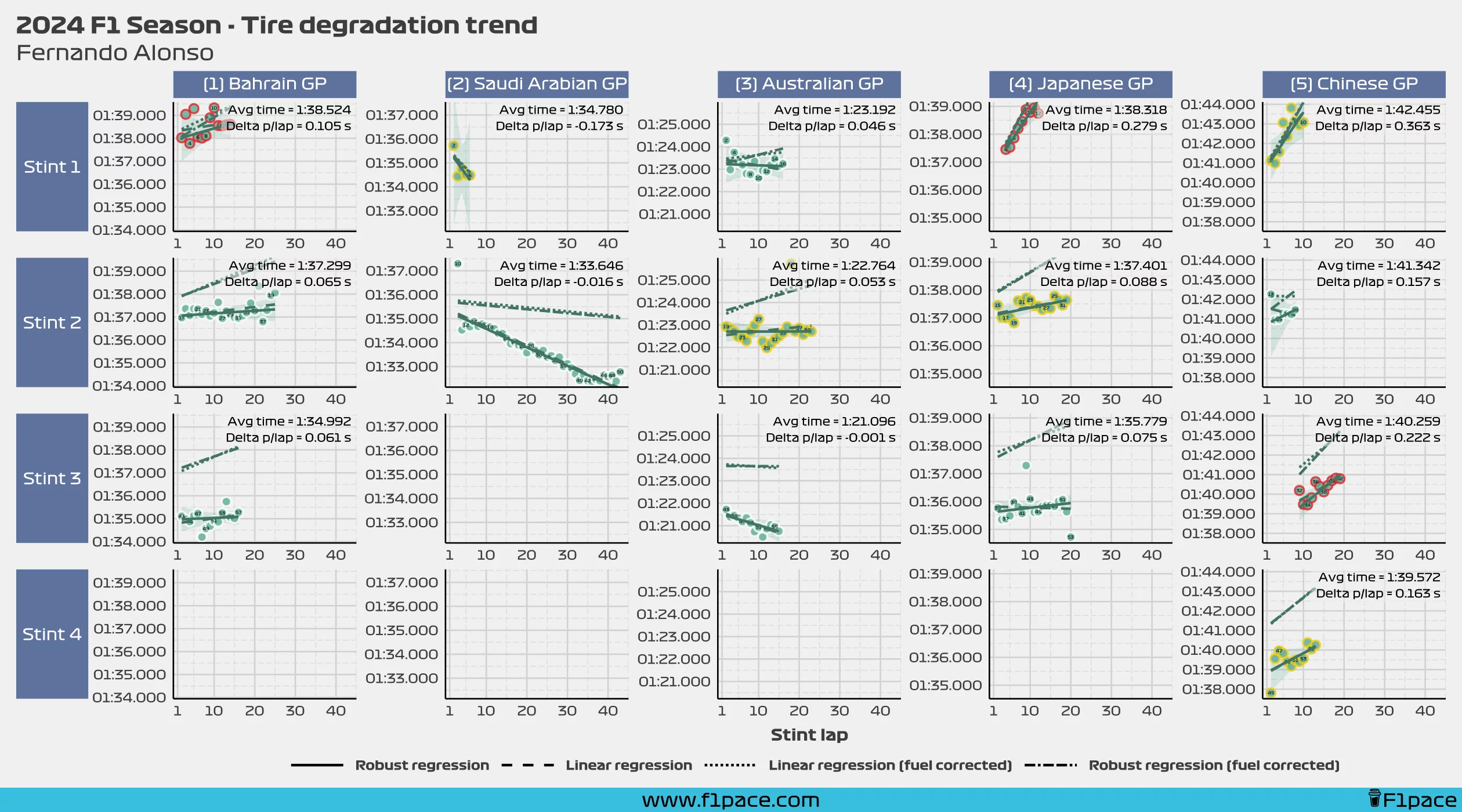
Why are the results so different? Who is right? Well, I don’t know. I don’t have access to the methodology used to create the analysis on the original post, so I can’t say if his analysis is correct or not. On my side of the court, I can tell you how I did the analysis and is up to you, the reader, to decide if the way I analyzed the data makes sense or not.
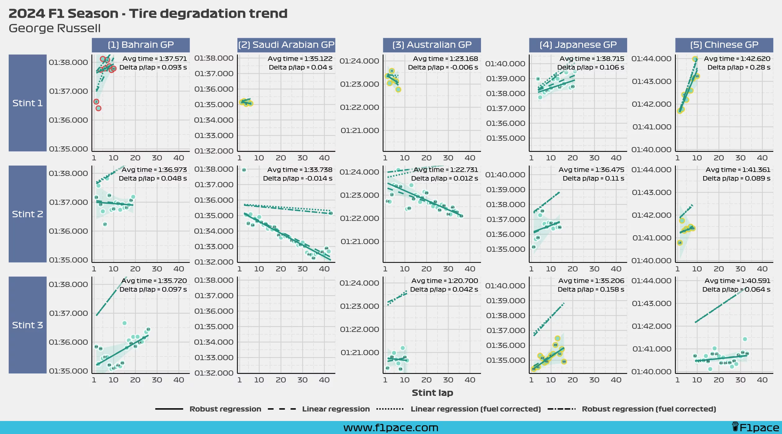
I find it quite interesting to see Daniel Ricciardo up next to Lewis Hamilton on the original chart provided by my fellow analyst. My results show a completely different outcome, with Daniel being the best in the tire management department, and Lewis being close to the bottom of the chart. Let’s take a look at the detailed data below.
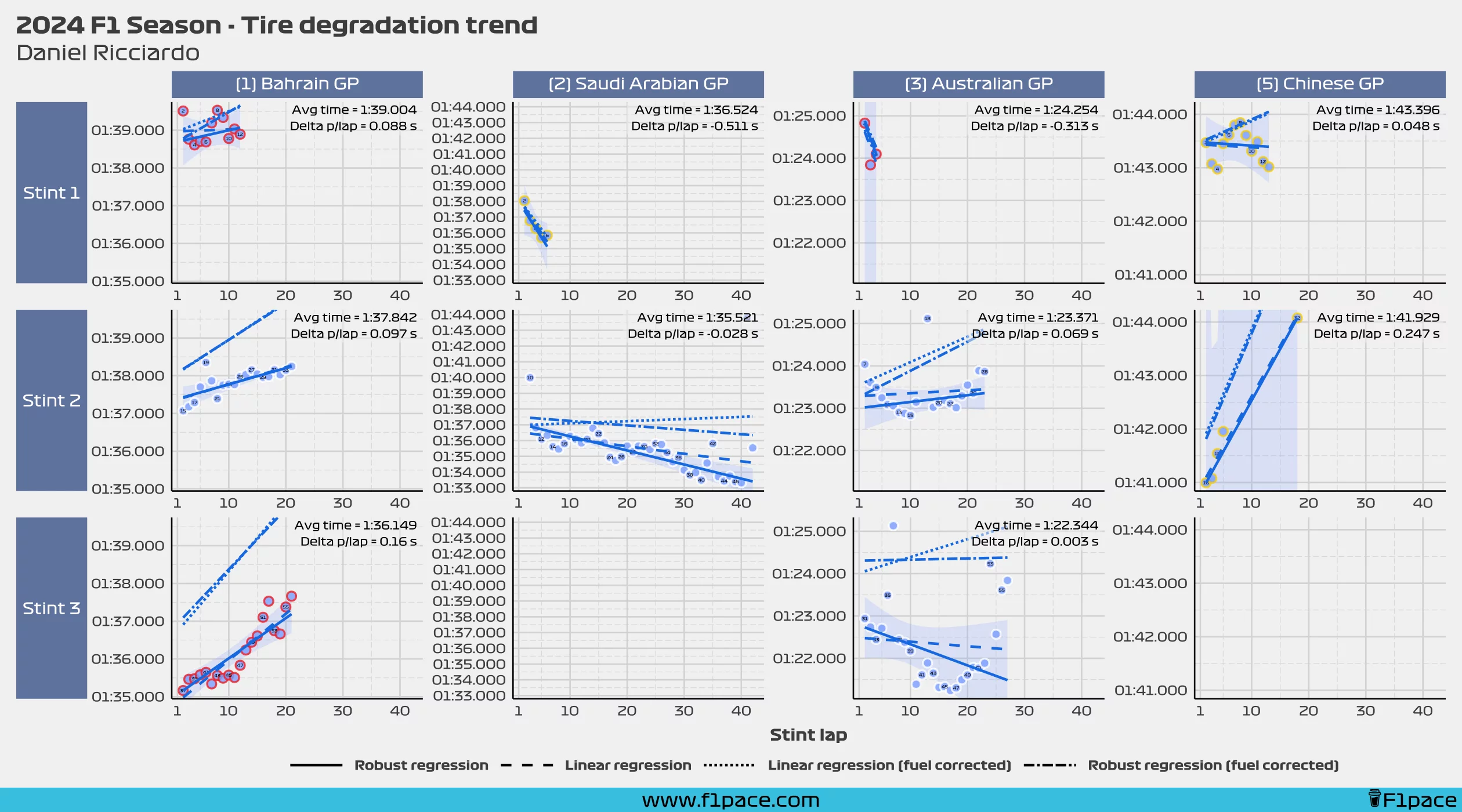
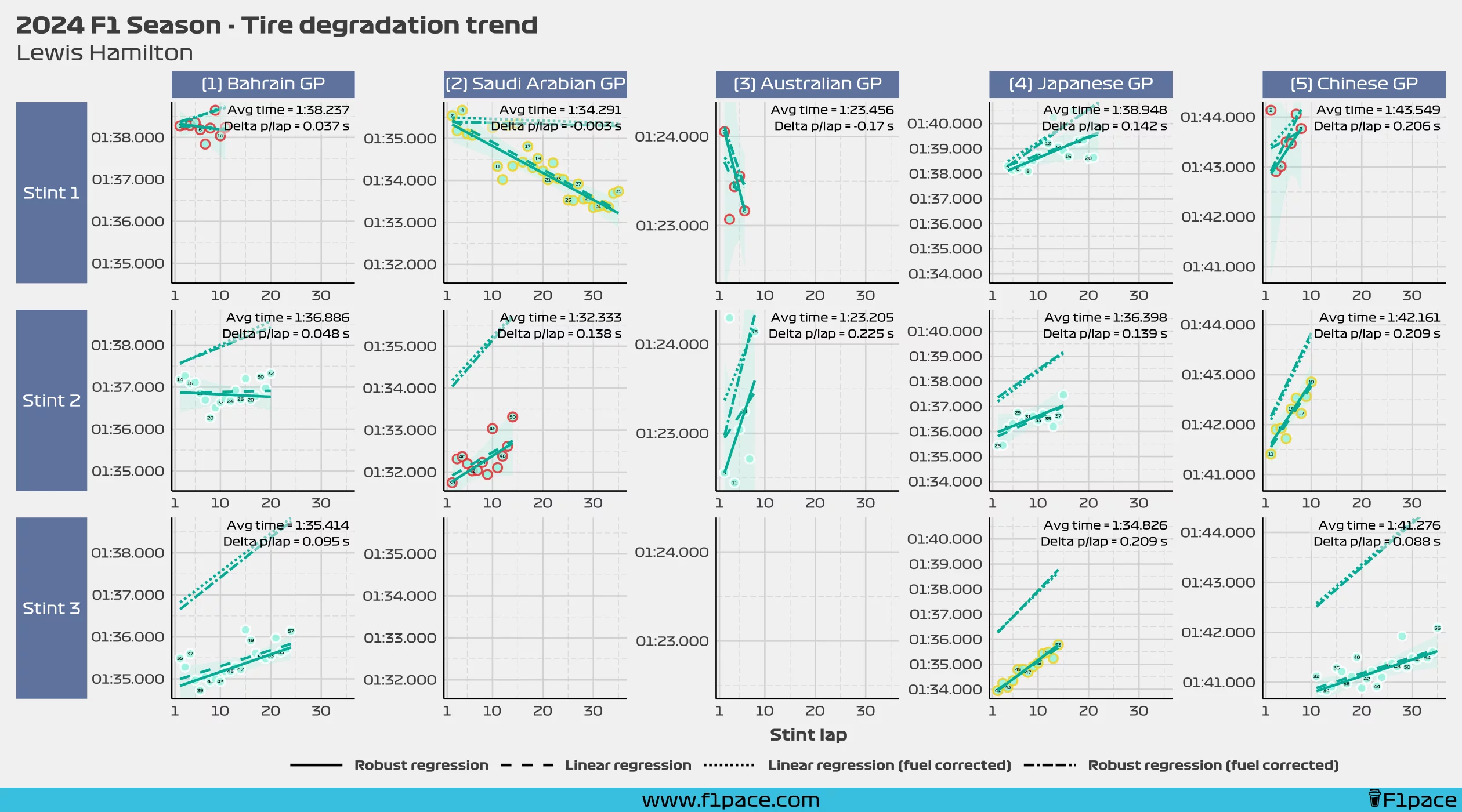
It’s clear to me based on the robust regressions that I created that Ricciardo has been better than Lewis in the tire management aspect. You can see how in Hamilton’s chart most of the fuel-corrected regression lines are quite vertical, showing that Lewis has struggled to keep the tires alive. It would be interesting to see how the other analyst reached his conclusion though.
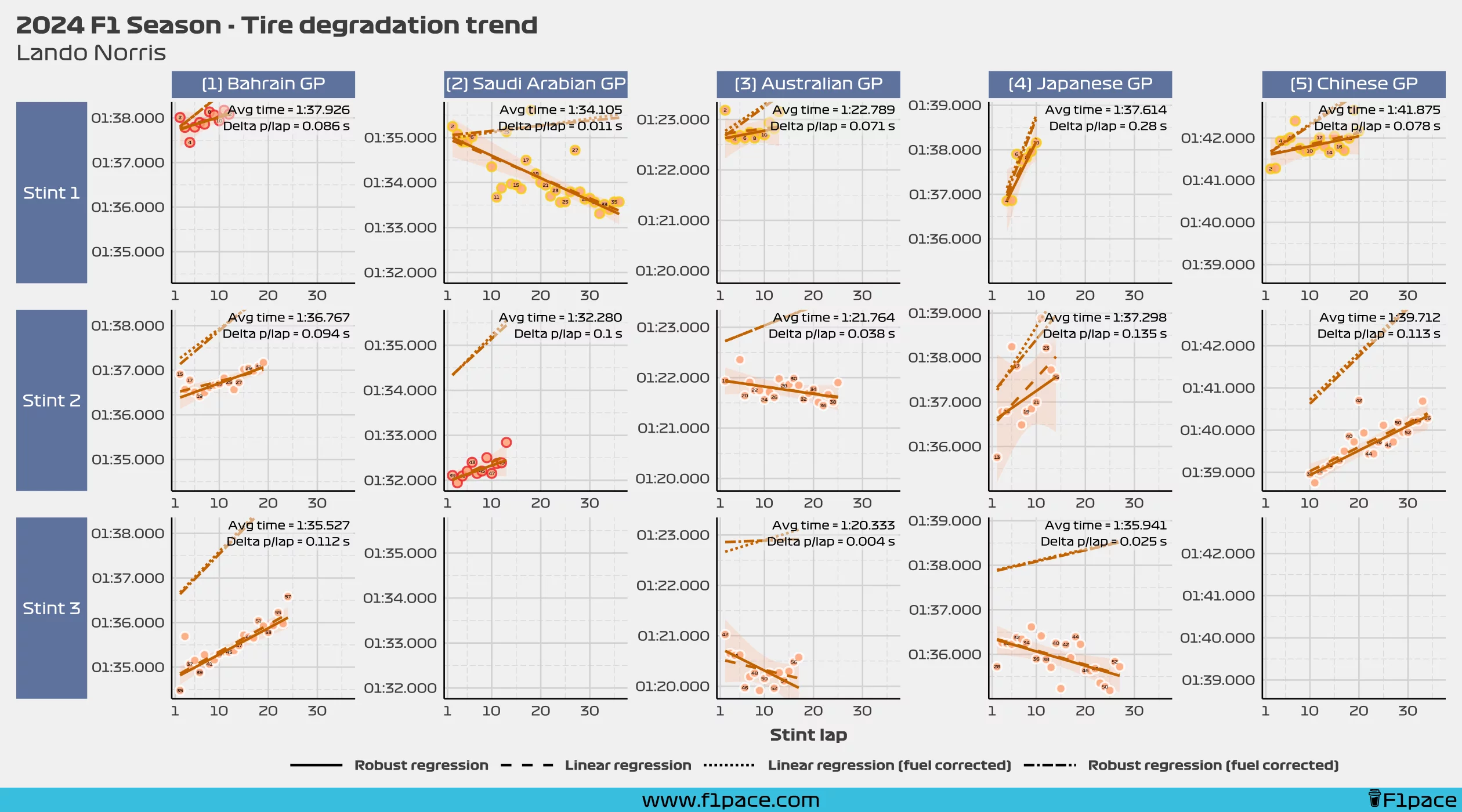
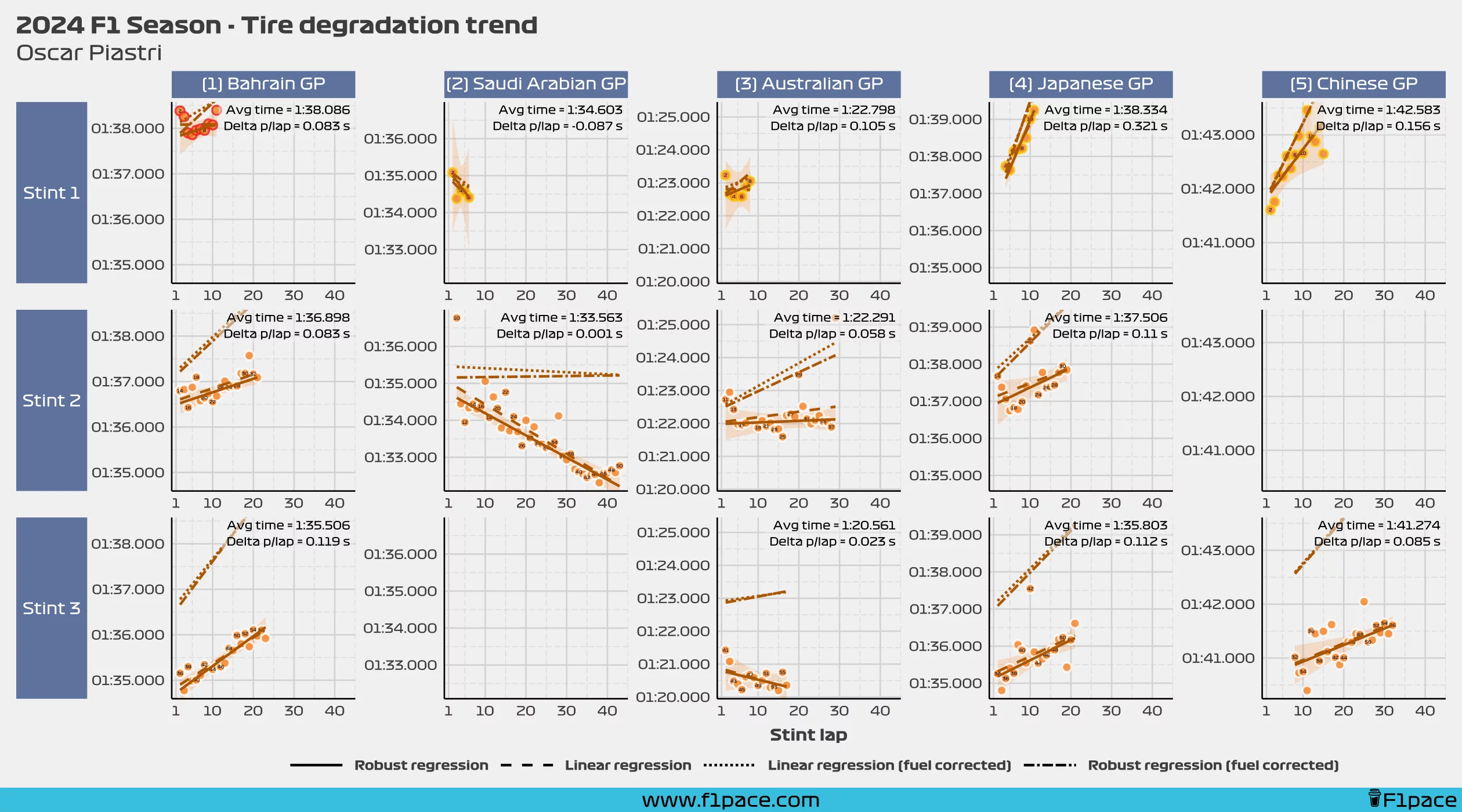
Detailed data
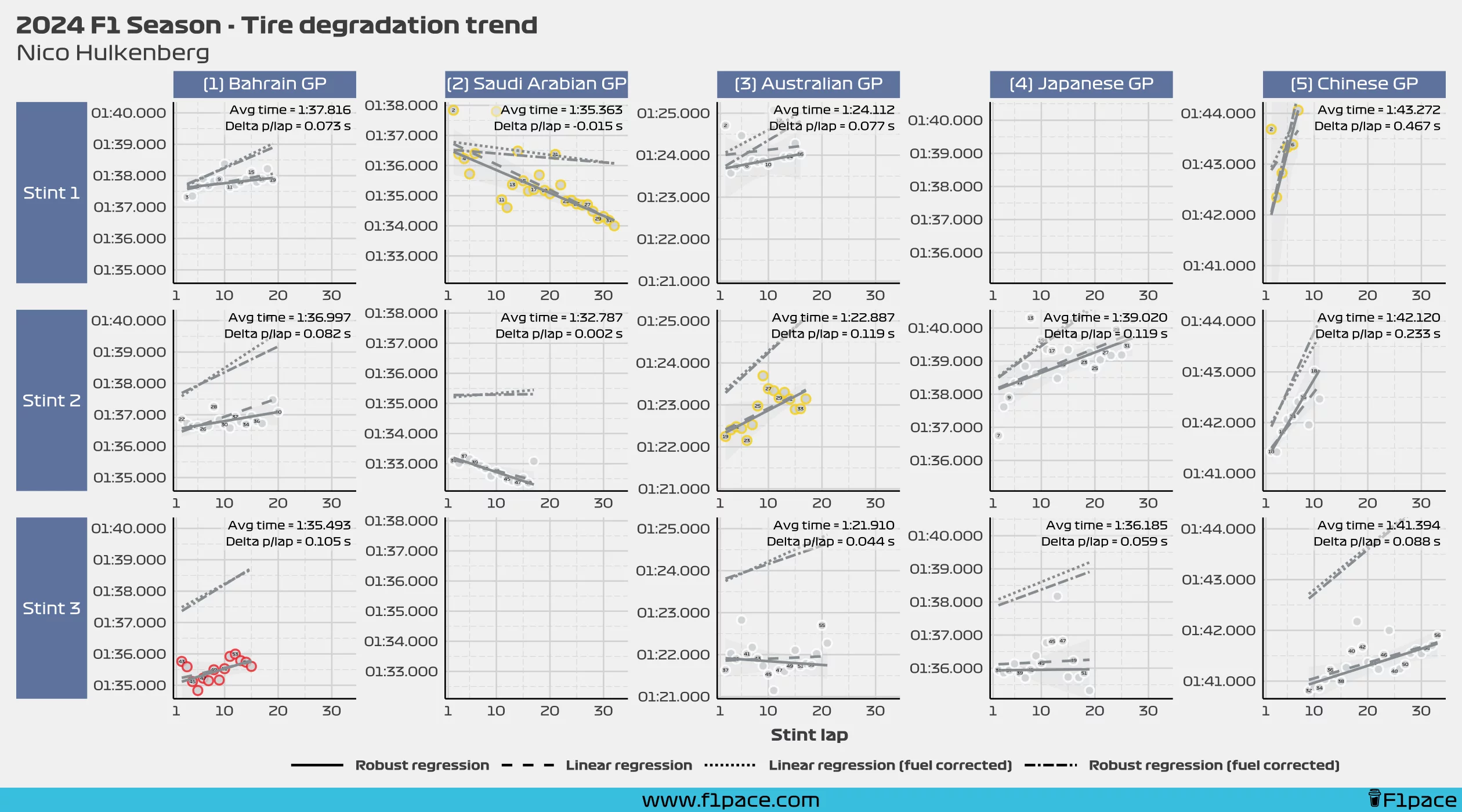
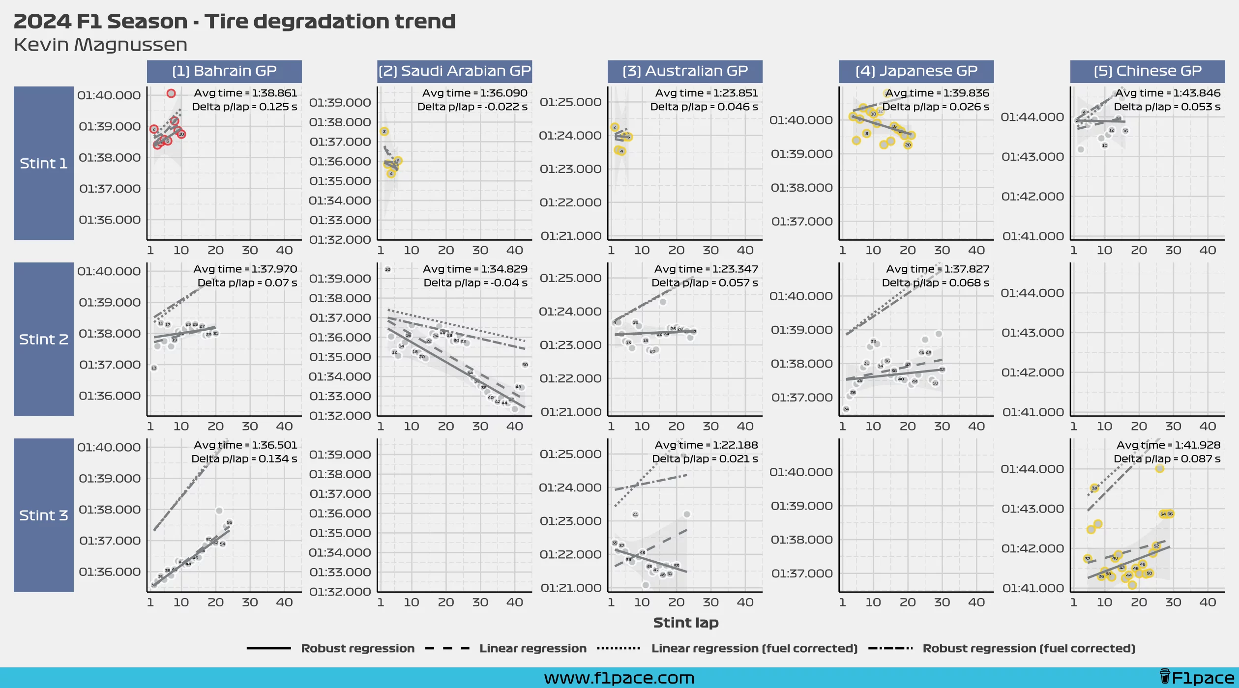
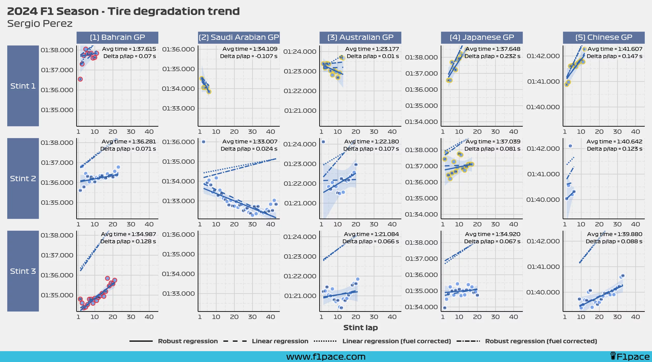
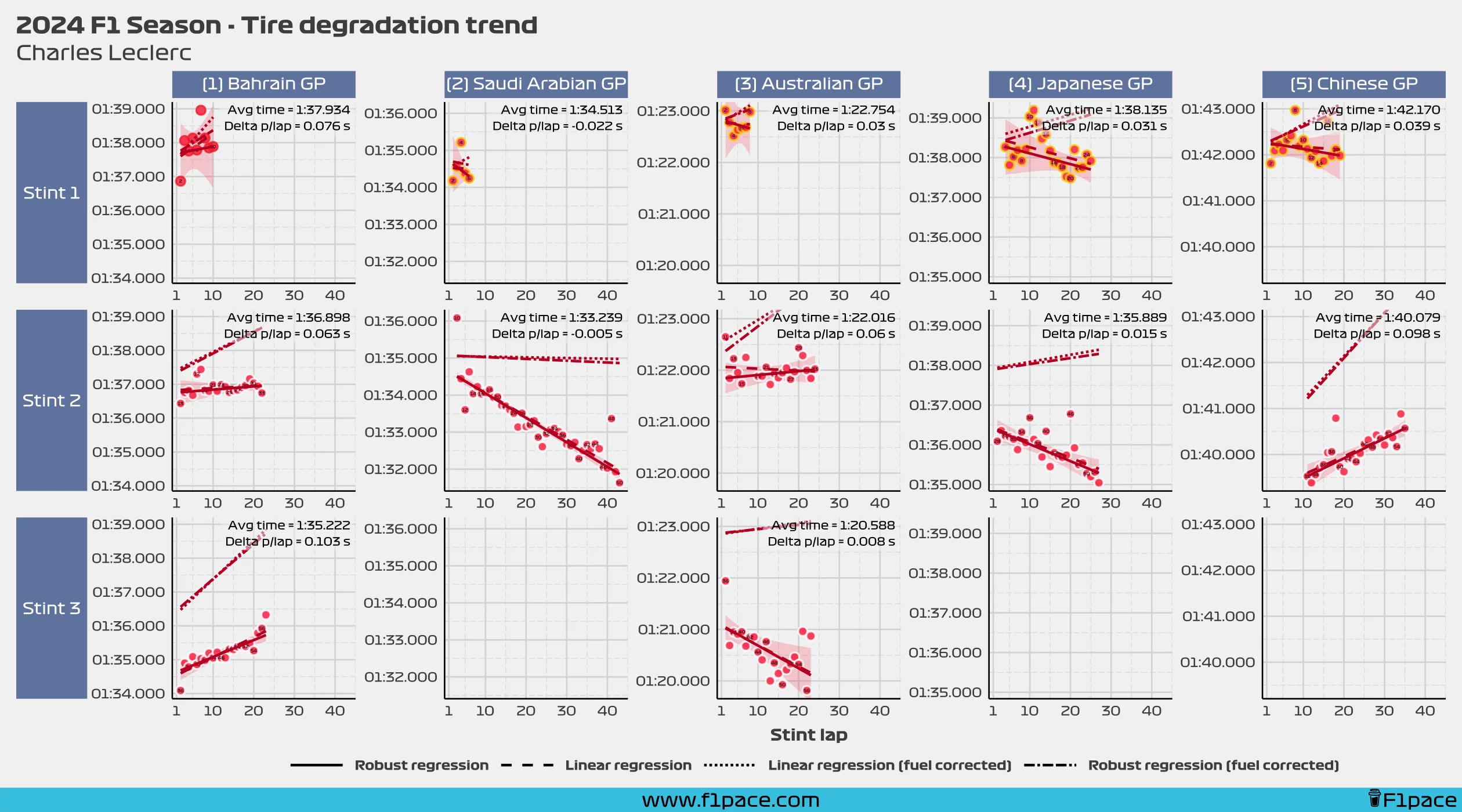
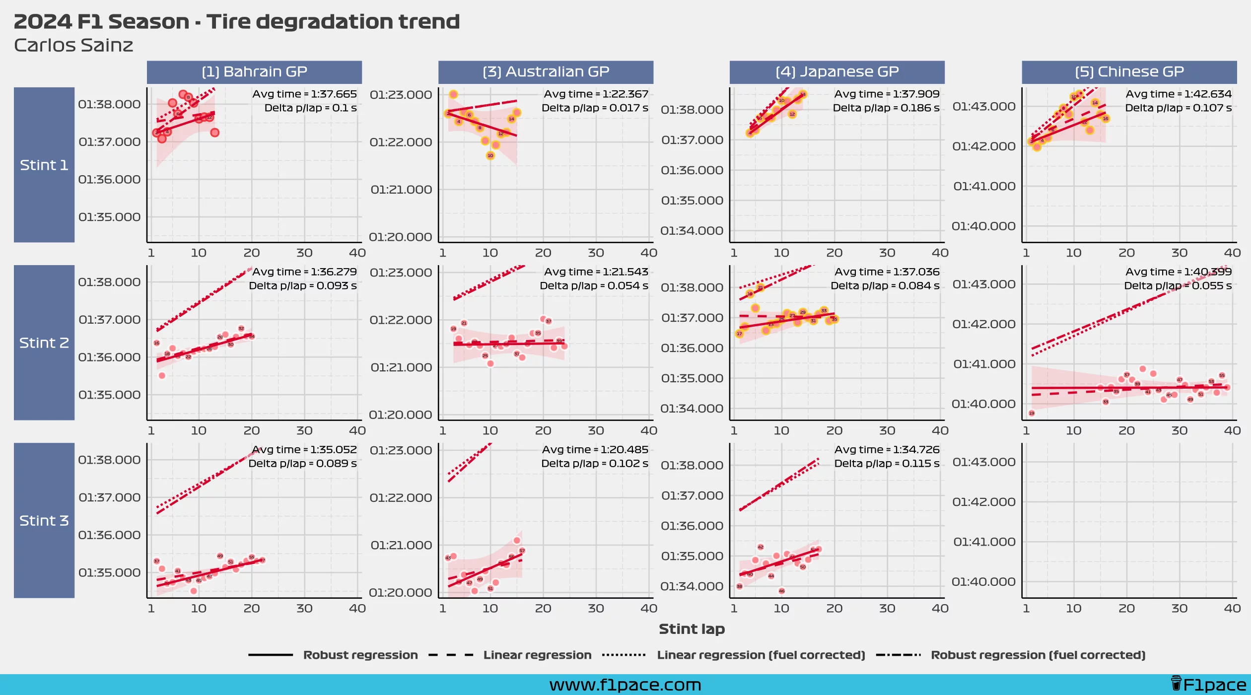
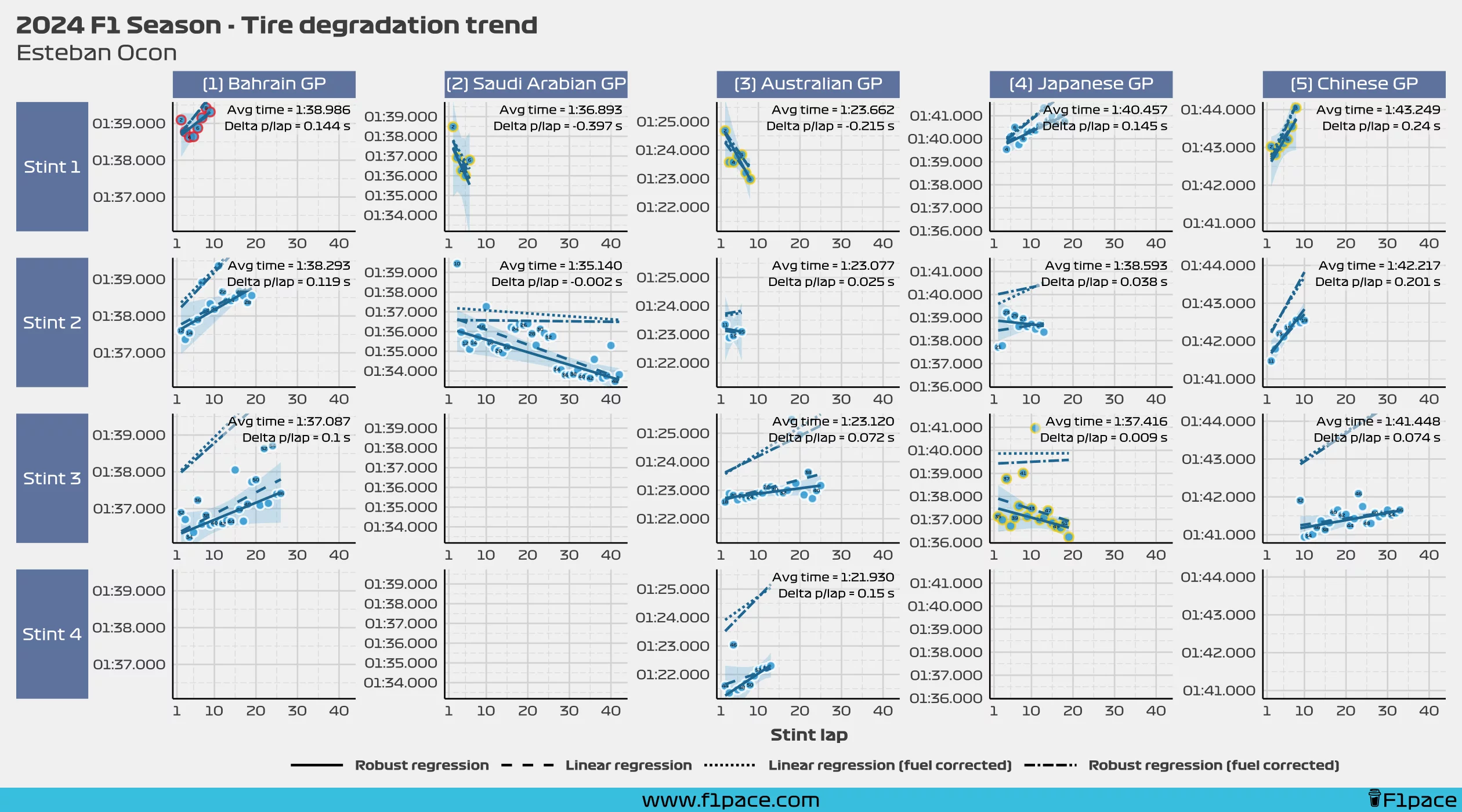
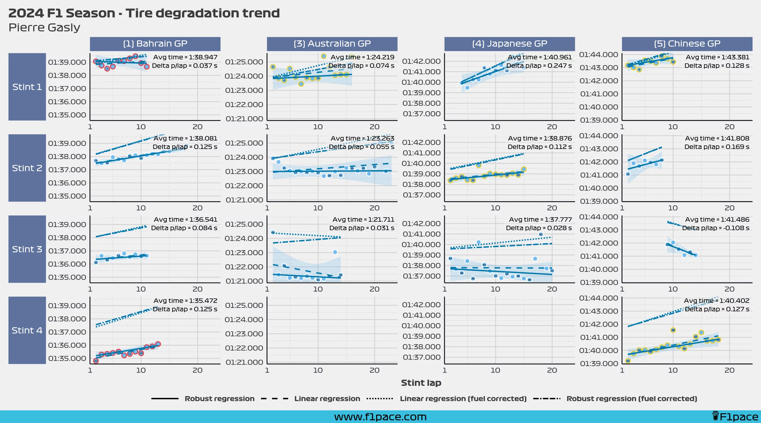
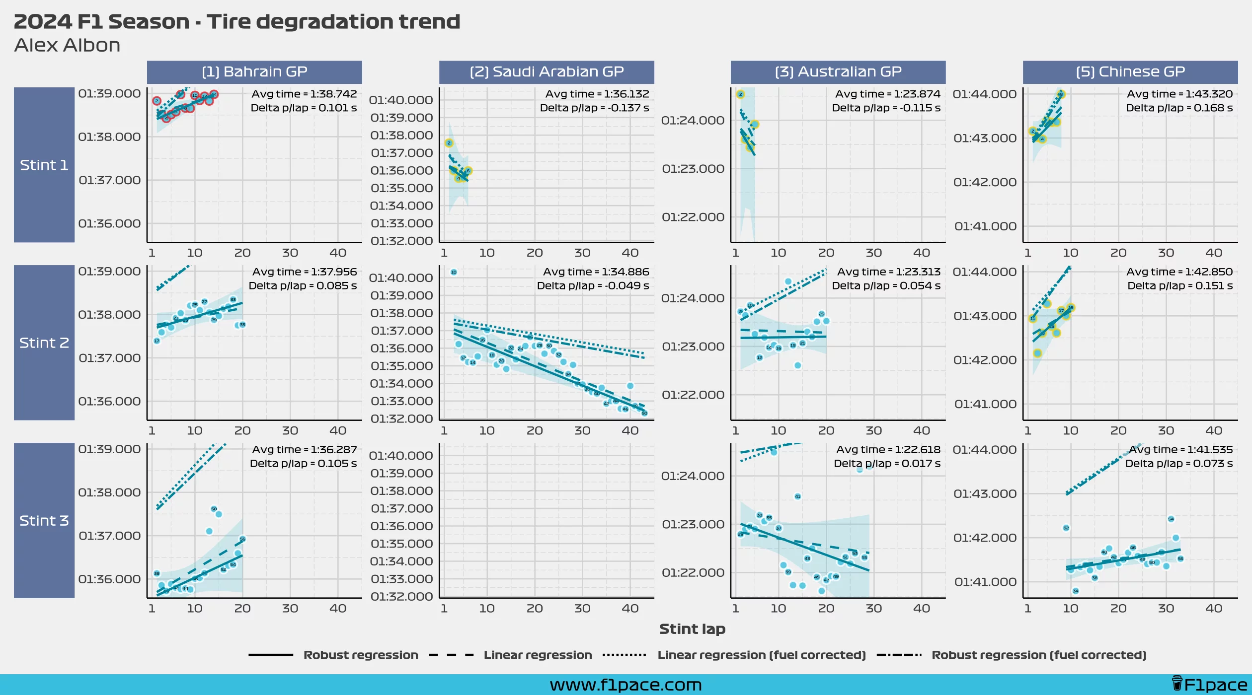
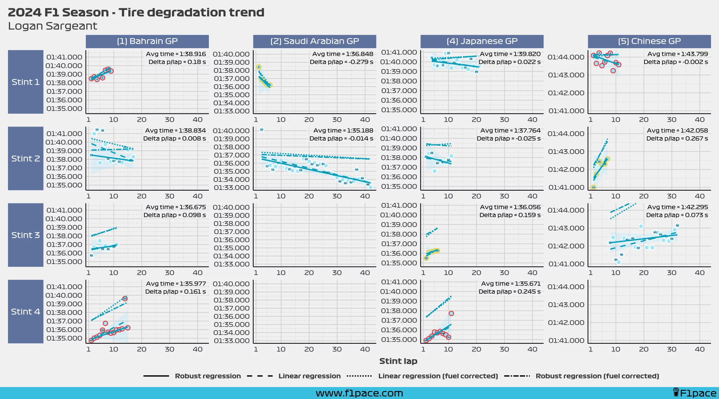
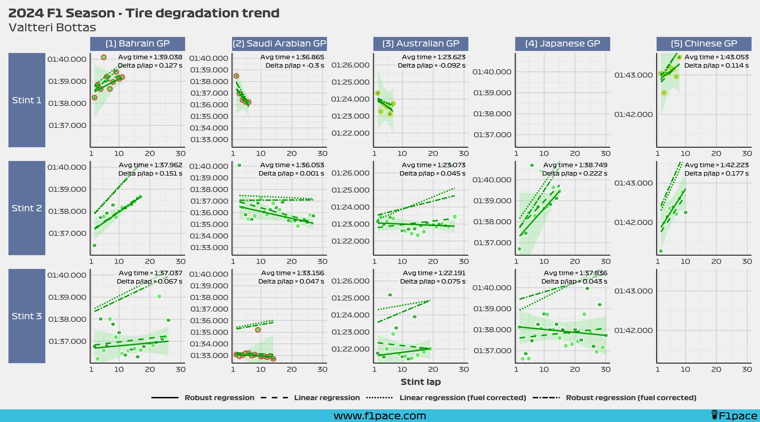
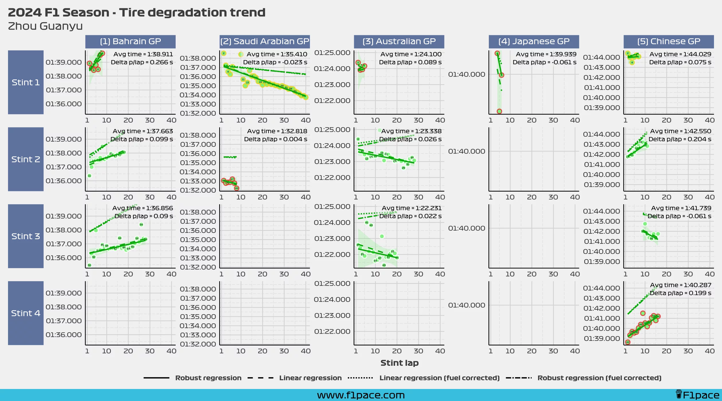
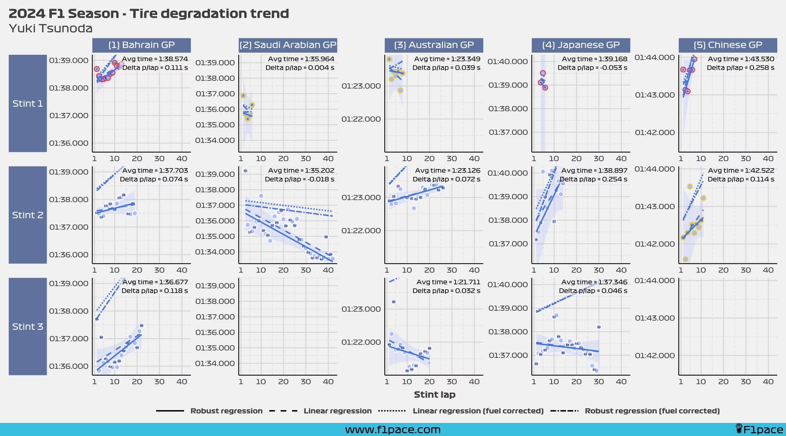
In case you want to take a look at all of the detailed data you can check out all of the charts below. They contain all of the regression lines used to create this analysis. While it is true that a simple line doesn’t always properly represent the data, it is usually fairly accurate to show a trend which is fairly easy to analyze.
Red Bull
Mercedes
Ferrari
McLaren
Aston Martin
Alpine
Williams
Sauber
RB F1 Team
Haas