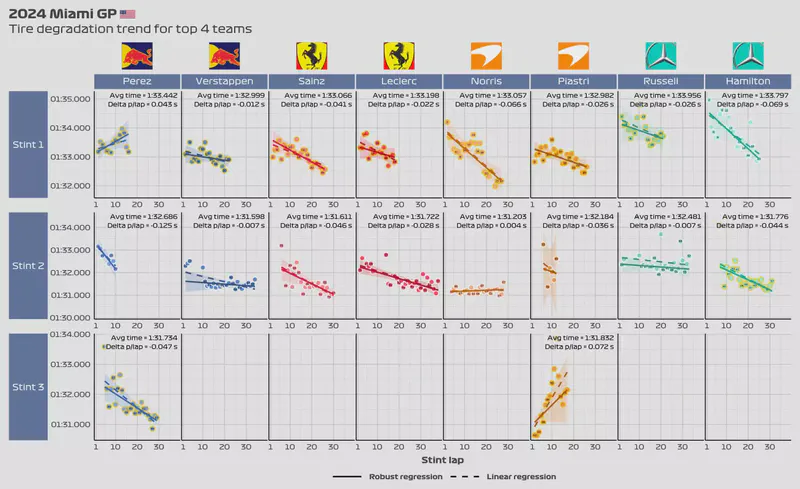
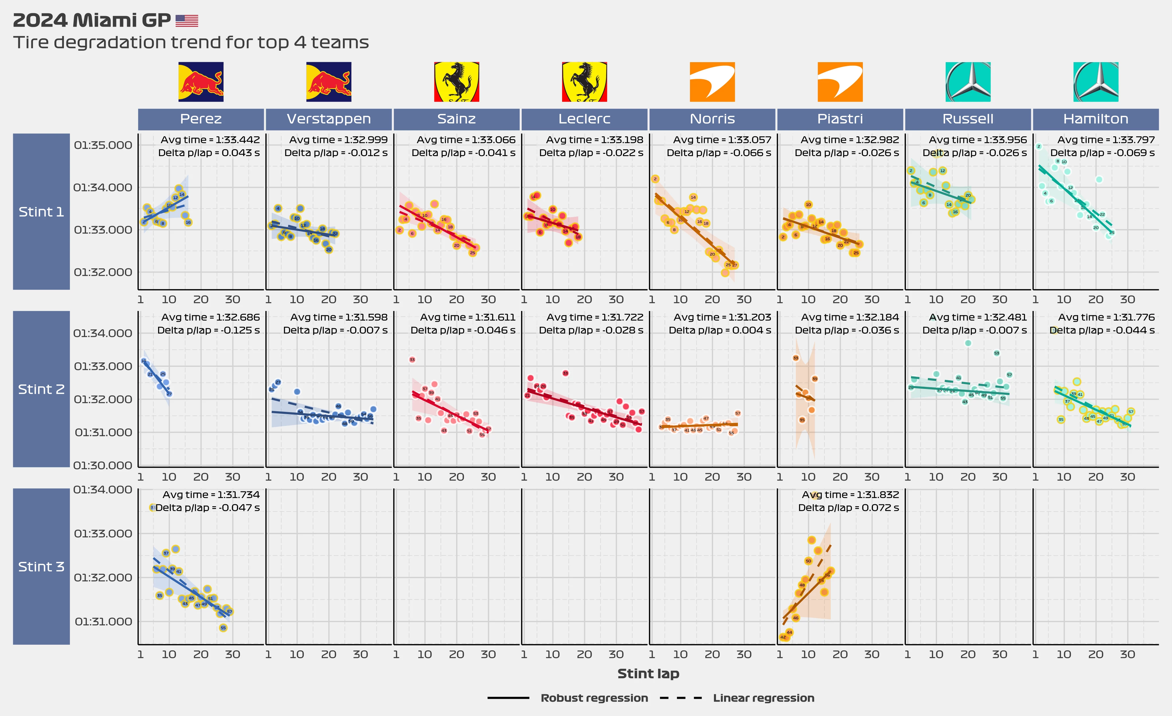
We have interactivity! Check out the tire degradation plot shown below.
This is the latest analysis I just came up with. I’ve been doing some charts that use a fairly complex model to analyze tire degradation, but unfortunately it’s a hard to modify for each race and I think it’s taking too much of my time. Because of this, I decided to create a simpler model to analyze tire degradation.
Analysis
This interactive chart is better visualized on a computer.
If you’re on a mobile device, tap and hold the chart to reveal the toolbar on the left. This toolbar enables zooming and scrolling. Hover over the data points to see a tooltip with additional information. On mobile devices you may need to click and hold the points to display the tooltip.
For the first time in a long time, we saw Red Bull struggling for pace. Yes, Red Bull, not just Sergio, but both him and Max. Verstappen got some damage to the underfloor of his car after hitting a bollard but he was struggling before that. Verstappen’s first was shorter than Lando’s, and yet his tire degradation was higher. While his lap times were stronger than the ones posted by his McLaren rival for the first 20 laps, it is clear to see that Lando was getting faster and faster as the race went on. On the second stint, both Max and Lando showed similar degradation, with Max perhaps being a bit stronger, but with less pace in the tank.
Sergio, on the other hand, had a bad first stint. Perhaps the lockup in T1 created a flat spot which in turn substantially diminished the tire’s life. Still, neither the pace nor the tire management was anywhere to be found. His third stint was stronger (Checo’s third stint can be compared to the second stint of drivers who only stopped once at the pits), with lap times comparable to those done by both Ferrari drivers.
At McLaren, it was a tale of two stories. While Lando showed that McLaren got the balance of the car just right, Oscar ended up with damage and finished outside of the points. Norris had the best pace and tire degradation of the grid, especially during that impressive first stint. Not to say that his second stint was poor, but his first one is the one that got him in the position to take advantage of the safety car.
Oscar Piastri showed solid pace in his first stint, keeping both Ferrari drivers behind him for lap after lap. He got damage fighting with Carlos and was released into a ton of traffic, which meant his lap times were slower than expected. Still, a strong showing for Oscar, who generally has struggled more with tire management than his teammate.
Ferrari had a decent weekend. Both Leclerc and Sainz were evenly matched, but neither one of them had the straight-line speed to overtake Oscar Piastri in his McLaren. Perhaps the team went too hard towards favouring race pace, but that’s easy to say in hindsight. In another timeline perhaps Carlos didn’t make a mistake and cost himself 4th place. There’s not much to say about Ferrari. They had good pace and decent tire management, but without the straight-line speed, they had no way to overtake in the twisty Miami circuit.
Finally, we have Mercedes. Although they have become a meme for struggling to properly understand their car, they showed very competitive pace for the first time in a long time. Lewis Hamilton had no problem keeping the tires alive during his first or second stint and was able to extract some pace out of the F1 W15. He, however, had the same problem that both Ferrari drivers had by not having enough straight-line speed to overtake. In the end, he settled for finishing the race in 6th position. Russell had a fairly weak weekend. While he wasn’t horrible, he didn’t excel either. His second stint was particularly poor, with him showing very little speed. During this stint, George was lapping around 7 tenths slower per lap than his teammate, albeit with slower tires.
Explanation
The chart is quite simple. I created two regressions for each stint for each driver that took part in the previous race. The first regression is a robust regression which is fairly insensitive to outliers, which means that it should give us more accurate results if the data is not very linear. The second regression is a traditional linear regression which is not good at handling outliers. The only reason I added the linear regression is to show that it will produce unreliable results under certain situations.
In the chart, I added both regression lines, the average lap time for each stint for each driver, as well as the average delta per lap as calculated by the robust regression. If both lines overlap, then the delta per lap will be pretty much the same. If both lines do not overlap, then it is better to trust the results of the robust regression.
This model is fairly simple to interpret, but less complex than the model that creates wiggly lines. I’m hoping it’ll be enough for this type of analysis but we’ll see as time goes on.