Maybe you don’t remember, but when I was using my previous site (F1bythenumbers) I worked using the telemetry data. For a very long time I stopped working with that type of data mostly because, well, it has many quirks. Believe it or not, all of the analyses out there are using data that 1) isn’t properly synced and b) has many inaccurate interpolated values. In some cases, the distances calculated are wrong by as much as 100 meters or even more. In my opinion, this is completely unacceptable. The simple truth is that the raw data obtained by most sources out there is just not up to the task of analyzing runs that require millisecond precision.
It wasn’t until a few weeks ago that I decided to give telemetry data a chance. I worked hard for dozens of hours to properly process the raw data and obtain a dataset that was accurate enough for my high standards. As far as I’m aware, this is the first and only analysis out there that uses corrected data.
I will be using this newly corrected data to give you more detailed analyses that you can trust, so hopefully, you’ll enjoy them.
Introduction
For this analysis, I will be working with data from the Free Practice 2 (FP2) session of the 2024 Monaco GP. In this analysis, I will compare the fastest lap done by Charles Leclerc (1:11.278) vs the fastest lap done by Max Verstappen (1:11.813).
This analysis is only possible after doing extensive post-processing of the raw telemetry data. The data points are properly synced and interpolation has been kept to a minimum. When interpolation was necessary it was done in a way that reduced the margin of error to the maximum by using complex statistical models that provide increased precision over simple interpolating techniques. I’m willing to put my head on the line here and assure you that this data is reliable and should provide proper, real, conclusions from what we saw in free practice 2.
My data won’t exactly match the data shown by other sources. I’ve extensively post-processed the raw data to get a dataset that is up to the task.
Time delta
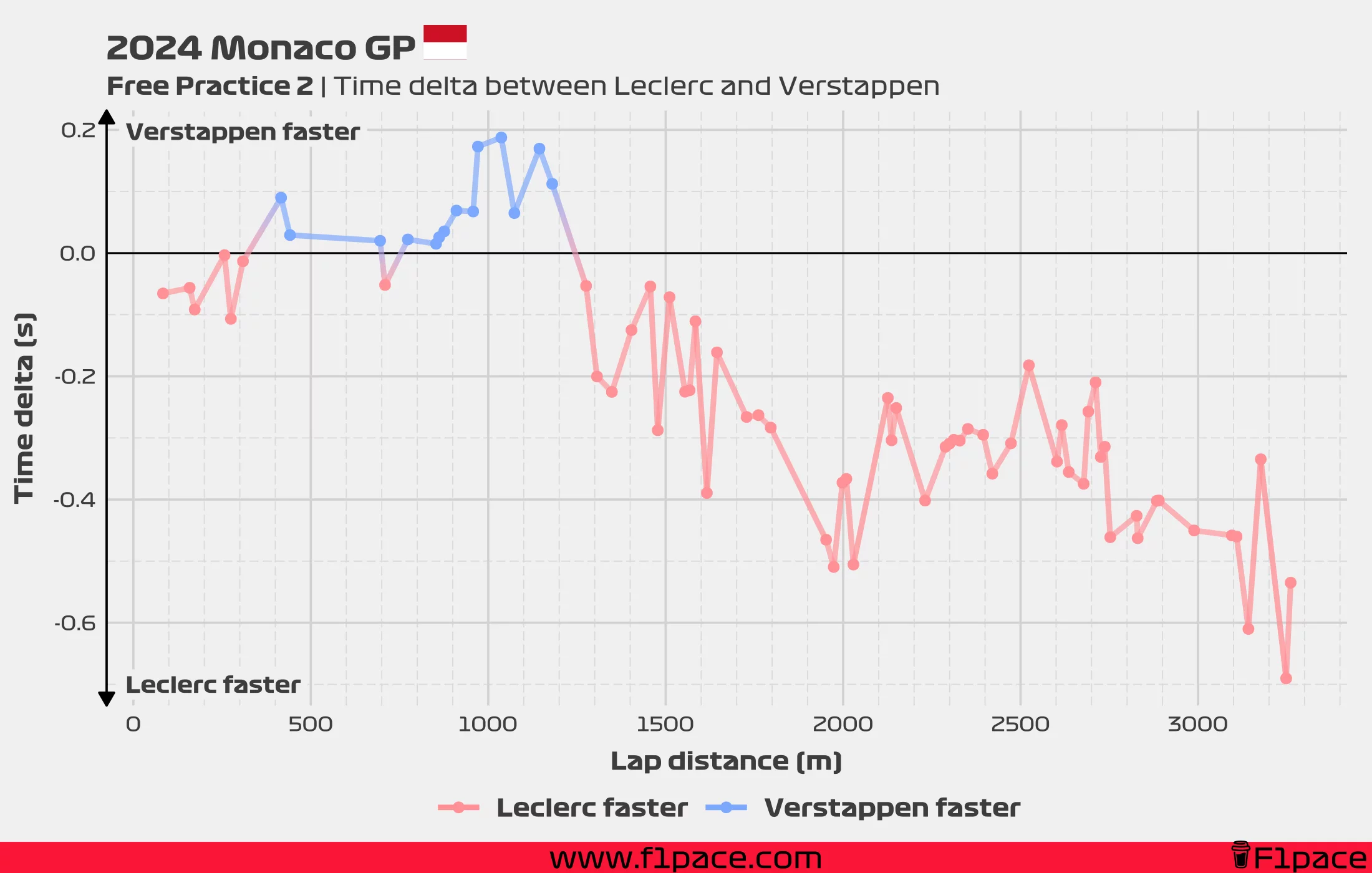
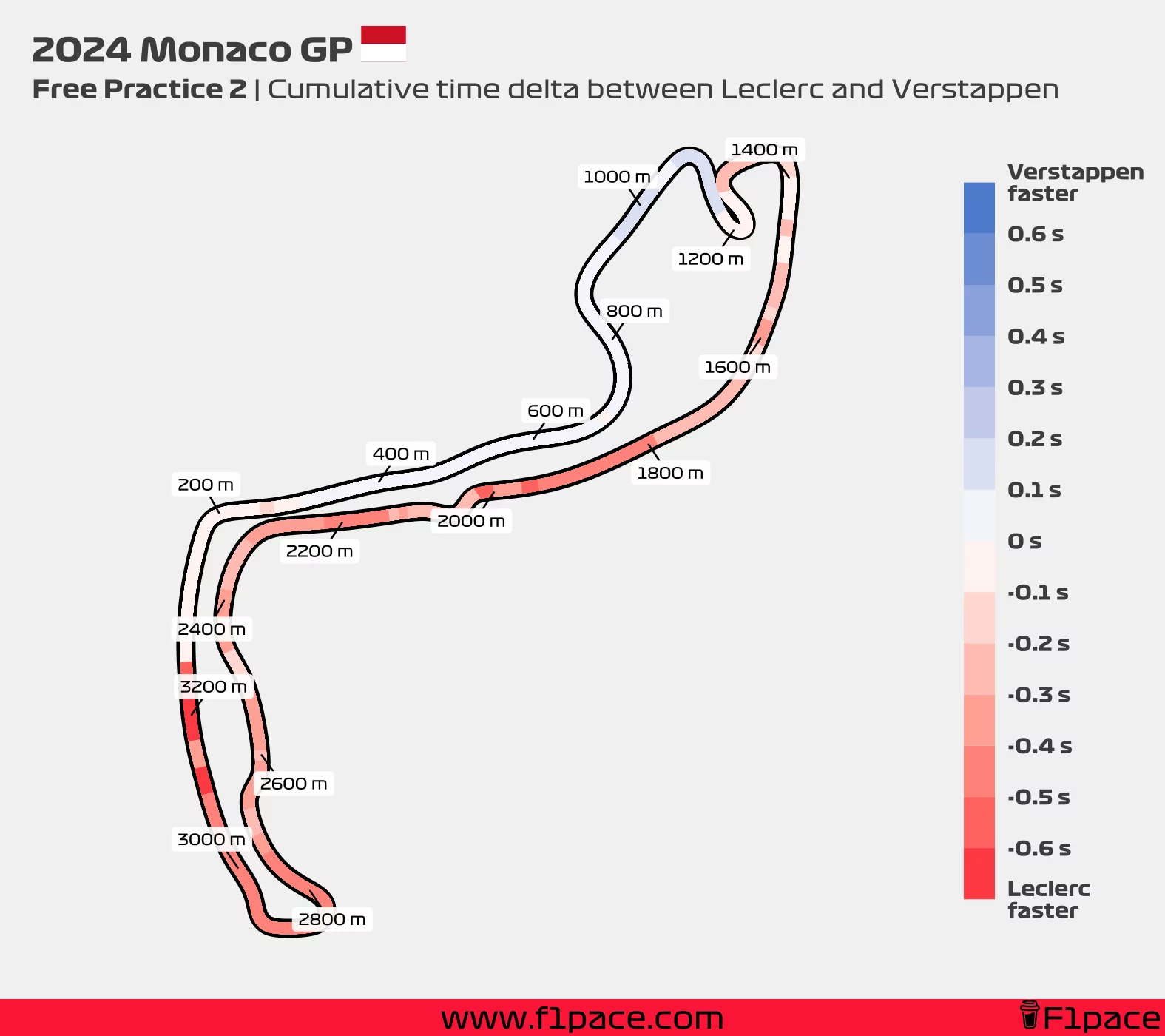
The two charts shown in this section work in tandem. The time delta chart shows the time gap between both drivers at different points of the lap, while the map shows the same cumulative delta over the course of the lap. The time delta chart has higher precision than the map, but the map shows a good overview of how the lap developed for both drivers.
Do not confuse this map with the track dominance graphic provided by AWS. My chart shows the cumulative time delta throughout a lap, while their graphic shows who was faster on predetermined sections of the track.
Both of these charts use only positional data, with minimal interpolation required to perfectly match the position of both drivers. The precision of this analysis should be well under 1 hundredth of a second.
Let’s start by analyzing the delta between both of the drivers of interest. We know that the final delta between them was 0.535 seconds, but where did Leclerc gain so much time over Max? The data shows that Charles had the upper hand for most of the lap. While Max was competitive for the first 1,200 metres or so, Charles Leclerc showed superior speed in the last 2/3rds of the lap.
After the hairpin (turn 6, shown at the 1200 metres mark on the map), Charles Leclerc increased his advantage to around 2 tenths of a second, and this gap increased to over 4 tenths of a second when reaching turn 10 (shown with the 2000 metre mark on the map). From turn 10 until turn 18 (shown before the 3000 metre mark) the delta remained fairly stable, with it being around 4 to 5 tenths in favour of the Monegasque driver. By the end of the lap, Charles managed to increase his advantage to over 5 tenths over Max.
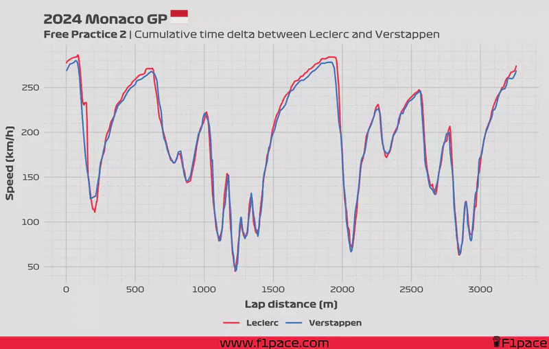
Speed telemetry
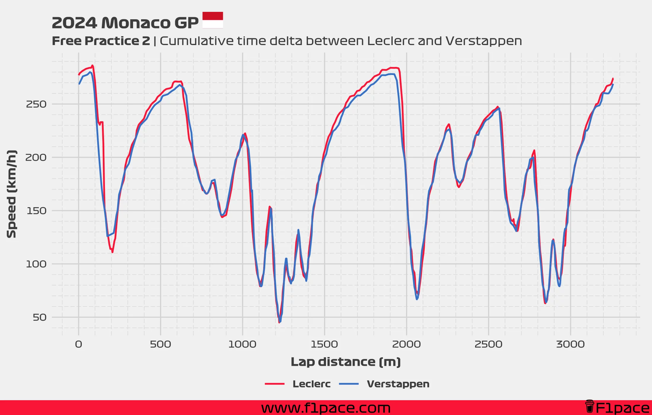
To better understand how Charles managed to get such a commanding lead over Max, we have to analyze the speed telemetry chart. The data shows the recorded speed of both drivers at different points during the lap.
This chart interpolates some speed data, but the interpolation was done with statistical models that produce far more realistic data points than simpler algorithms. Although the telemetry’s low refresh rate causes some “blockiness”, the data should be smoother and more accurate than that provided by other sources.
The chart clearly shows how Max was able to keep a higher speed in turn 1 (Sainte-Dévote, shown at the 200-metre mark), which allowed him to gain a time advantage up until reaching the hairpin. It is after this section that things go completely sideways for the Red Bull driver. I can’t see a major difference between the speed trace of both drivers in T7 or T8, but we can see Leclerc gaining more speed than Max after the 1500-metre mark. It is unclear whether Ferrari was running a higher engine mode, lower downforce, or if Red Bull was struggling due to the car’s bouncing. Both Sergio and Max complained about the car jumping too much, which could severely affect their exit out of T8 (Portier).
Still, the telemetry shows Max keeping up with Leclerc for the first 100 meters after Portier, and it’s only afterwards that the speed gap widens. This suggests to me that Red Bull was perhaps running a little bit more downforce, with the effects of this higher drag showing up at higher speeds.
Interestingly, Max seemed to slow down more than Charles for most of the remaining turns. Verstappen slowed his car more at T10/11, carried less speed at T12 (a little bit after the 2200-metre mark), and once again carried less speed than Charles at turn 17 (La Rascasse, shown at the 2800-metre mark). Finally, Max once again slowed more than Charles in the final T18/19 complex. All of these sections allowed Charles to increase his advantage from around 3 tenths of a second to the final delta of 0.535 seconds.
Final remarks
Hopefully, you have enjoyed this detailed analysis. I want to write more and create more personalized analyses, so I’m excited about the possibilities now that I have proper telemetry data. As I mentioned, my data won’t match the one provided by other sources. This data has been reworked to be more precise, allowing me to delve into the world of telemetry analysis. This process took at least 30 hours of hard work, at least based on rough estimates, but I think the result was worth it.
If you enjoyed this article, please support me and my project. Keeping this site going takes many hours of energy and effort. Trust me, maintaining a project like this one is no easy task. If you want to donate some money to the cause, please click on the “BUY ME A COFFEE” button. If you don’t have money to donate, please share the content with other people so that this project can keep growing. Thank you.