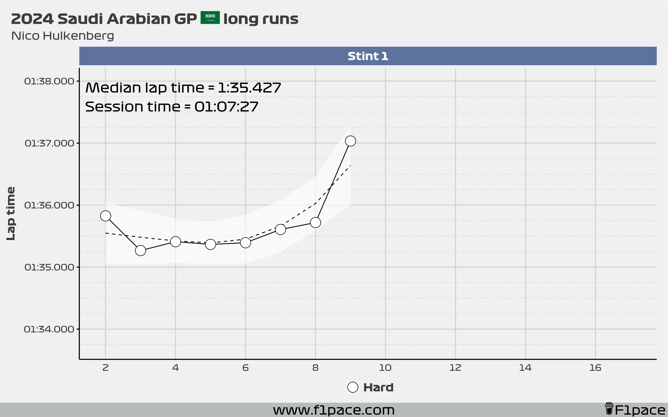
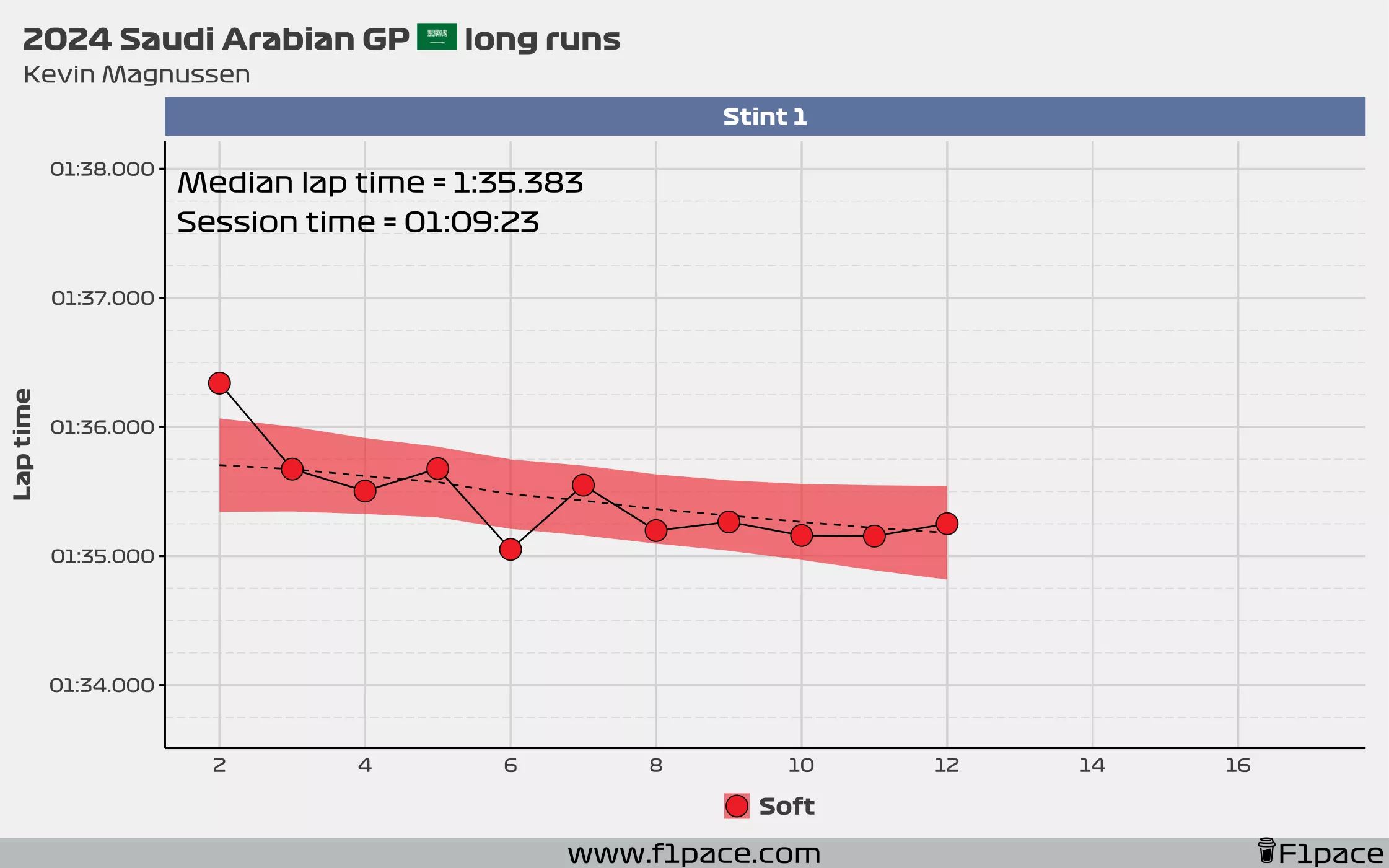
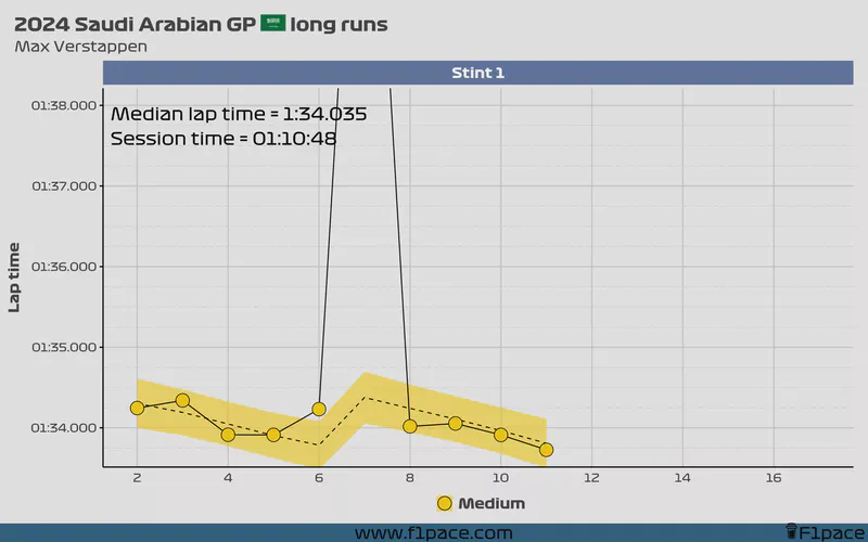
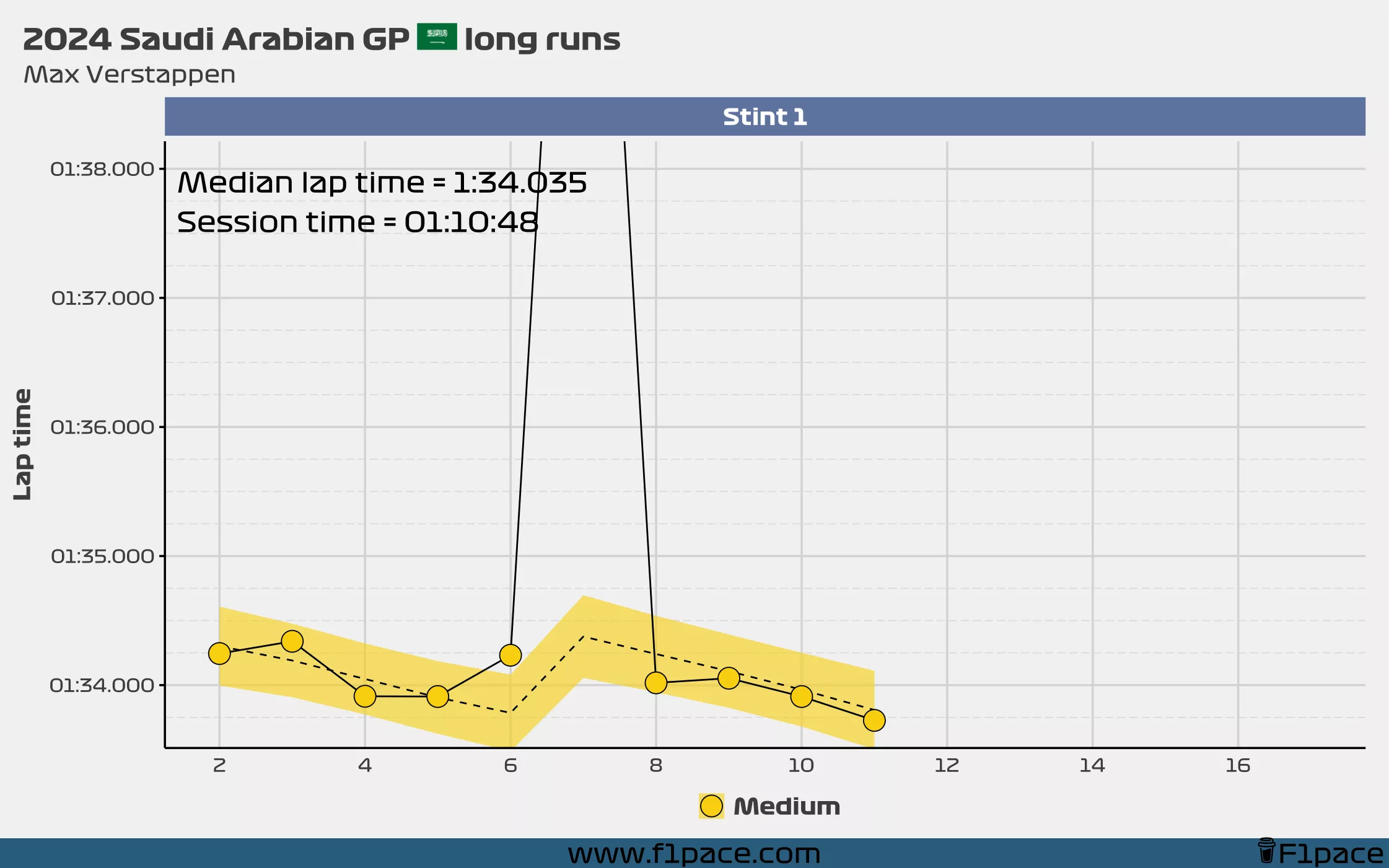
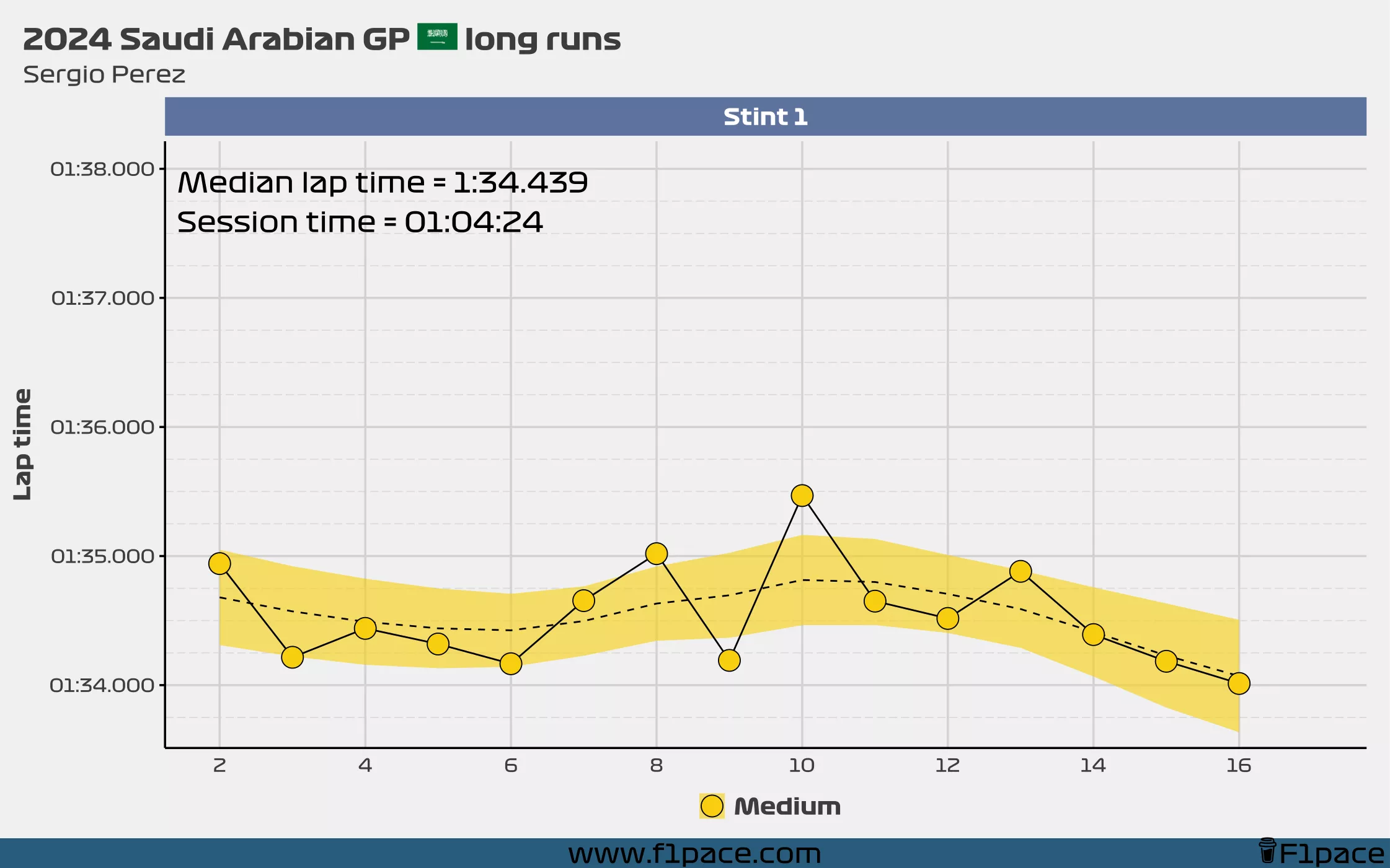
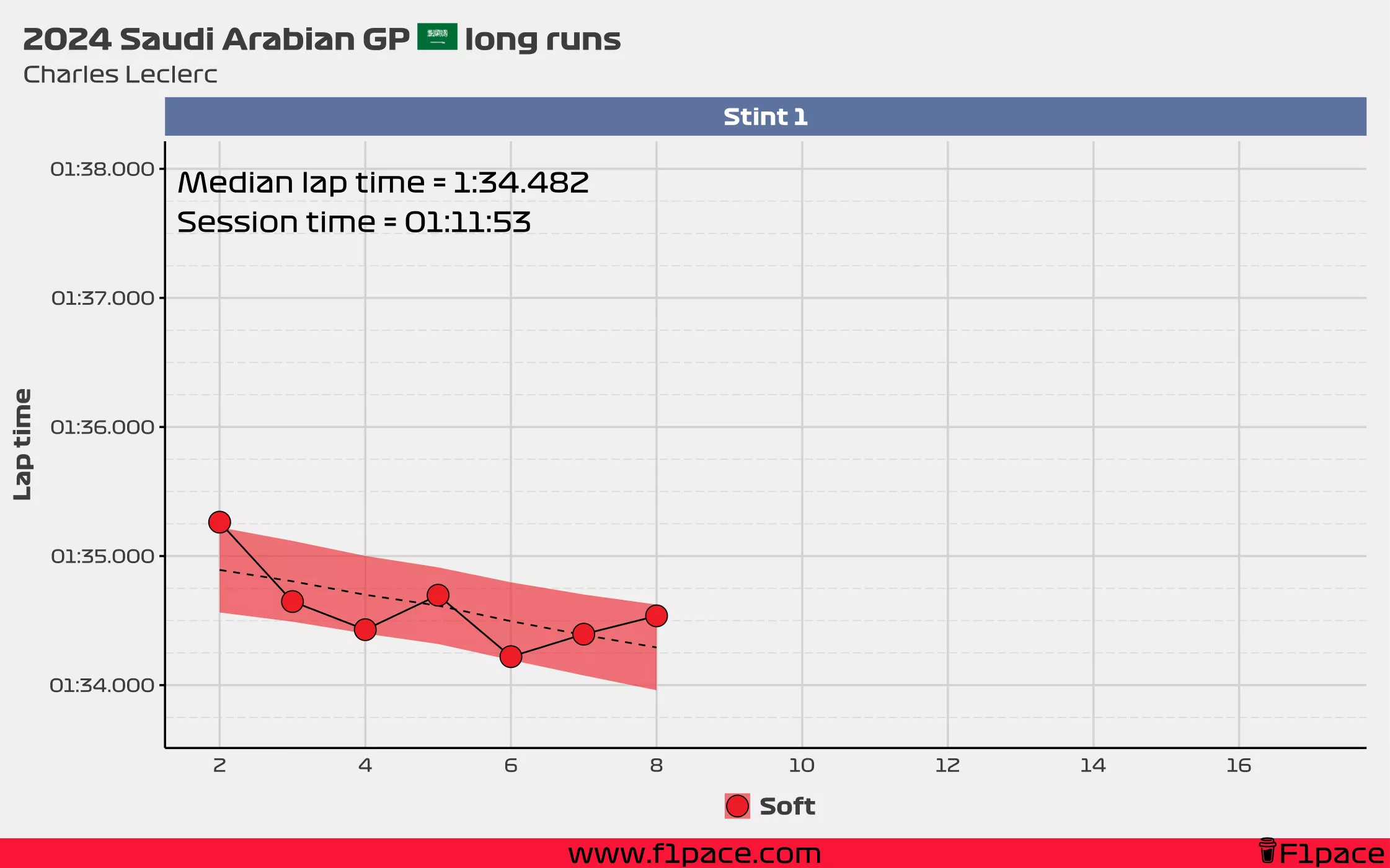
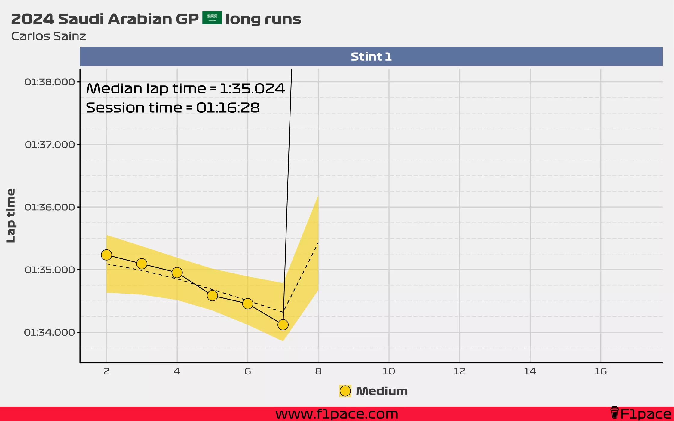
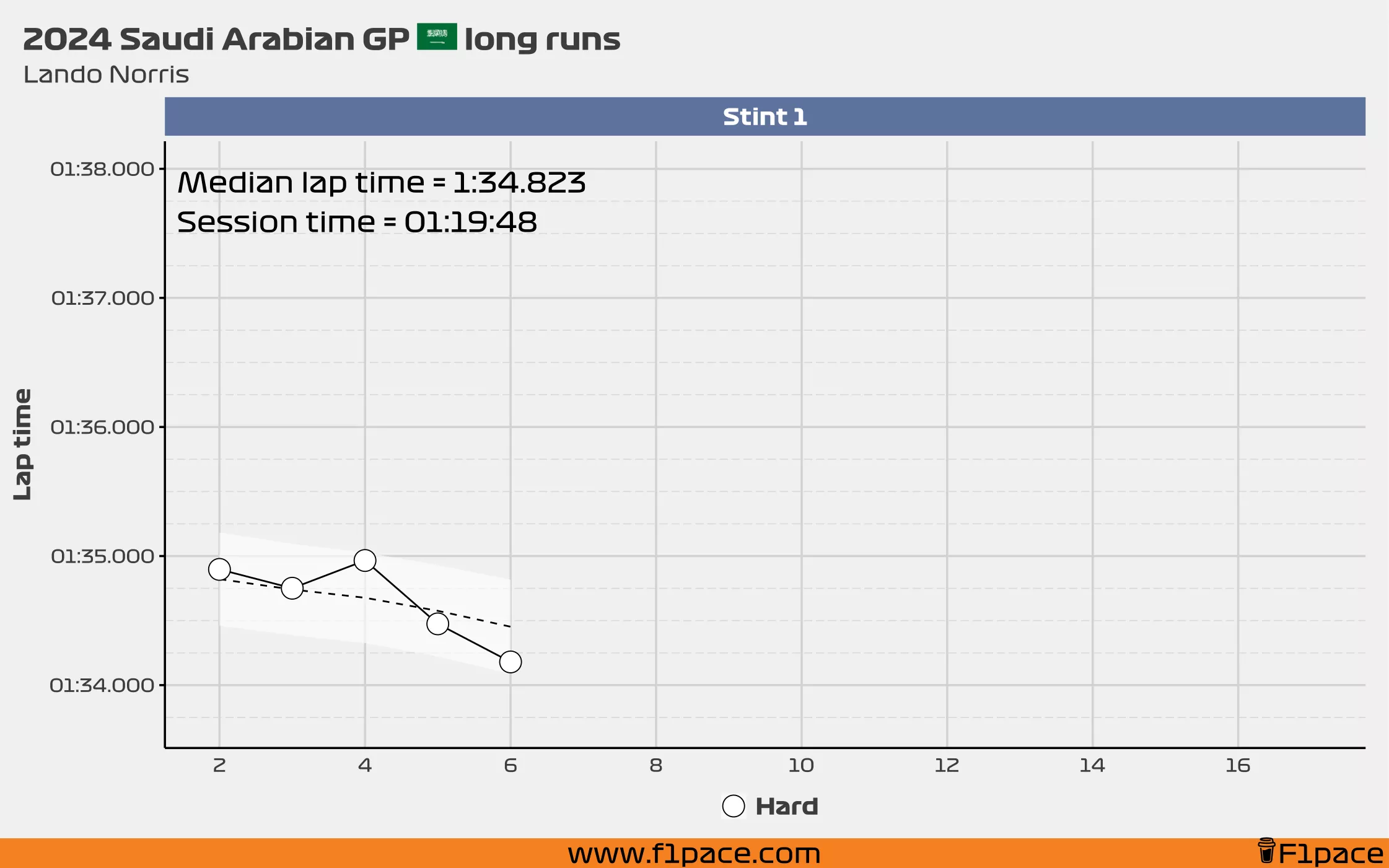
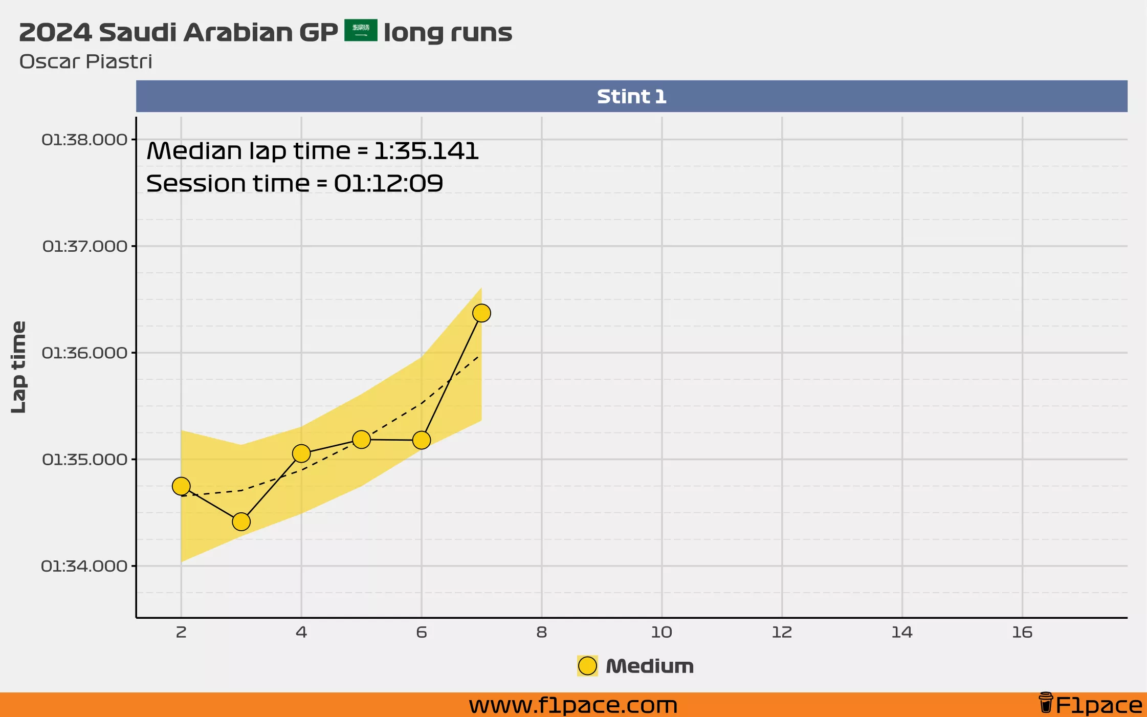
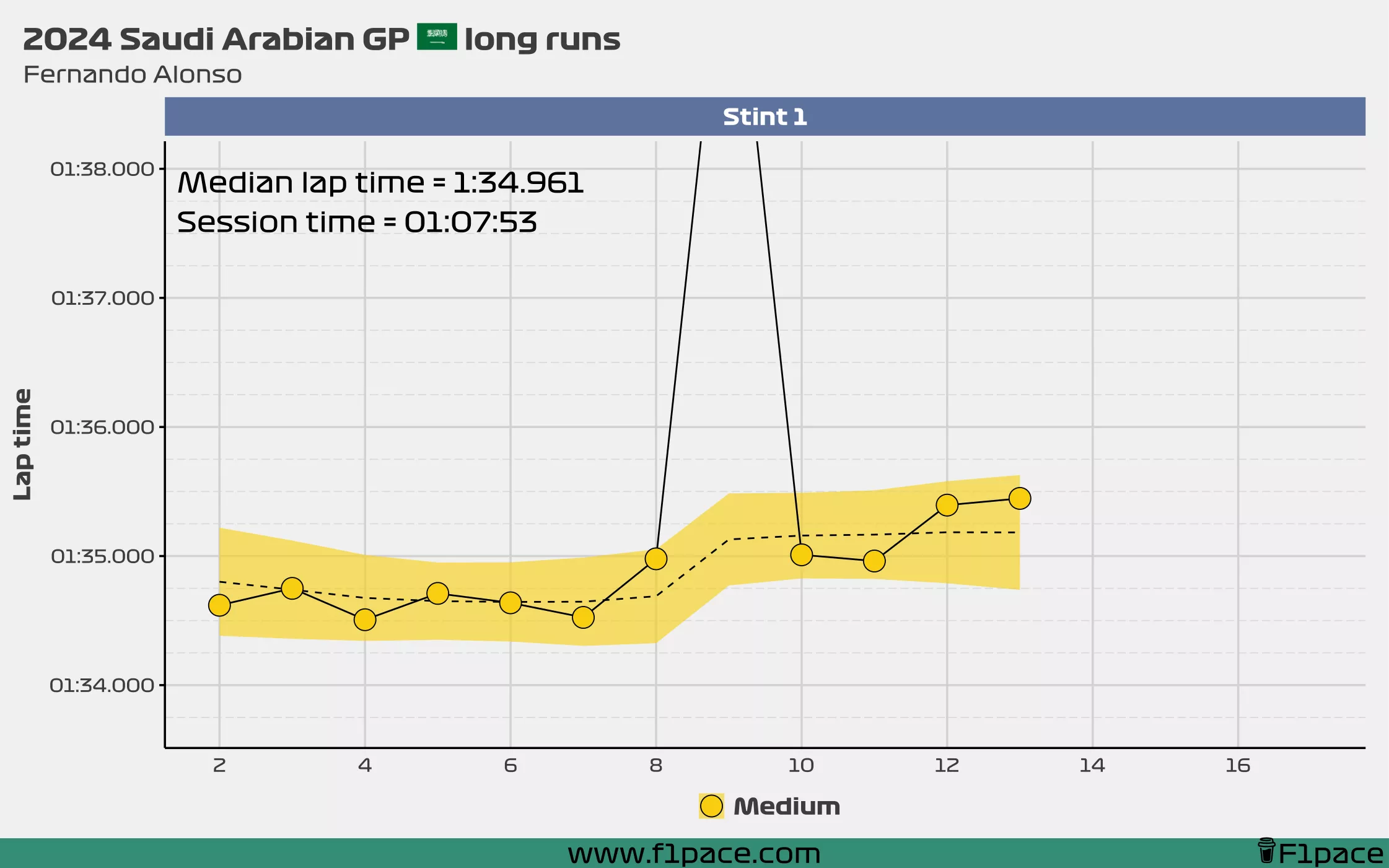
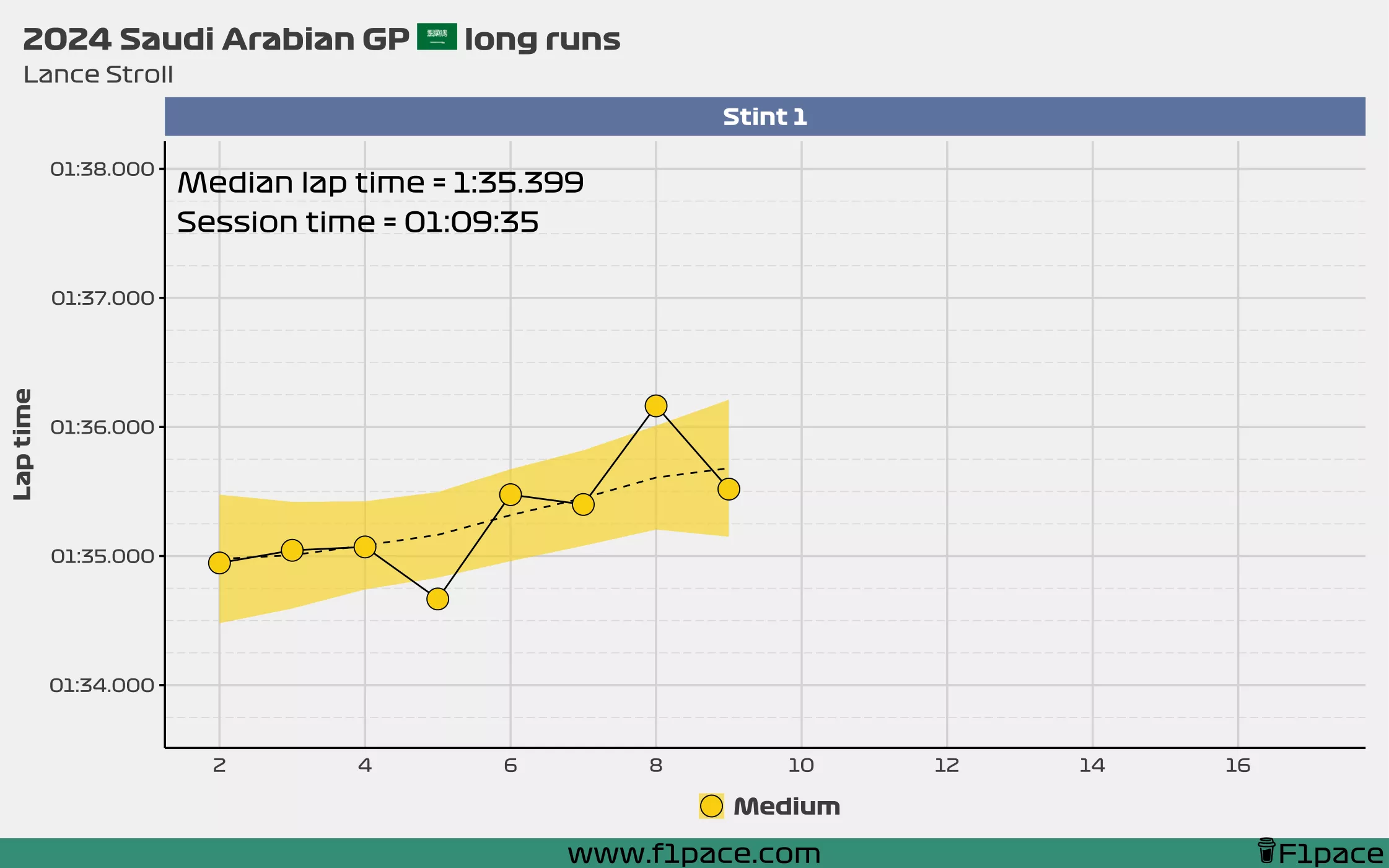
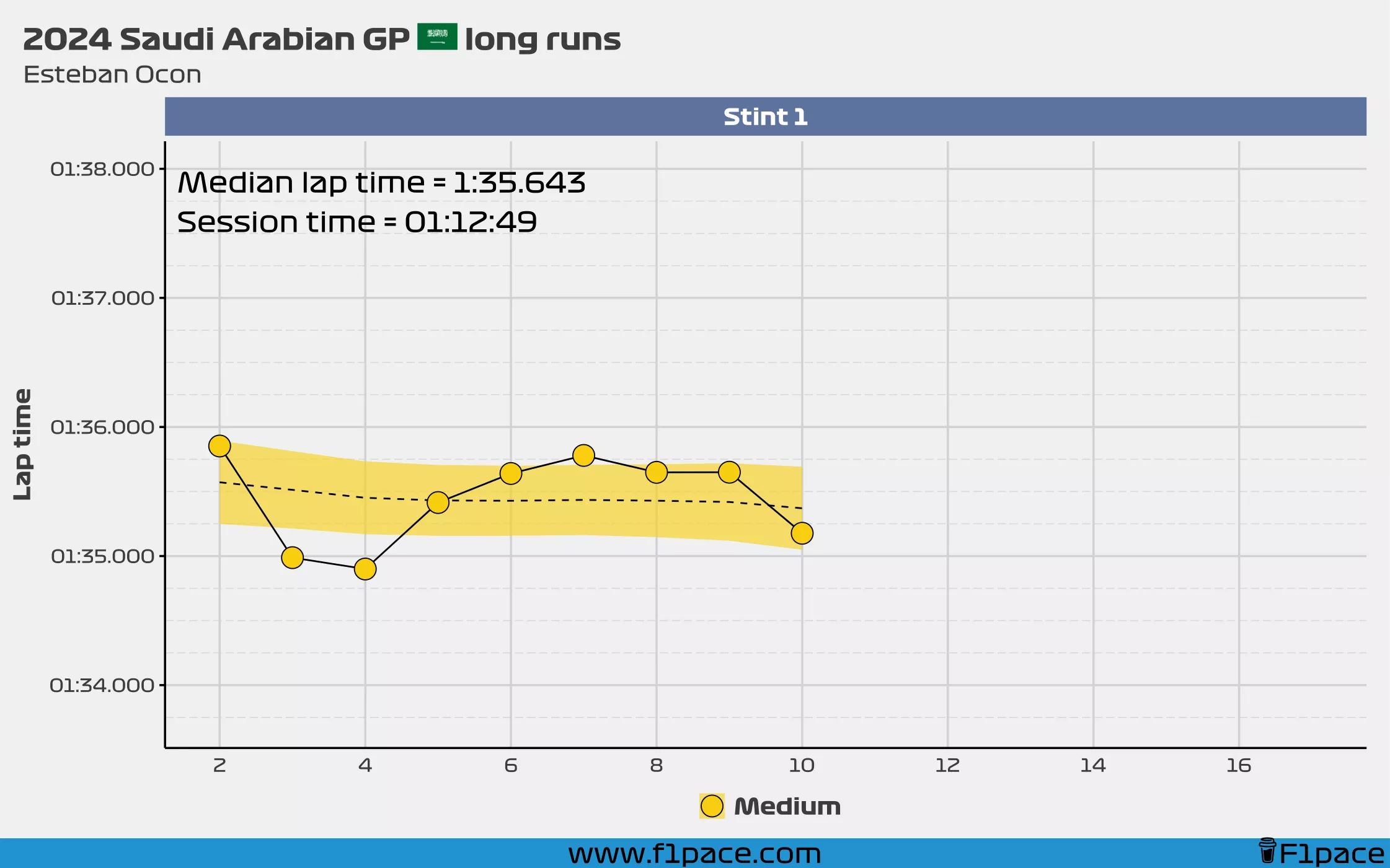
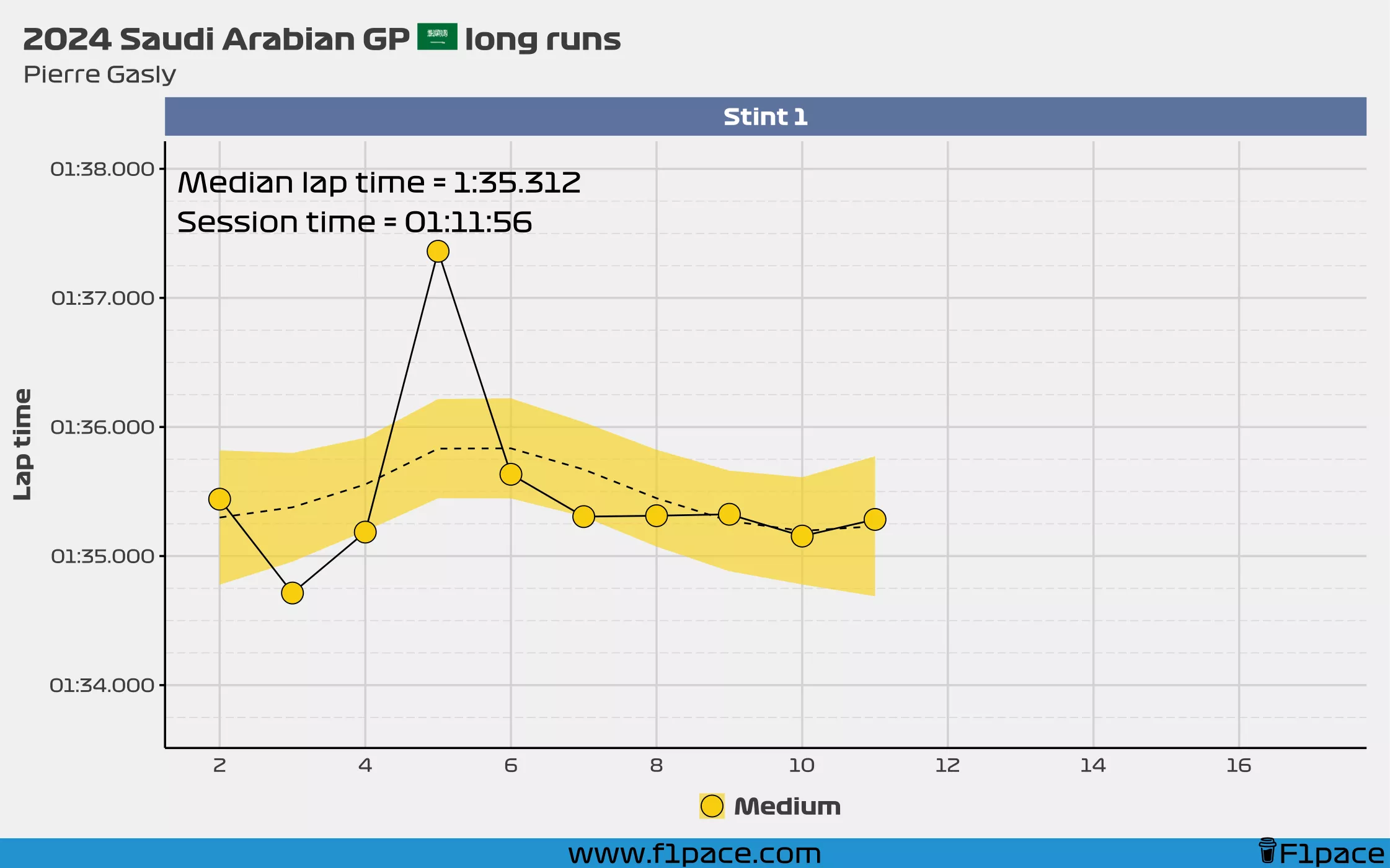
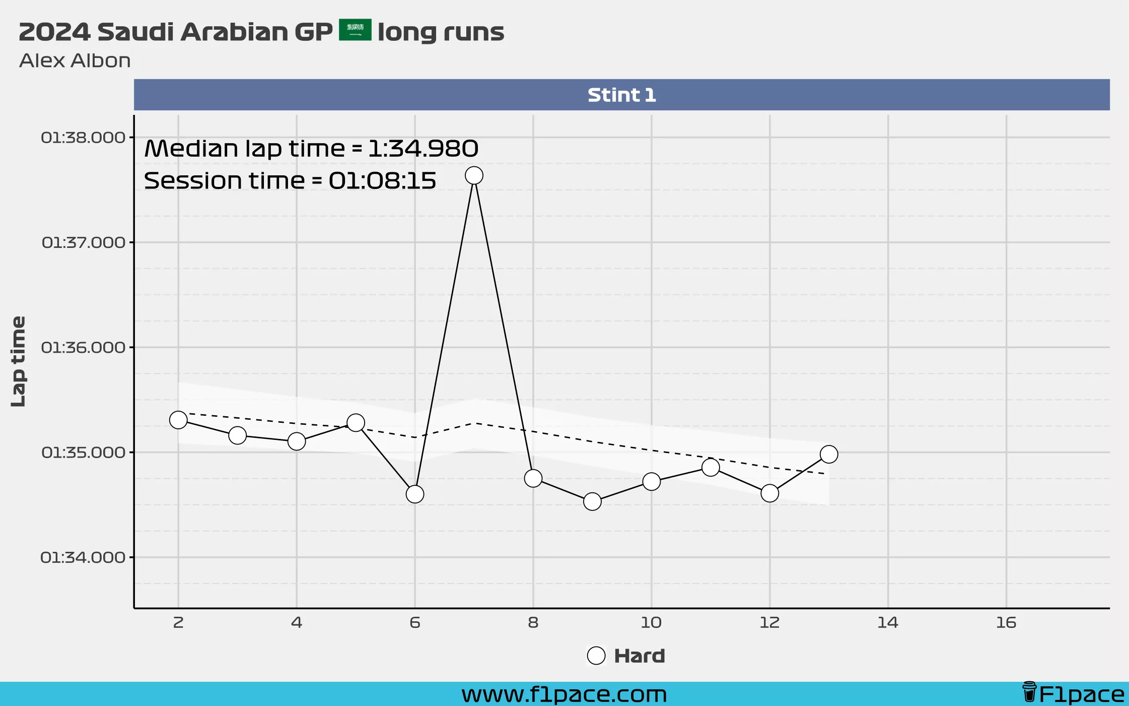
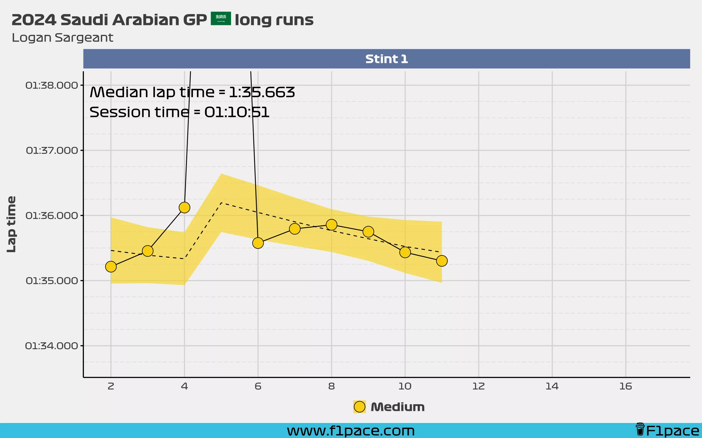
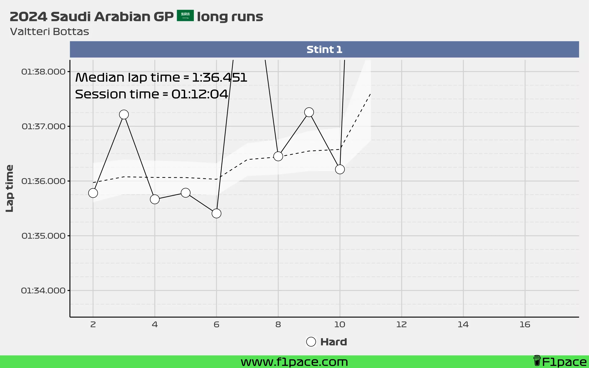
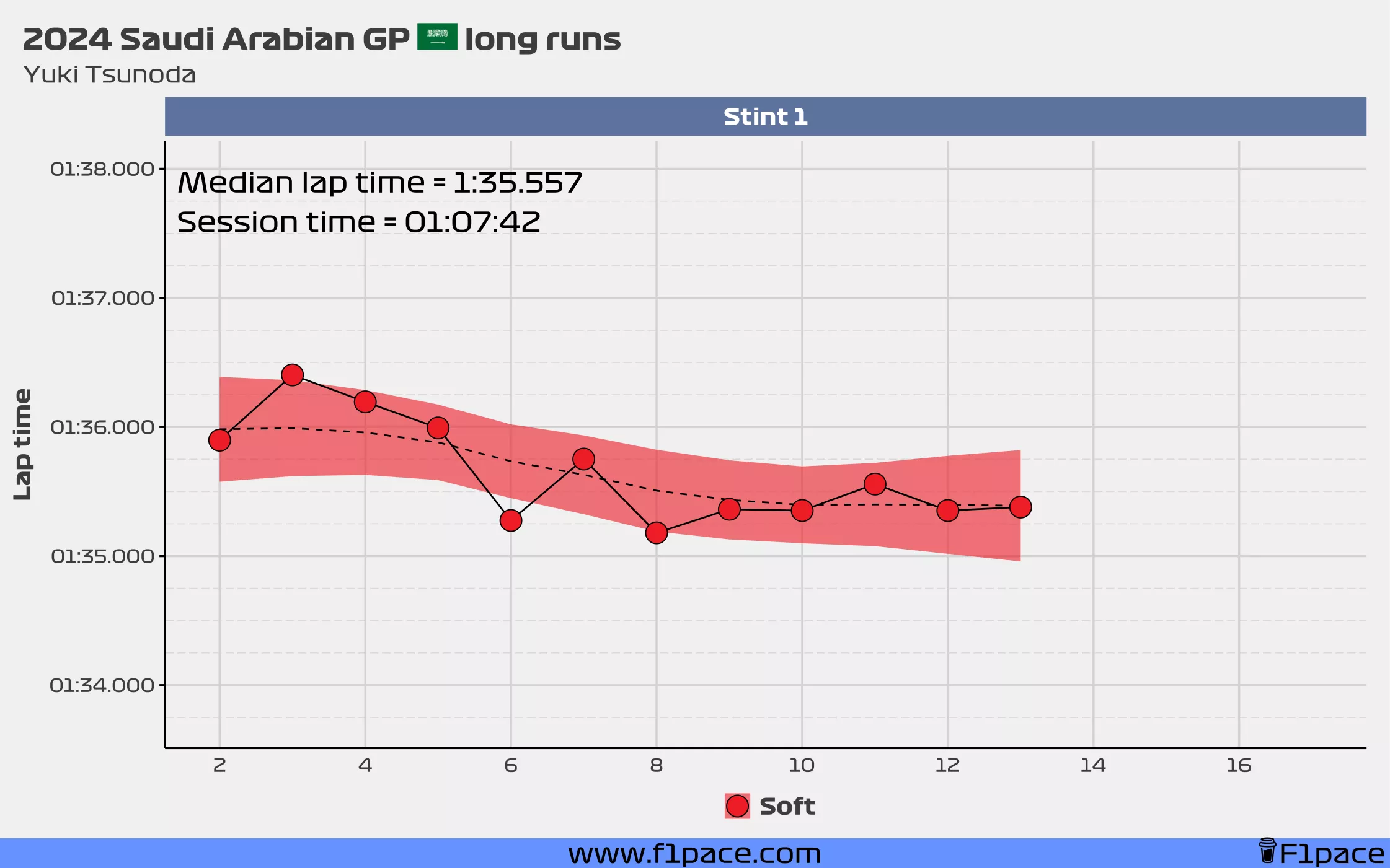
These are like the charts that I created for the pre-season testing in 2024, but done for the FP2 session. The dashed line and the ribbon are based on predictions created from a statistical model. As you can see, these predictions are designed to ignore the lap anomalies and instead present a smooth line. This is not a perfect model and I really built it in a few minutes, but I think it gets the job done for the most part. In some cases the line will be a bit too wiggly, which is mostly caused by a driver having too many anomalous laps in his run.
For this particular plot, a race pace simulation stint was considered as long a driver had a stint of 6 or more laps and I decided to show laps with a maximum time of 1:38.000.
Red Bull
Mercedes
No data!
Ferrari
McLaren
Aston Martin
Alpine
Williams
Sauber
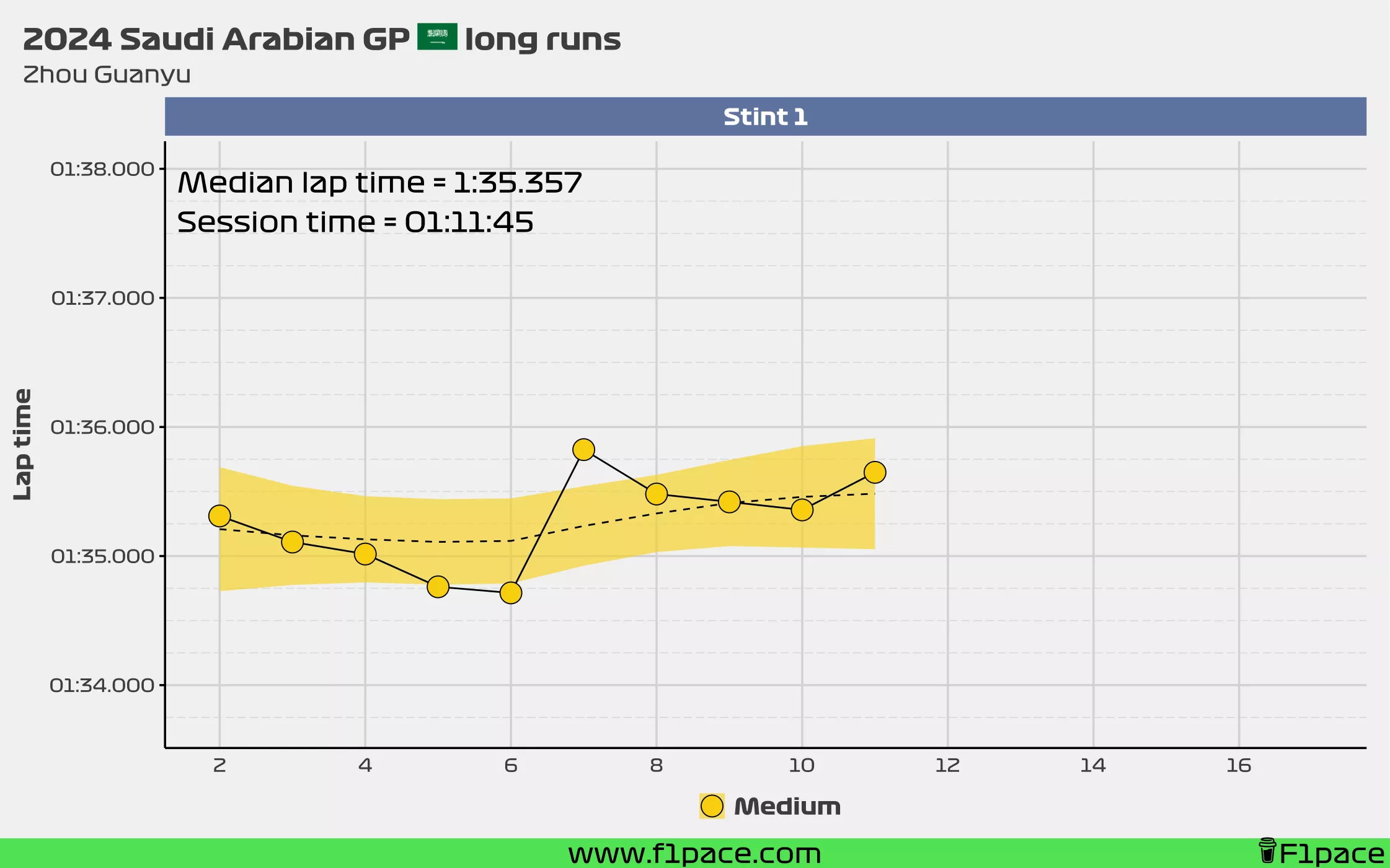
RB F1 Team
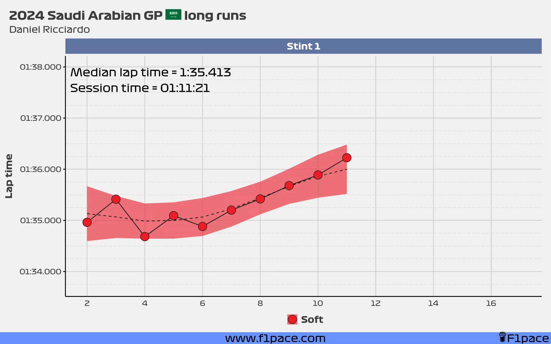
Haas
