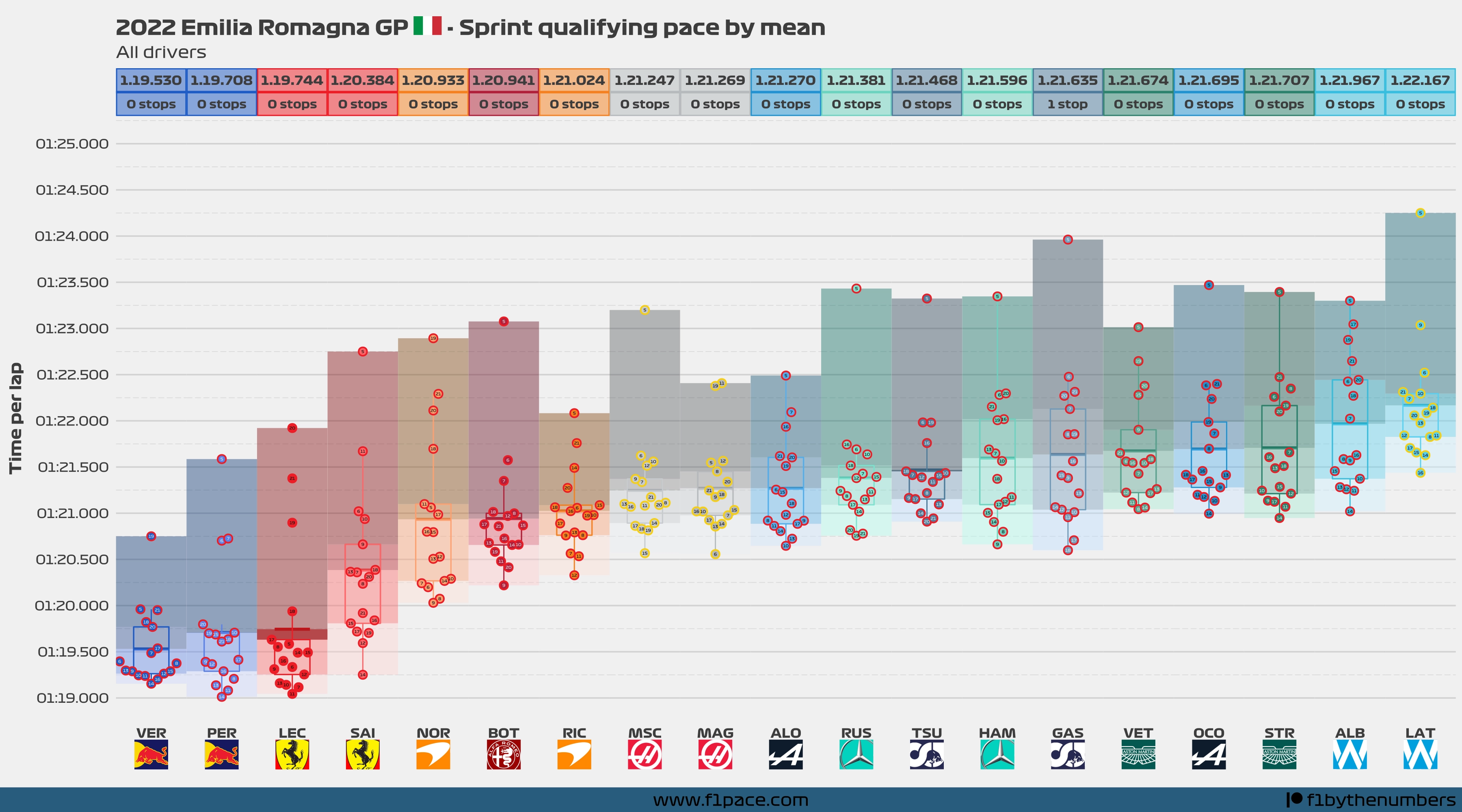
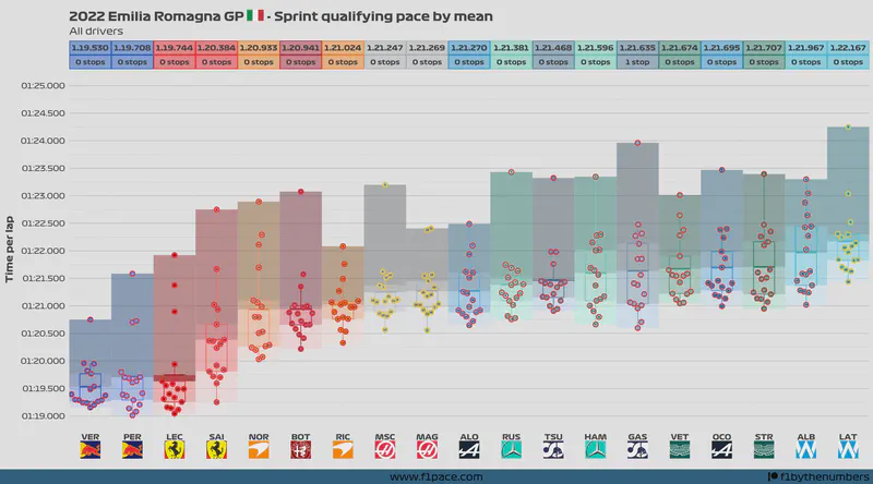
The main idea of these charts is to show the representative average pace of each driver. Since plotting the raw data will not show accurate information, I did a bit of data pre-processing.
- I removed the laps that were not raced under green or yellow flag conditions. This means that laps raced under Virtual Safety Car (VSC) or full Safety Car (SC) conditions were removed from the analysis.
- The first lap is not consistent with the rest of the laps so it was removed from the analysis. Finally, laps in which a driver entered or left the pits are not “full laps”, so they were removed from the analysis as well.
- If laps were done with the intermediate or wet tires, then they were considered for this analysis.
- The box represents a modified box plot, with the line in the middle representing the mean (average) time done by each driver. The top and bottom lines respectively represent the 75% percentile and the 25% percentile.
- The colors behind the box represent quantiles. There are 4 colours for each driver, with each colour representing a specific quantile. Quantiles with lighter colours include the fastest laps, while quantiles with darker colours include the slowest laps.
- The jitter in the x-axis is mainly used to separate stints for each driver.
- For example, if a driver stopped only once for new tires, then he had 2 stints during the race. Laps of the first stint will be aligned slightly more to the left side, while laps of the second stint will be aligned slightly more to the right.
- Within each stint, the x-axis doesn’t represent anything. The points are jittered just to separate them and allow you to have a better view of each lap.
Remember
Drivers with more pit stops tend to have faster average times than drivers with fewer pit stops.

