Disclaimer
First of all, I want to say that it took me a while to decide whether to do this post or not. I normally just focus on my analyses but I decided that there’s nothing wrong with talking about analyses done by others as long as it’s done with respect. Because of that, I want to make it clear: the purpose of this post is not to bash anyone, but to give out constructive criticism. With that in mind, let’s get on with it.
Be careful!
While browsing Reddit a few days ago I came up with a post called How the Midfield has evolved this season, visualised with Race Pace by @Formula Dino. This post was quite popular on Reddit and had around 1500 upvotes by the time I saw it.
The post shows some interesting information about the race pace of the best driver of each team throughout the first 4 rounds of the 2022 F1 season. While the information seems to be correct, as soon as I saw this post my mind went “uh-oh”. Can you tell what’s wrong with it?
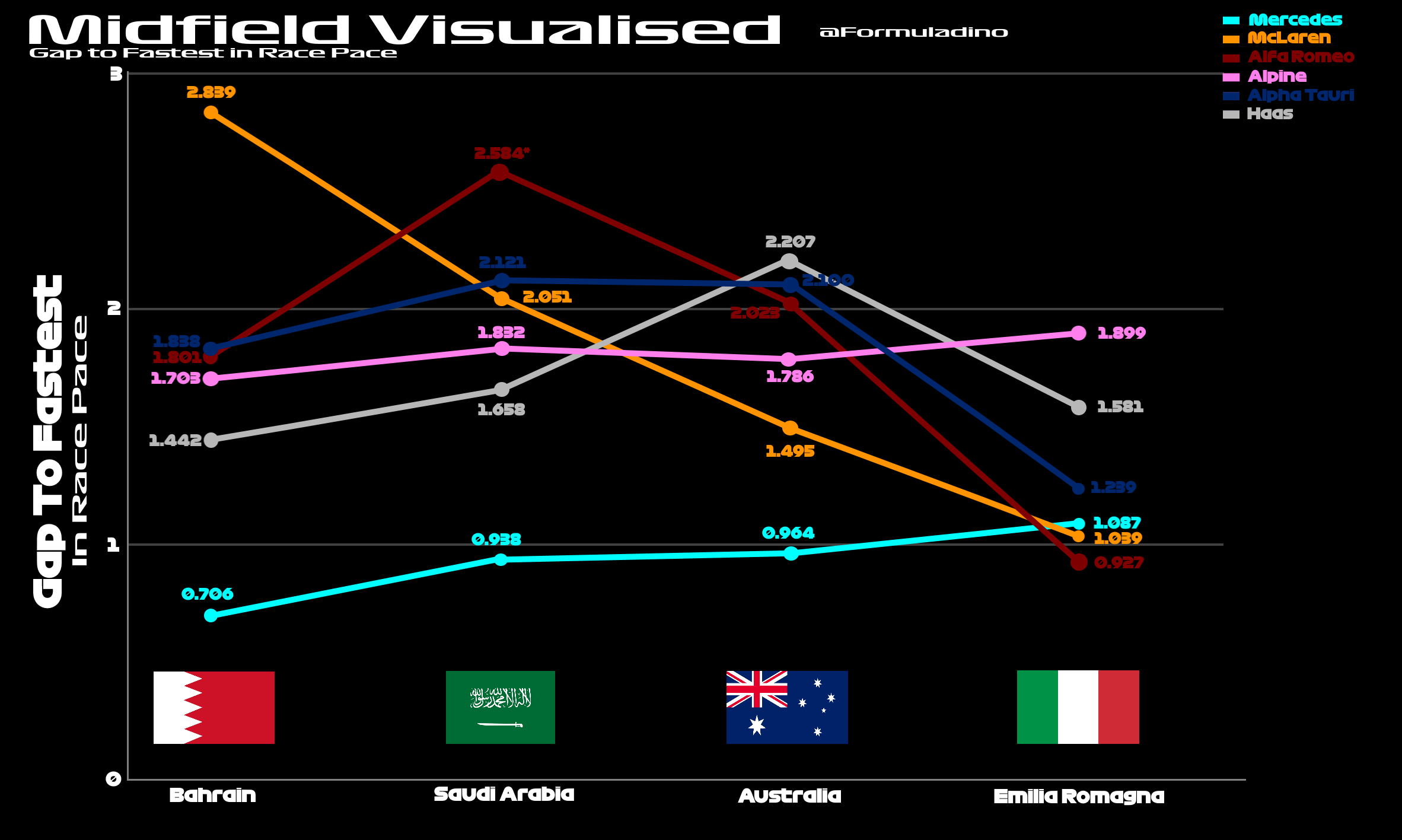
The main issue with this chart is not the data, but the way it is presented. There’s absolutely nothing wrong with comparing the race pace among teams for one race. However, comparing the race pace in seconds for multiple races is a no-no. The main reason this is a problem? The tracks have different lengths and the average lap times in distinct tracks are distinct as well.
The average mean race pace—that is correct, the average of the average race pace—for the first 4 races of the season is as follows:
| Race | Average mean race pace |
|---|---|
| Bahrain GP | 1:39.404 |
| Saudi Arabian GP | 1:35.208 |
| Australian GP | 1:24.438 |
| Emilia Romagna GP | 1:24.805 |
As you can see the race pace expressed in seconds is very different. The Bahrain GP has slower laps than all the other tracks. The Jeddah Street Circuit is pretty fast, but also long, so the laps are quite long as well.
So, what’s the problem? The problem is you would expect the delta—or gap—between drivers to be bigger in longer tracks than in shorter tracks. This makes sense when you think about it. Being 1% slower over 60 seconds equals being 0.6 seconds slower. Being 1% slower over 90 seconds means being 0.9 seconds slower. Proportionally the difference is the same, but in absolute values—seconds in this case—the difference is not the same.
So how can we fix this? The easiest way is just to convert all the values to percentages. For that, you need a reference value. In this case, I decided to use the fastest race pace time as the reference value. The data from all the other drivers were then compared to this reference value as a percentage. This means that the fastest race pace of each race was 100%, and every other driver was n% slower than this value.
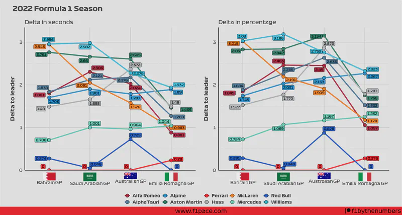
I think it’s easier to explain this with a chart. First, let’s take a look at the original chart, now recreated by me, on the left side vs the chart with relative percentage values on the right side.
Comparison between delta expressed as seconds vs delta expressed as a percentage
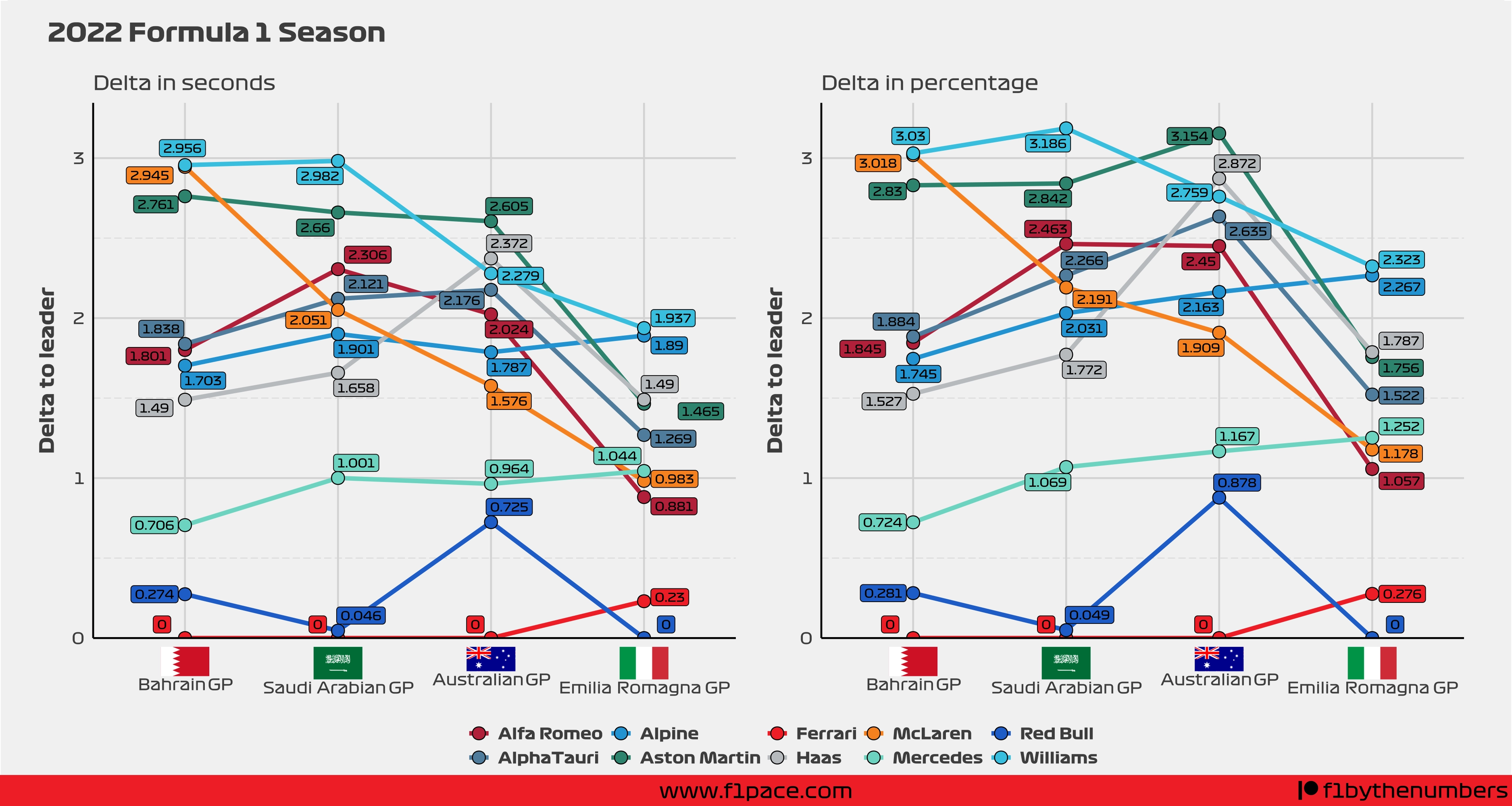
As you can see, the plots look quite similar. This is expected since the lap times are not wildly different between tracks. Having said that, there are some subtle differences that are worth paying attention to.
First of all, you can see that the Mercedes trend changes… a lot. It goes from being fairly flat to clearly positive. Something similar happens with the Alpine line. The plot on the left makes it seem like Alpine got better—closer to the fastest driver of the day—from the Saudi Arabian GP to the Australian GP. The chart on the right shows a very different story. Let’s take a closer look.
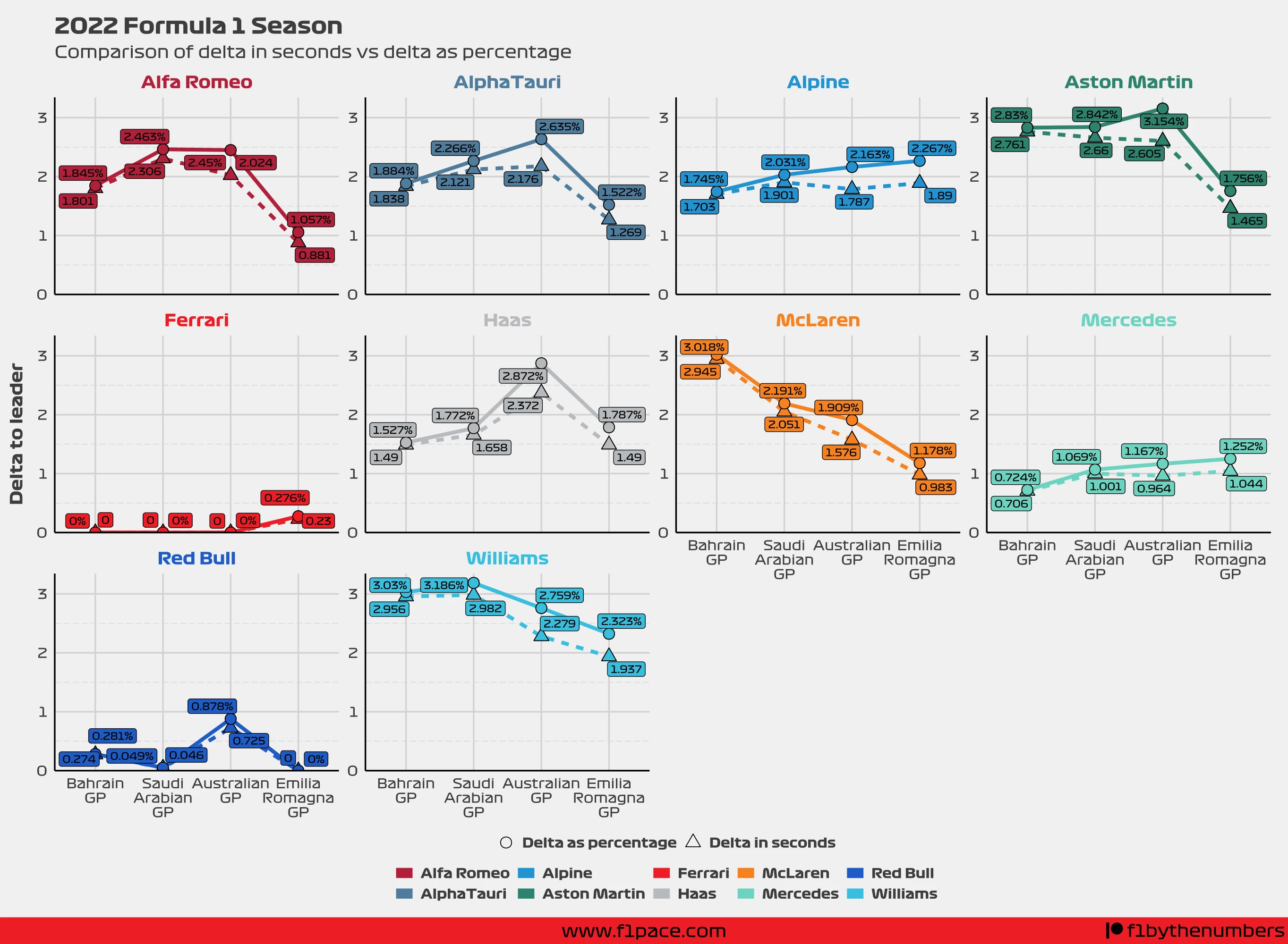
This chart overlaps both of the previous two charts. The data with the circles and the solid lines shows the delta as a percentage. The data with the triangles and the dashed line shows the gap in the original units—seconds.
Looking at this new chart we can see some major differences between the data in seconds vs the data expressed as a percentage. AlphaTauri was a lot slower in both the second and third races of the season. Alpine has been on a negative trend, with them getting slower each race. Aston Martin did not improve at the Saudi Arabian and Australian GP. They were pretty much equally slow at the Saudi Arabian GP, and significantly slower at the Australian GP. Williams was also in fact slower at the Saudi Arabian GP than at the Bahrain GP.
Final remarks
As I said at the beginning of this article, the idea behind writing this is not to bash anyone, but to create some constructive criticism. In this case, you can see how the results change, quite dramatically in the case of Alpine and Mercedes, when the data is transformed to percent change. So, thanks to @Formula Dino for creating this interesting chart. If you read this post, I would recommend you to transform your data next time. Not that you have to, but I think it would be a good idea.
Thanks everyone for taking the time to read this, and please, if you like the content, share it with friends and people who may be interested in reading about the world of data in Formula 1.