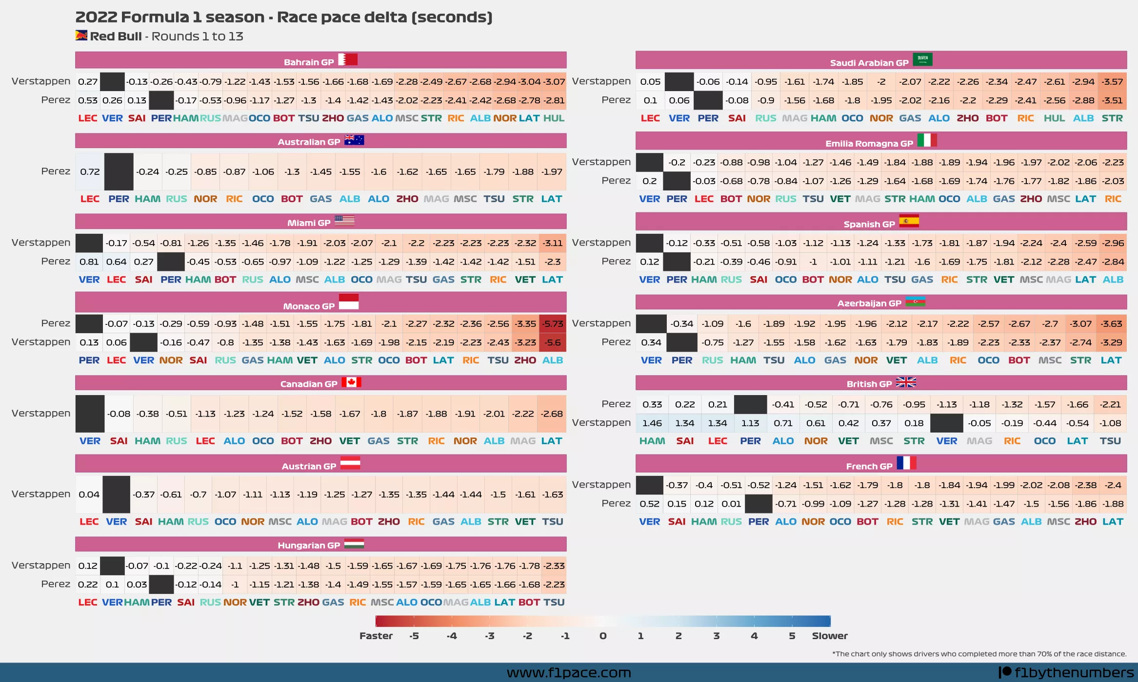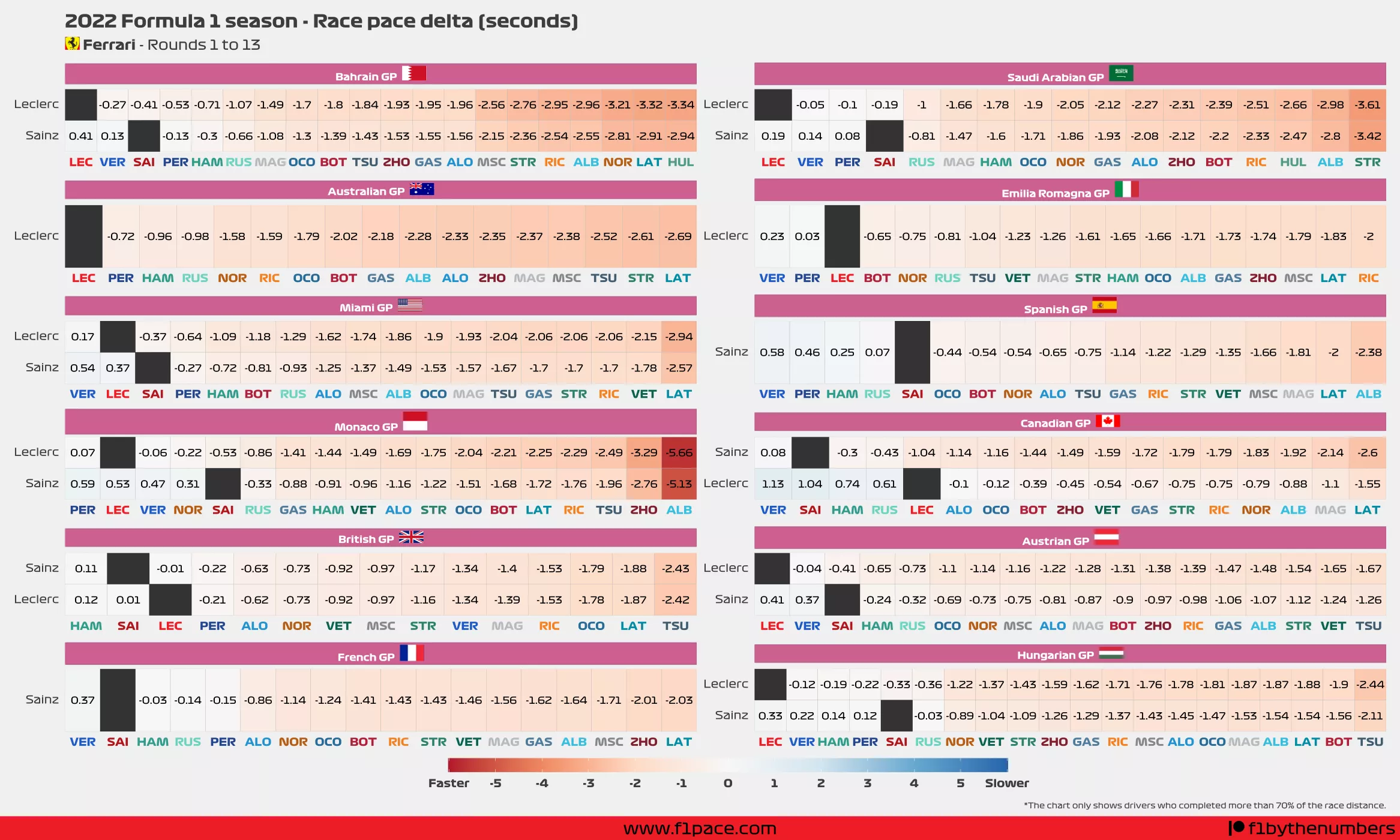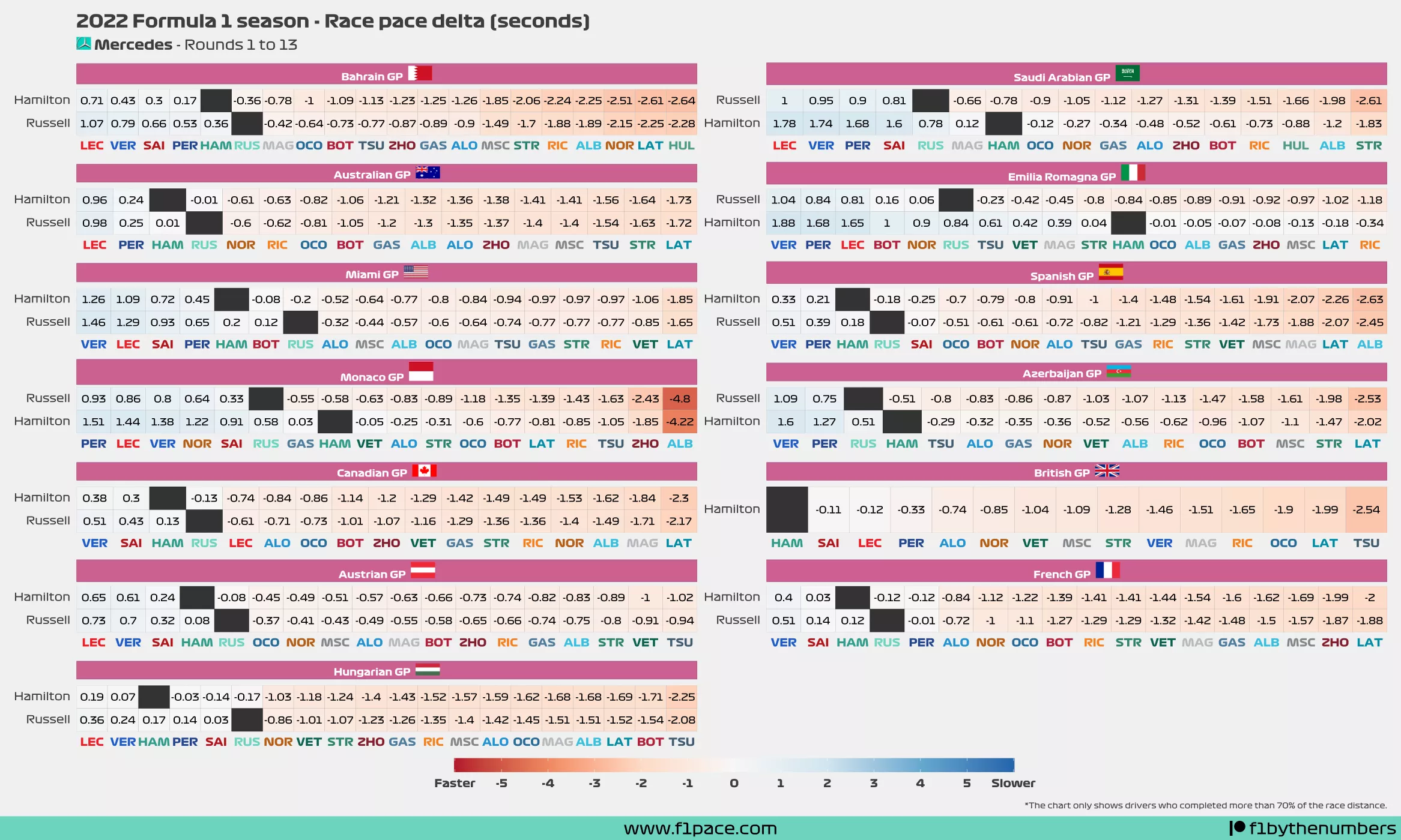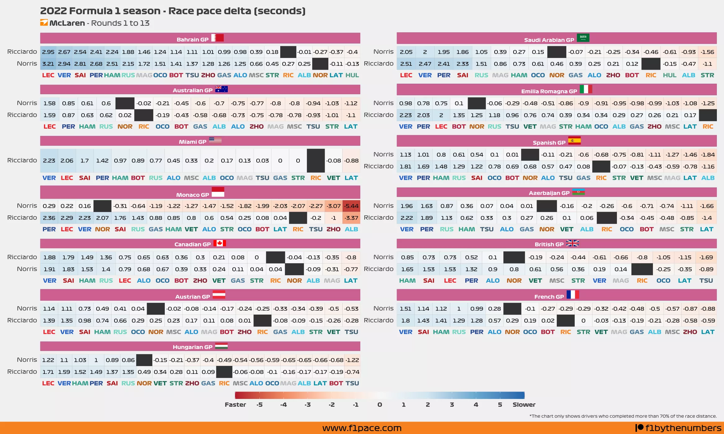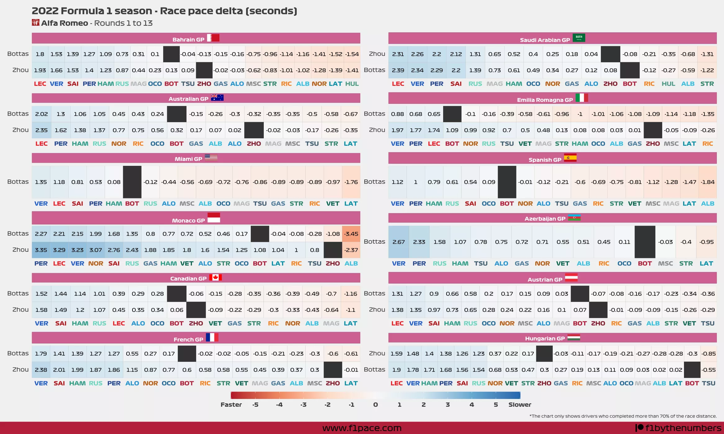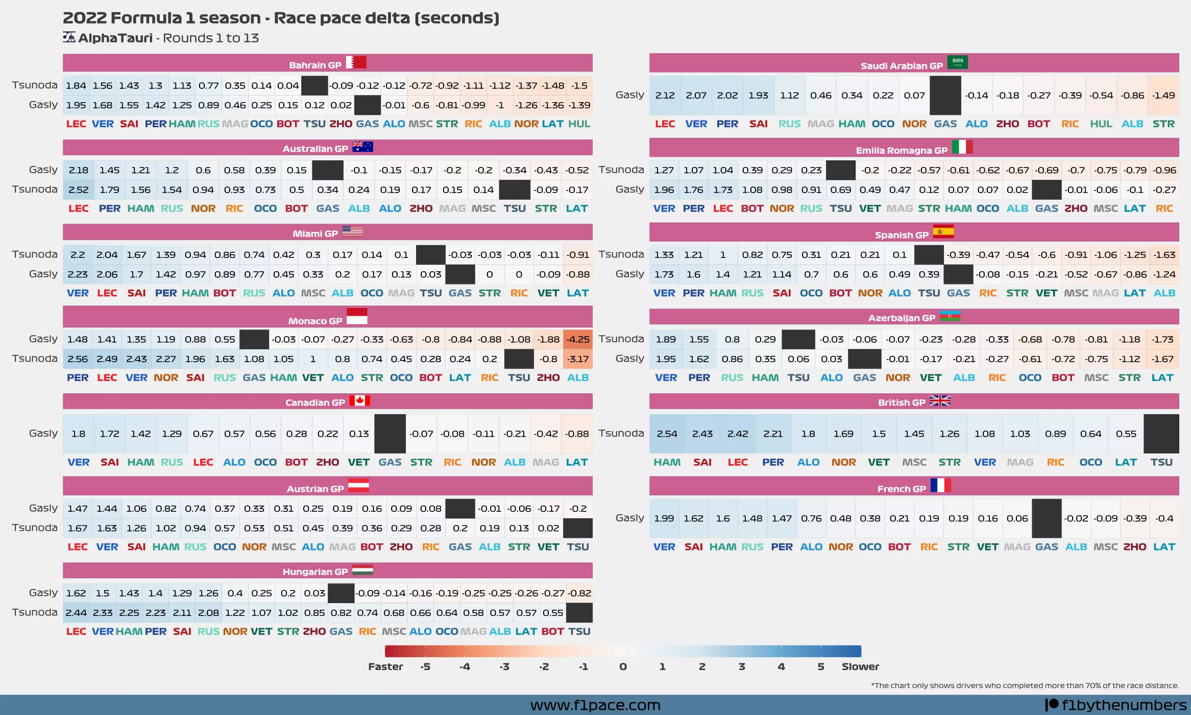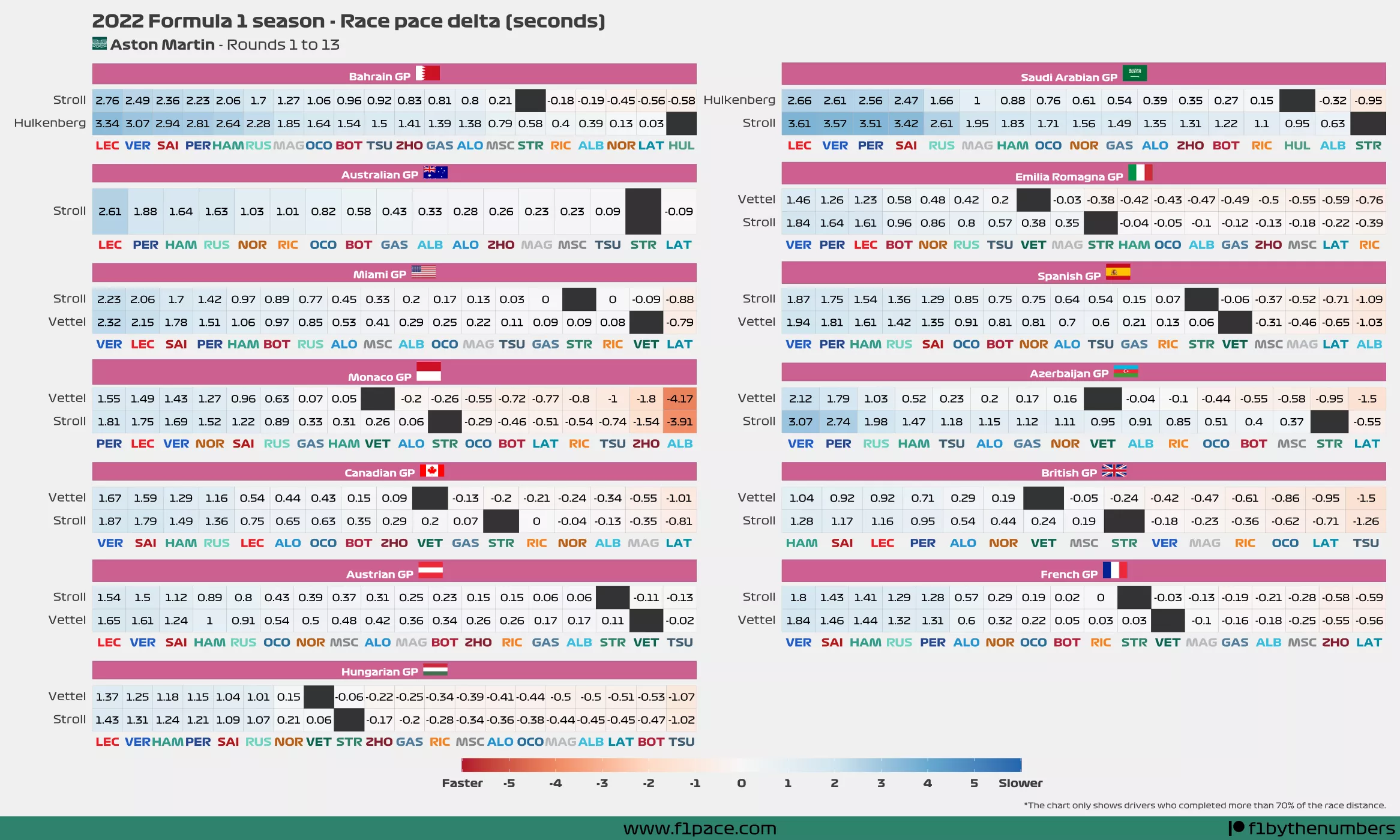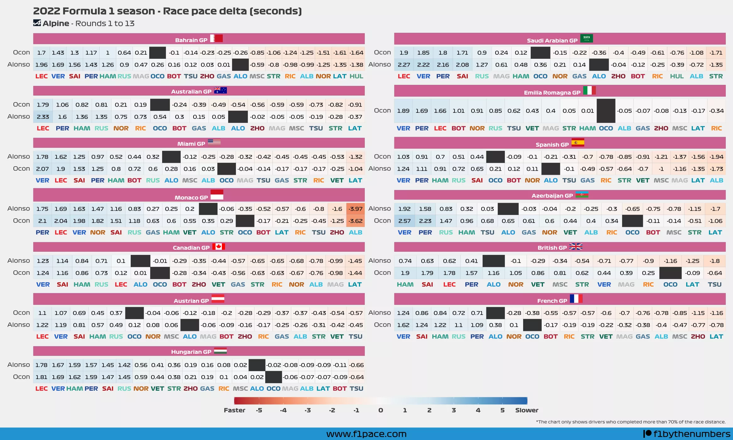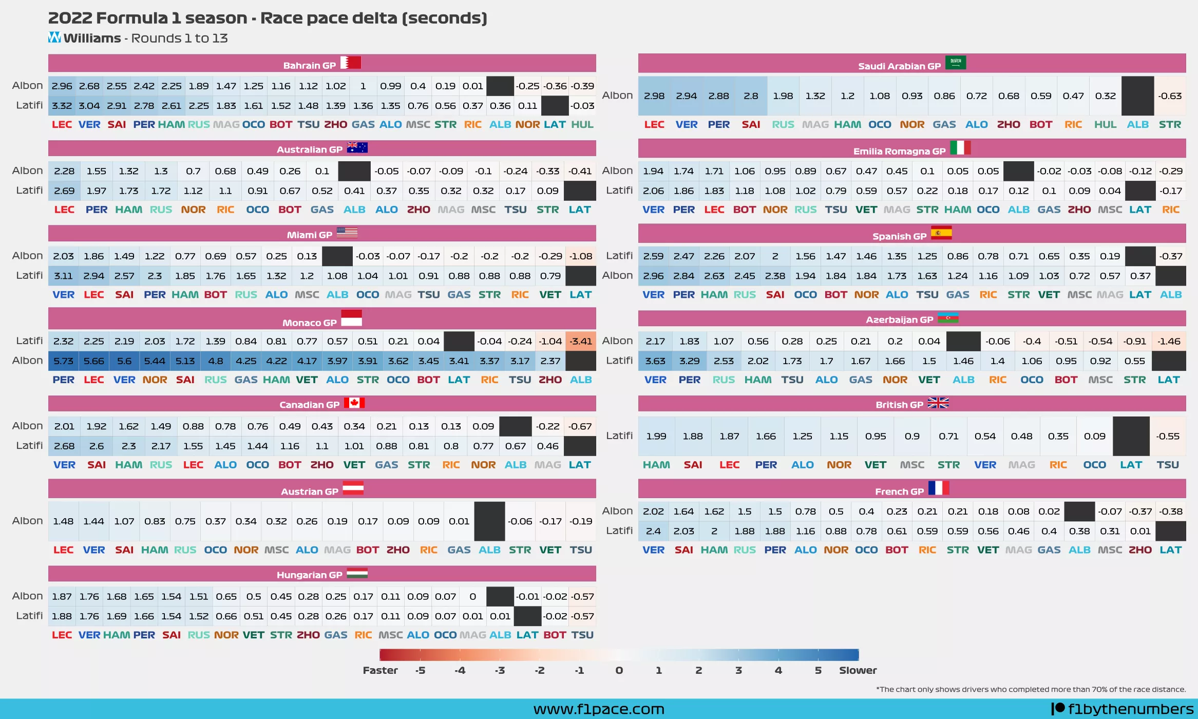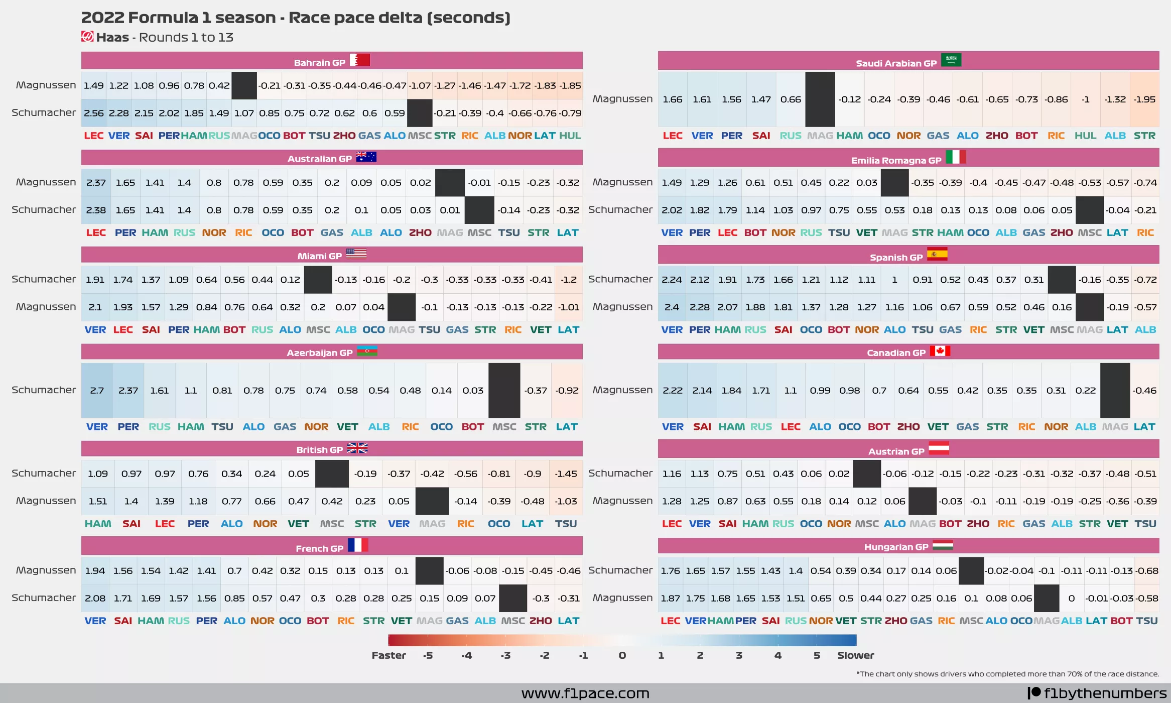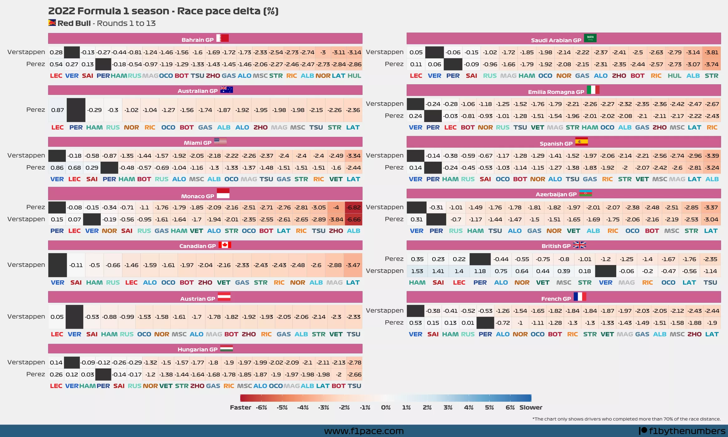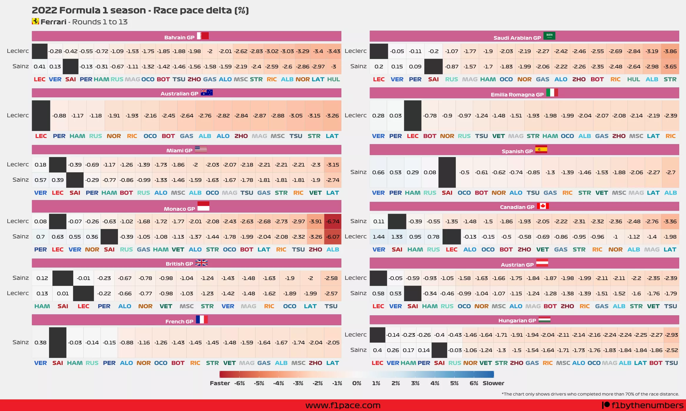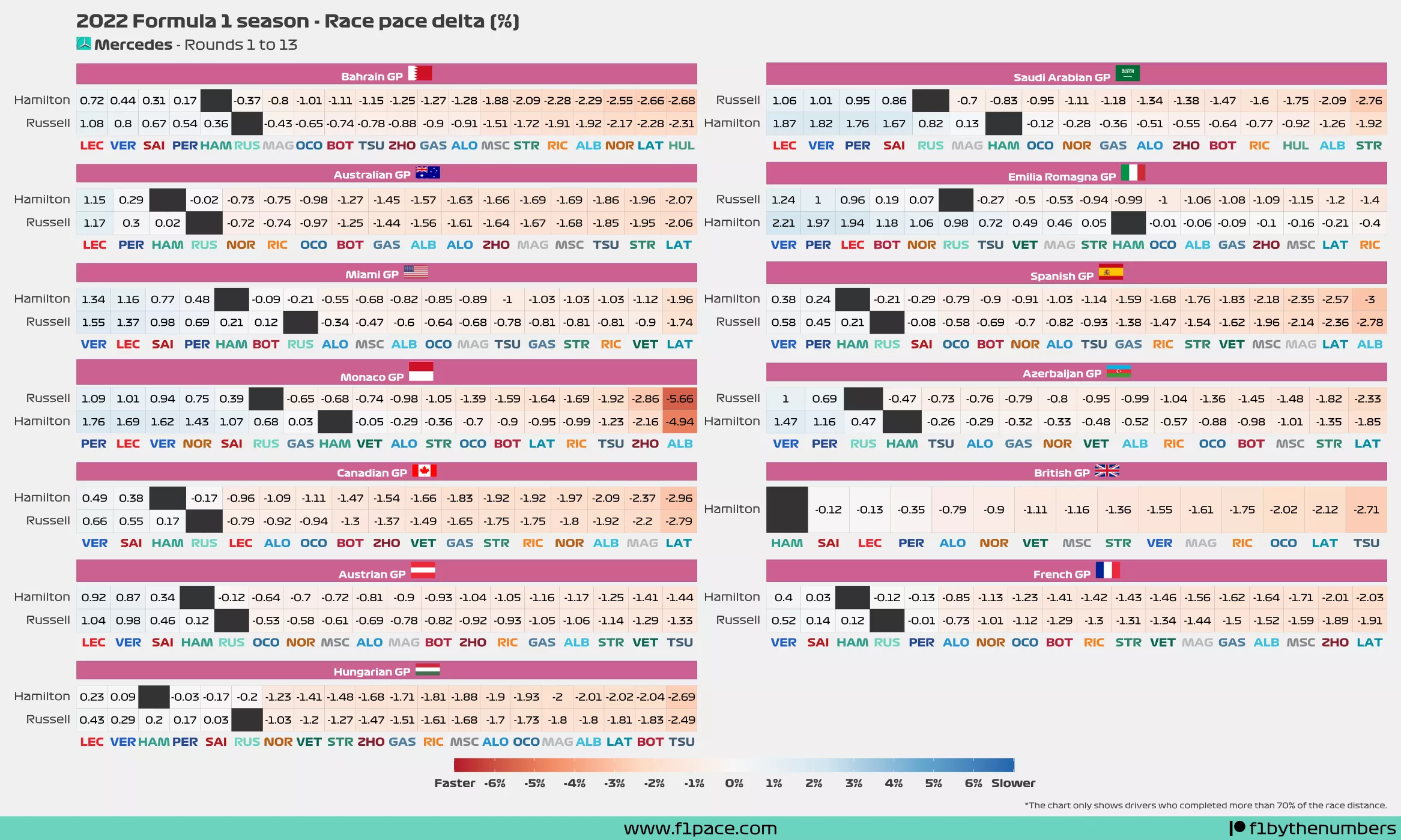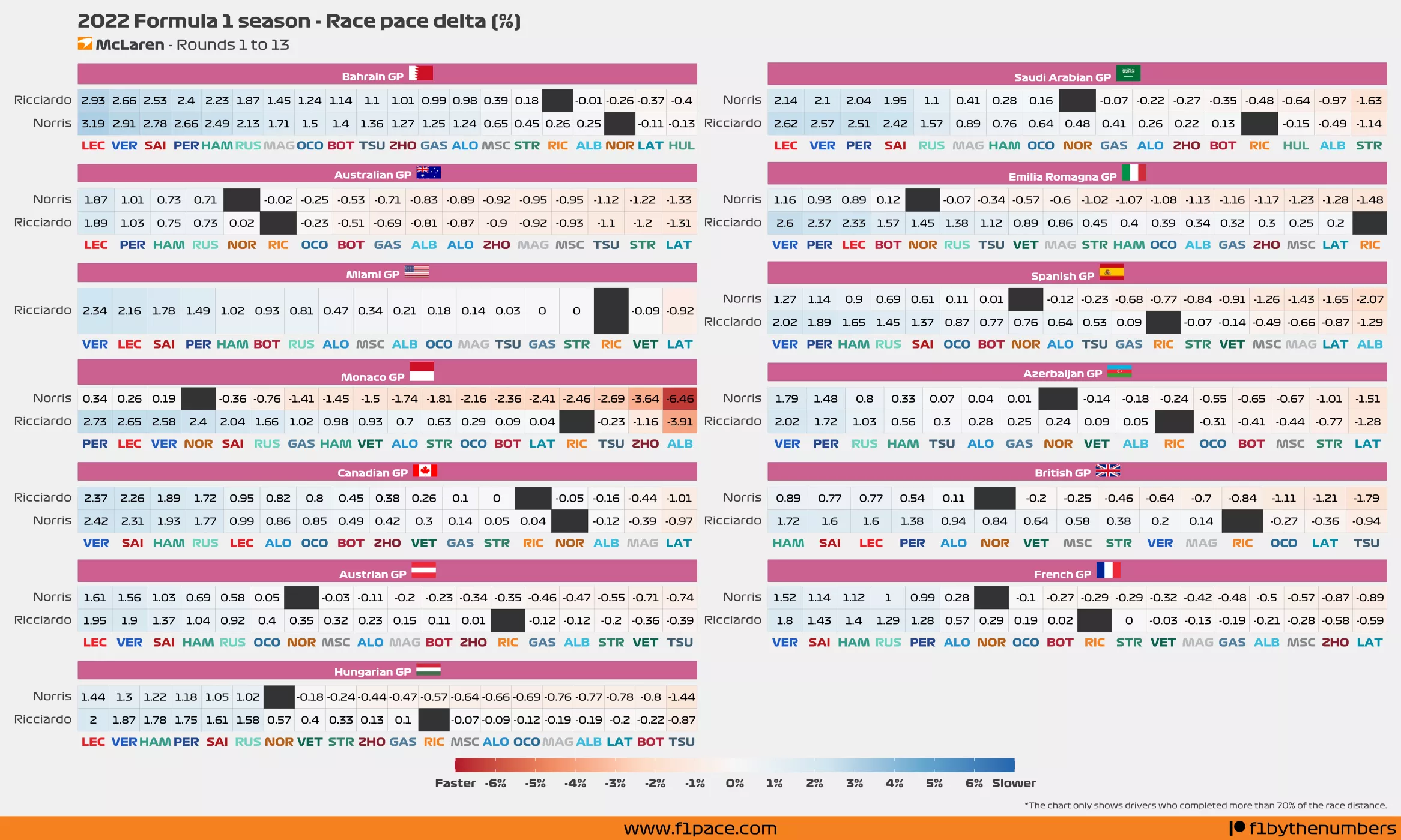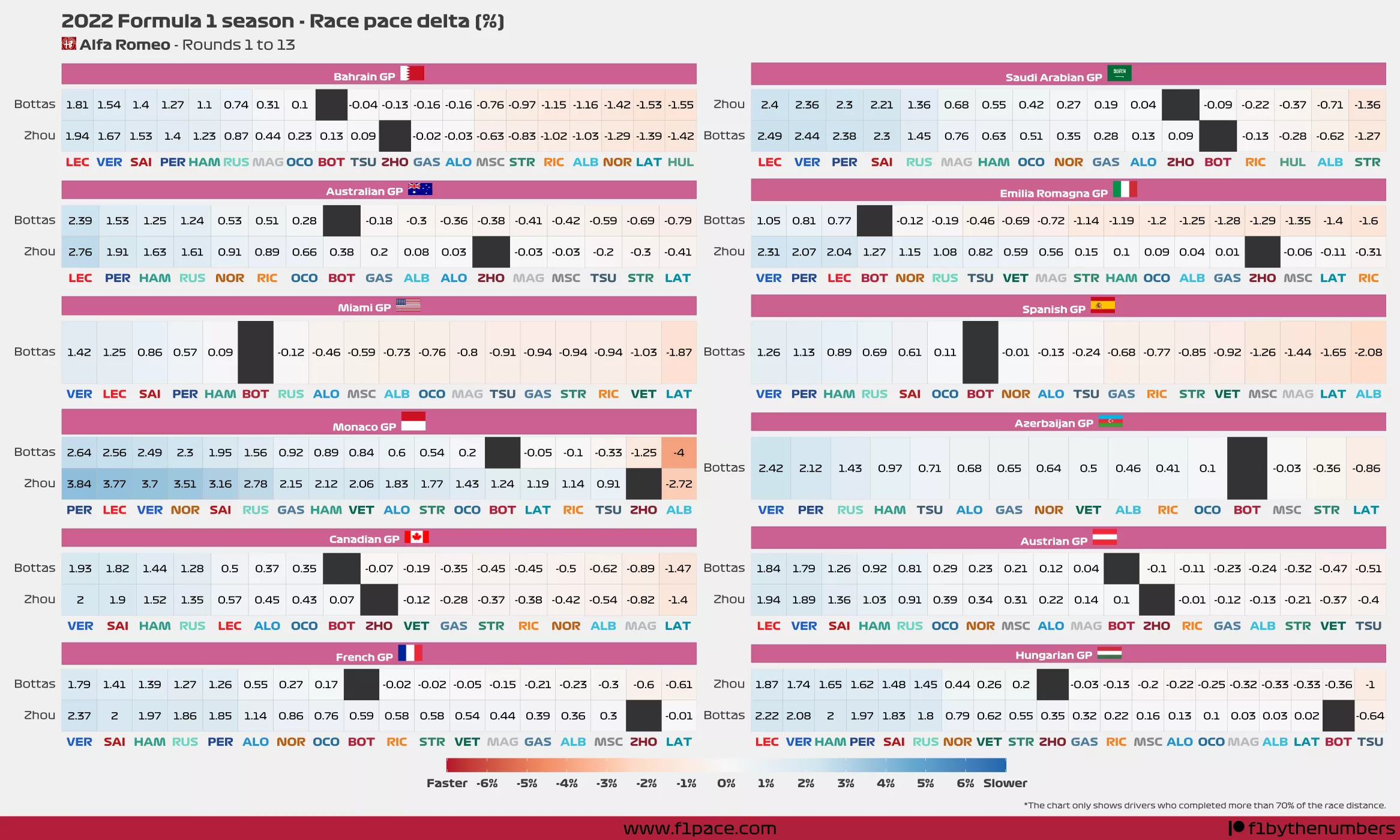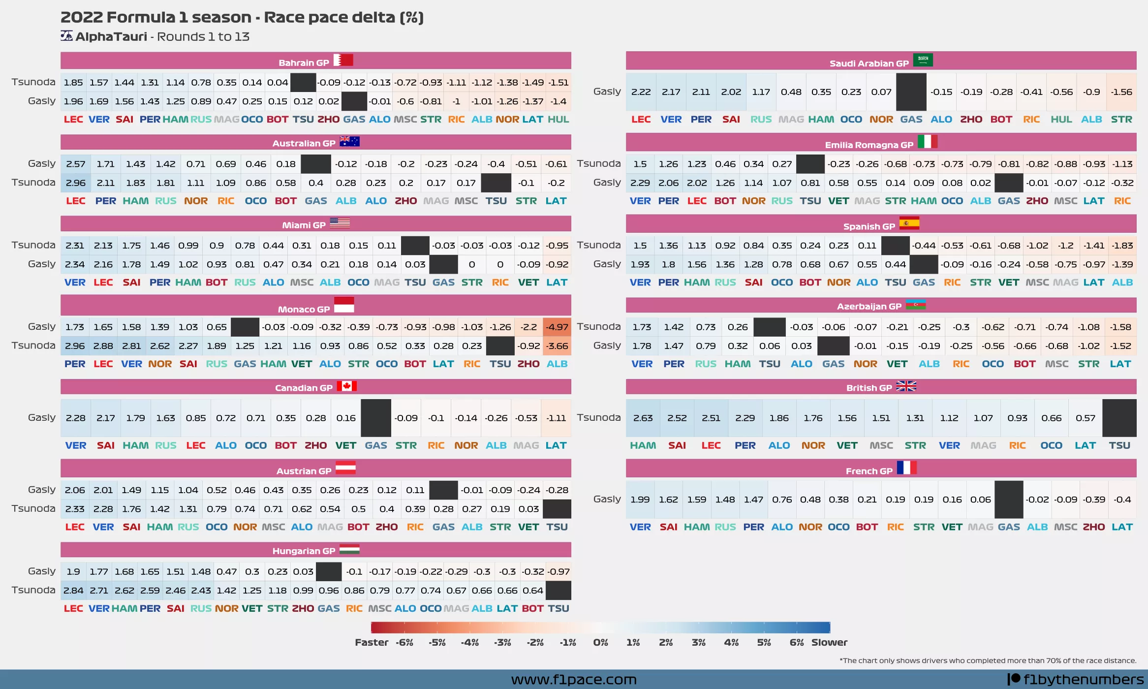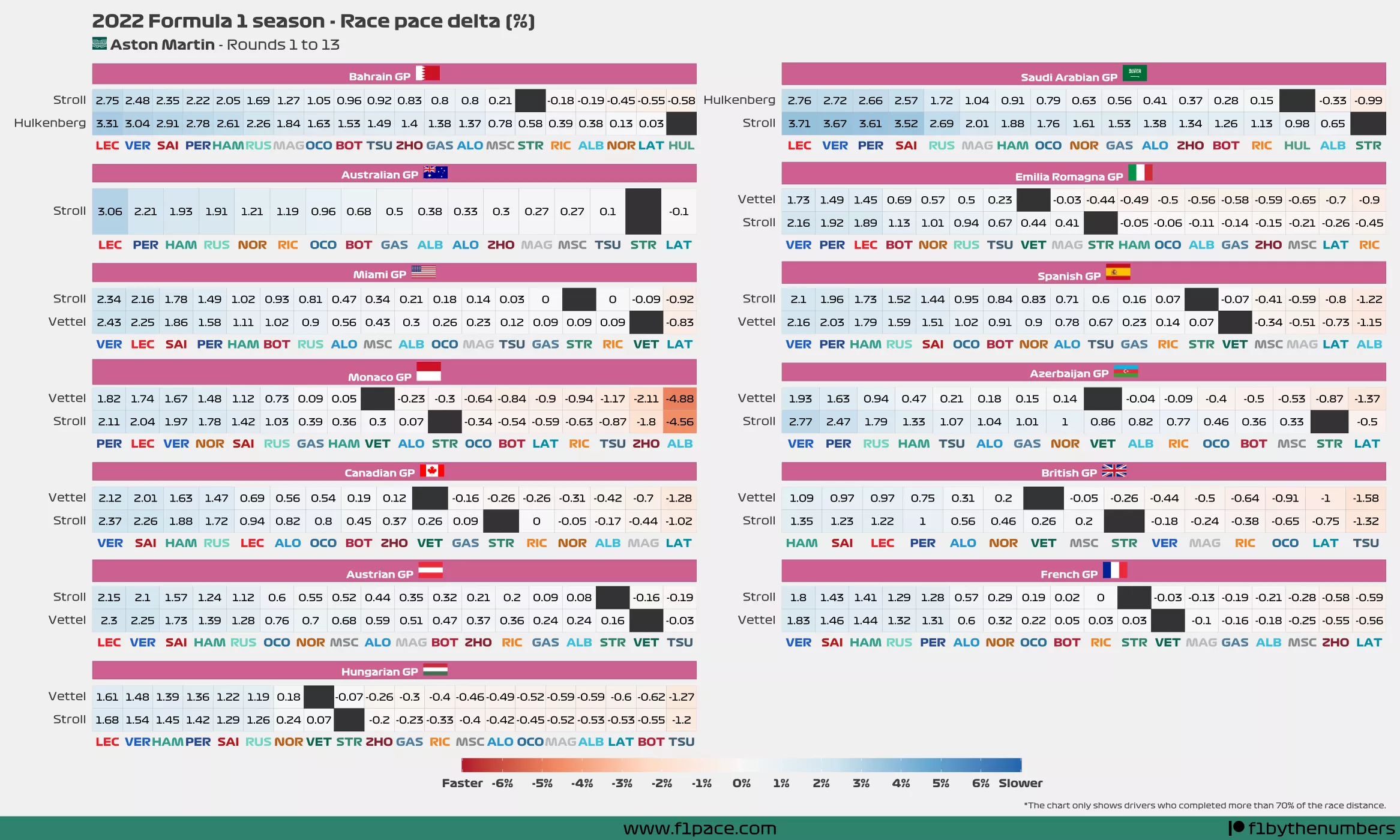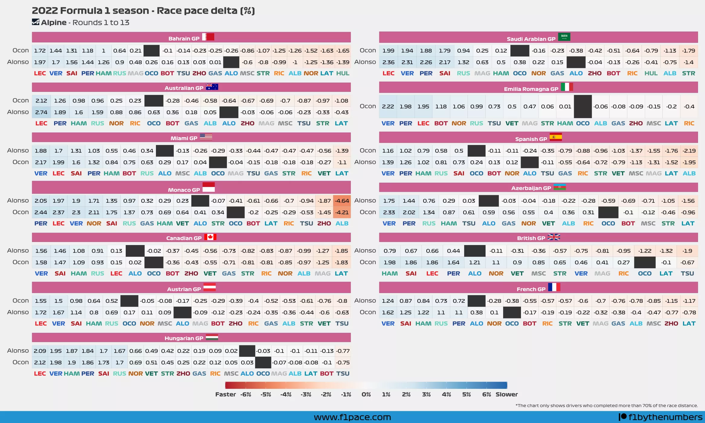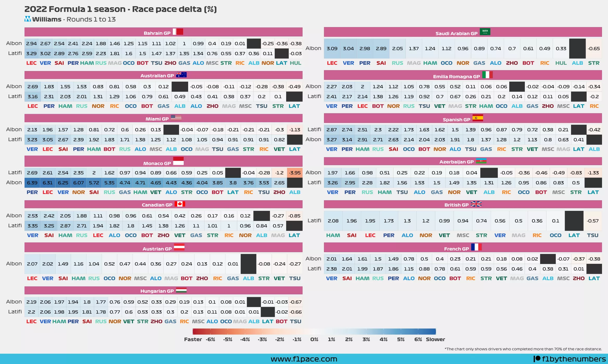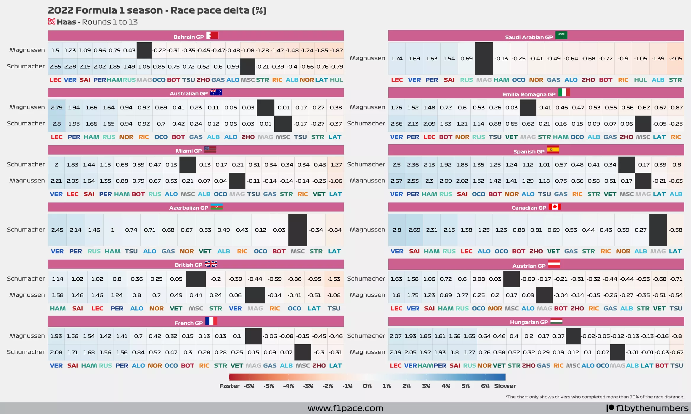
After going through some of the analytics that I get for this blog, I realized that my race pace delta chart was quite successful. This is a new addition to the blog and I’ve been doing one chart for the quali session and another one for the race. So first of all, thank you for enjoying and sharing the content =).
I decided to create multiple race pace delta charts for the whole season, making sure to do one for each team. This way you can check how your favourite driver did in each of the previous 13 races of the season.
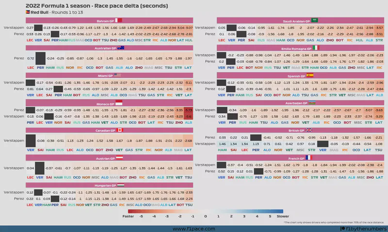
The chart reads like this:
- Choose a driver from the left side of the plot (y-axis)
- Choose a second driver from the bottom of the plot (x-axis)
- See where they intersect. The number that you see is the delta for their mean/average race pace.
- If you see negative numbers then that means that the driver on the left side was faster than the driver he’s being compared to.
- If you see positive numbers then that means that the driver on the left side was slower than the driver he’s being compared to.