As a (fairly) new addition to this blog I have created three plots: the lap time distribution plot, a lap time distribution plot separated by stints, and a plot that I decided to call “All the laps!”.
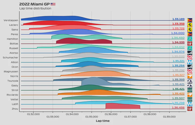
Lap distribution
Let’s start with the lap distribution plot. It’s quite likely that you’ve already seen a plot like this one before. In case you haven’t, let me tell you how to read a plot like this.
- The y-axis is fairly self-explanatory. It just shows the driver.
- The x-axis shows the lap time in intervals of 1 second, with the minor ticks at the bottom showing intervals of 0.5 seconds.
- The curves—also called slabs—show the density of the data for each driver. The density refers to the number of laps done with a specific lap time.
- The higher the slab, the more laps done with that specific lap time.
Why are the slabs “incomplete”?
The slabs are not incomplete but accurately reflect the data. Let me tell you why.
Most density charts generate a density estimate outside of the range of the data. This assumes that the distribution would look a certain way on the sides of the slab by doing some mathematical calculations. I’ve seen this done many times for cosmetic reasons—the “complete” slabs look pretty cool. So while estimating the density makes the slabs look better, they generate some misleading information.
For example, if a driver did many laps with a time of 1:25.250, then you would expect the slab to be pretty high around that section of the plot. However, perhaps the driver never had a lap time below that time. His fastest lap time was 1:25.250. The slab will “cut” short at 1:25.250. This reflects the fact that he had 0 laps below that time. If we had estimated the density outside of the range, then the slab would extend towards the left side of the plot, perhaps until 1:25.000. This is not real data. The driver had no laps faster than 1:25.250. In this case, the slabs would look quite nice, but they wouldn’t accurately represent what happened during the race. Because of this, I decided to create the less traditional trimmed slabs that show the density of only the laps that happened during the race.
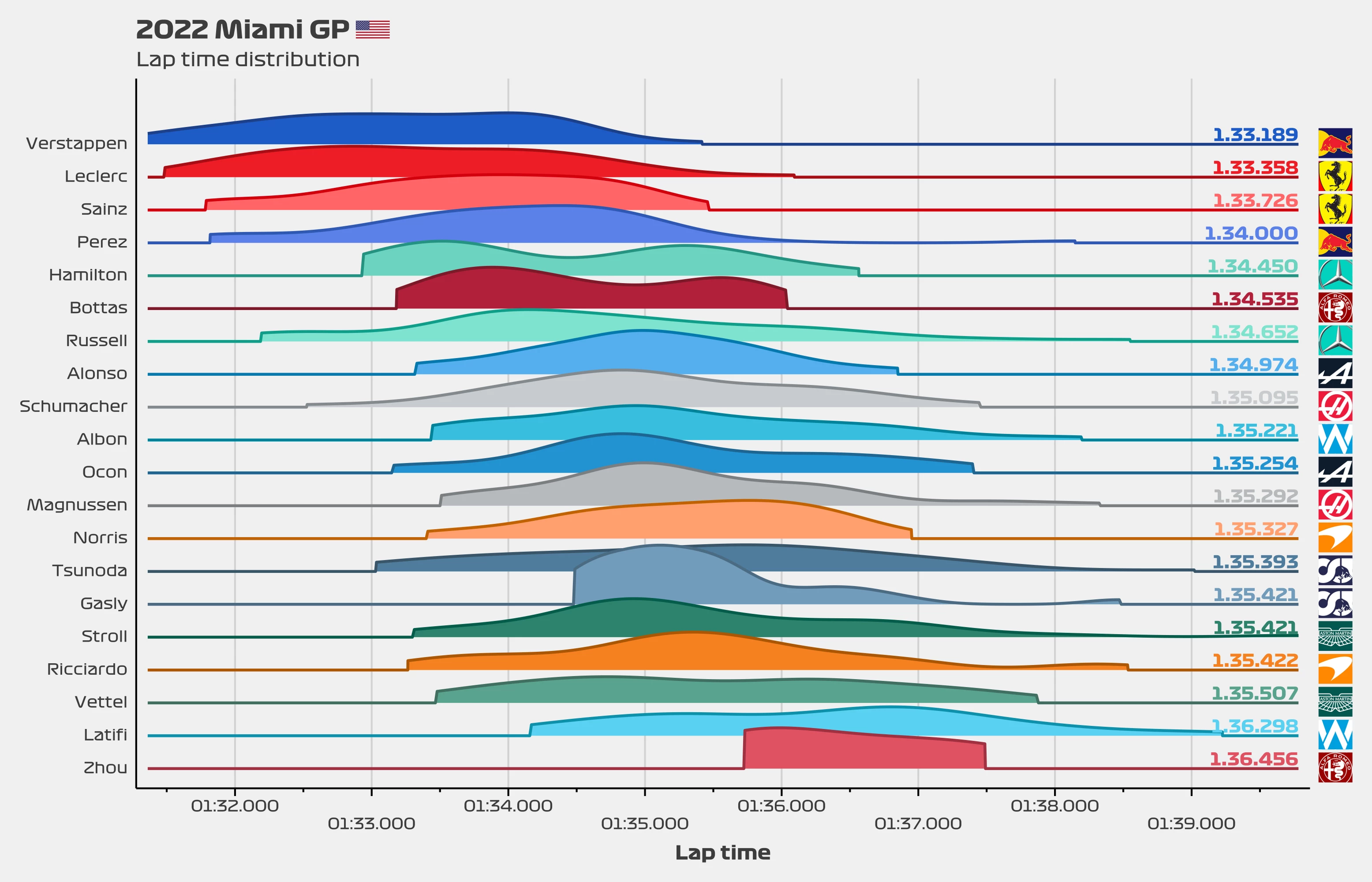
Lap distribution by stint
This chart is quite similar to the previous one but now the data is separated so that each slab represents one stint. Since now the stints are separated, the slabs should be less “smooth” and instead represent the data more accurately. Take note of the legend since it specifies what the colour of the lines and the type of line shows.
All the laps!
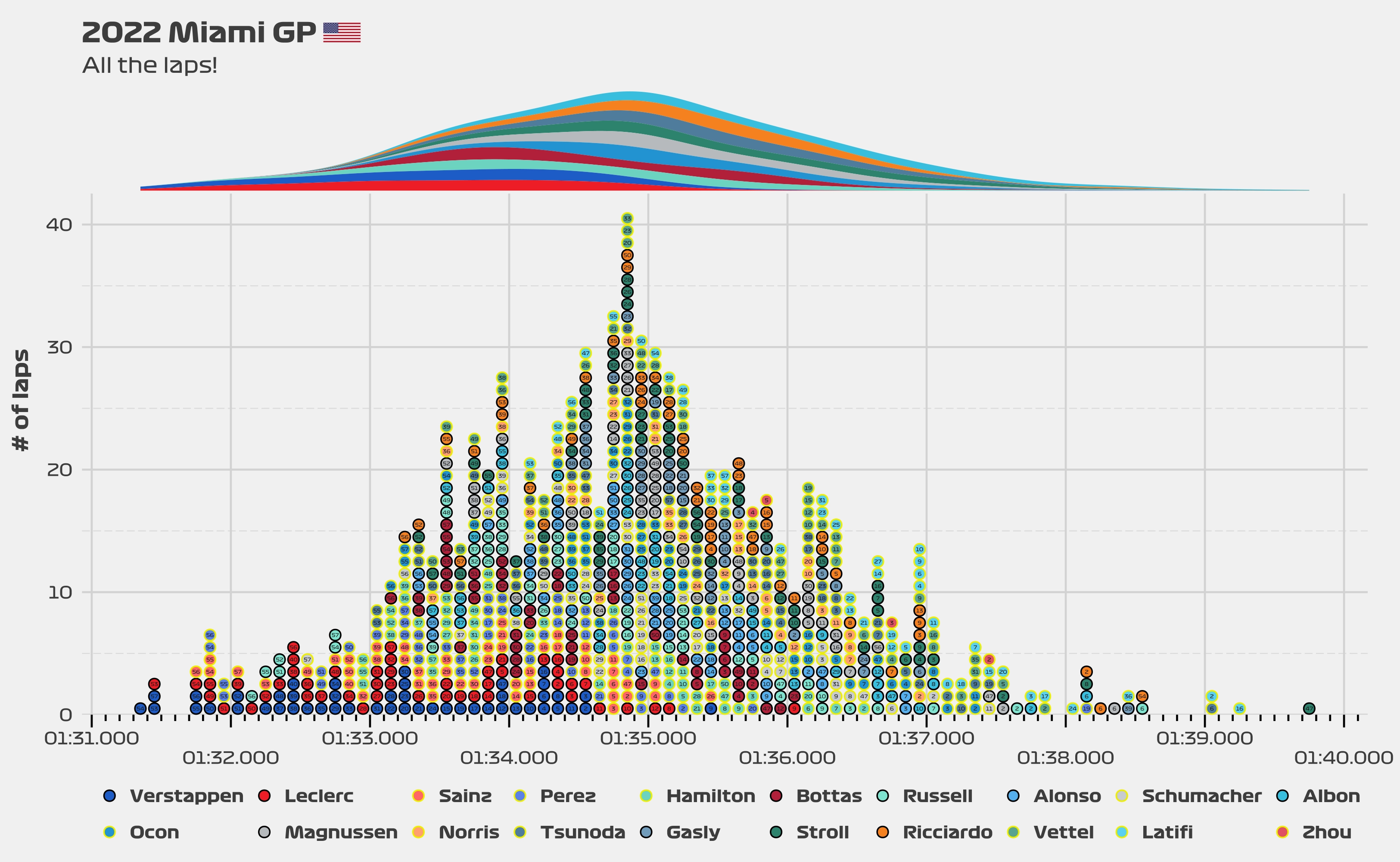
How do you read this plot?
- The x-axis shows the lap time in intervals of 1 second, with the minor ticks at the bottom showing intervals of 0.1 seconds.
- The y-axis shows the number of laps done within a 0.1 seconds interval.
- An example of a 0.1 seconds interval would be 1:25.000 to 1.25.100.
- If 10 laps were done within that interval, then you would expect to see a column with a height of 10 dots.
- The number inside each dot shows the lap number.
- The fill of the dots is used to identify which driver did which lap.
- The outside of the dots can take two different values: black or yellow. These values are consistent with the colour of the T-camera or T-cam that drivers use during the races. They are used in this case to easily identify drivers from the same team. For example. Verstappen uses a black T-cam in real life, so the outside of his dots in this chart are black. Pérez uses a yellow T-cam, so the outside of his dots are yellow as well.
- The slab at the top of the chart shows the density of the laps, split for each team.
- The higher the slab, the more laps were done around that specific lap time.
- The density is smoothed, meaning that is not a perfect representation of the data. It should, however, accurately represent the distribution of the laps.