There have been a lot of talks recently about Red Bull’s straight-line speed, so I thought: “maybe I should make a quick analysis about it?”.
What did I do for this analysis?
- I extracted some of the telemetry data provided by the F1 Live Timing app.
- Filtered the data to contain only information from Charles Leclerc and Max Verstappen.
- Filtered the data again, now to contain only the data from the main straight of the Miami International Autodrome.
- You guessed it, I filtered the data again. Now I only extracted the data for laps in which neither driver had used DRS.
- Unbelievable… I filtered the data… again. This time I checked which laps both drivers had in common—meaning laps in which both drivers did a representative lap without DRS—and extracted that data.
The result was a dataset of 43 laps for each driver—the same laps for both of them. Each of these laps contained information about speed, and distance travelled, among other variables.
After doing a bit more data wrangling and cleaning, I fitted a simple, but flexible, model to the data to obtain the average speed of each driver at different distances—in this case, every 100 meters—on the main straight. This data represents the average speed over 43 representative laps with no DRS activated for each of the two drivers previously mentioned.
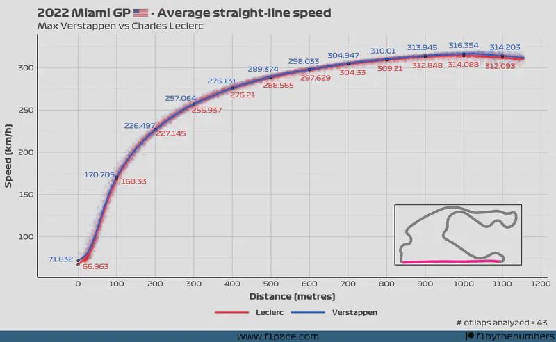
Average straight-line speed - Verstappen vs Leclerc
How to read the plot?
The plot is actually quite simple.
- On the x-axis we have the distance travelled on the main straight. The units are metres.
- On the y-axis we have the speed in km/h.
- The colours represent both drivers.
- The lines show the average speed over 43 laps at that particular distance in the main straight.
- The text labels show the average speed at 100 metres intervals.
- The transparent dots show each of the raw data points being analyzed. Since there are too many of them, I decided to make them semi-transparent.
- The map on the lower right side of the plot shows the Miami International Autodrome layout. The pink-coloored section highlights the main straight of the track that was analyzed in this article.
What do we see?
Both Leclerc and Verstappen were evenly matched on the main straight of the Miami track. However, there are some subtle but important differences between them.
First, you can see how Verstappen carried more speed at the beginning of the straight. From the start of the straight until metre 200, Max had a higher average speed than Charles. From the 200 to 700 metres interval, both the F1-75 and the RB18 were fairly evenly matched, with the delta between both drivers averaging around half a kilometre per hour. It isn’t until the end of the straight—after 900 metres—that we see a marked difference between both cars.
What happens after 900 metres? Red Bull was considerably faster than Ferrari. Take a look at the speed at both 1000 and 1100 metres. The delta increased to over 2 km/h. While this difference may not seem massive, it is very significant.
Without more data, I can’t say why this difference arises. Having said that, both speed curves follow a very similar path, and the F1-75 seems to lose performance when compared to the Red Bull only in the final 200 meters, not before. Because of this, I’m inclined to believe this delta could be caused by a different battery-deployment program. This is pure speculation on my part since I’m a data scientist and not a mechanical engineer or an aerodynamicist.
Final remarks
Max Verstappen and his RB18 had a small but powerful advantage on the straight in Miami when compared to Charles Leclerc and his F1-75. 2 km/h may not seem like much but considering that the end of the straight is the place where most overtakes occur, it meant that Charles never had a chance of getting close enough to Max to attempt to regain his lost position.
I hope you have enjoyed this analysis. While it looks fairly simple, it still took me several hours to make it. If you liked the article, please share it on social media, as well as with friends and other people who may be interested in the statistics of Formula 1. If you want to support me even more, you can click on the “buy me a coffee” button below to give me a donation.