Yes, this is yet another post about the sudden drama and controversy created during the 2022 F1 São Paulo GP. I mean, what else is there to talk about right now?
I came up with the title of this post after reading it in one of the Reddit threads talking about the incident. “Telemetry geniuses”. I don’t remember the username of the person who came up with that phrase, but I thought it was appropriate. It’s quite interesting seeing dozens of people who have no idea about telemetry or anything related to it suddenly talking like experts. How many posts and videos, most of them of really low quality, have been posted in the last few days? I don’t even want to think about it.
I haven’t been as active as I should be with this blog but I decided to do this post just out of disappointment. While I normally keep my opinions to myself and try to make these posts as objective as possible, I think it’s important to express myself as a person and not as a “blog” every now and then.
I love that more and more people are getting into data analysis, but it’s sad seeing too many low-quality posts get traction. Zero research is done. Just run a couple of scripts with no thought process whatsoever, or post a low-quality video, and that’s it, time to shine. It’s sad to see so much misinformation about something as exciting as Formula 1.
Before anyone asks, no, I’m not an expert in telemetry. Whenever I don’t know something I will let you know and ask for the input of people who do know more about something than I do. I, however, am thorough with my analyses and enjoy working with data. I think long and hard before deciding to make a piece like this one. It’s my opinion that an analysis must be carefully planned before even thinking about the execution. Hopefully this article shows how I work.
Anyways, let’s get on with the analysis. Enjoy.
F1 Live Timing Data
All of the “telemetry” analyses shown in the past few days are created using the data provided by the F1 Live Timing Data app. The data can be extracted in different ways, including an unofficial API. The data provided is quite rich and includes information such as throttle input, brake input, speed, positioning, etc. Having said that, it does not provide what I would call full-blown telemetry. I would instead call the data provided “pseudo-telemetry”.
Why pseudo telemetry you may ask? Just because the sampling rate of the data is not great. An average quali lap at Monaco contains less than 300 data points of car information data (speed, throttle, brake, etc) and less than 300 points of positioning data (X, Y and Z coordinates). Telemetry provided to the teams is much finer than that, containing thousands of data points for each lap.
As an example, let’s take one of Sergio Perez’s laps of the quali session of the 2022 F1 Monaco GP. In lap 14, we only have 277 data points of car information, with an average sampling rate of 0.26 seconds. So we only get a data point containing throttle & brake input 4 times per second, sometimes even less than that. While that may seem quite a lot, it isn’t especially in a sport in which thousands of a second can make a big difference.
What many people do to create “more” data is to interpolate the points, creating additional data points by using usually a linear regression. This creates more granular data, but this data isn’t real, it is approximated by using statistics. There’s nothing wrong with interpolation, it is a very valuable tool for data analysts and scientists, but it comes with a big caveat. What is it? Well, it could be wrong. Interpolation tries its best to create data based on mathematical formulas, but it has a margin of error, and in some cases, it’s just plain wrong. I will use a bit of interpolation in this post, but I will mention it so that you know that the data could in fact be misleading or inaccurate.
1. Lap length
According to Wikipedia, the Circuit de Monte Carlo has an official length of 3.337 km or 3337 meters. You would expect each lap provided by the unofficial data to have an approximate distance similar to the official number, with slight differences due to the racing line. You would also expect all drivers to have laps with a very similar distance, with once again a few differences due to the distinct racing line that different drivers take. So, is that true?
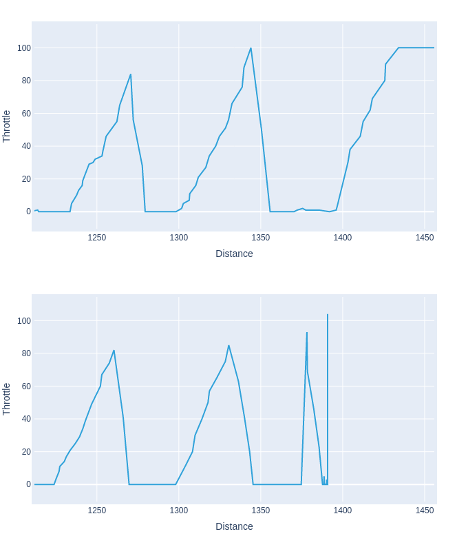
I decided to filter only the valid laps from the quali session of the Monaco GP. By valid, I mean laps of less than 1 minute and 15 seconds (sorry Zhou :( ). I also decided only After filtering them, I created a histogram which shows what’s the frequency of the lap length provided by the API. In this case, I ended up with a total of 99 laps from 19 different drivers—once again, sorry Zhou. Take a look at the chart.
Does it look like all the provided laps have the same length? Because it doesn’t look like that to me. The results show that the average lap length provided by the API is 3273 meters, with a standard deviation of 7.3 meters. The range between the shortest lap (3245 meters) and the longest lap (3292) is 47 meters. Do you really think that a driver could drive 47 meters more or less than another during a quali session? Of course not. This is an error caused by data inaccuracy.
Why is this massive data discrepancy happening? The answer is actually quite simple. The distance between the data points provided by the API is calculated using the simple formula Distance = Speed multiplied by Time. For each data point, the API calculates how much a driver changed position based on his current speed. These small distance intervals are added up one by one, and by the end, you end up with the final distance travelled by each driver. There’s nothing wrong with this formula or with the API. It is doing what it intends to do. The problem is that neither the positioning data nor the sampling rate are detailed enough to provide accurate data. A missing data point here and there, and slight positioning inaccuracies add up over a full lap, causing errors in the total lap distance.
What I want to say is that the distance data that you see on these “telemetry” posts is in fact inaccurate. It is not raw data provided by the live timing app, but data calculated from a simple formula. The formula is correct, but due to problems with the granularity of the raw data, these little errors add up and cause big discrepancies in the final data.
1.1 The REAL problem with data accuracy
A post called “Throttle telemetry data for all of Checo’s laps around the corner of the crash in Monaco 2022 Qualifying” gained traction on the F1Technical subreddit. The post consists of a series of charts detailing throttle input of all of the laps done by Sergio Pérez during the 2020 Monaco GP.
I’m not going to bash anyone here, but I will use this as an example of how poor data visualization, and even worse, poor understanding of the data, can lead to wrong conclusions. I’m not showing the full chart here because it’s crazy big, but you can look at the whole thing at r/F1Technical. Let’s take a look at a section of the chart.
The data is clear, Checo Perez was braking 20 meters earlier at T8. Incontrovertible evidence that he crashed on purpose. Or is it? Comments such as “20 meters early in a relatively low speed corner is a HUGE difference” or “DTS: “Formula 1 is a millimeter-margin sport” Perez: “sorry, did you say 20m?” are posted by users that take a look at this chart. It’s not their fault the chart is misleading, but it leads to poor outcomes. Credit to the user denzien who said “After overlaying these graphs, it looks like he actually gets on the throttle later than all but about 4 of his previous runs by as much as 25 meters”. You were right, the data does show that, but it’s not because of the reason you think.
2. Perez’s telemetry
Let me show you a similar chart to the one that was just shown previously and shared on the F1Technical subreddit. This new chart was created by me and contains similar information, but with some additional details.
I decided to plot three different laps from Sergio. In this case, I ended up with laps 14, 20, and 25 which is the final lap in which he crashed. The black line shows the throttle input, while the red line shows the brake input. The white labels show the distance at each data point, as calculated by the API.
2.1 20 METERS EARLIER?!
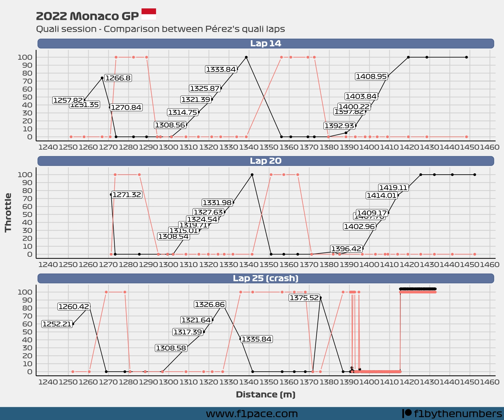
I decided to add not only the lines between the data points but the dots as well. Each dot represents a single data point. You can see how very few dots appear on the chart, meaning that there is little data creating it.
Did Sergio actually brake 20 meters earlier on his final troublesome lap? The chart seems to indicate that. On lap 14 he started braking at meter 1392. On lap 20 he did it at the 1396-meter mark. In his final lap, he did it at the 1375-meter mark. That seems to be around 20 meters for sure, at least according to this data. But we know that this data could be wrong since it was calculated and not provided by the official app. Let’s try something different.
2.2 The reality
Instead of just relying on the distance provided by the API, let’s actually plot the data points on a map. These points are based on the car data, which doesn’t contain any positioning data. Once again, the positioning data is interpolated, but this is the best we got for now. So even though this chart should be way more representative than the previous one, it will still have an error margin.
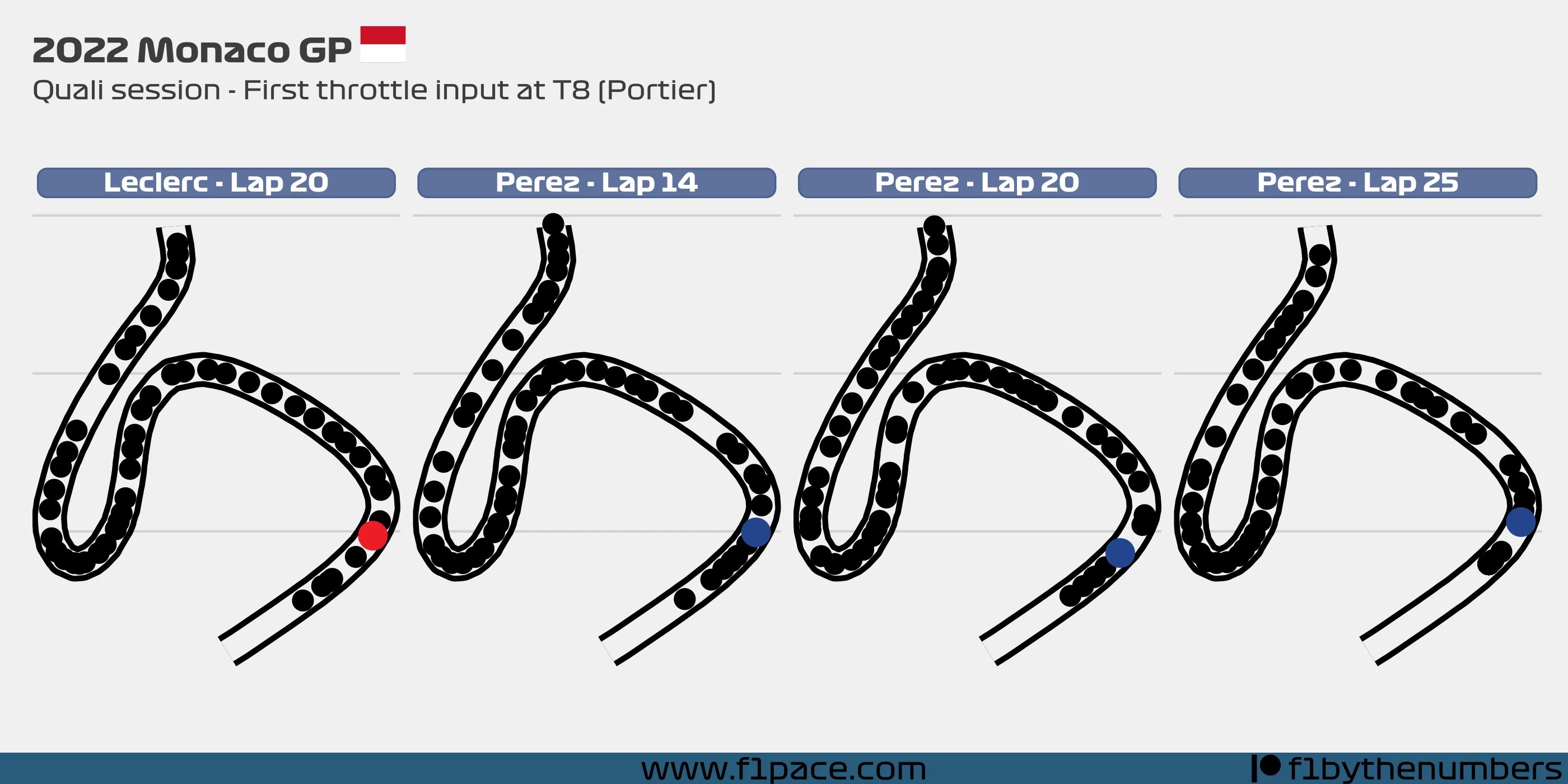
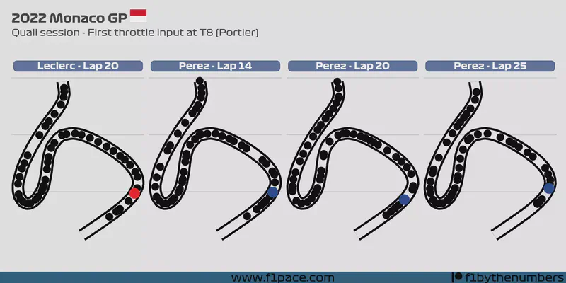
The chart has information from 4 different laps. First, we have Charles Leclerc’s fastest lap. Then we have the three previously mentioned laps (14, 20 and 25) from Sergio Pérez. I decided to show the Leclerc data as a reference point. You’ll see why in a minute.
The chart is quite simple. I’m showing turns 6, 7 and 8 of the Monte Carlo circuit. The black dots represent data points provided by the API. The coloured dot shows the point at which the driver pressed the throttle, according to the data. Remember that this data could be off by as much as half a second, but on average by 0.26 seconds.
Does it look like Pérez accelerated 20 meters earlier on his final lap? It doesn’t look like that to me. It is true that he tried to attack the corner earlier than in lap 14 and even more than on his 20th lap, but not by that much. According to my calculations, Checo initiated throttle input 3.49 meters earlier than on his 14th lap, and 4.78 meters earlier than Leclerc did on his 20th lap. This number has a margin of error, but it clearly shows that the 20 meters claim is ridiculous. Just think about it. Did he accelerate before he even entered the corner? Of course he didn’t, and the video evidence also shows that. But poor data visualization can skew one’s opinion.
2.3 So…what happened then?
That is a more difficult question, and one that I don’t think I can answer. Let’s take a look at the pseudo-telemetry data.
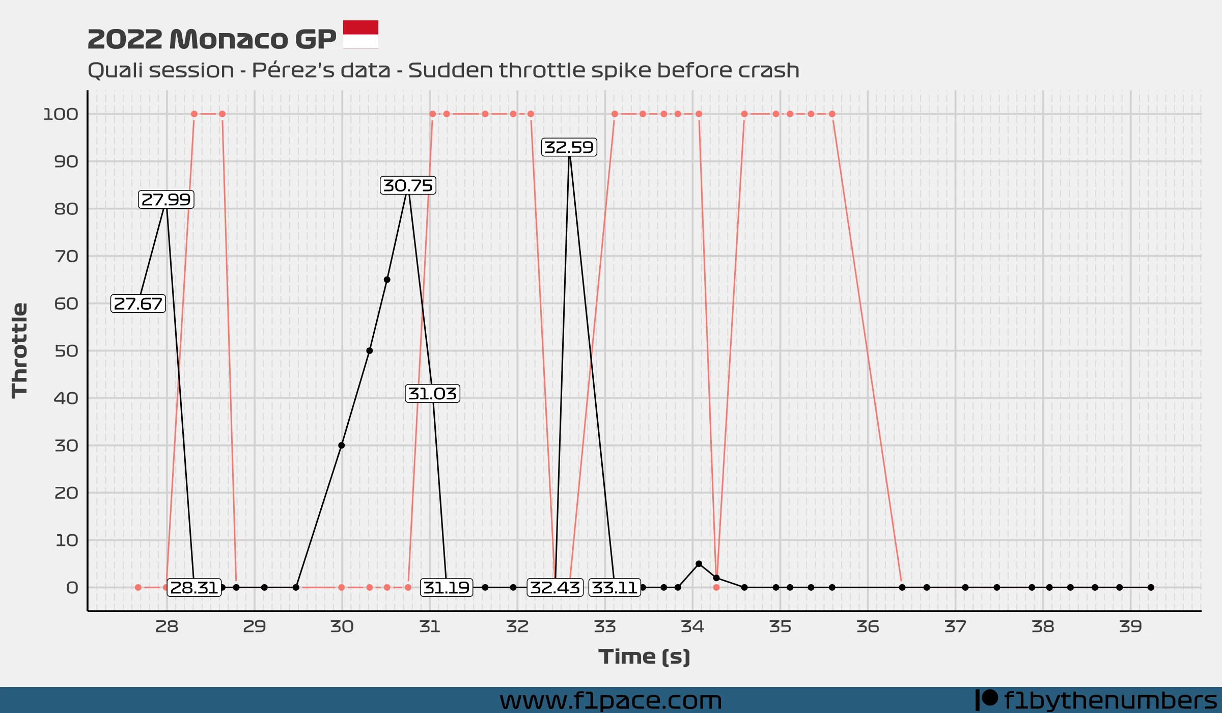
This chart is quite similar to plot #3, but with time on the x-axis instead of distance. The labels now show the time provided by the API for each data point.
Something to remember is that the data is pretty spaced out. The incident is represented by a single data point. It’s impossible, at least in my opinion, to make a definitive conclusion with what is a single data point.
It is true that there is a big spike at second 33.59. The spike is quite fast, with the throttle input seemingly going from 0 to 93% in the span of at most 16 milliseconds. This is crazy fast. It’s actually so fast that I’m not sure if it can be done. It is however what the data shows, and this is actual data provided by the Live Timing app.
I tried timing myself pressing a Logitech throttle pedal to the max as fast as I could. It usually took me around 15 milliseconds. My Logitech pedal has pretty much no resistance whatsoever and also has a short travel distance. Is it possible to fully press an F1 throttle pedal in 16 milliseconds? This is an actual question. For the motorsport engineers out there, please get in touch with me if you know the answer to this question. I ask because if you look at how long it took to depress the throttle, the answer is around 30 milliseconds for the 27.99 to 28.31 data points. It seems to me like pressing an F1 car throttle pedal should be harder than releasing it, but I am not an expert in this area so I won’t comment on it.
2.4 Similar incident
The idea of looking for the telemetry of similar incidents came to me while doing this analysis, but it seems other people also came up with the same idea. A user called probablysitting posted a thread called “REQUEST: Can someone make a comparison between Checo’s last Monaco qualy lap, and other similar spins? “ on the F1Technical subreddit. Thanks a lot to user Bitinid for providing examples of similar incidents. I got especially interested in an incident that happened during the quali session of the 2022 Turkish GP.
Once again, I got the pseudo-telemetry data and plotted the incident in question. If you want to take a look at the video of the spin, check it out at the official Formula 1 website.
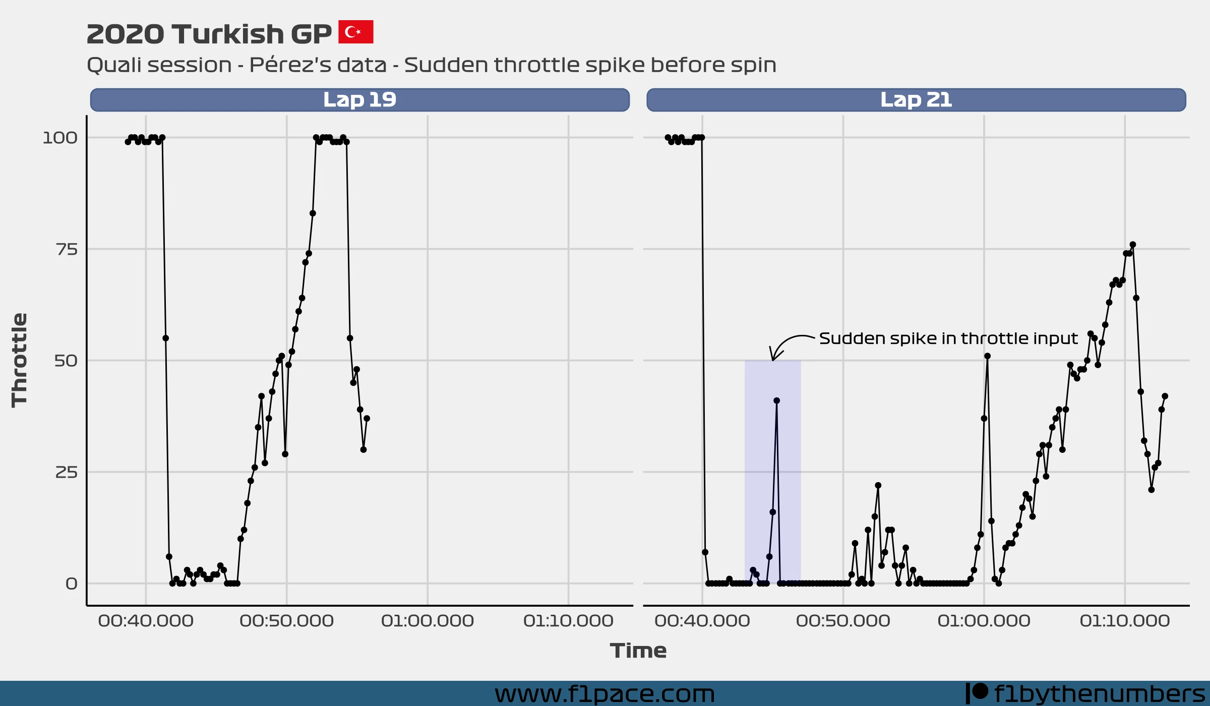
The chart shows two different laps done during the quail session. One shows Sergio successfully completing the corner, while the other one shows him spinning out of control.
You can see how in his 21st lap he pushed the pedal to 41% before spinning out of control. It is impossible to know if he pressed it more before releasing it due to the lack of data granularity. This is a similar type of incident which shows a sudden spike in the throttle pedal that causes a car to spin. The main difference, at least in my opinion, is that this occurred under wet conditions and with what appears to be a lighter throttle input. Still, it shows how sudden spikes in throttle input on slow corners aren’t as rare as initially thought.
3. A sudden push?
One possible explanation to what could’ve happened is that Pérez realized he wasn’t carrying enough speed into T8 (Portier). Let’s take a look at the data.
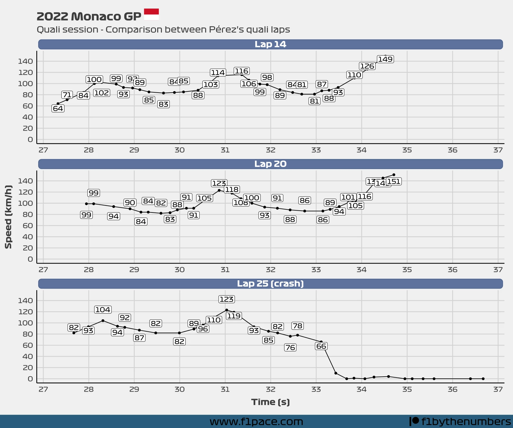
We know that the distance provided by the API is not accurate, but the lap time is. Since we expect the delta between different laps to be a few fractions of a second, we should get a more synchronized picture of what happened in different laps by using time (s) on the x-axis.
It is clear to me that Sergio was carrying less speed during his final lap than in his 14th and 20th laps. Just before the crash, Sergio was carrying around 10 km/h less speed before reaching the apex of T8. It is not out of the realm of possibility to think that he got desperate and pushed the car beyond its limit. A little extra push could’ve saved the corner.
Finally I think it’s also possible that he wanted to induce a bit of oversteer to force the car to rotate faster. It’s a risky move but had it paid off people would be talking about it right after the quali session.
4. Data has its limits
So we’ve done an analysis and compared the data to a similar incident. Nice. Can the data say for sure what happened? No. This is something that is difficult to accept for someone who loves data. Accepting that data is sometimes incapable of proving something. The data that I currently have doesn’t prove to me that Sergio Pérez crashed on purpose. It doesn’t prove either that he didn’t. The data just provides extra information that could assist you in making a more informed decision.
5. My opinion
As stated before, I normally keep my opinions to myself. I made this blog to be impartial and objective, and that will continue to be its goal. Having said that, I think some people may be interested in knowing what I think, so I will give my opinion this time.
Looking at the video and after analyzing the data, it does seem that the 93% throttle input is an anomaly. I don’t think anyone can debate that. It’s important to remember, though, that the data is not very granular due to the average sampling rate of almost 1/3 of a second. While taking a look at the video of the incident it seems to me that Sergio wanted to give the car a little push before attacking the apex of turn 8. Considering that he was carrying less speed than in previous laps, and fully knowing that it was his last attempt at improving his time, he might have gotten greedy and tried to attack the corner more than the car allowed him to.
Is it possible that Sergio crashed on purpose? Of course. I don’t rule anything out. It just seems to me that a driver error is way more plausible, especially after considering the circumstances—last quali lap, carrying less speed into T8 and knowing that a sudden push of the throttle pedal can easily unsettle the car and cause a spin/crash.
6. Final remarks
I hope you guys enjoyed this post. It wasn’t easy to do, and really it takes a lot of effort to do the things that I picture in my mind. I don’t like doing low-quality posts, which means that it takes quite a bit of time to do each detailed post.
I’m sad to see so much misinformation online. So many low-quality posts with zero thought process involved. Just randomly pressing buttons and posting as soon as possible for internet votes. Hopefully my post has helped to fix some of that.
In any case, thank you for reading this article and for visiting my site. If you would like to support me, share this article with friends and if you’re interested in donating a bit of money to the cause, just click on the “buy me a coffee” button below.